Executive Summary
- What it is An AI chart generator turns prompts, spreadsheets (Excel, CSV, JSON), and live connectors (Google Sheets, SQL) into executable visualization code and rendered charts in seconds.
- How it works A parsing layer infers schema, a language model writes plotting code (Matplotlib, Plotly, Vega-Lite), and multi-agent repair loops debug failures before rendering. Leading engines return 1 to 4 candidate variants per prompt.
- What to watch Published benchmarks still report residual hallucinations and weak accessibility defaults. Every chart needs a human check before it leaves the building.
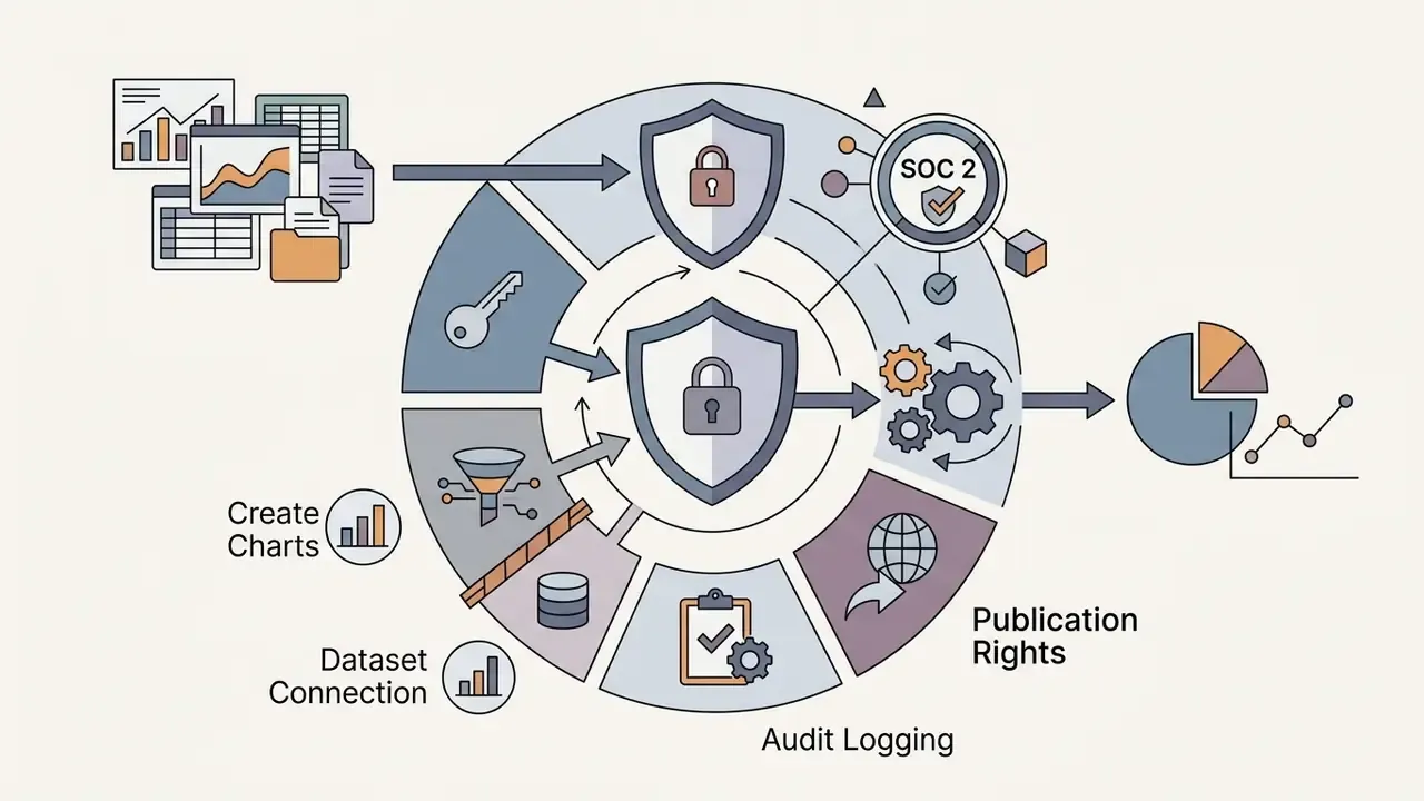
- Security first Uploading confidential workbooks to consumer accounts creates Shadow AI exposure. Require SOC 2 or ISO/IEC 27001 attestation, zero-data-retention terms, PII masking, RBAC, and VPC or self-hosted deployment for regulated data.
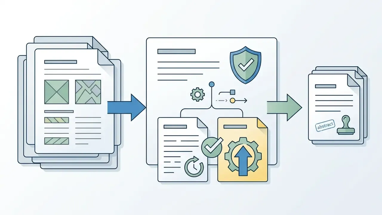
- Audit trail Prefer tools that export the generating Python or Vega-Lite code, so Model Risk Management and GRC teams can archive a reproducible artifact next to the figure.
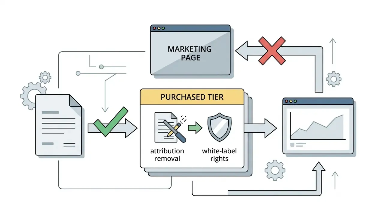
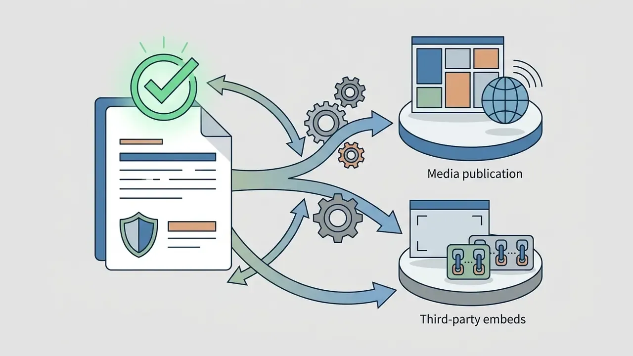
- Licensing Under US Copyright Office guidance (current as of 2026), purely machine-generated visuals are not protected. Document human-in-the-loop edits and confirm attribution-removal rights on paid tiers before publishing.
One line for the executive committee: speed is cheap, evidence is not.
What Is an AI Chart Generator and What Can It Create?
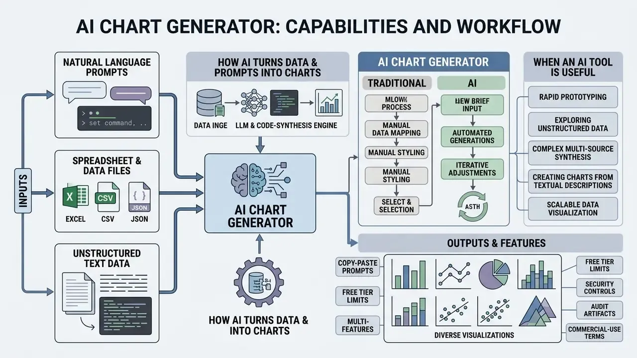
An AI chart generator is a software tool that uses large language models (LLMs) and code-synthesis engines to convert natural language prompts, spreadsheet files, or unstructured text into executable visualization code and rendered diagrams. Unlike a static graphics app, an ai chart generator parses column schemas, selects visual encodings, and renders data structures into readable visual reports within seconds.
Figure 1. Manual charting versus AI-automated generation. In a manual pipeline, an analyst cleans raw cells, selects ranges, picks a template, and formats axes by hand across four to six discrete steps. In an AI pipeline, the same dataset moves through schema inference, prompt parsing, code compilation, rendered chart, and human verification. Formatting labor shrinks. One mandatory validation gate appears that the manual workflow never had.
How AI Turns Data and Prompts into Charts
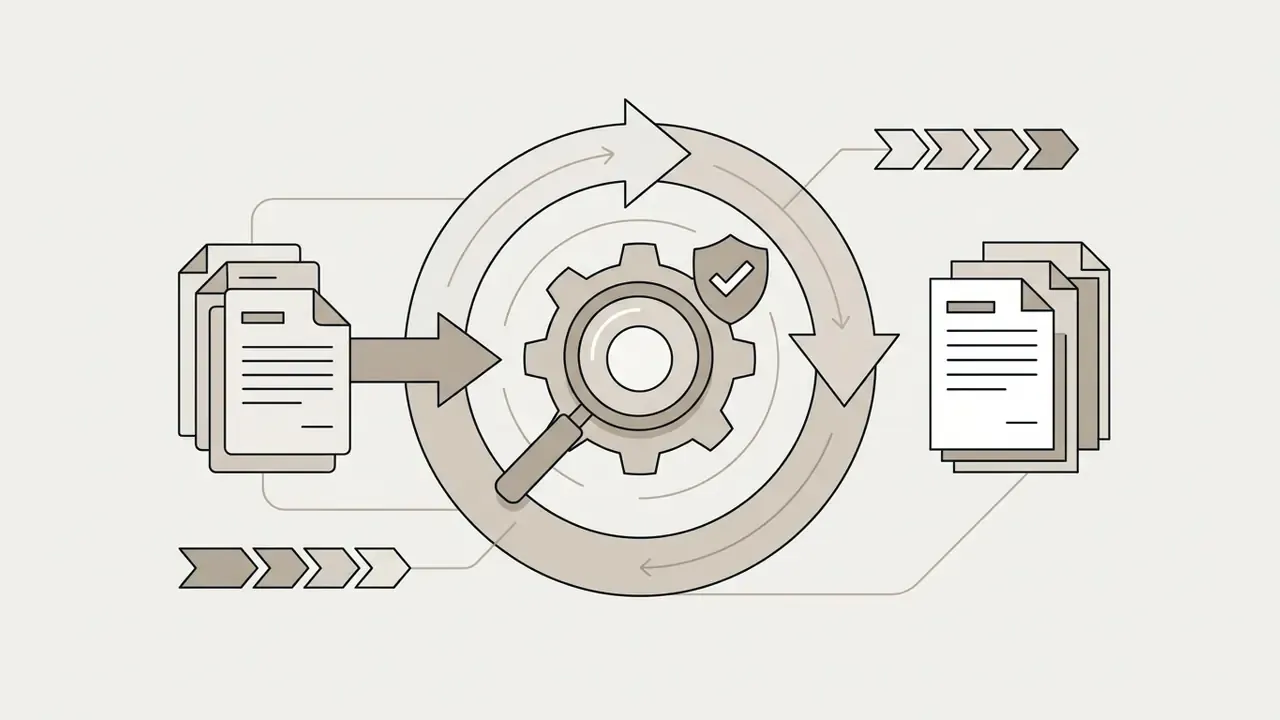
A chart ai generator processes tabular data and text prompts through a multi-stage compilation pipeline. First, a data inference module parses uploaded spreadsheets or narrative passages, identifying data types, numerical ranges, categorical labels, and missing values. Next, the underlying model writes structured visualization code, such as Python Matplotlib, Plotly, or a Vega-Lite specification, mapping data attributes to axes, colors, and markers.
Research in automated data visualization points to two design patterns. In the ChartifyText framework (2024), a language model infers a structured table directly from prose before passing that schema to a chart generation module. Multi-agent architectures go further and separate drafting, code execution, and iterative repair, so syntax errors get fixed before anything renders.
«A multi-agent pipeline built on GPT-4o-mini reduced code execution failures to 4.5% on Text2Chart31 within three repair iterations, outperforming fine-tuned models by nearly five percentage points.»
That 4.5% figure belongs to the study above, not to any vendor marketing page. Worth repeating, because the number circulates without attribution.
Recent evaluation work also shows that prompt design, not only model size, determines whether generated visualizations respect logical constraints:
«An evaluation of six LLMs across eight prompting strategies on the nvBench dataset revealed substantial differences in visualization accuracy, validity, and constraint compliance.»
During rendering, leading engines produce 1 to 4 candidate visuals from a single prompt. Multi-candidate generation lets you compare encodings, for example a horizontal bar layout against a grouped column layout, and keep the figure that represents the dataset honestly. If nothing fits, most interfaces offer two branches: regenerate with a revised prompt, or promote one candidate into a full editor for manual refinement.
AI Chart Generator vs Traditional Chart Maker
A traditional chart maker asks the user to format cells, highlight ranges, pick a template from a drop-down, and adjust axis properties by hand. An ai chart maker flips the order. You describe the analytical intent in plain English, and the model handles extraction, aggregation, and visual mapping.
Research on natural-language-to-visualization (NL2VIS) systems, including the Chat2VIS study, found that models infer usable plotting code even from ambiguous queries.
«LLM-based approaches with well-designed prompts outperform traditional NLP pipelines that rely on hand-written grammar rules for visualization accuracy.»
A conventional graphic maker still wins on granular drag-and-drop control. An ai driven chart maker wins on time-to-insight, because it produces a presentation-ready figure directly from raw inputs. In practice, mature teams run both: generation first for the draft, editor second for the publication-grade artifact.
| Parameter | Traditional chart maker | AI chart generator |
|---|---|---|
| Time to first draft | 10 to 30 minutes of manual selection and formatting | Seconds to under a minute from prompt or upload |
| Design flexibility | Full drag-and-drop and granular property control | Generation first, refinement afterwards in an editor |
| Layout automation | User places titles, legends, and axes | Automatic encoding, spacing, and legend placement |
| Entry threshold | Assumes charting and formatting familiarity | Plain-English instruction, no template knowledge required |
| Reproducibility | Manual steps are hard to replay | Exportable code (Python, Vega-Lite) can be archived and re-run |
When an AI Tool Is Useful for Chart Creation
An ai tool to create charts earns its keep in corporate reporting, market-research synthesis, and cross-functional collaboration. Financial institutions handle enormous volumes of tabular and textual data, so fast and accurate visual synthesis feeds directly into decision quality.
Consider a finance team summarizing quarterly performance across twelve operating units, working from earnings transcripts and dense workbooks. Most of the formatting burden shifts to a prompt-driven workflow. The honest framing here is directional rather than numeric: layout configuration moves from manual work to a generated draft, and the analyst's remaining effort concentrates on validating figures and reviewing conclusions.
Actual latency reduction depends on data cleanliness, dataset size, and how many review cycles your internal controls require. Measure it internally before quoting it externally. I have seen teams claim large savings, then discover the review gate consumed the gain.
Teams weighing adjacent generation categories can compare options to see how evaluation criteria differ between quantitative visualization and creative image generation.
What Data Can You Upload or Describe for an AI Chart?
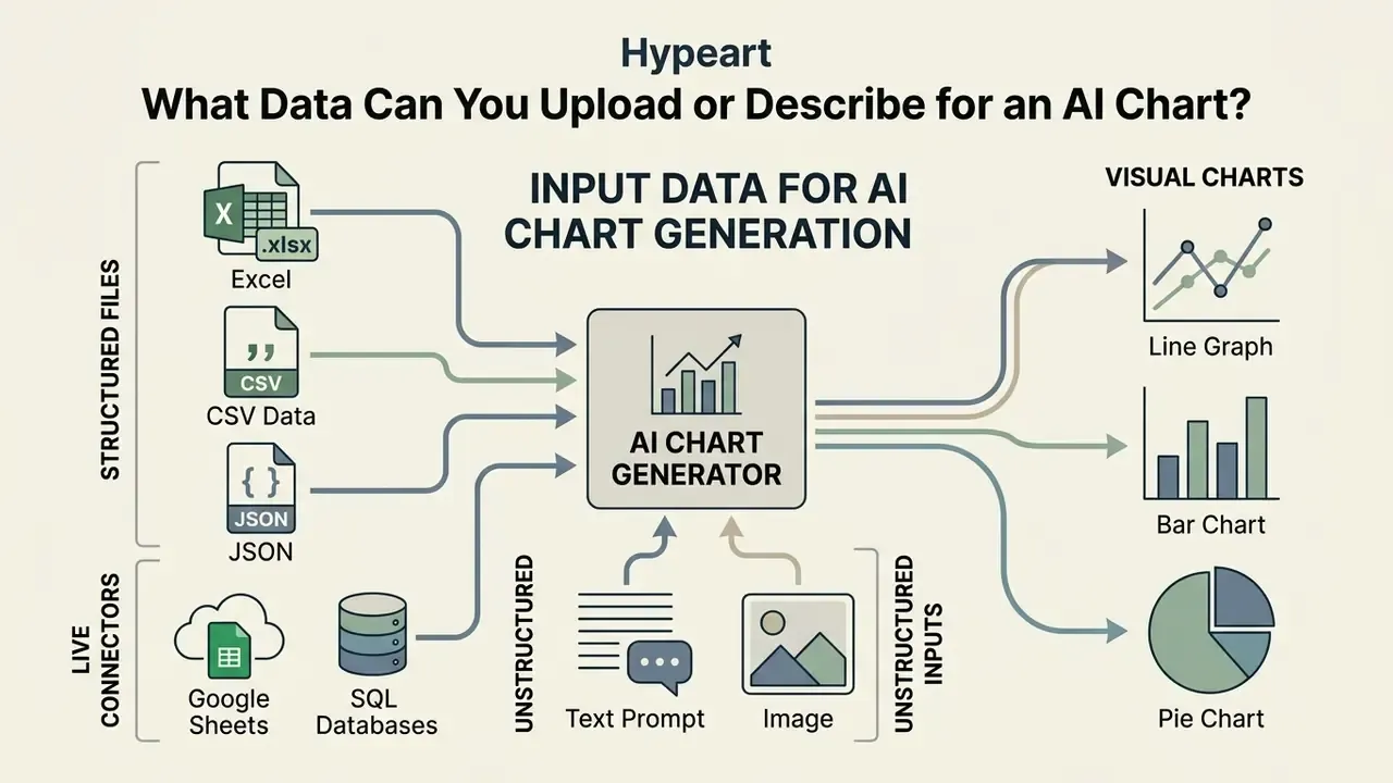
Modern chart creation tools accept a wide range of inputs: structured spreadsheet files (Excel, CSV, JSON), live cloud connectors (Google Sheets, SQL databases), free-form narrative descriptions, and static images. Knowing how each format is ingested keeps output accurate and cuts processing errors.
Create an AI Chart from Excel and Spreadsheet Files
An ai chart generator from excel turns multi-tab workbooks into structured visual diagrams. Systems such as Microsoft Copilot in Excel and Google Gemini in Google Sheets read structured cell ranges, identify primary keys, and suggest chart types based on the dataset.
When you feed an excel ai chart generator, preparation matters more than prompting. Microsoft's published Excel chart documentation states that hidden rows and hidden columns are not plotted by default and must be included explicitly through the "Hidden and Empty Cells" setting. Hidden worksheets remain referenceable from other sheets even when not visible. Treat vendor documentation as version-dependent, and re-verify the setting in your own tenant before relying on it for regulated reporting.
Converting native .xlsx files into standardized table formats also helps the model parse header rows, string categories, and numeric series without misreading blank cells or formula fields. Third-party testing suggests .xlsx behaves most predictably in Google Sheets after conversion to the native Sheets format. An ai excel chart generator will happily plot a subtotal row as a category if you leave it in, so strip those first.
«Flourish and Datawrapper support live data updates from Google Sheets and CSV, which keeps dashboards current without manual file transfers.»
Before you standardize on one vendor, view the guide covering licensing terms across AI generation platforms.
Generate Charts from CSV Data
CSV remains the most reliable route for chart creation ai workflows, because it is a lightweight, standardized text format with no hidden state. An ai graph generator from excel or CSV reads comma-separated records and maps columns straight to visualization parameters.
Ingestion limits vary by platform architecture. Oracle AI Agent Studio documents a 25 MB single-file limit for delimited data. Dust supports delimited files up to 50 MB. Relevance AI enforces a 50,000-row cap. Keptune documents a 50 MB ceiling for CSV, XLS, and XLSX uploads before it renders Plotly-based interactive charts.
«CSV preparation standards require UTF-8 encoding, concise header rows, and properly escaped quotation marks inside text fields to prevent parsing failures.»
A few more hygiene rules that quietly prevent misparsing: remove empty trailing records, delete summary and subtotal rows that are not part of the dataset, avoid merged cells, and strip currency symbols from numeric columns so the model treats them as measures instead of strings. Date formats deserve their own pass. Mixed MM/DD/YYYY and YYYY-MM-DD values in one column are a classic source of silently wrong time axes.
Use JSON, Google Sheets, and SQL Connectors
Developer-oriented pipelines feed chart engines directly from JSON payloads, live Google Sheets ranges, and SQL query results. JSON dominates in product analytics, event logs, and API responses. Flat arrays of objects with consistent keys parse most reliably, while deeply nested structures should be flattened or mapped explicitly before upload. Vendor documentation notes that highly variable JSON and XML files should stay smaller than flat CSV equivalents, because dense nesting eats parsing budget.
Live connectors change the operating model from one-off generation to continuous reporting. Google Sheets sync keeps published charts aligned with a source range on an hourly, daily, or weekly refresh. SQL and warehouse connectors, including Snowflake-style and Databricks-style endpoints exposed through APIs, let charts read from governed tables instead of exported copies.
That distinction is a control decision, not a convenience. Querying a governed table preserves row-level permissions. Emailing a CSV export duplicates sensitive data into an ungoverned location, usually someone's downloads folder.
For enterprise rollouts, pair connectors with role-based access control so report consumers can view rendered charts without gaining query rights on the underlying dataset. Automation teams can open the hub for connector and scheduling documentation.
Make a Chart from a Text Prompt or Image
An ai chart generator from text free tool builds charts purely from descriptive statements or from uploaded graphics. Give it a prompt such as "Plot annual software subscription revenue growth from 2021 to 2026," and the system infers the missing values, constructs an internal table, and outputs the figure. Because those values are model-generated rather than measured, an ai chart maker from text output should be labeled illustrative unless you supply the numbers yourself. This is the single most common way a made-up figure enters a real deck.
For image inputs, advanced tools use computer vision and layout analysis to create editable graphs from images. Eraser's published documentation states that static .png and .jpeg files can be imported and redrawn as editable diagrams by selecting an image input and prompting a re-draw. The DiagrammerGPT paper (arXiv, updated 2026) describes a two-stage pipeline in which a language model first produces a diagram plan and a visual generator then renders the open-domain diagram.
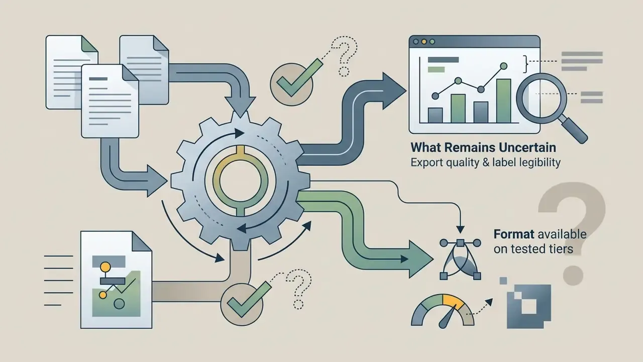
These capabilities are vendor-documented and research-documented, not universal. Reconstruction accuracy degrades on low-contrast screenshots, rotated labels, and charts without visible axis values. Always reconcile recovered numbers against the original source data.
Beyond quantitative charts, code-synthesis models compile unstructured text into node-based diagrams: flowcharts, process maps, swimlane diagrams, and mindmaps in Mermaid.js or Graphviz syntax. The same prompt interface therefore covers documentation and system design, which is why control-narrative and KYC process diagrams often end up in the same tool as the revenue charts.
Supported data sources and input requirements for AI chart generation
| Data source | Primary use case | Data preparation requirements | Expected AI output |
|---|---|---|---|
| Excel files (.xlsx, .xls, .xlsm) | Multi-tab corporate reporting, financial modeling, structured analysis | Format data as explicit tables, keep header rows, manage hidden rows, columns, and sheets deliberately | Interactive or static charts with column bindings, legend mappings, and editable styling |
| CSV data (.csv, .tsv) | Lightweight exports, system-to-system analytics, automated reporting pipelines | UTF-8 encoding, single header row, escaped commas and quotes, respect file size limits (25 to 100 MB by vendor) | Executable plotting code (Python, Vega-Lite) plus high-resolution rendered figures |
| JSON data (.json) and API payloads | Developer logs, nested object arrays, system analytics summaries | Flat arrays or explicit key-value mappings, validated syntax, flattened deep nesting | Automated schema parsing into bar, line, or scatter visualizations |
| Google Sheets and SQL connectors | Recurring dashboards, live KPI tracking, governed warehouse reporting | Define a named range or query, set refresh cadence, configure RBAC so viewers cannot query raw tables | Auto-refreshing embedded charts and scheduled report exports tied to the source of record |
| Text prompts | Qualitative summaries, rapid hypothesis testing, conceptual modeling | State explicit metrics, context, numerical ranges, and comparison categories in the prompt | Inferred table plus a rendered visualization, to be labeled illustrative |
| Images and screenshots (.png, .jpg) | Converting legacy presentation graphics or PDFs into editable formats | Upload high-contrast files with legible labels and readable axis text | Reconstructed vector graphics, editable code blocks, or interactive canvas elements |
Enterprise Data Security, SOC 2, and Shadow AI Risk
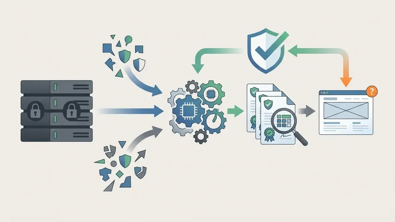
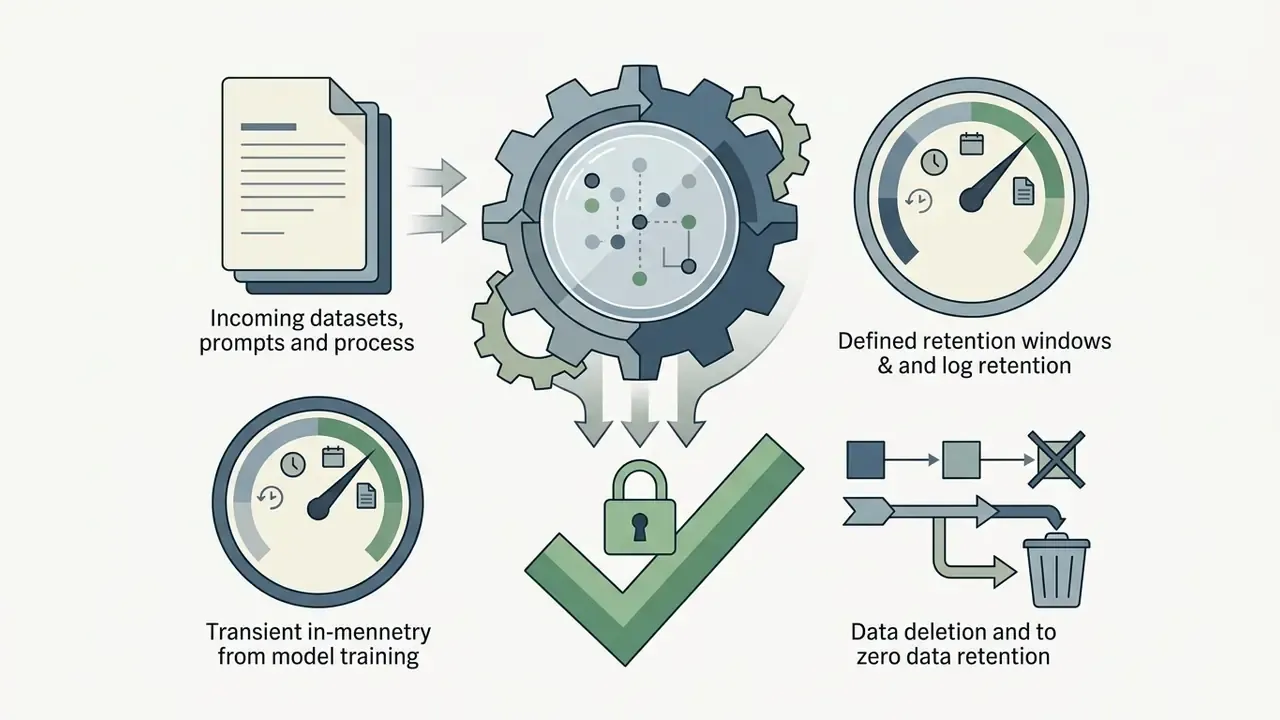
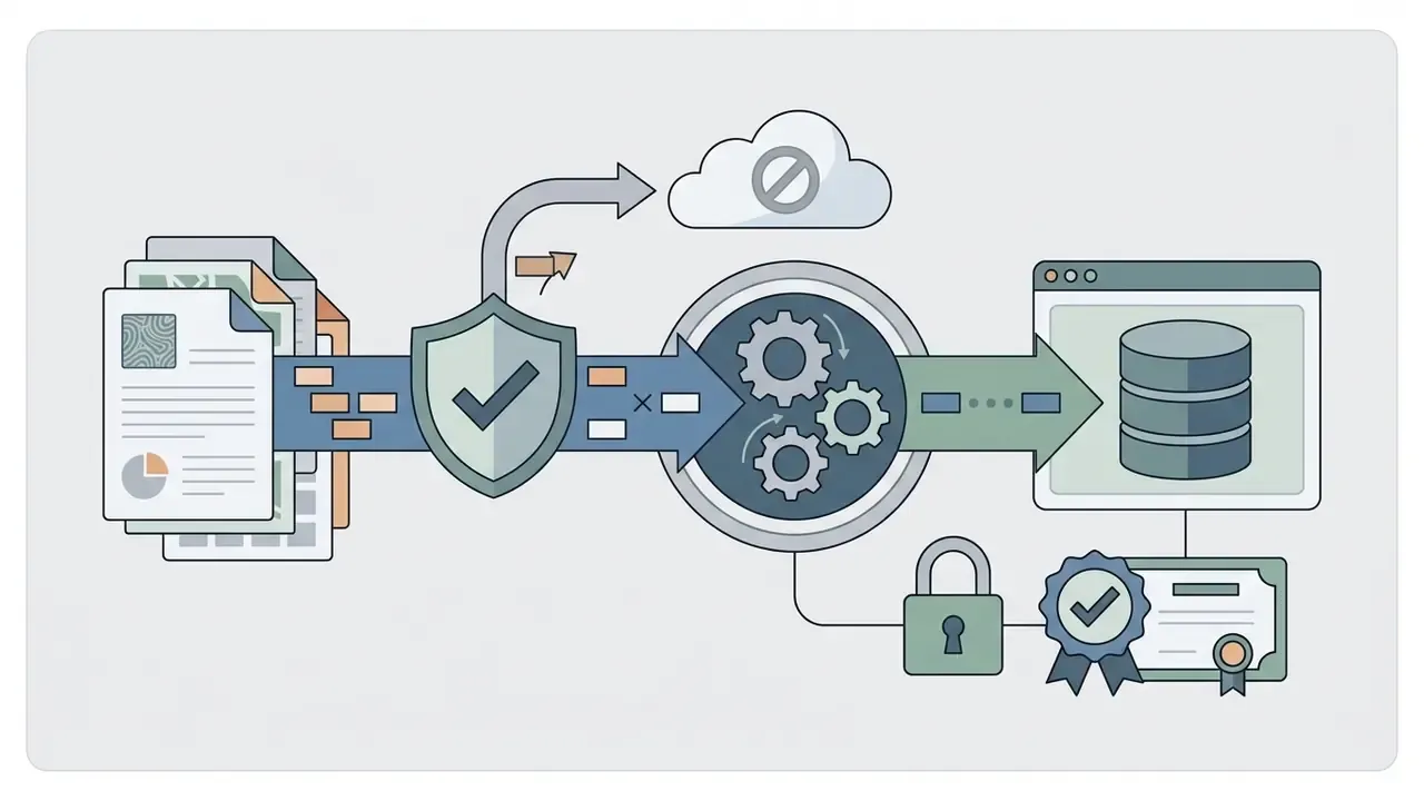
Uploading a revenue workbook to a free browser tool is a data transfer, not a formatting action. For banks, insurers, and fintech operators, chart generation therefore sits inside the same control perimeter as any other third-party processing arrangement.
Control checkpoints to require before you approve a chart generator:
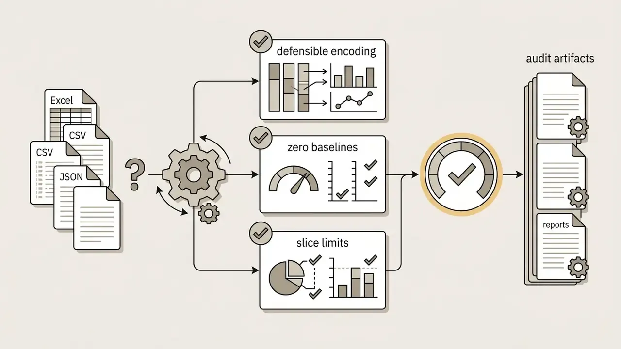
Audit trail and model-risk reproducibility. For Model Risk Management and internal audit, the chart image alone is not evidence. Choose tools that expose the generating artifact, whether Python source (Matplotlib or Plotly), a Vega-Lite specification, or Mermaid syntax, and archive it alongside the dataset hash, prompt text, model name and version, and generation timestamp. Julius AI, for example, documents editable code and notebook saving with PNG and SVG export, which makes the visualization re-runnable rather than merely re-viewable.
A practical archival bundle holds five items: input dataset or query definition, prompt, generated code, rendered output, and the reviewer's sign-off. Five items. No exceptions during month-end.
Ownership deserves one more sentence, because it is where most governance programs stall. Each recurring chart should have a named owner, an approved purpose, an access boundary, an escalation path when the figure looks wrong, and a documented way to switch the pipeline off.
This section describes general control practices and does not constitute legal, audit, or compliance advice. Validate requirements with your own risk, security, and compliance functions.

Which AI Chart Types Should You Use for Your Data?
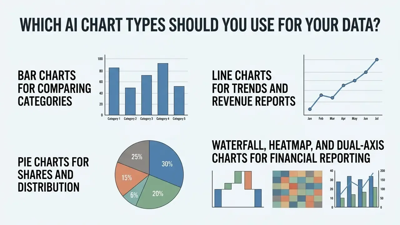
Choosing the correct chart type is the difference between insight and misreading. An ai graph engine can recommend a format from the data attributes, but you still need to know when a bar chart, line chart, or pie chart is appropriate.
Figure 2. Chart-type decision tree. Start from the data relationship. Comparison across discrete categories leads to a bar or dot plot. Change over an ordered time axis leads to a line, area, or slope chart. Part-to-whole composition summing to 100% leads to a pie, donut, or stacked bar. Contribution to a change between two totals leads to a waterfall. Density across two categorical dimensions leads to a heatmap. Two measures on different scales lead to a dual-axis chart, used sparingly, with both axes labeled.
Bar Charts for Comparing Categories
Bar charts remain the standard for comparing discrete categories, tracking product performance across regions, and ranking business metrics. In a bar chart or vertical column layout, bar length represents magnitude directly, so comparison happens without mental arithmetic.
Figure 3. Sample vertical bar chart. Regional annual software subscription revenue across four markets (North America, Europe, Asia-Pacific, Latin America), sorted descending, with explicit value labels above each bar and a zero baseline.
«CDC data visualization standards (2024) require bar charts to begin at a zero baseline, with categories sorted logically so rank order is read correctly.»
Those guidelines set several practical rules. Start the numerical axis at zero to prevent visual distortion. Sort categories logically, either chronologically or by magnitude, to emphasize rank. Keep bar orientation consistent across a related series. Hold bar width uniform, because thickness carries no measurement value. Give every bar a unique label, and run percentage axes from 0 to 100%. Uniform spacing and non-overlapping category labels keep dense enterprise datasets readable on a projector, which is where most charts actually get judged.
Line Charts for Trends and Revenue Reports
Waterfall, Heatmap, and Dual-Axis Charts for Financial Reporting
Finance and risk teams need encodings beyond the three basics, and several sit behind paid tiers in commercial tools:
- Waterfall (bridge) charts decompose movement between two totals, for example opening to closing revenue, into positive and negative contributions such as new business, expansion, churn, and FX effects. Datawrapper documents waterfall support on its Business tier, which turns chart-type requirements into a procurement input.
- Risk heatmaps encode density or severity across two categorical dimensions, such as business unit by risk category, or product by region, using a sequential or diverging palette rather than a categorical one. Reserve diverging palettes for data with a meaningful midpoint.
- Dual-axis charts plot two measures on different scales, revenue against margin percentage being the classic pair. Use them sparingly, label both axes explicitly, and consider two stacked panels when correlation is the message.
- Sparklines compress a trend into a KPI card for board packs. Direction without layout cost.
Matrix of analytical goals and recommended AI chart types
| Analytical goal | Recommended chart type | Optimal data characteristics | Key design requirements |
|---|---|---|---|
| Category comparison | Bar chart (horizontal or vertical), dot plot | Discrete categories with one quantitative metric | Zero baseline, sort by value, uniform bar width |
| Time-series trend analysis | Line chart, area chart, sparkline | Ordered temporal points with continuous values | Limit to 1 to 4 series (max 6), label inflection points, consistent intervals, disclose axis truncation |
| Proportional share (part-to-whole) | Pie chart, donut chart | Mutually exclusive categories summing to 100% | Limit to 2 to 6 slices, order clockwise by size, consolidate minor categories into "Other" |
| Multi-variable composition | Stacked bar, stacked area, treemap | Categorical or temporal data with sub-category breakdowns | Distinct palettes, limited stacking depth, explicit total labels |
| Contribution to change (bridge analysis) | Waterfall chart | Opening balance, signed drivers, closing balance | Color-code positive and negative bars, label opening and closing totals, verify components reconcile |
| Risk or density matrix | Heatmap | Two categorical dimensions crossed with one intensity measure | Sequential or diverging scale with legend, colorblind-safe palette, annotate extreme cells |
| Two measures, different scales | Dual-axis chart | Paired metrics such as absolute revenue and percentage margin | Label both axes, avoid implying false correlation, prefer stacked panels when in doubt |
Read across that matrix and the pattern is clear. Bar charts give immediate clarity for categorical comparison. Line charts expose temporal movement across financial quarters. Pie charts summarize simple proportional distributions. Waterfall and heatmap encodings handle the reconciliation and risk-matrix cases that lightweight tools quietly omit, which is exactly where finance teams get stuck on a free tier.
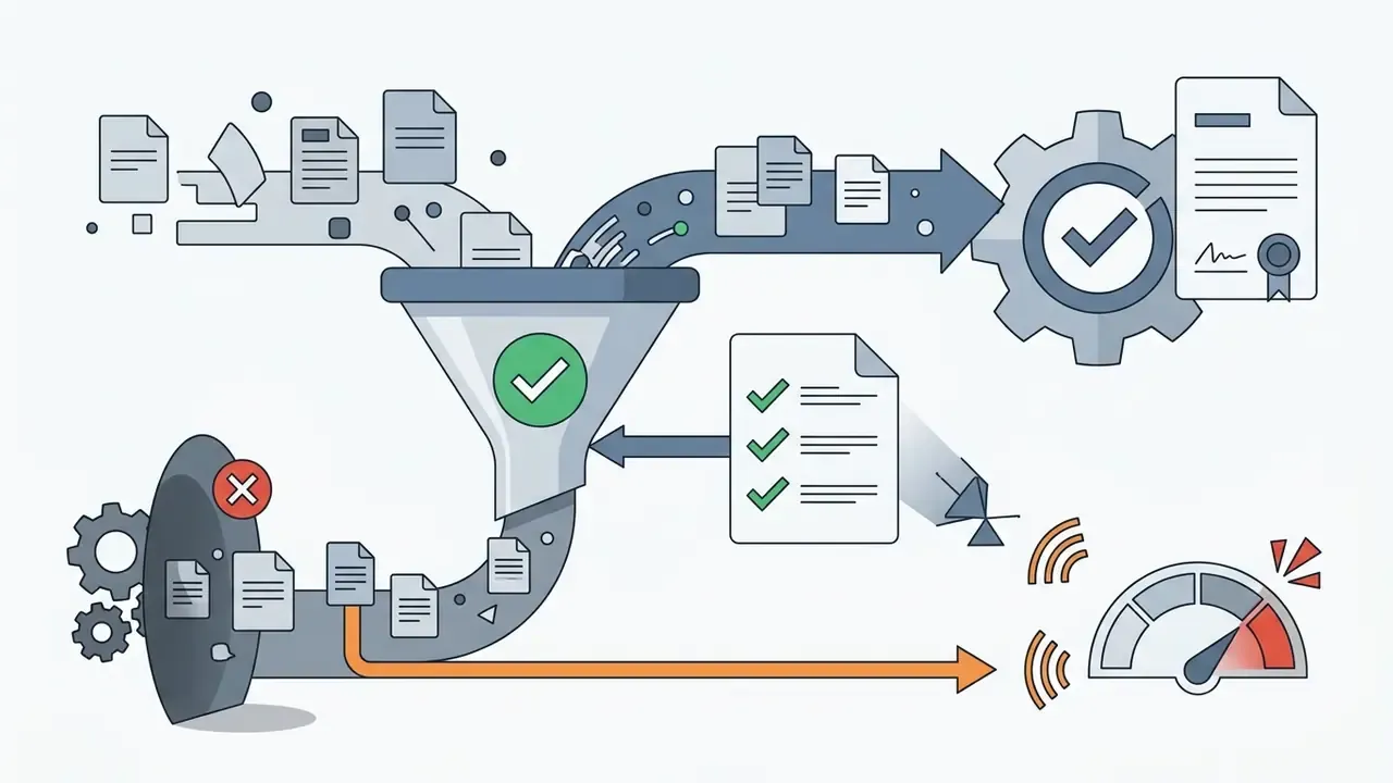
Known limitations of automated chart generation. Automation does not remove the review requirement:
«A manual inspection of 100 charts produced by a multi-agent pipeline found hallucinations in 6 cases, and only 33.3% of charts on Text2Chart31 met basic color-blind accessibility requirements.»
Mitigations are unglamorous and effective: cross-check plotted totals against the source aggregate, confirm axis units and date ranges, test the palette in a color-vision simulator, and require a named human reviewer for any chart entering external reporting.
This information is general in nature and does not replace professional data verification before publication in corporate reporting or regulated materials.
How to Create a Chart with AI Step by Step
Working with an ai chart maker online follows a five-step operational workflow, from raw data ingestion to prompt configuration, generation, styling, and export.
Figure 5. AI chart creation workflow. Five sequential steps, each with a text label in the page for accessibility:
- Upload data (Excel, CSV, JSON, or a connected Sheets range or SQL query).
- Write the prompt, naming metrics, categories, and chart form.
- Generate the chart and review the candidate variants.
- Customize style, labels, legend placement, and palette.
- Export or share, together with the generating code artifact.
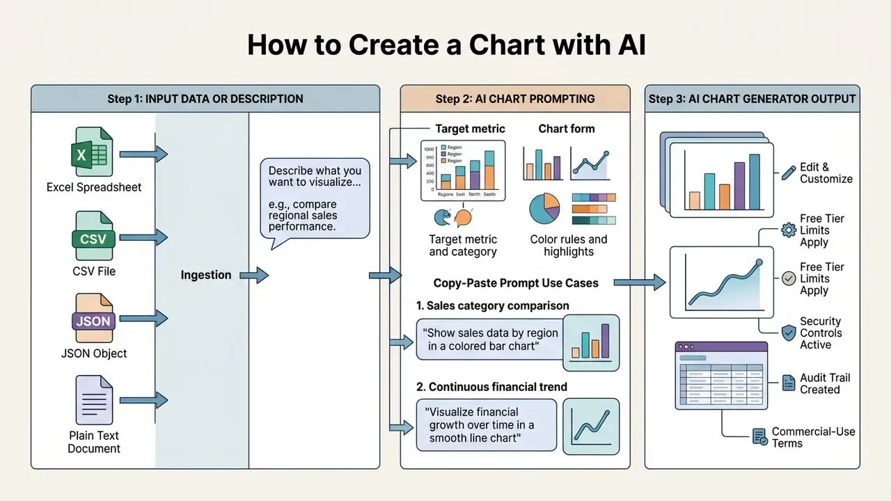
Upload Data or Start with a Text Description
The first phase supplies source material to the chart generator ai interface. You can upload structured files (.xlsx, .csv, .json), connect a live Google Sheets range or SQL query, or type a descriptive prompt straight into the input window.
Schema discipline pays off immediately. According to US Department of Labor electronic filing specifications (2026), CSV and spreadsheet imports must begin with a clean header row of distinct column labels, followed directly by continuous data rows. Note that schema rules are format-specific: some federal import templates require a header record, while certain legacy batch formats forbid one. Follow the target specification instead of a generic assumption.
Remove empty rows, orphaned formulas, and unformatted summary totals. Otherwise the model misidentifies numeric types during schema parsing, and you will spend the saved time debugging a chart instead of building one.
Write a Prompt That Generates the Right Chart
Prompt quality drives encoding, palette, and filter choices in any chart creator ai. A strong prompt supplies context, names target variables, and sets formatting constraints explicitly.
Established style guides, including UK Government Analysis Function standards, suggest structuring prompts around three operational parameters:
Instruction-tuning research suggests chart generation quality is trainable rather than emergent:
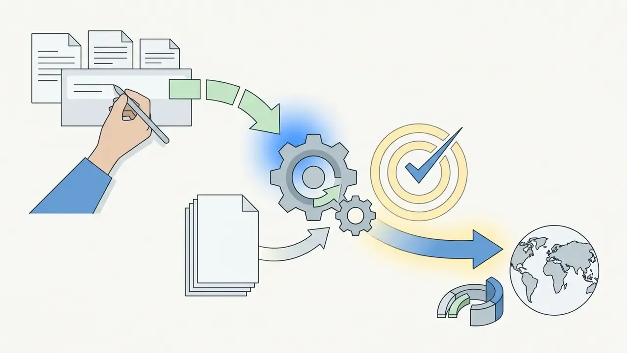
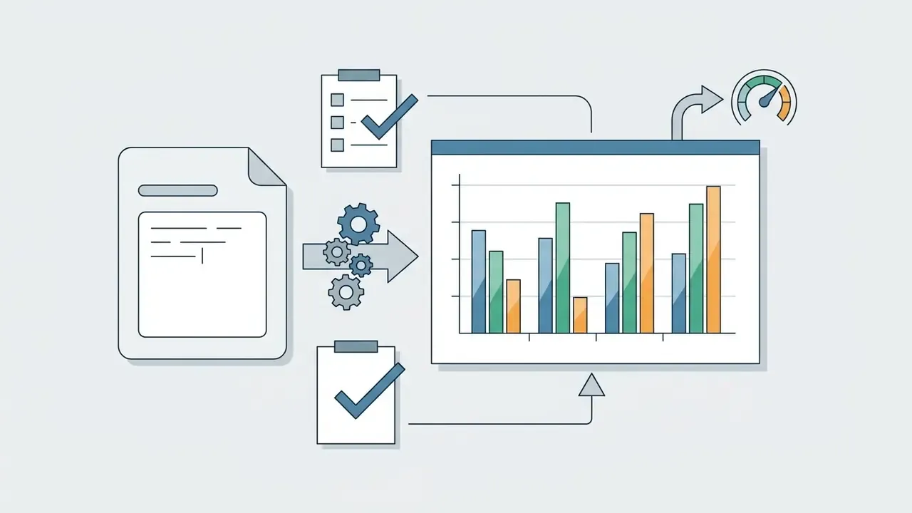
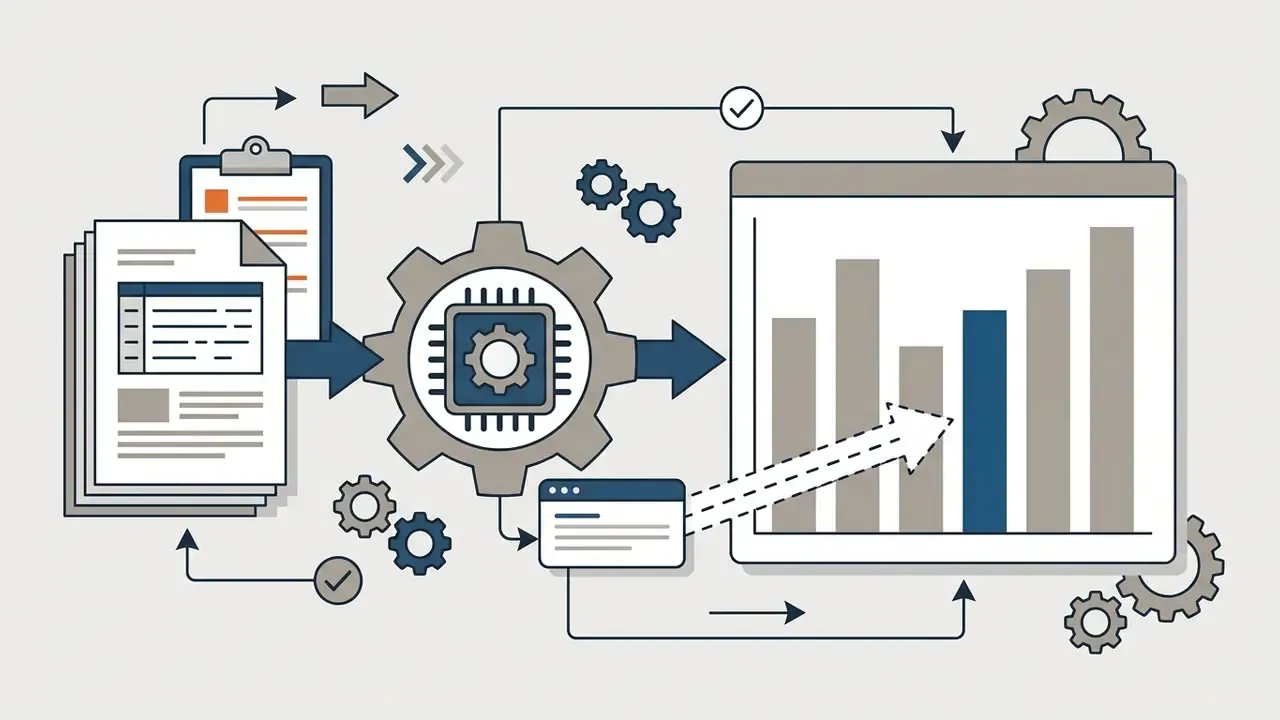
«Text2Chart31 contains 11,128 description, code, and chart triples across 31 chart types; smaller models fine-tuned on it outperformed larger open-source counterparts on generation quality.»
Copy-Paste AI Chart Prompts by Use Case
1. Sales category comparison (bar chart):
"Act as a data analyst. Generate a vertical bar chart comparing 'Quarterly Revenue'
across 'Product Categories' from the uploaded dataset. Sort the bars from highest to
lowest revenue. Accentuate the top-performing category in Navy Blue (#001F3F) and set
all other bars to Muted Grey (#D3D3D3). Ensure the Y-axis baseline starts strictly at zero."
2. Continuous financial trend (line chart):
"Plot a time-series line chart tracking 'Monthly Recurring Revenue (MRR)' from Jan 2026
to Dec 2026. Include a maximum of 2 data lines (Current Year vs Previous Year). Display
explicit value labels at peak and valley inflection points. Set the title to
'2026 MRR Growth Trajectory'."
3. Market share breakdown (pie or donut chart):
"Create a donut chart displaying the market share percentage among operating units.
Limit to the top 5 categories ordered clockwise by size; group all remaining minor
segments into an 'Others' slice. Output explicit percentage labels on each slice."
4. Revenue bridge (waterfall chart):
"Build a waterfall chart reconciling 'Opening ARR' to 'Closing ARR' using the columns
New, Expansion, Contraction, and Churn. Color increases green and decreases red, label
the opening and closing totals in bold, and confirm that all components sum to the
closing balance."
5. Risk matrix (heatmap):
"Render a heatmap of 'Issue Count' with 'Business Unit' on the Y-axis and 'Risk Category'
on the X-axis. Use a colorblind-safe sequential palette, include a legend with numeric
breaks, and annotate the three highest cells with their values."
6. Reproducibility add-on (append to any prompt above):
"Return the full Python (Plotly) source code used to generate this chart, list the exact

column names consumed, and state any rows dropped or values imputed during processing."
Prompt refinement tips. Be specific about sort order ("sorted high to low"), because default ordering is often alphabetical. State the aggregation explicitly, "sum by month" rather than "monthly". Name the output format when you need SVG or PNG. When the first candidate is close but imperfect, change one variable at a time, so you can attribute the improvement to something.
Best Free AI Chart Generator Tools: Pricing, Limits, and Commercial Use
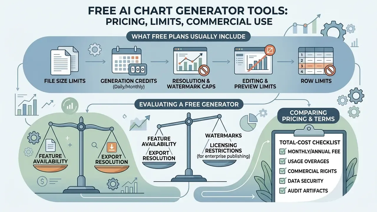
Evaluating a free ai chart generator means balancing feature availability, export resolution, watermarks, and licensing restrictions for enterprise publishing.
Figure 6. Free versus paid feature matrix. Free tiers typically cover standard chart types, capped uploads, watermarked or attributed output, and PNG export. Paid tiers unlock vector SVG and PDF export, attribution removal, advanced chart types (waterfall, dual-axis, heatmap), scheduled data refresh, team seats, SAML SSO, and self-hosting.
What a Free AI Chart Generator Usually Includes
A best free ai chart generator tier gives individuals enough to evaluate the product: standard chart types (bar, line, pie), basic CSV uploading, and standard-definition PNG downloads. Useful for a pilot. Rarely enough for a regulated report.
Restrictions bind quickly. ArchitectureDiagram.ai grants two diagram creations per month with mandatory watermarking. Miro provides ten AI credits per team per month and consumes one credit per diagram. Visual Paradigm Online's free edition exports JPG, PNG, SVG, and PDF, but stamps a watermark. Many free tiers also require visible attribution, for example "Created with Datawrapper", on public web embeds and withhold high-resolution vector SVG export.
Concrete free-tier thresholds to expect:
- File size thresholds. Free web-based parsers typically cap datasets between 10 MB and 100 MB per file. One note-taking platform caps imports at 100 MB, while API-driven ingestion tools restrict single CSVs to 25 to 50 MB.
- Daily and monthly generation credits. Entry tiers run on daily refresh tokens, for example 10 free generation credits per day with storage for 2 saved graphs, or lifetime trial pools of roughly 2 to 5 diagram exports. Credit-based design tools may allocate around 60 credits per month, charging 1 credit for a prompt-based chart and up to 3 for a document upload.
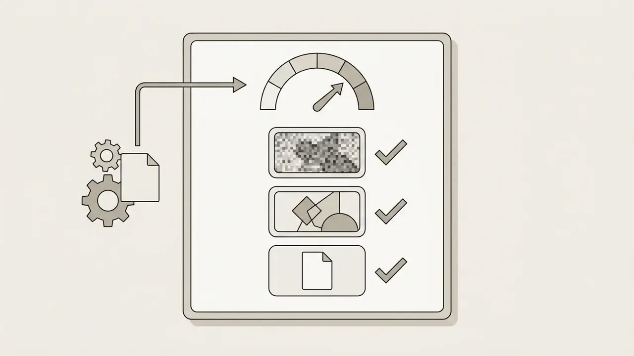
- Resolution and watermark caps. Free plans often limit output to roughly 2K resolution and watermark premium rendering modes.
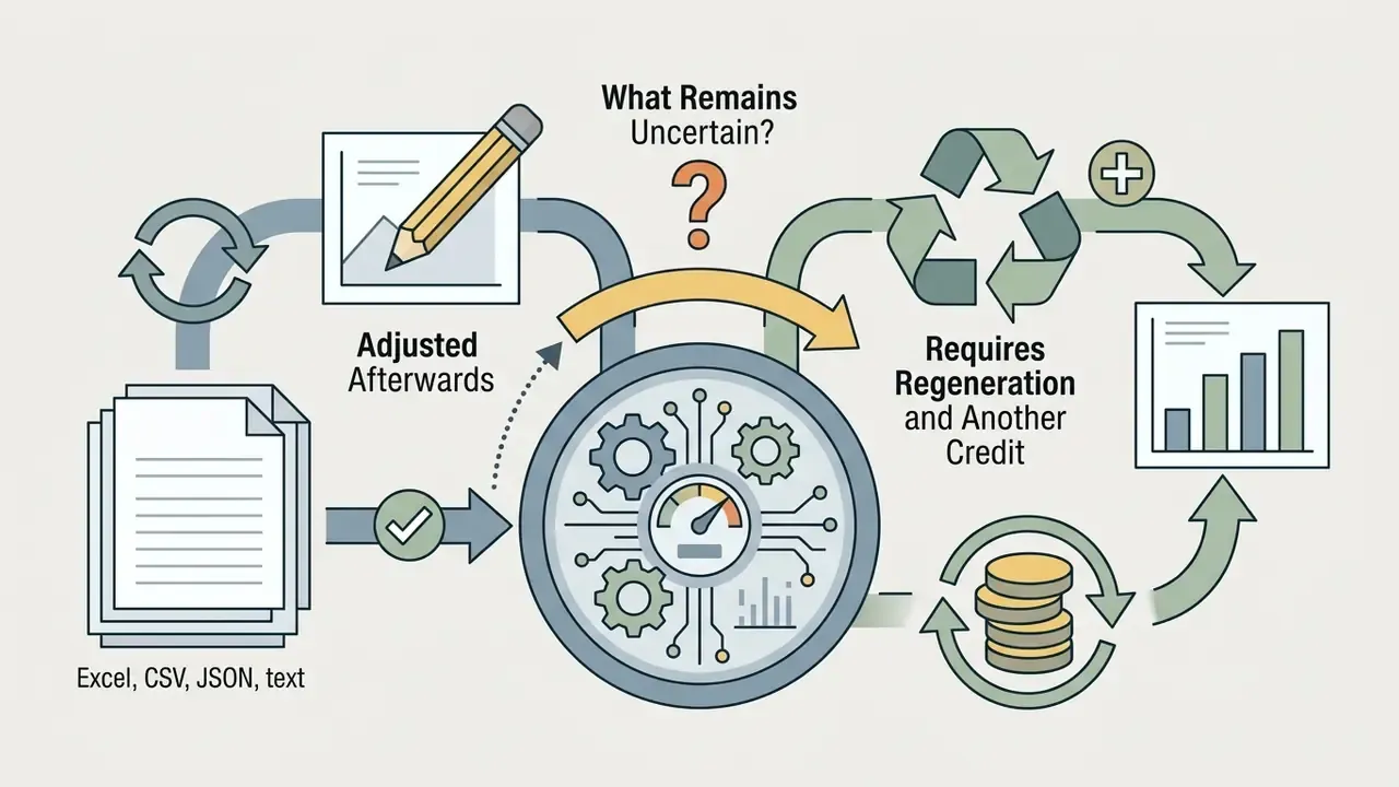
- Editing and preview limits. Some free generators return a static image with no post-hoc editing. Changes then require modifying the source dataset or spending another credit. Several also omit real-time preview and only return the chart after processing completes.
- Row limits. Row caps, for example 50,000 rows per CSV, can bind before file-size limits on wide datasets.
Anyone searching for an ai chart generator free online should also check whether the free plan permits commercial publication at all. Several allow generation but not client-facing distribution, and a free ai chart generator from excel may restrict multi-tab uploads specifically.
How to Compare AI Chart Generator Pricing
When comparing commercial pricing across enterprise platforms, weigh volume limits, seat costs, and integration features. Tiers usually split into Individual, Team, and Custom Enterprise. Paid plans remove generation caps and unlock advanced types such as waterfall, dual-axis, and heatmap figures.
«Datawrapper offers a Pro plan at $21 per user per month with attribution removal and SVG export, a Business plan at $39 with waterfall chart support and extended team rights, and Enterprise with self-hosting and SAML SSO.»
«Flourish provides more than 50 chart types, live updates via Google Sheets or CSV, HTML export for self-hosting, and enterprise security features on Publisher and Enterprise plans.» Flourish Pricing Page, Flourish Studio (2026). https://flourish.studio/pricing/
Mid-market ai chart generator tools cluster around $5 to $36 per month for individuals and small teams. Unlimited generation, brand kits, watermark removal, password-protected links, and scheduled Google Sheets refresh tend to appear at the top of that band. Enterprise analytics platforms frequently publish only a starting price and require a custom quote for volume, SSO, and SLA commitments. Build that quotation cycle into the procurement timeline, because it rarely closes in a week.
Total-cost checklist: per-seat versus per-workspace pricing; extra-user and extra-theme surcharges; credit top-up costs; whether SVG and PDF export are tier-gated; whether scheduled refresh consumes credits; and whether the security features you actually need (SSO, audit logs, self-hosting) exist only at enterprise level.
Check Commercial-Use and Export Terms Before Publishing
Before publishing AI-generated visuals in corporate reports, campaigns, or news media, verify the licensing terms and the copyright boundary.
«Under US Copyright Office guidance (2026), copyright protection extends only to human creative decisions: selection, arrangement, or substantial editing of the visual content.»
| Tool or platform | Supported data inputs | Free tier limits | Paid pricing tiers | Commercial use and licensing terms |
|---|---|---|---|---|
| Datawrapper | CSV, Excel, web spreadsheets | Unlimited public charts, PNG export, visible attribution required | Pro: $21/user/mo; Business: $39/user/mo; Enterprise: custom | Pro and Business allow attribution removal and full commercial publishing; Enterprise adds SAML SSO and self-hosting |
| Flourish | Spreadsheets, CSV, Google Sheets sync | Unlimited public projects, basic AI credits, attribution required | Presenter and Publisher tiers; custom Enterprise | Paid tiers permit custom branding, white-label embeds, and self-hosted HTML export |
| Julius AI | Excel, CSV, database tables | Limited initial query credits, standard downloads | Pro: about $20/mo; Team: custom | Full export of Python Matplotlib or Plotly code and figures for commercial reports, useful as an audit artifact |
| Venngage AI | CSV, XLSX, text prompts | Basic templates, restricted high-resolution export | Premium: about $10/mo; Business: about $24/mo | Classifies AI-generated chart graphics as copyright-free for commercial and business use |
| Graphy-class AI chart apps | CSV, Excel, pasted tables, Google Sheets | Limited AI charts and embeds on the free tier | About $16/mo (unlimited charts, watermark removal); about $36/mo (auto Sheets refresh, brand kits, password links) | Commercial publishing generally tied to an active paid subscription; verify branding and embed rights in current terms |

AI Charts for Reports, Marketing, Finance, and Recurring Workflows
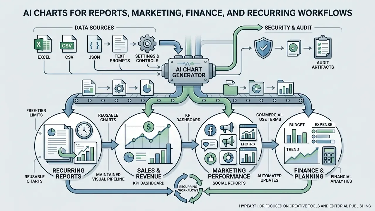
Bringing ai charts into recurring workflows converts static analytics into a maintained visual pipeline across sales, marketing, and finance.
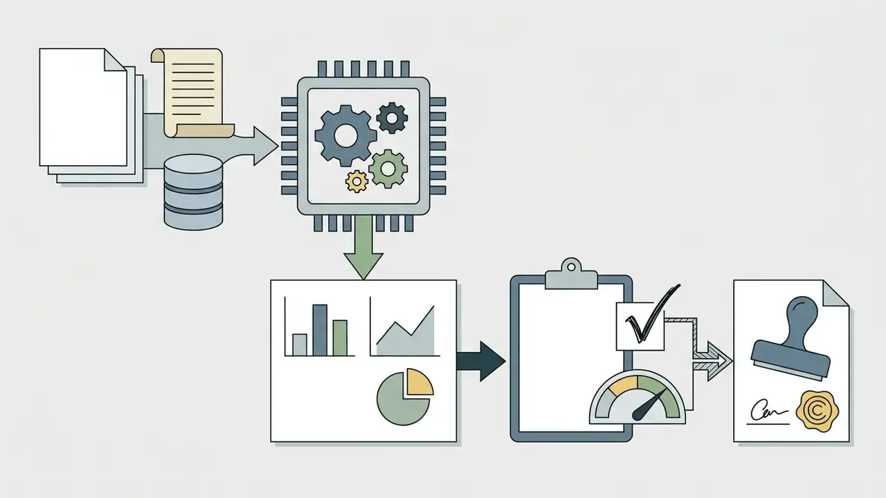
Figure 7. Enterprise data flow architecture. A scheduled ETL job pulls CRM and ERP data into a governed warehouse table. The chart engine reads that table, or a connected Sheets range, through an RBAC-scoped connector. Generated charts and their source code are versioned together. A scheduler distributes the rendered PDF or dashboard link to reviewers on a fixed cadence.
Sales and Revenue Dashboards
In sales operations, a chart maker ai turns raw CRM data and accounting exports into executive revenue dashboards. Automated pipelines render pipeline stage breakdowns, representative performance rankings, win-rate analysis, deal-size distributions, and period-over-period revenue lines without manual formatting. KPI cards usually occupy the top layer, total revenue, net margin, operating expenses, and year-over-year growth, with trend indicators and target-versus-actual comparison beneath.
«ChartifyText lets users select a sentence inside a document and automatically builds a chart from the extracted values, helping analysts visualize trends from narrative reports.»
Figure 8. Executive revenue KPI dashboard. Monthly Recurring Revenue line graph with prior-year comparison, a sales-funnel stacked bar by pipeline stage, a regional performance bar comparison sorted descending, and four KPI cards with sparkline trend indicators.
Illustrative example, presented as a hypothesis rather than a documented client result: a regional financial services institution streamlining monthly revenue auditing integrated an automated spreadsheet ingestion pipeline that pulled accounting exports directly into standardized chart templates. The observable effects were qualitative. Manual spreadsheet copying disappeared, templates stayed consistent across reporting periods, and every published figure retained a verifiable link back to the source export.
Percentage time savings depend on control requirements and dataset quality. Treat any single figure as illustrative rather than a benchmark, and measure the baseline in your own close cycle before claiming a reduction. That caution is not pedantry. Unverified efficiency claims tend to reappear in ROI models, where they quietly exclude control costs and residual risk.
Reusable Charts for Recurring Reports
For monthly financial reviews, quarterly earnings decks, and weekly operational updates, reusable templates with live data synchronization remove the repetitive work entirely.
Enterprise visualization platforms support scheduled refreshes from connected cloud spreadsheets, including Google Sheets and Microsoft Excel web services. Coefficient documents scheduled imports for Excel on hourly, daily, or weekly cadences with dynamic cell-based filters, while web-service flows can push refreshed query output into Excel or Google Sheets so downstream charts follow the source of record. Template automation tools additionally process workbook templates through read and write ranges, regenerating recurring report files from a fixed structure.
«Doc2Chart improves chart data accuracy by up to 9 percentage points over single-pass generation and up to 17 points over query-based retrieval methods when working from documents.»
Two operating patterns dominate in practice. A weekly marketing refresh regenerates a channel dashboard every Monday from the latest ad-platform pull. A month-end finance refresh rebuilds cash-flow and runway charts from the newest accounting export. Both should log each regeneration, so a figure circulated on a given date can be reconstructed later without guesswork.
For additional regulatory context on automated content generation, you can open the hub covering litigation and compliance documentation.
How We Reviewed These Tools, and What Remains Uncertain
Transparency about method matters more than a confident verdict. This guide was assembled by an editorial review process rather than a sponsored test, and several claims were deliberately softened during review.
Claims we tightened. Two efficiency figures from earlier drafts, a "several hours to under three minutes" reduction and an "85% faster board reporting" claim, were replaced with qualitative outcomes, because neither traced to a verifiable published measurement. The 4.5% execution-failure statistic now carries explicit attribution to the 2025 multi-agent study. Microsoft's hidden-row behavior is described as published documentation with a version and tenant caveat. Image-to-diagram capability is attributed to Eraser documentation and the DiagrammerGPT paper, with accuracy limits stated.
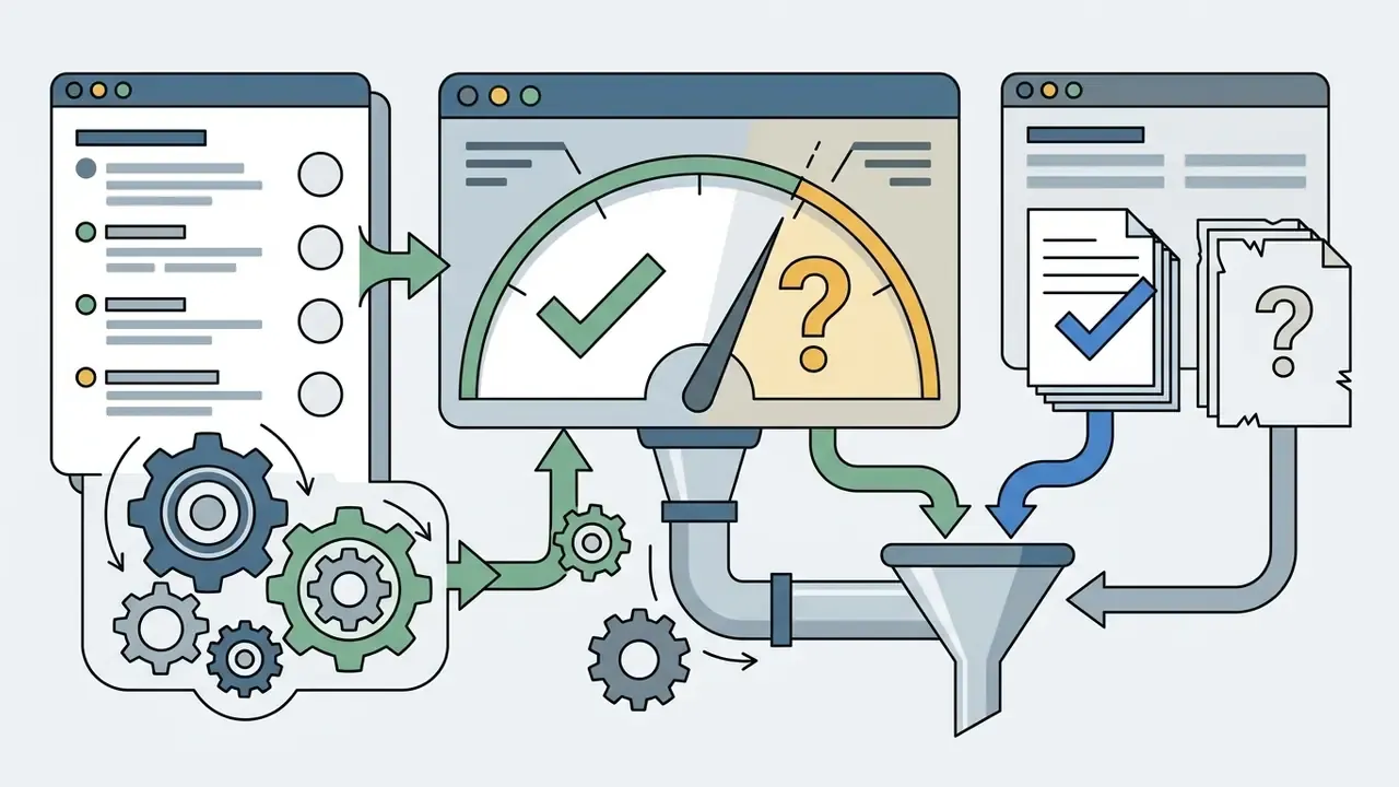
Open questions we cannot yet answer with evidence. How much residual hallucination survives a two-reviewer process in production reporting? Does exporting generated code satisfy your internal audit's definition of reproducible evidence, or will validation teams demand a locked pipeline? What is the true total cost when control overhead, review time, and license fees are added to the subscription price? These remain hypotheses until your own analytics, interviews, and internal measurements say otherwise.
A safe next step. Pick one recurring, non-sensitive report. Run it through an approved tool for a full cycle. Archive the five audit artifacts each time. Then compare the control cost against the time recovered, and only then decide whether to widen the scope.
FAQ: AI Chart Generators, Limits, and Governance
Can AI really choose the right chart type from a spreadsheet?
Often yes. Most tools analyze column structure, data types, and distributions, then propose bar, line, or pie encodings, frequently returning several candidates. Treat the suggestion as a starting point. Business context, audience, and reporting convention still need human judgment.
Which file formats are supported?
Commonly .xlsx, .xls, .xlsm, .csv, .tsv, .json, plus text prompts and image uploads. Live connectors add Google Sheets and SQL-backed sources. XLSX support is flagged as experimental in some vendor documentation, so verify it in the product you actually deploy.
Are free AI chart generators suitable for large datasets?
Usually not. Free tiers commonly cap files between 10 MB and 100 MB and may enforce row limits around 50,000 records. For large or frequently updated data, tools with backend processing, warehouse connectors, or scheduled pipelines beat browser-only converters.
Can I edit a chart after it is generated?
It depends on the tool. Editor-based platforms allow full post-generation control over colors, labels, legend placement, and axis names. Some lightweight free generators return a static image only, so changes mean editing the source data or spending another credit.
Can I generate charts from images or PDFs?
Some platforms can. Documented image-to-diagram workflows import PNG or JPEG files and redraw them as editable diagrams, and several analysis tools accept PDFs. Accuracy depends on contrast and label legibility, so reconcile recovered values against the original data every time.
Do AI-generated charts carry copyright?
Purely machine-generated output is not protected under US Copyright Office guidance (2026). Protection attaches to human creative selection, arrangement, or substantial editing. Some vendors label output copyright-free, while others grant commercial rights only to paid subscribers.
How do I keep confidential data safe?
Do not upload unmasked PII or client-identifiable financial records to consumer accounts. Require SOC 2 or ISO/IEC 27001 attestation, zero-data-retention and no-training clauses, SSO and RBAC, and for regulated datasets a private-tenant, VPC, or self-hosted deployment.
What should I archive for audit purposes?
Five artifacts: the dataset or query definition with a hash, the exact prompt, the generated code (Python, Plotly, or Vega-Lite), the rendered chart, and a named reviewer sign-off with timestamp and model version.
Can AI produce flowcharts and mindmaps, not just charts?
Yes. Code-synthesis models emit Mermaid.js or Graphviz syntax for flowcharts, process maps, swimlane diagrams, UML, ER models, and mindmaps, all from the same natural-language interface.
Do charts update automatically?
On paid tiers, commonly yes. Scheduled refresh from Google Sheets or Excel web services runs hourly, daily, or weekly and updates embedded charts without regeneration. Confirm whether that refresh consumes generation credits.
Who owns an AI chart pipeline in a governed environment?
A named person, not a team inbox. Document the owner, the approved purpose, the access boundary, the escalation path for a suspect figure, and the shutdown mechanism. No evidence, no autonomy. To explore the full repository of technical guides, software evaluations, and operational frameworks, open the hub.