- Three steps: upload a photo (drag-and-drop, file picker, public URL, or cloud storage), click Add Text and type your caption, then drag it into position and click Save Image.
- Two privacy rules: choose a tool that renders everything client-side in your browser (HTML5 canvas) and never uploads originals to a server; verify that export is watermark-free at full resolution.
- One readability rule: keep at least 4.5:1 contrast for normal text and 3:1 for large text (18pt regular / 14pt bold and above). Add a shadow, outline, or semi-transparent backplate when the background is busy.
What this guide covers: the fast three-click path, the full typography toolkit, fonts, size and color, designer-level layout rules, logos and background removal, template and duplication workflows, social media captions and screenshot annotations, a tool comparison, what happens to metadata and content credentials, cropping and filters after text, a pre-export checklist, and a FAQ.
Adding text to an image online lets individuals, creators, and enterprise teams put a message directly on visual media without installing heavy software. Modern browser-based editors render typography on canvas elements in real time, balancing design flexibility with privacy and speed. Because rendering happens locally, a screenshot of an internal dashboard or a customer invoice never leaves the device it was opened on. That single detail matters more to a compliance team than any font count.
Add text to image online in a few clicks
To add text to image online quickly, upload a visual file to an in-browser editor, generate a text overlay layer, format the text, and export the final file. In-browser processing uses HTML5 canvas APIs for local modification, so sensitive documents or branded graphics stay on the user's device during editing. The Canvas API draws characters with fillText() and strokeText() at exact coordinates, which is why exported glyph edges stay crisp at original resolution.
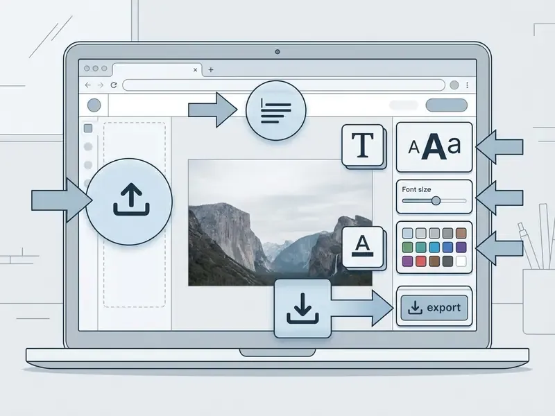
Select image and upload your photo
Users import media into a text editor with the select image button, by dragging files onto the canvas, or by pasting a public URL. Import works from local storage, public web URLs, and cloud services including Google Drive, Google Photos, and Dropbox. Cloud pickers earn their keep when the source photo sits on a phone but the editing happens on a desktop. Client-side interfaces convert local files into temporary browser memory buffers, allowing immediate editing of high-resolution raster files: JPG, PNG, WebP, GIF, and HEIC captures from iPhone cameras.
Editor documentation across major platforms confirms four standard input paths: drag-and-drop from the file system, the file-picker dialog, pasted image URLs, and selection from a connected media library (CKEditor 5 Documentation. https://ckeditor.com/docs/ckeditor5/latest/features/images/image-upload/image-upload.html).
For teams managing digital asset workflows, reviewing the broader tool landscape helps keep asset security consistent. You can explore the hub to examine structured workflows for media processing.
Click add to create a text box
A click add action places an editable text box onto the active canvas layer. Users type custom text straight into the field, and the rendering engine maps characters onto the specified coordinates instantly. Because canvas text is painted as pixels, well-built editors keep an HTML input overlay above the canvas, so the string stays editable until export. Miss that detail and you end up retyping a caption you cannot select.
Modern interfaces let creators keep multiple independent text layers on a single canvas. A title, a subtitle, and several numbered labels can each carry their own font, color, and rotation. If you want to add text box to image compositions repeatedly, layer independence is the feature that saves the most time. Responsive overlay interfaces also measurably outperform static ones in user testing:
«In a user study, 93.8% of expert annotators preferred the responsive overlay interface over the baseline tool when correcting segmentations.»
When testing automated verification systems for generated media, teams frequently evaluate tools like an ai image detector to confirm image provenance alongside text overlays.
Position the text and download the image
Positioning an add text overlay to image layer means dragging the text box into a designated safe zone or centering it with alignment guides. Adding top text or bottom captions calls for locking elements so nothing shifts during final processing. Smart guides behave the way they do in desktop suites: when an element lines up with an edge, a center axis, or another layer, a guide line appears, and releasing the pointer fixes the position (Adobe Help Center, 2025. https://helpx.adobe.com/sk/photoshop/desktop/use-grids-measurement-guides/alignment-grids-guides/work-efficiently-with-smart-guides.html).
Once alignment is done, the export function flattens the canvas into a raster output. A reliable add text to image tool finishes that export without degrading resolution, and it never overwrites the source: the editor writes a processed copy instead. Small point, big consequence for anyone who has to produce the original later.
Comprehensive typography toolkit
A capable browser editor is defined by the breadth of its formatting controls, not by marketing language. The specification below describes what a full-featured tool should expose in a single panel, without menus, pop-ups, or paid gates.
- Font library 1,000+ Google Fonts loaded directly into the browser canvas, covering sans-serif, serif, slab, display, monospace, and script families, plus a short list of 10 to 12 recommended pairings for users who do not want to browse the whole set.
- Color and style palette 100+ solid HEX presets, custom RGB/HEX entry, an eyedropper for sampling colors straight from the photo, and linear or radial gradients for headline text.
- Text effects (40+ combinations) drop shadow with independent blur, distance, and angle control; outer stroke with adjustable width; 3D extrusion; outer glow; solid and semi-transparent background pads; curved text paths along an arc.
- Multi-line controls line height from 0.8× to 2.5×, letter spacing (kerning), word spacing, and left / center / right / justified alignment for multi-line blocks.
- Transform controls free rotation by any angle, proportional scaling, opacity from 0 to 100%, and layer order (bring forward / send backward) for stacked elements.
- Layer management unlimited text blocks per image, each styled independently, with one-click duplication of any block.
Readers comparing overlay features with full editing suites can see how these controls map onto broader toolsets in our guide to AI photo editors.
Customize text on an image: font, size and color
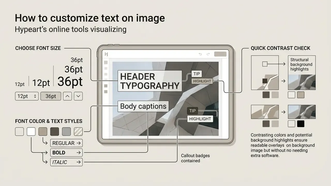
Customizing typography on an image means choosing complementary typefaces, setting precise font size and font color values, and adding structural background highlights. Get those three right and legibility holds up even against complex, multi-colored backgrounds.
Choose font size, font color and text styles
The font size color combination decides whether an operational visual or a social graphic passes web readability thresholds. Standard accessibility guidance requires a contrast ratio of at least 4.5:1 for normal text against its background, and 3:1 for large text.
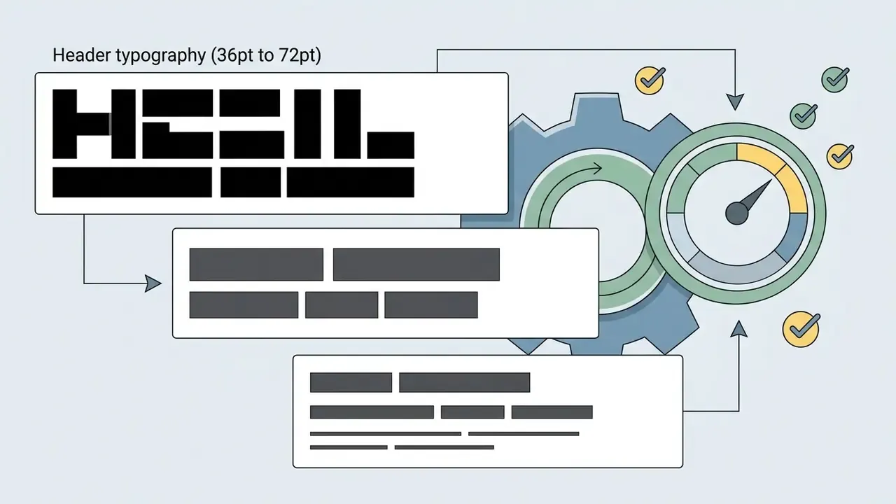
Practical size ranges, aligned with public-sector media guidance that sets explicit minimums (titles 55pt, headings 22pt, captions 16pt, body 18pt):
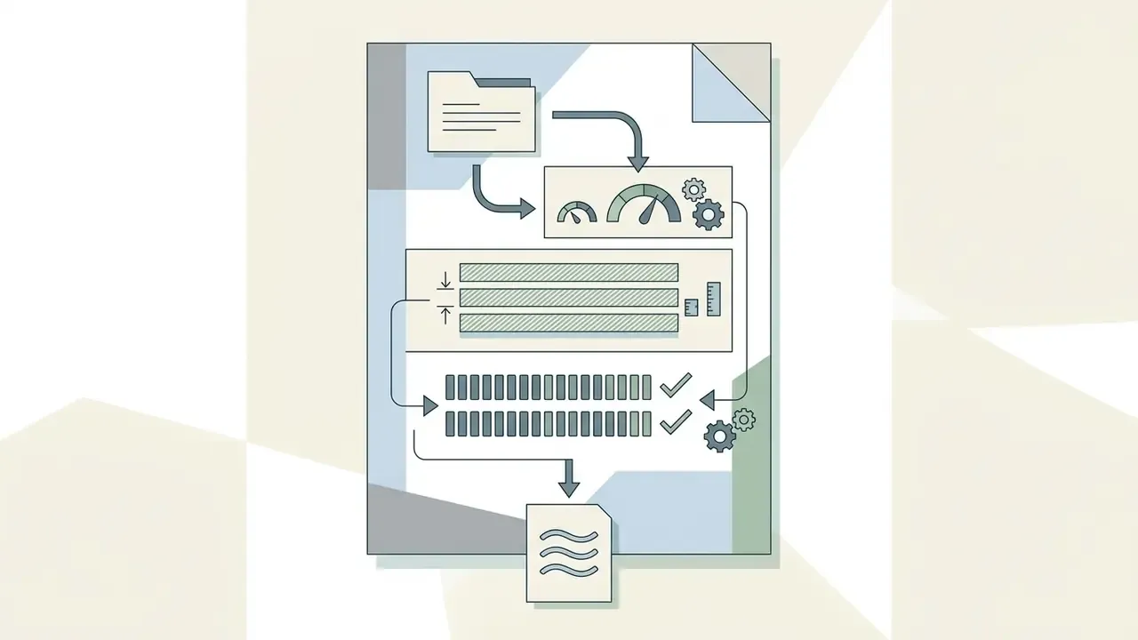
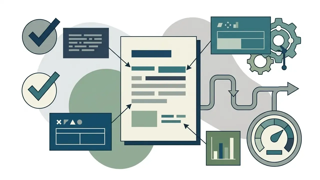
Quick contrast check without extra software. Sample the lightest and darkest pixels directly under your text with the eyedropper, paste both HEX values into any contrast checker, and confirm the ratio clears 4.5:1. A common failure looks like this: white 18pt text on a pale sky (ratio near 1.6:1) reads fine on a large monitor and vanishes on a phone in daylight. The fix is either a darker backplate at 40% opacity, or switching the text to a dark tone sampled from the shadows in the same photo.
Curated text styles keep visual clutter down. Users who want to add fancy text to image layouts should still cap themselves at one decorative face per frame. When evaluating visual analysis pipelines, automated systems often rely on an ai image describer to audit structural image metadata before branded assets go out, and teams documenting caption logic sometimes standardize on a written ai image description template so alt text stays consistent.
Add text effects for readable overlays
Applying text effects such as drop shadows, outer strokes, and semi-transparent backplates keeps dark text from dissolving into dark image regions. Peer-reviewed legibility work suggests that on complex backgrounds, drop shadows support reading performance more effectively than plain outline strokes. Eye-tracking data explains why:
«Low contrast and cluttered backgrounds increase gaze fixation duration and reduce reading speed.»
W3C guidance adds that shadows, transparency, spacing, and letter effects all change perceived contrast, and that a border around letters can contribute to the effective contrast calculation. So a 1 to 2px outer stroke is a legitimate accessibility tool, not only a stylistic flourish.
How to add text to a photo like a professional designer
Typography carries as much meaning as the words themselves. Four rules cover most of the distance between an amateur caption and a designed layout. One more habit, learned the hard way: read the caption out loud before you export. Awkward line breaks are much easier to hear than to see.
- Match typography to mood.Use a clean sans-serif (Inter, Roboto, Montserrat) for modern product shots and UI screenshots; a serif (Playfair Display, Lora) for editorial quotes and long-form pull text; a script or handwritten face for greeting cards, invitations, and personal milestones. Decorative display fonts work for one short line only, never for body captions.
- Sample accent colors from the image.Use the eyedropper to pick a secondary or minor tone from the photo rather than a dominant one: a color found in a small detail harmonizes with the frame without competing with it. If the sampled shade sits too close to the background, shift its lightness a few steps or move to a complementary hue.
- Prevent background clash.If a photo carries high spatial noise (foliage, crowds, textured walls), place a semi-transparent dark backplate at roughly 40% opacity behind white text, or run a soft gradient scrim across the bottom third of the frame. Nielsen Norman Group makes the same recommendation for text over photography: evaluate the image's dominant colors, then add a semi-transparent overlay when contrast falls short.
- Avoid focal subject occlusion.Put primary headings into dead visual zones: open sky, flat walls, deep shadows, blurred bokeh. Never cover eyes, product labels, or the UI element a screenshot is meant to explain. Center the block for a poster-style statement; offset it into a quiet corner for a cleaner editorial feel.
Add brand logos and auto-remove backgrounds
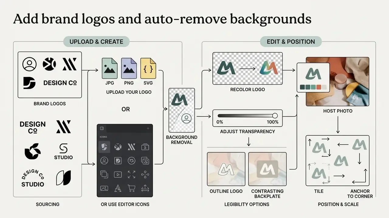
Text is often only half of the overlay. Brand marks, icons, and signatures complete the composition and establish ownership of the asset.
Upload your brand mark in PNG, JPG, or SVG format, or build a simple mark from the editor's icon gallery when no file is available. If your logo ships with a solid white or black background, run a 1-click monochrome background removal in the browser instead of exporting a transparent version from a desktop suite. From there, adjust the logo the same way you adjust text:
- Recolor the mark to match the palette of the host photo.
- Transparency sliders (0 to 100%) turn any graphic into a non-intrusive watermark.
- Outline or contrasting backplate keeps a light logo legible over a light background.
- Position, rotation, and scale controls let you tile the mark or anchor it to a corner.
Adobe's own watermark documentation recommends transparent PNG files for graphic watermarks and exposes transparency, rotation, and size as the core settings. Those are the same three controls that matter in a browser editor (Adobe Acrobat help, watermark guidance).
Workflow efficiency: templates, duplication and image swapping
Users who process a series of images, whether a product catalog, a tutorial sequence, or a weekly social set, need repeatability far more than they need new fonts.
- Auto-saved templates browser local storage keeps your last 10 typography styles ready on your next visit, so a recurring caption style does not have to be rebuilt from scratch.
- 1-click layer duplication clone an existing text box with identical font, color, effect, and rotation, then reposition it elsewhere on the canvas. Fastest way to build numbered annotation sets.
- Swap image, keep text replace the background photo instantly while locking text position and formatting, which is ideal for producing the same badge or price tag across ten product shots.
- Instant export a single click flattens the canvas and writes the processed copy to your device; the original file stays untouched.
Because all of this runs locally, the operations stay fast even on a weak connection. There is no upload round-trip between edits. Dedicated add text to image software on the desktop still wins for batch jobs of several hundred frames, but for sets of ten to fifty, the browser path is usually quicker end to end.
Add text to photos for social media and visual content
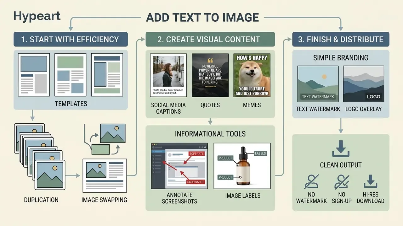
Create captions, quotes and memes
Creating a social media post means balancing text density against visual framing. Large-scale analysis of marketer-generated content supports a short and centered approach rather than heavy blocks of copy:
«Posts with more text receive fewer likes and comments, while centered, positive, and visually congruent text substantially increases engagement.»
The study analyzed 34,610 Facebook and Instagram posts and applied causal forest modeling to isolate composition variables, which is why its conclusions about overlay size and centrality translate cleanly into layout decisions. Complementary platform research points the same way for AI-assisted visuals:
«Across more than 500,000 Instagram posts, AI-generated images carrying meme-style text overlays went viral significantly more often than the same images without text.»
Accessibility guidance adds a constraint engagement research tends to ignore: caption text should never obscure the underlying visual or the player controls, and alternatives should stay configurable in size and position (W3C Media Accessibility User Requirements). Practical rules for any media post that satisfy both sides: simple sans-serif faces, 16px or larger effective size, high contrast, CamelCase hashtags, moderate emoji use, and alt text on every published asset.
Creators often add cool text to image compositions to spotlight a key quote or a product announcement, and the same pattern works when you want to add text to your image for a newsletter header. To evaluate emerging options for digital asset creation, teams can compare options across browser-based tools.
Annotate screenshots and add labels to images
Precise add text to image good annotations let technical teams highlight interface elements, error logs, or workflow diagrams without ambiguity. Structured documentation guidelines recommend four annotation forms: rectangular callout boxes, area labels, stage labels, and alphabetical or numerical markers with descriptions placed immediately after the image caption. They also insist that a callout must not obstruct the UI element it points to.
Overlay vector shapes including directional arrows, focus circles, callout balloons, numbered badges, and highlight boxes to steer attention on technical screenshots. Arrows and boxes carry the pointing work; short text labels carry the naming work. One label per paragraph in the surrounding copy keeps the mapping between image and explanation unambiguous.
Practical example. A documentation team assembling internal audit screenshots can keep the whole workflow inside the browser: the screenshot opens locally, numbered callouts and short labels are drawn on the canvas, and the flattened copy is saved to a controlled folder. No unencrypted file travels to a third-party server at any point, which removes the vendor-processing step from the review chain. Time savings depend on volume and template reuse, so measure against your own baseline rather than assuming a number. For teams whose annotated screenshots may end up as exhibits, the retention questions covered in our compare options section on litigation workflows are worth reading before you standardize a process.
To track industry updates on visual media processing tools, you can read the latest ai image editing news.
Add a simple text watermark or logo
Choose an add text to image tool for free use
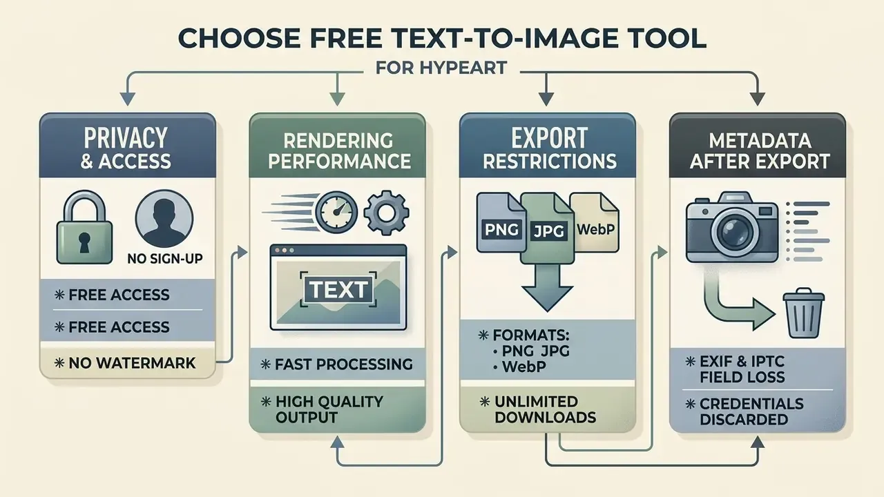
Choosing an add text to image tool comes down to privacy standards, rendering performance, export restrictions, and subscription terms. Browser engines that render locally give the strongest data posture, because the image is processed inside the user's active session. An add text to image generator hosted in the cloud may be faster to onboard, yet it introduces a server copy you then have to account for.
| Tool Category | Browser Processing | Mandatory Sign-Up | Export Watermark | Metadata Retention | Data Leakage Risk | Supported Export Formats | Primary Use Case |
|---|---|---|---|---|---|---|---|
| Local Web Editors | 100% Client-Side | No | None | EXIF usually stripped on canvas export | Low (no upload) | PNG, JPG, WebP | High-privacy and enterprise annotations |
| Freemium Web Suites | Cloud-Based | Yes | Free tier watermark (drafts) | Varies by vendor; often re-encoded | Medium to high (server copy retained) | PNG, JPG, PDF | Marketing templates and social graphics |
| Simple Meme Generators | Client-Side | No | None | Stripped | Low | JPG, PNG | Rapid quick-text overlays |
| Desktop Software | Local Device | No | None | Configurable, can be preserved | Very low (offline) | All raster formats | Offline batch processing |
This information is general in nature. Service terms, watermark policies, and privacy practices change over time; verify current conditions on the provider's own site before using any tool for commercial purposes.
Free access, no sign up and no watermark
An add text to image free utility that works under an add text to image no sign up model deploys in seconds and never asks for corporate credentials. Picking a tool that delivers add text to image no watermark output keeps the result clean enough for external publication. Before you trust a "free forever" claim, check three things: whether downloads are capped per day, whether the full font library is open on the free tier, and whether export writes at original resolution.
Accessibility shortcuts deserve the same scrutiny as free tiers, because bolt-on overlay layers can make a page harder to use rather than easier:
The takeaway for text-on-image work is direct: build contrast and legible sizing into the asset itself instead of hoping a downstream widget compensates.
When building workflows for automated captioning or descriptive tagging, enterprise developers often review structured guides. To see how automated description pipelines work, view the guide on visual media metadata. For a broader view of what free tiers usually restrict, compare feature limits and export rules across free photo editors.
For privacy-conscious teams looking for no-cost editing utilities, an ai image editor free no sign up keeps file processing local without account creation.
Image formats and download options
Modern browser-based editors support the key raster image formats: JPG, PNG, and WebP. The right export configuration depends on where the asset is going:
- PNG: lossless compression, ideal for text overlays that need crisp character edges and transparent backgrounds. Since the path is lossless, a quality slider has no meaningful effect here.
- JPG: lossy compression with an adjustable quality slider, best for high-resolution photography; keep quality at 85 or above when the frame contains small text.
- WebP: next-generation web format supporting lossy and lossless modes, with smaller files at comparable visual fidelity (Google WebP documentation).
If the finished overlay has to be printed or shown larger than the source allows, run the flattened file through one of the AI image upscalers after the text is baked in, so the typography scales with the photo.
Metadata, EXIF and C2PA after a canvas export
Continue image editing after adding text
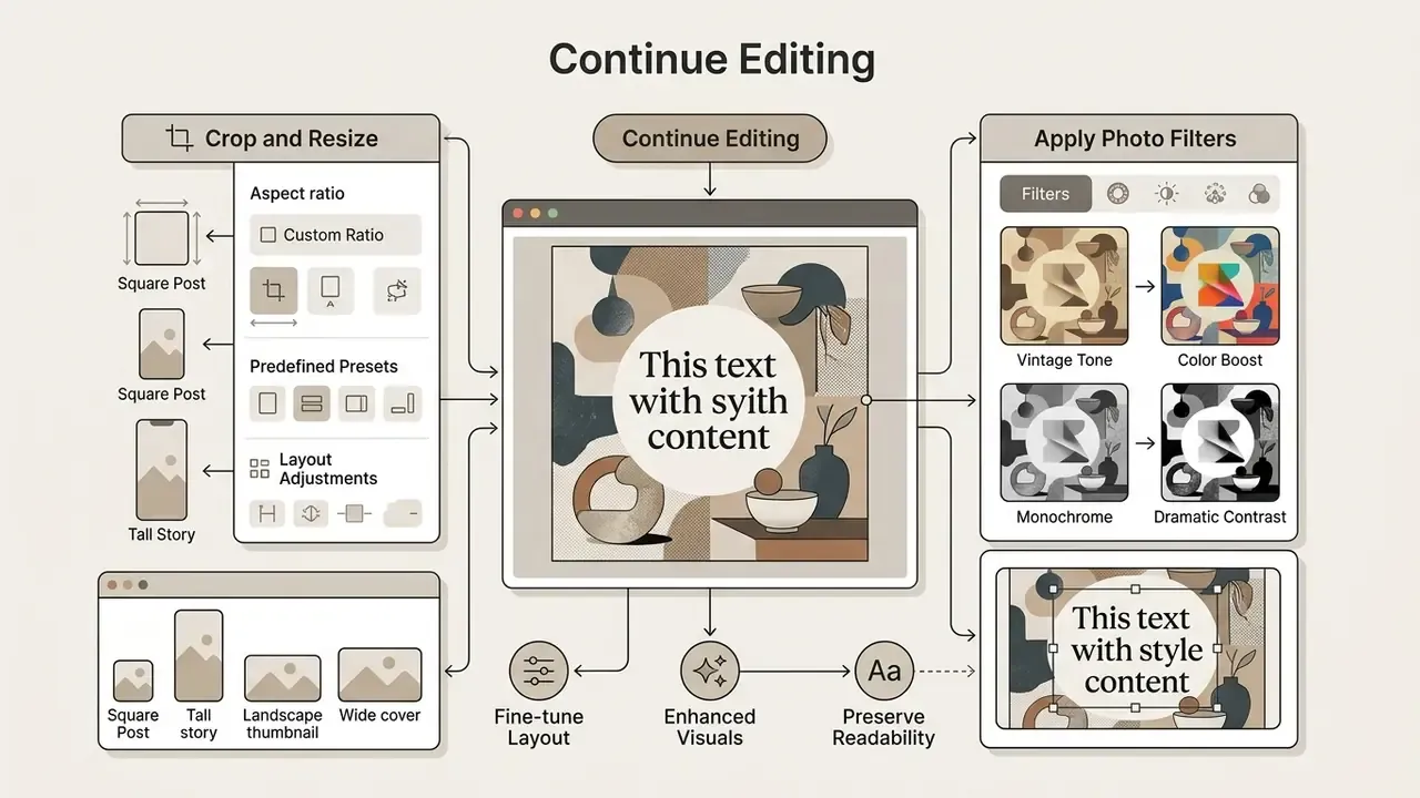
Finishing a visual asset usually takes secondary adjustments after the typography is placed. Doing those canvas operations in one interface avoids the loss of text sharpness that comes from repeated re-compression cycles. Vendor documentation for image pipelines confirms that both orders are valid: transformations can be applied to an overlay before it is placed, or to the whole composition after the text layer is merged.
Crop and resize image for the final layout
A resize image operation performed after the typography is final has to respect safe margins, otherwise platform auto-cropping will clip the words. Standard social display guidance keeps critical text inside the central 80% safe area; Google Ads states the rule explicitly, and YouTube channel branding defines a 2048×1152 asset with a 1235×338 safe zone for text and logos. Crop to the target ratio first, then resize to the platform's pixel dimensions.
Ready-made presets worth keeping at hand:
- Instagram Feed (1080×1080px) and aspect ratio 1:1 (1200×1200px) for square feed posts.
- Stories / Reels (1080×1920px) and aspect ratio 9:16 for vertical mobile placements.
- YouTube Thumbnail (1280×720px) and aspect ratio 16:9 (1200×628px) for video and web banners.
- Facebook Cover (1640×924px) and portrait 4:5 (1200×1500px) for cover art and high-real-estate feed slots.
Typography scales down with the canvas, so verify size after resizing. Federal design guidance recommends a minimum of 16px for body text and a line length of 45 to 75 characters for comfortable on-screen reading (U.S. Digital Service, Accessibility for Visual Designers. https://digital.gov/guides/accessibility-for-teams/visual-design/).
When combining multi-source visual elements before any image add step, teams often use an ai image combiner to merge layers smoothly. If you need cropping, retouching, and text in one session, review the feature sets of full online photo editors.
Use photo filters without losing text readability
Photo filters applied after text placement change the underlying luminance values, and character contrast can collapse as a result. When a filter darkens the background, adjust font color or raise drop-shadow opacity to hold WCAG-compliant legibility. Contrast is calculated on the final rendered colors, not the source colors, so the check has to be repeated after every filter pass. Where a filter has flattened detail or introduced noise, AI image enhancers can restore local contrast before the text layer is re-evaluated.
Practical example. A communications team publishing a documentation portal with several hundred annotated product images can enforce one gate before export: every annotated frame is checked against the 4.5:1 and 3:1 thresholds, and any frame that fails receives a darker backplate or a larger type size. The measurable outcome is fewer support tickets about unreadable labels. The exact reduction depends on the starting quality of the library, so track it in your own ticketing data rather than borrowing a figure from another organization.
For broader definitions of image processing terminology and asset workflows, consult our comprehensive glossary.
Pre-export checklist
Seven items, run before you click Save Image:
- Spelling and numbers.Proofread the overlay text. A baked-in typo means re-editing the whole frame.
- Contrast.Sample background pixels under the text and confirm 4.5:1, or 3:1 for large type.
- Safe area.Critical text sits inside the central 80% of the frame for the destination ratio.
- Occlusion.No label covers a face, a product mark, or the UI element being explained.
- Edges.Nothing is clipped at the canvas boundary after the final crop.
- Format.PNG for crisp text and transparency, JPG at 85 or above for photographs, WebP for web delivery.
- Resolution and metadata.Export at original resolution, and archive the untouched original beside the annotated copy.
Frequently asked questions (FAQ)
How do I add text to a image online without losing quality?
Upload your original file to an in-browser editor that renders with HTML5 canvas. Export the result as a lossless PNG or a high-quality JPG to preserve text clarity and avoid compression artifacts. Do not re-save the same JPG repeatedly, because each pass adds damage around letter edges.
Can I download my edited photo without a watermark?
Yes. A privacy-focused browser tool lets you add text to the image and download the final file free of watermarks or forced platform branding. Some cloud suites mark free downloads as watermarked drafts, so confirm export terms before you commit to a workflow.
Does adding text to an image compromise privacy?
If the tool processes files entirely client-side in browser memory, nothing is uploaded to a remote server, which keeps the file confidential. Local processing still does not protect you from browser extensions or synced folders, so pair the tool choice with endpoint controls.
Can I add more than one text block to the same image?
Yes. Unlimited independent text layers can coexist on one canvas, each with its own font, size, color, effect, rotation, and opacity. That is how you pair a headline with a subtitle, or how you number several callouts on a single screenshot.
Can I add multiline text and control line spacing?
Yes. Multi-line blocks support left, center, right, and justified alignment, adjustable line height (roughly 0.8× to 2.5×), and letter spacing. Those controls are what make quote cards and structured labels look deliberate rather than improvised.
How do I add top text to image files like memes?
Open the image, create a text box, set it to a bold condensed face in uppercase, then anchor the block to the upper safe zone with a 1 to 2px outer stroke. A second block at the bottom completes the classic two-line format.
How do I add text to a screenshot?
The workflow is identical to a photo: open the screenshot in the editor, add numbered labels or callout text, overlay arrows or highlight boxes where needed, then save the annotated copy. Keep callouts off the interface element you are describing.
Can I upload a logo and remove its white background?
Yes. Upload the mark in PNG, JPG, or SVG. If it carries a solid monochrome background, apply the one-click background removal, then set opacity, color, outline, and position to blend it with the photo.
Can I import images from Google Drive or Dropbox?
Yes. Alongside drag-and-drop and the file picker, cloud import from Google Drive, Google Photos, and Dropbox, plus pasting a public image URL, are standard input paths in modern browser editors.
Which font should I choose for my photo?
Match the typeface to the subject: sans-serif for products, interfaces, and modern branding; serif for editorial quotes; script for personal and celebratory cards. One display font per image at most, and keep captions in a neutral, highly legible face.
Does the exported file keep EXIF data or content credentials?
Usually not. A canvas re-encode writes new pixel data and commonly drops EXIF, IPTC, and provenance manifests such as C2PA. If that metadata matters for audit or licensing, archive the original and document the relationship between original and derivative.
Editorial note
This guide was compiled by the Hypeart editorial team from primary sources: accessibility standards published by the W3C and the U.S. Access Board, federal design guidance from digital.gov, platform asset specifications from Google, YouTube, and Meta, peer-reviewed legibility and engagement research, and hands-on testing of browser-based text-overlay editors that render locally via HTML5 canvas. Feature counts, contrast thresholds, and export behavior were verified against vendor documentation at the time of writing. Product terms change often, so re-check pricing, daily limits, and privacy policies on the provider's own site before adopting any tool for commercial or regulated work. Disclaimer: this material is informational and does not constitute legal, security, or compliance advice. Contrast figures reference published accessibility criteria; individual conformance depends on your final rendered assets. Any operational examples describe generic workflows and are not audited case studies.
Appendix A: contrast and type-size reference
| Content role | Minimum contrast | Suggested size | Recommended effect on busy backgrounds |
|---|---|---|---|
| Poster headline | 3:1 (large text) | 36 to 72pt bold | Drop shadow, blur 4 to 8px |
| Subtitle / kicker | 4.5:1 | 24 to 32pt medium | 1 to 2px outer stroke |
| Caption | 4.5:1 | 16 to 24pt regular, max 2 lines | Semi-transparent pad, 40% opacity |
| Numbered callout | 4.5:1 | 14 to 18pt bold uppercase | Solid badge behind the number |
| Watermark / logo | Not applicable (exempt) | Scale to 5 to 10% of frame width | 25 to 35% opacity |