Last updated: 2026 · Written and fact-checked against: official Google Workspace Help documentation, W3C WCAG 2.2, and peer-reviewed layout research · Expert review: Marcus Hale, AI Governance & Operational Risk Analyst (presentation and audit-deck quality control).
The 30-Second Answer
- No, Google Slides has no native "Wrap text" button. Unlike Google Docs, Slides places every image and text box on an object-based canvas, so text never reflows automatically around a graphic (Google Workspace Help, 2026. https://support.google.com/docs/).
- You simulate wrapping with four workarounds (1) resize a single text box beside the image, (2) insert manual soft line breaks with
Shift + Enter, (3) split copy across multiple text boxes, or (4) build a borderless table or layered shape grid. - Fastest for short captions resize one text box. Most stable for multi-paragraph decks: multiple text boxes. Most fragile: manual line breaks, which shift whenever the copy is edited or exported.
- Non-negotiable polish rules keep 0.20 to 0.35 in clearance between graphic and text, set internal padding via
Format options > Text fitting, use 18 to 24 pt body copy, 1.15x to 1.5x line spacing, and keep body text left-aligned (never fully justified in narrow columns). - Before an executive review open the deck after export to
.pptxand PDF. Forced line breaks are the first thing to break.
What You Will Actually Decide in This Guide
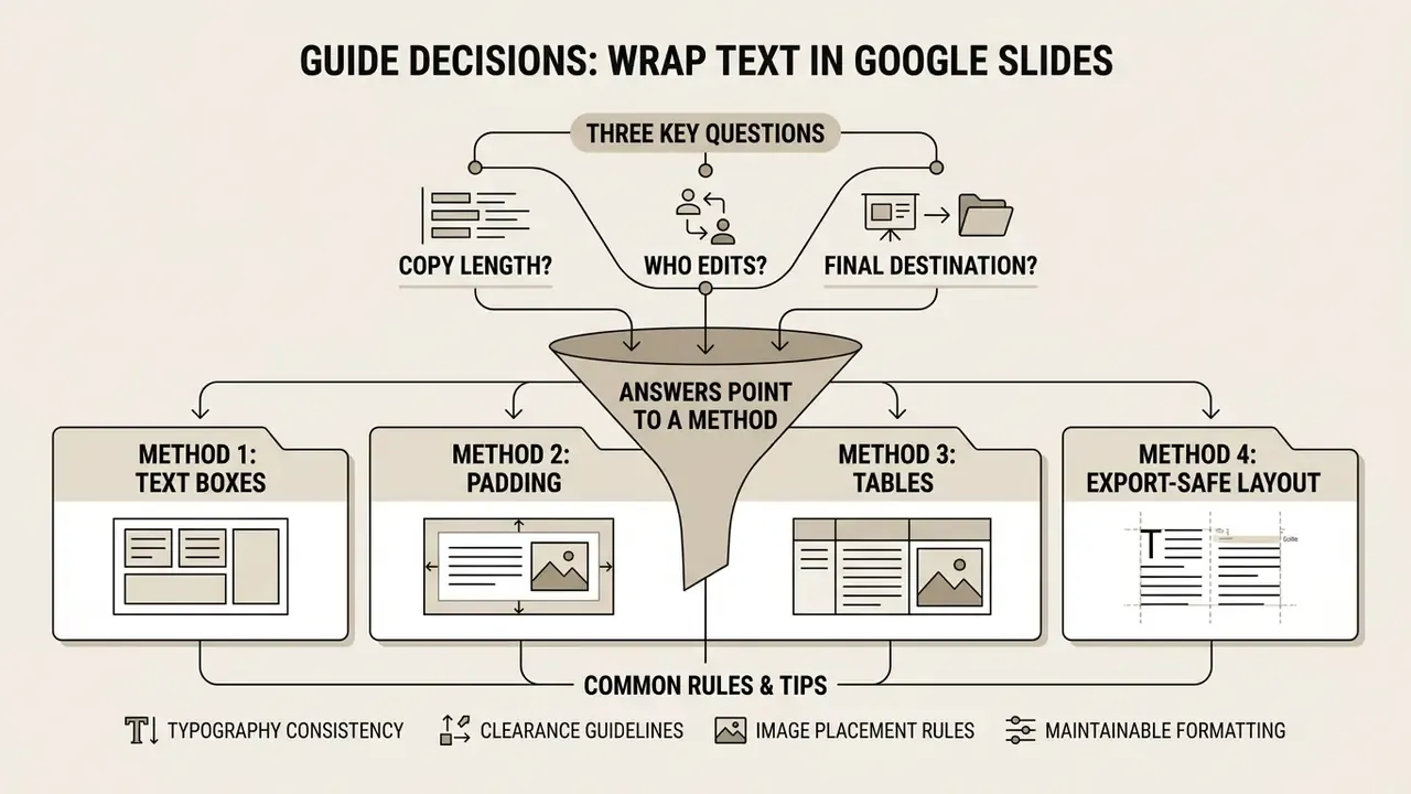
Three questions decide everything else. Answer them before you drag a single handle.
- How long is the copy? One caption behaves nothing like four paragraphs, and the wrap method has to match the word count.
- Who edits the slide after you? A deck reviewed by six colleagues needs structure that survives careless typing.
- Where does the file end up? On-screen only, or exported to PowerPoint and PDF for distribution?
Those answers point to one of four methods below, plus a short list of typography and clearance rules that separate an improvised slide from something you would put in front of a risk committee. There is also a troubleshooting section, because manual layouts fail in predictable ways, and a mobile procedure for the iPad crowd.
Can You Wrap Text Around an Image in Google Slides?
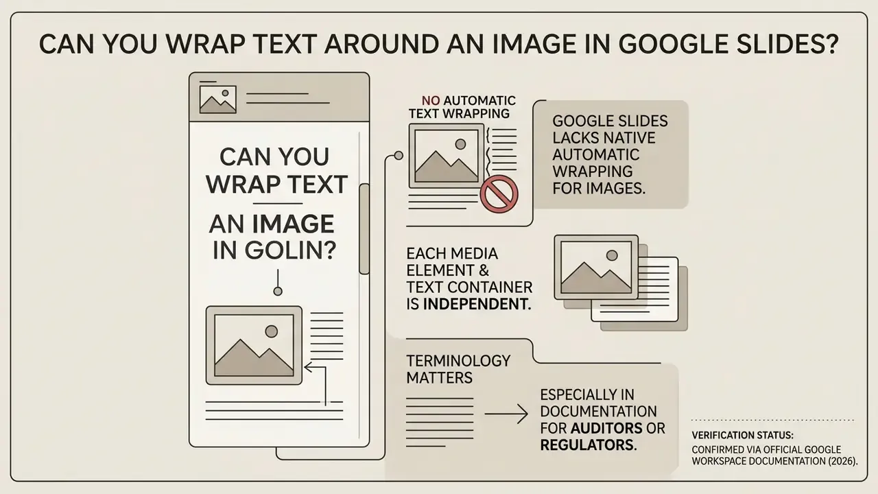
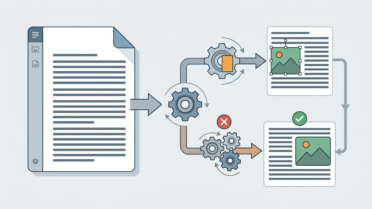
Google Slides does not have a native automatic text wrapping feature for images. Unlike Google Docs, which includes built-in flow settings such as "Wrap text" or "Break text", the Google Slides presentation interface runs on an object-based canvas model (Google Workspace Help, 2026).
«Google Slides does not expose an image "text wrap" mode. All copy lives inside independent text boxes that do not interact with neighbouring objects.»
Because Google Slides doesn’t ship a text wrapping feature, every media element and text container exists as an independent floating layer. When an image so placed on a slide overlaps a text container, the copy will not reflow around the image borders. Nothing happens. To create a visual text wrapping effect, you have to position, resize, or split multiple text boxes around the graphic object yourself.
Terminology matters here, especially in documentation that auditors or regulators may read later. What you build in Slides is simulated wrapping, a manual layout technique, not an automatic wrap text feature. Naming it correctly stops the next editor from hunting for a setting that does not exist.
Choose Your Method First: Layout Decision Matrix
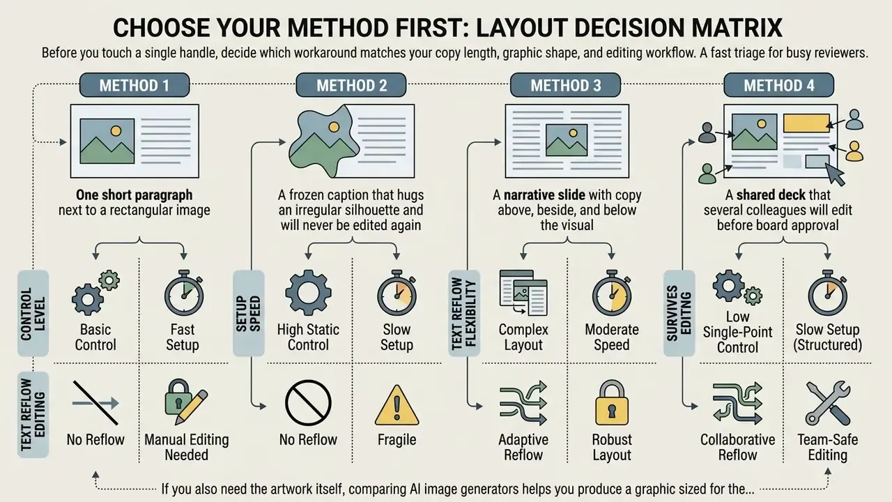
Before you touch a single handle, decide which workaround matches your copy length, graphic shape, and editing workflow. The optimal choice depends on editorial priorities: setup speed, content density, and long-term editability.
| Layout Method | Control Level | Setup Speed | Text Reflow Flexibility | Survives Later Editing | Recommended Text Volume |
|---|---|---|---|---|---|
| Single Text Box Resizing | Moderate | Fast | High (intra-box only) | Good | Short-to-medium copy |
| Manual Line Breaks | High (custom contour) | Slow | Low (breaks upon editing) | Poor | Static short captions |
| Multiple Text Boxes | High (multi-sided flow) | Moderate | Moderate (per-container) | Good | Multi-paragraph content |
| Borderless Tables | Structured (grid) | Fast | High (cell-confined) | Excellent | Dense comparative data |
Fast triage for busy reviewers:
- One short paragraph next to a rectangular image, go with Method 1.
- A frozen caption that hugs an irregular silhouette and will never be edited again, Method 2.
- A narrative slide with copy above, beside, and below the visual, Method 3.
- A shared deck that several colleagues will edit before board approval, Method 4. Tables lock content into cells and resist accidental drag.
If you also need the artwork itself, comparing AI image generators helps you produce a graphic sized for the layout you already chose, instead of retrofitting the slide to a stock photo. For a broader view of tool trade-offs, the AI Media Comparison hub covers the same evaluation logic across formats.
Prepare the Image and Text Box for a Clean Layout
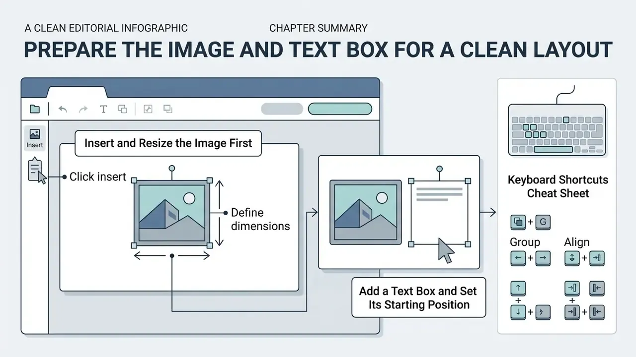
To build a clean layout, insert your image first, set its final dimensions, and only then position a text box next to it. Placing the graphic before arranging body copy prevents layout distortion and saves real edit time later.
Insert and Resize the Image First
Insert the media element onto the target slide before you add or arrange any text container.
- Click insertin the top navigation bar, select Insert image, and choose your file source (local upload, Google Drive, or web search). If the source file needs cropping, background cleanup, or colour correction first, AI photo editors handle that prep outside Slides, and so does a desktop photo editor for macOS if you prefer a local pipeline.
- Once the picture appears on the canvas, click and drag its corner handles to resize image proportions without distorting the aspect ratio. Low-resolution assets blur when scaled up on a 16:9 canvas, so AI image upscalers are worth a pass before you place the file.
- For exact dimensions, right-click the image and open Format options > Size & rotation, then type numeric width and height values.
- Position the graphic in its final location, leaving enough negative space on the left, right, or top margins to receive your text around image blocks cleanly.
- Confirm the canvas geometry via File > Page setup (Standard 4:3, Widescreen 16:9, Widescreen 16:10, or Custom in pixels) so your later margin math stays valid.
Add a Text Box and Set Its Starting Position
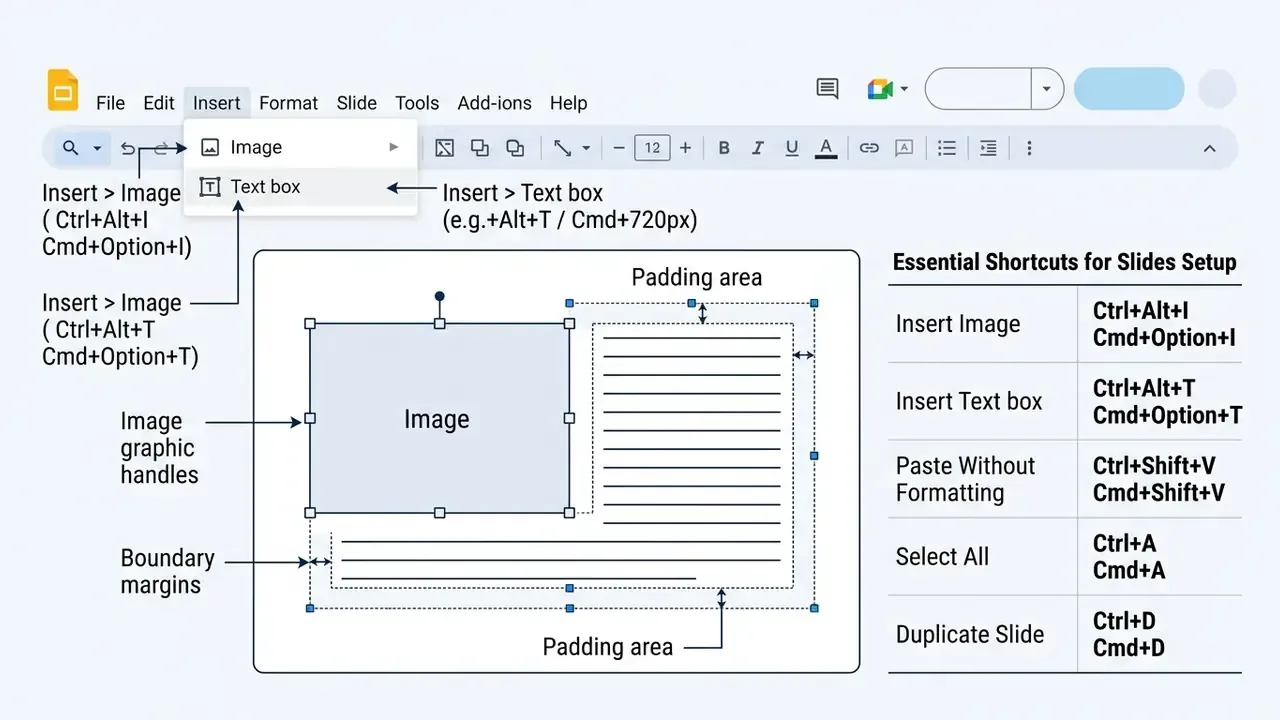
After the visual element is locked, insert text box via the Insert menu or the toolbar icon. Click and drag on the slide canvas to create the container directly beside or around the image.
Position the primary text box so its boundaries align with the outer edges of the visual media. Keep a visible gutter, at least 0.25 inches of white space, between the graphic and the text box border. That single habit does more for better readability than any font tweak.
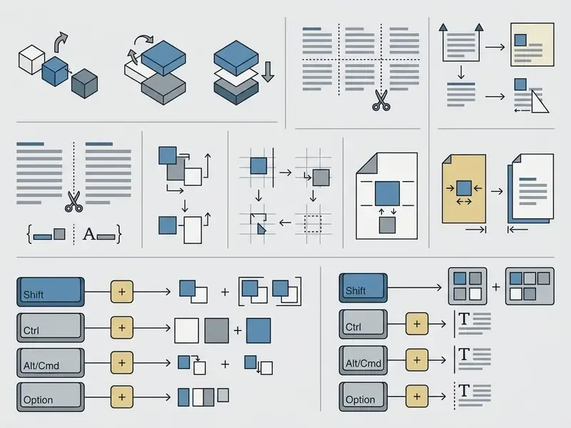
Keyboard Shortcuts Cheat Sheet
Method 1: Resize a Text Box Around the Image
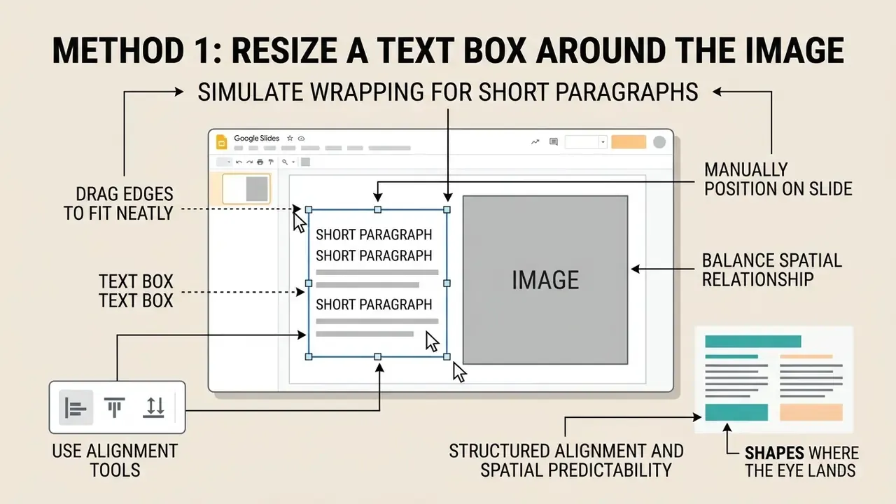
Resizing a single text box to sit neatly beside an image is the fastest way to simulate wrapping for short paragraphs. You keep one continuous text stream and still avoid overlap with the adjacent visual.
Drag Text Box Edges to Fit Neatly Beside the Image
- Select the container by clicking its outer border to reveal the blue sizing handles.
- Drag the side handles toward the centre of the slide until the box border stops just short of the image edge.
- Zoom in (View > Zoom > 150%) and use the arrow keys for final single-pixel corrections.
- Check that no glyph descender (g, y, p) crosses the graphic boundary in full-screen preview.
Narrowing the bounding box forces internal word wrapping inside the container, which makes the text flow cleanly alongside rectangular graphics. Your copy will fit neatly beside the graphic with no manual returns inside the paragraph. Fewer moving parts, fewer surprises.
Manually Position Text and Image on the Slide
Use the alignment tools to balance the spatial relationship between container and graphic. Select both the image and the text box, right-click, then open Align to line up their top or centre axes. Google's alignment commands snap objects to the edge or centre of the slide, which is the documented way to control manual positioning. For paragraph-level control inside a box, Format > Align & indent handles indents and first-line offsets.
«An inverse-reinforcement-learning model accurately predicted gaze fixation sequences across 450 web pages viewed by 41 participants.»
Structured alignment and spatial predictability shape where the eye lands first, and that influences retention. Consistent gaps between image edges and adjacent copy, plus a handful of small adjustments at the end, are what lift a slide to a professional look.
Method 2: Use Manual Line Breaks to Shape Text Around an Image
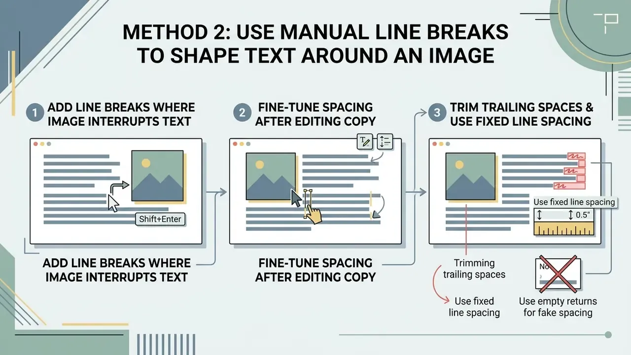
Manual line breaks let you contour copy around visuals that sit in slide corners or occupy the centre. By inserting explicit returns, you vary individual line lengths inside one text container.
Add Line Breaks Where the Image Interrupts the Text
- Place the cursor inside the text block directly before the word that collides with the image boundary.
- Press Shift + Enter (or Enter) to force a soft line breaks return, dropping the rest of the sentence to the next line.
- Repeat for each line that borders the graphic, working top to bottom so earlier breaks do not shift later ones.
- Preview in presentation mode (Ctrl + F5) to confirm the contour holds at full resolution.
This manual spacing technique adjusts line length line by line, producing a custom wrapping effect that follows rectangular or irregular shapes. A forced break simply ends the current line at the image boundary, while normal wrapping happens only at permitted soft wrap opportunities. Powerful, and brittle for exactly the same reason.
Fine-Tune Spacing After Editing the Copy
Whenever you update or adjust text inside a hand-broken container, you have to review and fine tune the line lengths again. Adding or deleting words moves every manual return after it, which produces uneven gaps or wrapping you did not intend.
Review paragraph alignment and spacing after each edit. If a rewrite shifts your breaks awkwardly, delete the extra returns and manually adjust line terminations to restore line spacing and better readability.
Three habits keep hand-broken blocks tidy:
- Never fake spacing with empty returns. Set paragraph space before and after to
0, then control rhythm through Format > Line & paragraph spacing. - Use one fixed line-spacing value (1.15 or 1.2) across every broken block, so the contour reads as intentional rather than accidental.
- Trim trailing spaces before each soft return. A stray space pushes the next line one character further from the graphic, and you will stare at it for ten minutes wondering why.
Method 3: Use Multiple Text Boxes for Full Flexibility
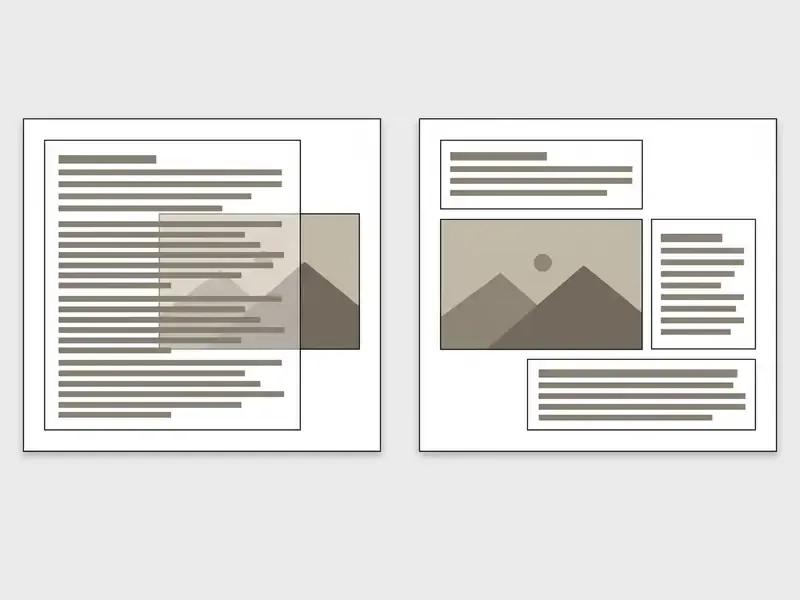
Multiple text boxes give you maximum control when wrapping copy around complex visuals or placing text on several sides of an image. Splitting the narrative into separate text boxes lets each container move independently, with no fragile manual returns holding the layout together.
Split Text Into Separate Boxes Around the Image
- Divide your paragraph into distinct semantic blocks: intro, side note, conclusion.
- Cut each segment with
Ctrl + Xand paste it into an independent text box. - Place one text box above the image, one narrow container beside it, and a third underneath.
- Group the finished cluster with
Ctrl + Alt + Gso a single drag moves the whole composition.
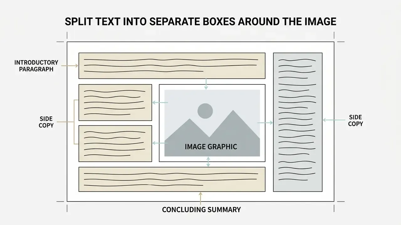
Arranging individual boxes around the graphic recreates the look of advanced automatic wrapping. Because each container is independent, moving the visual means repositioning a neighbouring box rather than re-editing paragraph returns.
Wrapping Text Around Shapes, Icons, and Transparent PNGs
With non-rectangular media, isolated product cutouts, vector icons, charts, or org-chart nodes, a standard rectangular bounding box leaves dead negative space that ruins the illusion.
- Use PNGs with alpha transparency. Export visuals with transparent backgrounds (
.png) so adjacent text boxes can sit closer to the subject without a white rectangle colliding with the copy. Images with transparent backgrounds or a single clear focal point produce the cleanest wraps. - Stair-step your text boxes. Place two to four narrow, stacked containers with incrementally staggered left or right margins alongside an irregular subject. Each box mimics one "line group" of a true contour wrap, roughly what CSS
shape-outsidedoes on the web. - Wrap around shapes and icons the same way. The identical manual technique works for shapes, icons, charts, and diagrams. Position the text boxes against the visible silhouette, not the invisible bounding rectangle.
- Curved text via the Drawing tool. For circular or arced wrapping, open Insert > Drawing > New, select the Curve tool to plot a path, add your copy, and insert the rendered vector onto the slide. Slides has no native "curve text" command, so the Drawing canvas is the supported route.
- Match the graphic to the gap, not the reverse. When the silhouette fights your column, regenerating or extending the asset beats nudging six text boxes. Writing sharper prompts for ai art generation is often the shortcut here.
Align Multiple Text Boxes Consistently
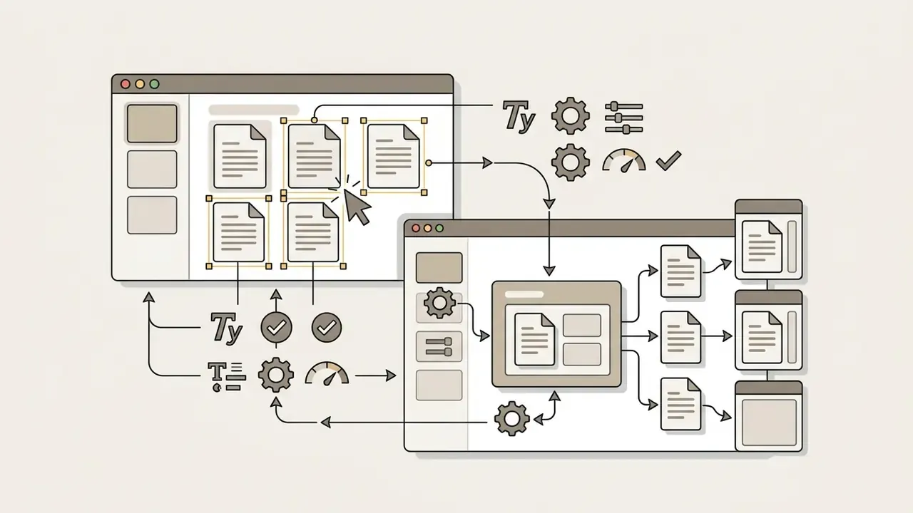
To keep structural uniformity across multiple text boxes, apply identical font styles, sizes, and line-spacing values to every container. Select all frames at once, open Format options, and confirm that line spacing (1.15x or 1.2, for instance) is the same everywhere.
Pro tip, batch-format disparate text boxes: each box you draw separately defaults to its own formatting. To kill font-size discrepancies across a multi-box layout, hold Shift and click every text box to select them together. Any typography change applied from the top menu (font family, size, line spacing, alignment) propagates instantly to all highlighted containers.
Use the smart alignment guides, those red dynamic guidelines, when dragging containers across the canvas. When left margins and vertical gutters line up precisely across separate text boxes, the result reads as a single composition instead of three stray blocks. That is most of what people mean by text alignment discipline.
«Use sufficiently large text and alt text for all images so slides remain accessible to audiences with fluctuating needs.»
Method 4: Use Tables, Shapes, or Layering for Structured Layouts
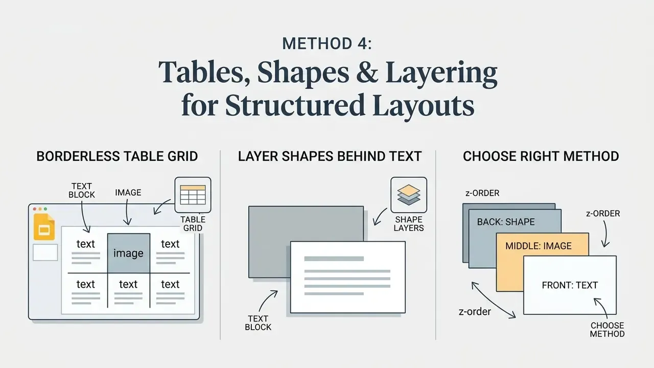
Alternative structural containers, borderless tables, shape blocks, and object z-ordering, give you stable grid layouts for media-heavy presentations. Which container fits depends on copy length and graphic dimensions.
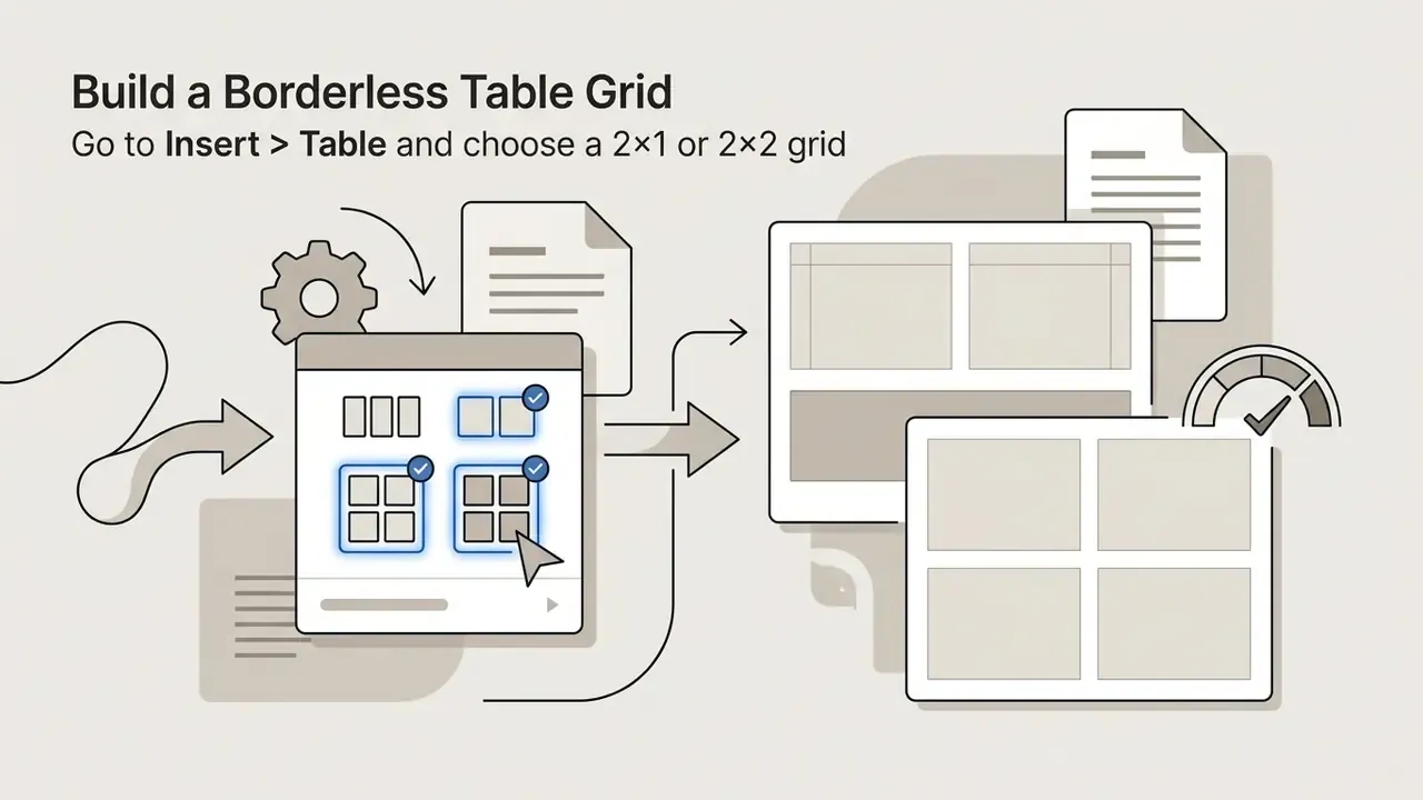
Build a Borderless Table Grid
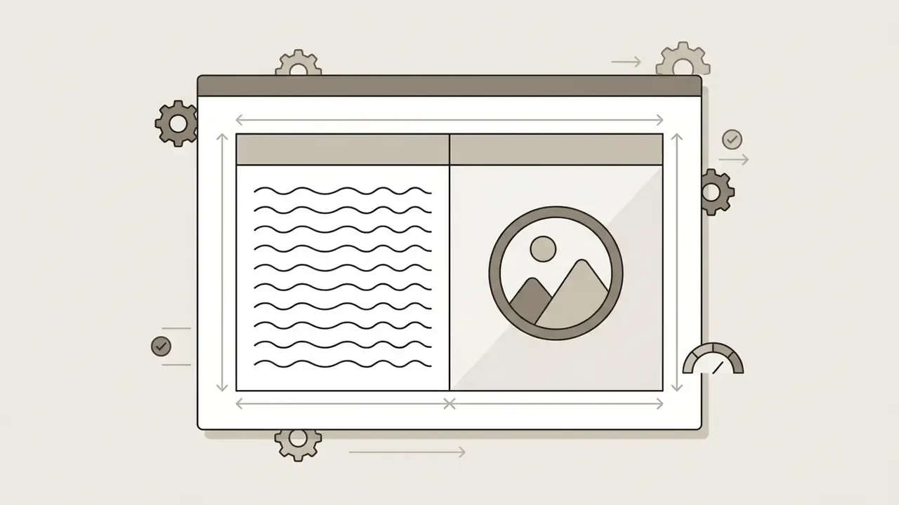
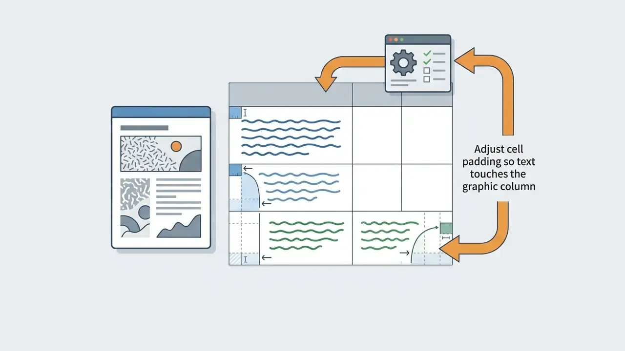
For dense narrative slides, a two-column borderless table guarantees that copy in column one never overlaps media in column two. Text is confined to a cell, so no colleague can accidentally drag a paragraph across the artwork during review. That is the main reason audit and board decks favour this structure over free-floating boxes.

Layer Shapes Behind Text for Contrast
When visual design takes priority, semi-transparent shapes behind text containers create the background contrast you need over busy imagery.
- Insert a rectangle via Insert > Shape > Shapes.
- Set Fill colour > Custom and lower opacity to roughly 40 to 60%.
- Send the shape behind the copy but in front of the photo using
Ctrl + Downuntil the stack reads photo, then shape, then text. - Group the shape with its text box so both travel together.
«Text-aware compression significantly outperformed baseline methods on both subjective and objective readability scores for scene text.»
Choose the Right Method for Your Slide Content
Revisit the layout decision matrix above before you hand a deck to co-editors. The four methods differ less in appearance than in durability. Intra-box wrapping and table cells absorb text edits gracefully, while hand-placed returns encode the exact character count of today's copy. A deck that passes review on Monday and gets rewritten on Wednesday should never rely on Method 2 alone.
Copy volume is the second filter. A 25-word caption tolerates any method. Three paragraphs beside a chart need either multiple containers or a grid, otherwise the visual appeal of the whole google slides presentation collapses into a wall of text. If you work from slides templates with fixed placeholders, check the master first: editing the layout via Slide > Edit theme is usually faster than fighting a placeholder on every slide of your next presentation. If you are budgeting time across a deck series, the calculators hub helps estimate production effort per asset.
Refine Text Wrapping for Better Readability and a Professional Look
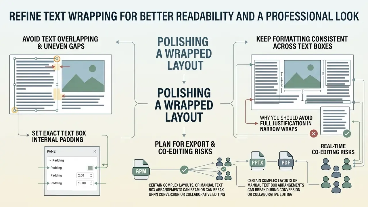
Polishing a wrapped layout comes down to three audits: line spacing, visual collisions, and typographic consistency across every element on the slide.
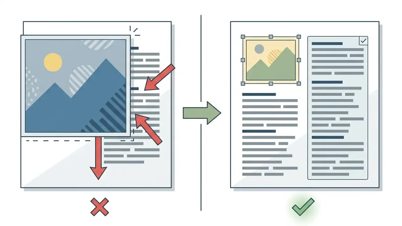
Avoid Text Overlapping the Image and Uneven Gaps
Text placed directly on unadjusted media damages contrast and can fail WCAG 2.2 thresholds. The standard requires a contrast ratio of at least 4.5:1 for normal text and 3:1 for large text (Success Criterion 1.4.3), plus line height of at least 1.5× font size and paragraph spacing of at least 2× font size for blocks of text (Success Criterion 1.4.12).
«Text and images of text must have a contrast ratio of at least 4.5:1; large-scale text requires at least 3:1.»
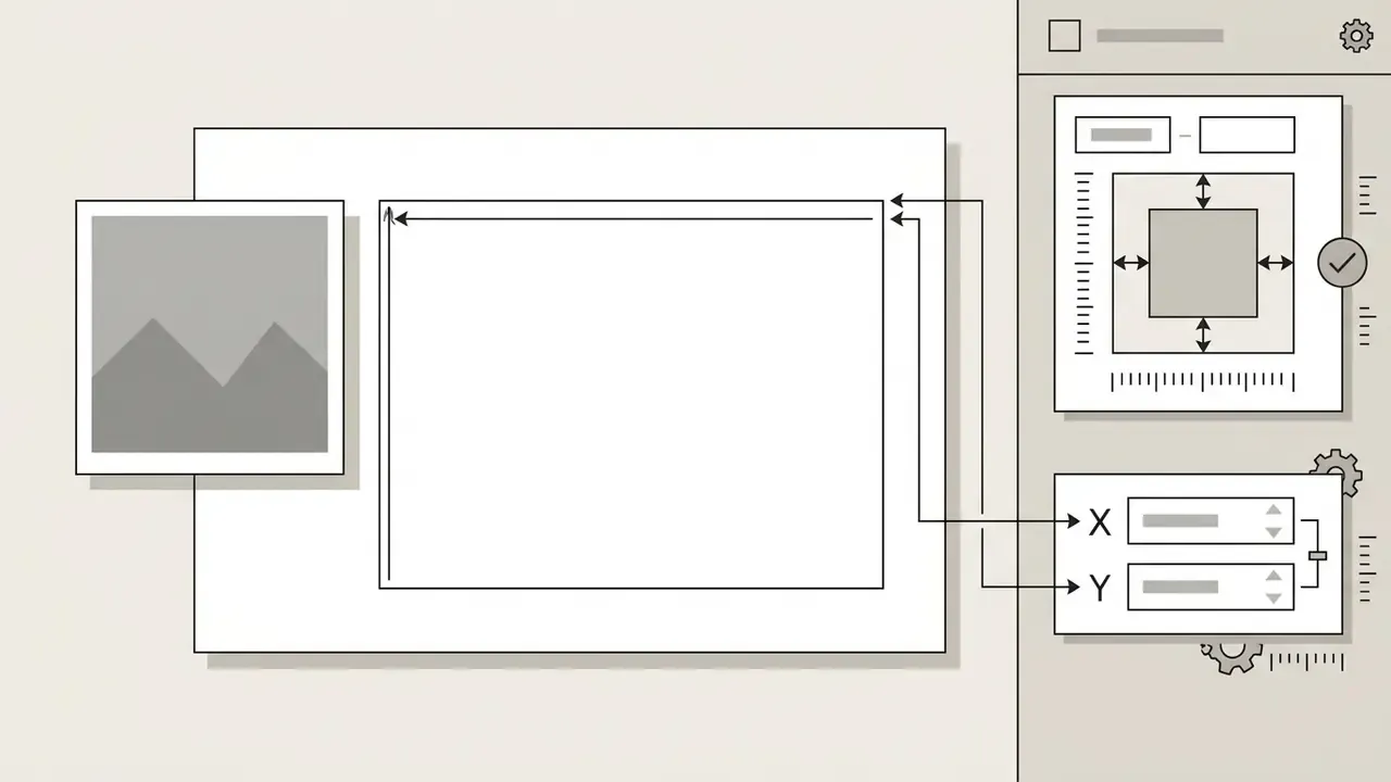
Set Exact Text Box Internal Padding
Dragging handles fixes external spacing. Internal padding controls how far the first character sits from the container wall. To stop text touching the borders without moving the box:

Ctrl + Alt + K / Cmd + Option + K).

0.10 in to 0.15 in gives tight graphics clearance without wasting column width.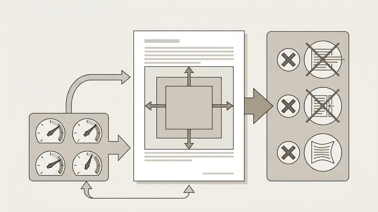
Keep Formatting Consistent Across Text Boxes
With multiple text boxes or split containers, mismatched font sizes and line heights quietly destroy the visual hierarchy. Apply one typographic system to every body block on the slide.
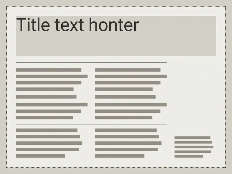
Why you should avoid full justification in narrow wraps. Competing guides often recommend setting alignment to Justified (Ctrl + Shift + J) to get flat left and right margins beside an image. In narrow columns, under roughly 3 inches wide, the Slides rendering engine has no advanced hyphenation algorithm, so full justification stretches word tracking and opens vertical rivers of white space down the block. WCAG guidance also advises against text justified to both margins for blocks of body copy.
Best practice: keep body text left-aligned (Ctrl + Shift + L). To tidy a ragged right edge, widen or narrow the column in 0.05-inch increments, or drop a single soft return (Shift + Enter) on one trailing word. Avoid full text justification (justify text) in narrow blocks. Left-aligned text (aligning text) keeps character spacing predictable and gives the slide that look polished finish executives register without noticing why.
Plan for Export: PPTX, PDF, and Real-Time Co-Editing Risks
Manual wrapping is coordinate-based. Stable on screen, sensitive at conversion time.
- PDF export re-renders type through a vector pipeline. Soft returns calculated against browser font metrics can land one word earlier or later, reopening gaps you already closed.
.pptxexport maps each Slides text box to a PowerPoint shape. Custom padding, autofit behaviour, and tight 0.10-inch gutters are the first properties to drift, especially when non-standard fonts get substituted on the target machine.- Real-time collaboration is the other risk vector. Any co-editor who retypes a sentence inside a hand-broken block destroys the contour silently, because nothing in the interface flags the dependency.
Accessibility Warning: Auto-Beautified Slides Lose Their Text Layer
«Beautify converts the slide into a single raster image with no text boxes, making all text inaccessible to screen readers.»
If a one-click beautifier flattens your carefully wrapped layout into a picture, the visual result may survive while the semantic content disappears. Keep an editable master version of every wrapped slide, and add alt text to each image via Right-click > Alt text (Ctrl + Alt + Y). If the deck will be reused commercially, confirm asset rights under the relevant commercial use terms too.
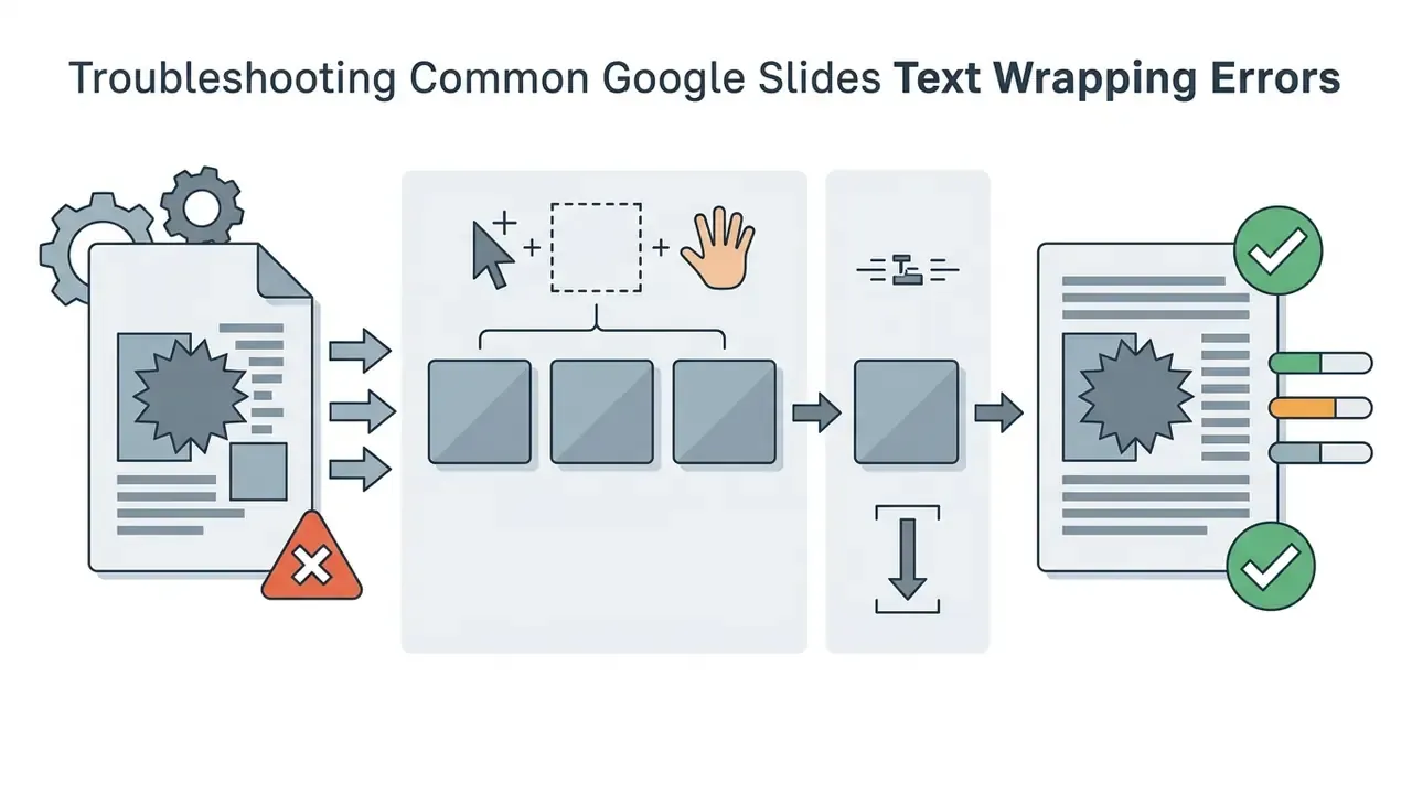
Troubleshooting Common Google Slides Text Wrapping Errors
1. Text Jumps or Overflows When You Resize the Font
2. Text Overlaps the Image After the Graphic Moves
3. Unintended Line Breaks After Exporting to PDF or PPTX
4. The Graphic Layer Blocks Text Editing
5. Uneven Gaps Between Several Text Blocks
6. Inconsistent Fonts Across Multiple Text Boxes
7. Text Is Too Small or Too Large for the Remaining Space

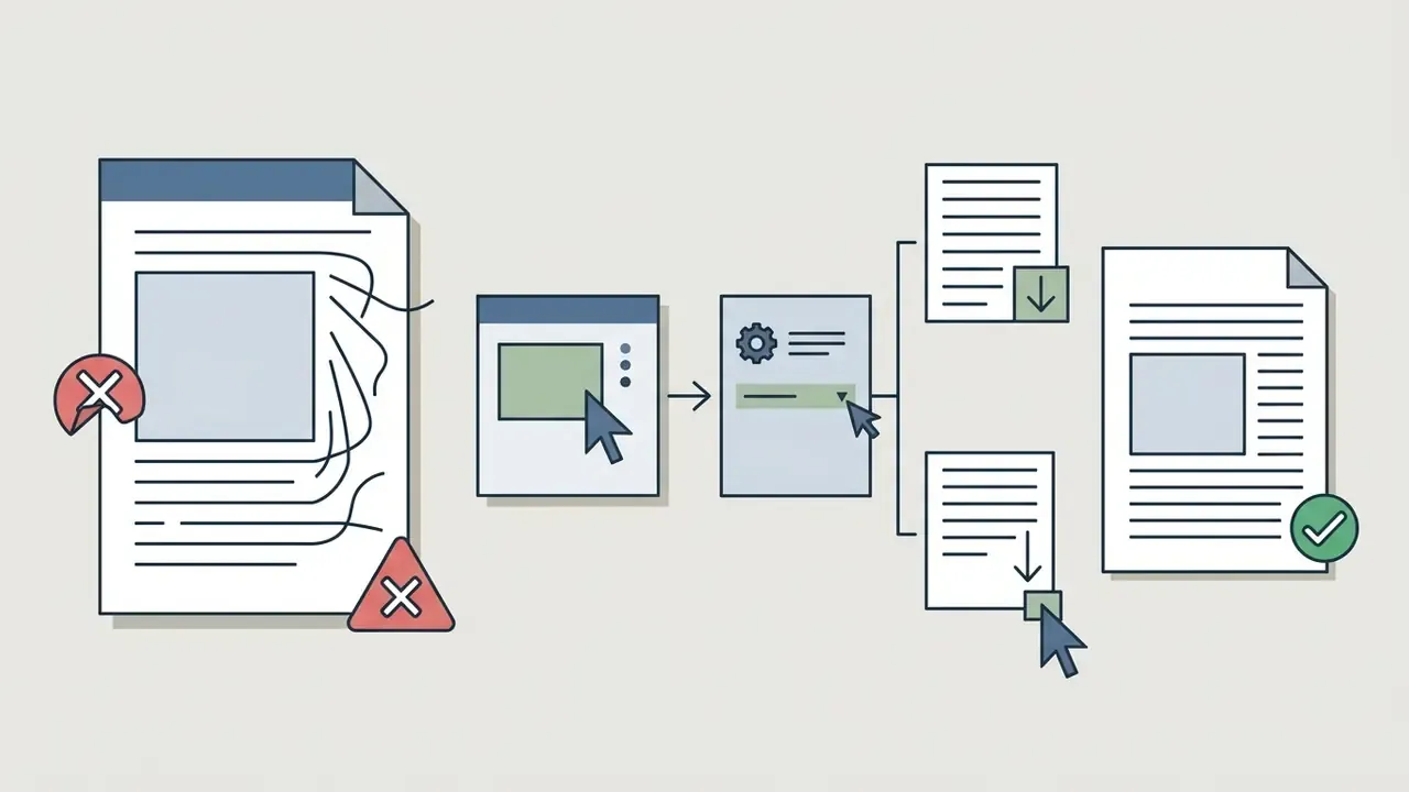

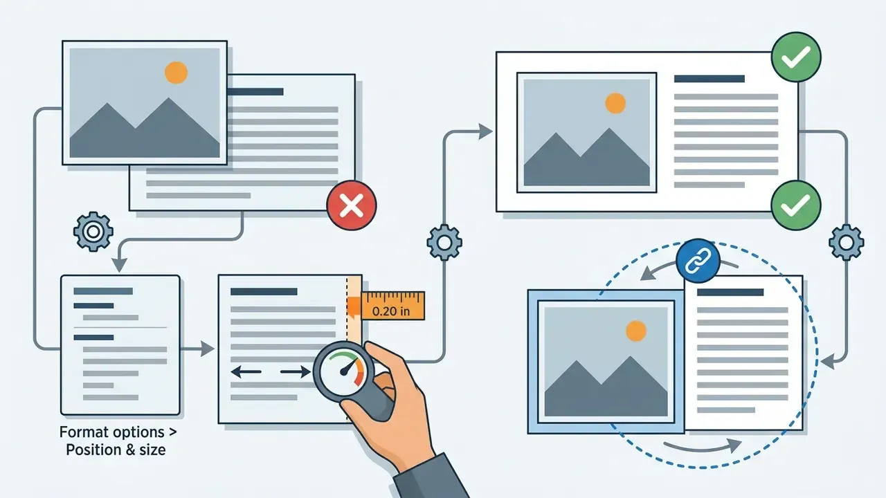

Shift + Enter) were calculated on browser-rendered fonts and shift during vector conversion or font substitution.


Ctrl + Shift + Down). To edit a buried box, press Tab repeatedly to cycle through objects.

FAQ About Wrapping Text Around Images in Google Slides
Does the Text Wrapping Effect Work in Google Slides on Mobile?
Yes. Manual wrapping layouts built in Google Slides render accurately on iOS and Android, because object coordinates are absolute and identical across clients. Creating or editing complex layouts on a phone is another matter: touch-input precision limits you, and Google's mobile help documents only insert-and-arrange actions for text and objects, with no automatic wrap control (Google Workspace Help, Insert and arrange text, shapes, diagrams, and lines, 2026. https://support.google.com/docs/answer/1696521).
You can drag containers and insert line breaks in the mobile app, but precise margin work and multi-box alignment are far easier in the desktop browser.
«Across four display field-of-view configurations (90°–360°), screen geometry significantly affected reading speed and visual search accuracy.» - Study on Display Field-of-View and Type Effects on Text Readability and Visual Text Search (2023). https://dl.acm.org/
How to Wrap Text in Google Slides on Mobile and iPad (Step-by-Step)
- Open your presentation in the Google Slides app for iOS, iPadOS, or Android.
- Tap the + (Insert) icon in the top navigation bar and select Image to place your graphic.
- Drag the corner handles to set the image dimensions, then move it to the left or right margin.
- Tap + again, choose Text box, and drag its boundaries next to the image.
- Enter your text, then drag the side handles to set the column width so the copy stops short of the picture.
- For complex contours, tap the text box, choose Edit text, and insert soft returns with the virtual keyboard's Return key.
- Pinch to zoom before final placement, then tap once outside the objects to preview the composition.
On iPad, an external keyboard and trackpad make step 5 dramatically more accurate. For board-ready decks, still finish the margin work on desktop.
Can You Wrap Text Around an Image Without Changing Its Size?
Yes. Leave the graphic at its original dimensions and adjust only the copy container:
- Insert the image and do not touch its size.
- Add a text box beside it via Insert > Text box.
- Drag only the text box side handles to narrow the column.
- Move the box closer to the image until the gutter reads roughly 0.25 in.
- Fine-tune internal padding in Format options > Text fitting for balance.
Can You Put Text Behind an Image in Google Slides?
Yes, object layering lets you place text behind an image, though legibility usually suffers. To change layer order, select the object, right-click, click Order, and choose Send backward or Send to back (or press Ctrl + Down to step the image back one layer at a time).
For better readability when layering text over or behind visuals, insert a solid or semi-transparent shape behind the text box to establish a high-contrast background. Verify the result against the 4.5:1 ratio before you publish.
Can You Wrap Text Around Multiple Images?
Yes, by combining multiple text boxes or building a multi-cell borderless table grid.
Place separate text frames next to each respective graphic. Anchoring copy blocks to their corresponding visual objects prevents layout shifting and preserves a clear semantic structure. Group each image with its neighbouring text box (Ctrl + Alt + G) so one drag relocates the pair without re-aligning the entire slide.
How Do I Curve Text Around a Circular Image?
Slides has no curved-text command. Open Insert > Drawing > New, select the Curve tool, plot the arc, type your copy along it, and click Save and Close to drop the rendered vector onto the slide beside the circular graphic.
Why Doesn't Google Slides Have Text Wrapping at All?
Slides is built for presentation composition, not document flow. Each element is an independently positioned page object (shape, image, table, line), and slides inherit structure from layouts and masters. Because no continuous text stream runs across objects, there is nothing for an image to displace. Hence simulated wrapping through manual placement.
Appendix A: Editorial Revision Notes (Superseded Wording)
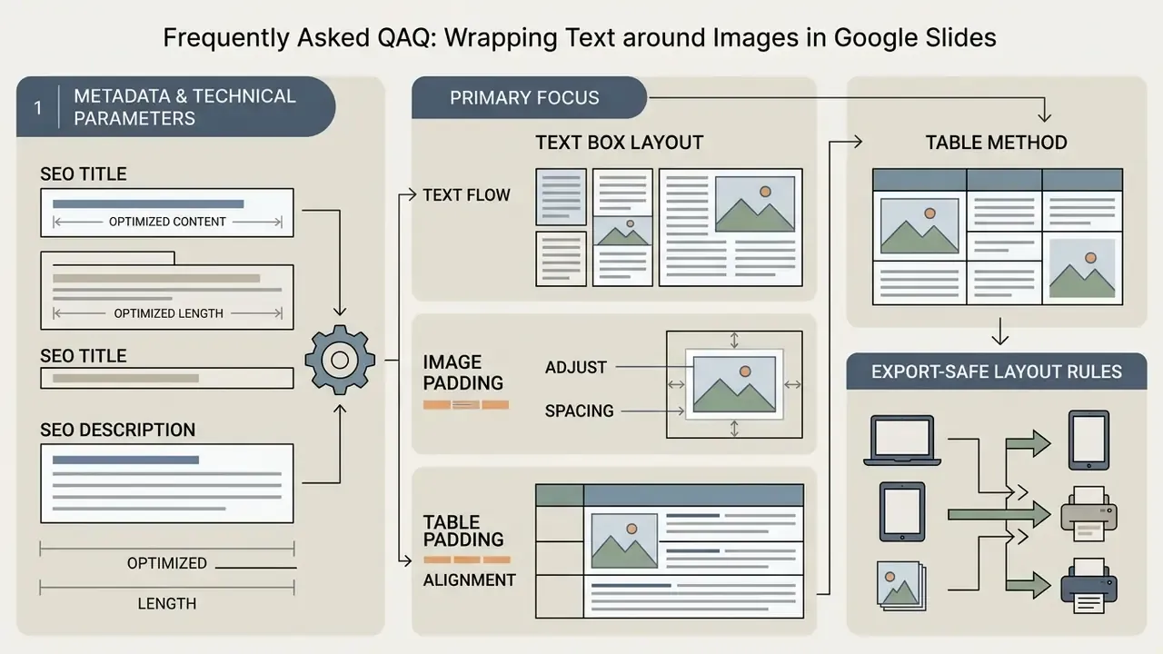
Metadata & Technical Parameters
- SEO Title How to Wrap Text Around an Image in Google Slides (4 Methods)
- SEO Description Learn how to wrap text around an image in Google Slides with text boxes, padding settings, shortcuts, mobile steps, and troubleshooting for clean, professional slides.
- Primary Focus Google Slides layout optimization, manual text wrapping methods, media alignment, presentation accessibility, and visual legibility.
- Structured Data
HowTomarkup for Methods 1 to 4 (step names mirrored from the numbered lists above) andFAQPagemarkup for the FAQ questions, emitted as JSON-LD in the page head.
Footer Navigation / Hub Links:
- Explore automation and media editing processes in our main [workflows](/workflows/) hub.
- Media prep companions: [video editor for mac](/workflows/video-editor-for-mac/), [video editor for](/workflows/video-editor-for-chromebook/) Chromebook, [video compressor for](/workflows/video-compressor-for-discord/) Discord.
- Evidence and testing: [AI Media Benchmarks and Review Proof](/benchmarks/).