«Designing an effective background requires balancing visual aesthetics with functional interface clarity; without structured composition rules and contrast controls, even high-resolution visual assets degrade user experience.»
The short version
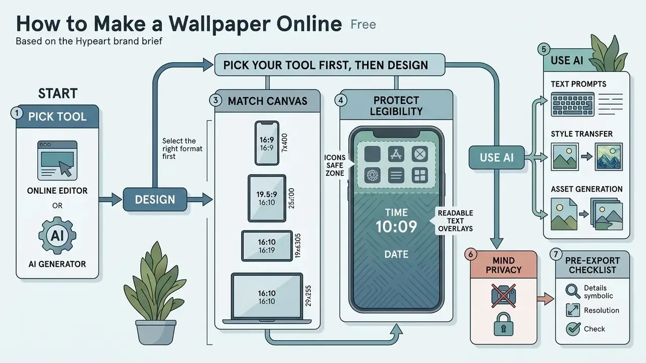
- Pick your tool first, then design. Template editors (Canva, Adobe Express, Fotor, Picsart) win on speed; photo editors win on control; AI generators (Midjourney, Firefly, NightCafe, Artguru-class tools) win on originality. Confirm watermark and export-resolution policy before you invest time.
- Match the canvas to the hardware. 1290×2796 px for modern iPhones, 1080×2400 to 1440×3120 px for Android, 1920×1080 up to 3840×2160 px for 16:9 desktops, 3440×1440 px for 21:9 ultrawide. Keep the top clock band and the 48 px Windows 11 taskbar strip visually quiet.
- Protect legibility. Hold at least a 4.5:1 contrast ratio for text and 3:1 for informative icons, and use a semi-transparent scrim, a soft drop shadow, or a light background blur behind any typography.
- Use AI in three modes. Text-to-image for original art, image-to-image for stylizing your own photos at a locked aspect ratio, and looped video export for live or animated wallpapers.
- Mind privacy. Uploading personal, client, or corporate imagery to a free third-party generator is a data-handling decision, not just a design one. Read the retention and training-data terms first.
How to use this guide
Three reading paths, depending on what you actually came for.
If you want a finished wallpaper in ten minutes, read the tool comparison, set the canvas size for your device, then jump straight to the pre-export checklist. If you care about craft, start with style and composition, because every later decision (crop, scrim opacity, prompt phrasing) depends on the visual direction you lock early. And if you are producing backgrounds for a fleet of company machines rather than your own phone, read the privacy subsection first. That one is not optional.
Each main section is written to stand alone, so skipping ahead will not break the workflow. The tables are the parts worth bookmarking: canvas dimensions, style clusters, and prompt templates are the details nobody remembers between projects.
Compare free online wallpaper makers before you start
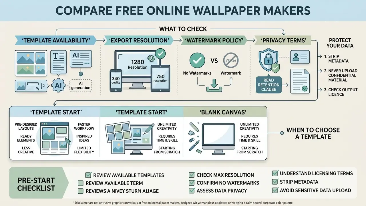
Evaluating web tools requires reviewing template availability, export resolution limits, watermark policies, and privacy terms before committing to a platform. Choosing a wallpaper maker online free no sign up simplifies production while securing high-quality, uncompressed image downloads.
Online design platforms offer varying editing capabilities, template libraries, and file export conditions. Selecting an appropriate tool depends on whether your project requires photo editing, template customization, or generative AI art. Most mainstream creative suites now publish a dedicated wallpaper entry point: Canva and Adobe Express both expose text-prompt wallpaper generation with aspect-ratio presets on free tiers, Fotor advertises HD wallpaper download without watermarks and hundreds of editable phone templates, NightCafe allows you to start generating with free daily credits before creating an account, and CapCut caps free generations per day. Verify those limits at the moment of use, because free-tier credit rules change faster than feature sets. For structured evaluations of creative software tools across workflows, explore our detailed AI Media Comparison breakdown, and for a shortlist of zero-cost generators see our roundup of free AI art generators.
Understanding platform constraints prevents unexpected export fees or resolution limits at the end of the design process. Nothing stings quite like a finished composition that only exports at 1024 px wide. Web tools offering no-registration access allow creators to draft and download assets quickly. Verifying export settings ensures your finalized graphics remain free of intrusive brand watermarks.
When designing custom wallpapers for team workspaces or branded corporate desktops, select cloud-based editors that support real-time collaborative editing and cross-device asset sync. Designing on a desktop browser while testing live previews on a paired mobile app ensures layout grids align across all hardware form factors before final deployment. Shared team folders also keep brand palettes, logo lockups, and approved typography consistent when several people ship desktop backgrounds for the same fleet of machines.
Protect your data before you upload anything (Updated)
Free browser-based wallpaper makers are convenient precisely because they accept arbitrary uploads, which is exactly why they deserve a risk review. Uploading family photographs, client artwork, unreleased product renders, or internal screenshots to an unvetted generator transfers those files to a third-party server under that vendor's retention and model-training terms. In corporate environments this is the classic Shadow AI pattern: a well-meaning employee personalises a work laptop and, in the process, moves confidential imagery outside the security perimeter.
Practical safeguards before your first upload:
- Read the retention clause.Confirm whether uploads are deleted after processing or retained for model improvement, and whether an opt-out exists.
- Strip metadata.Camera EXIF data can carry GPS coordinates, device identifiers, and timestamps; remove it before uploading personal photos.
- Never upload regulated or confidential material.Customer data, internal dashboards, medical imagery, or unreleased IP should be edited locally rather than in a free web tool.
- Check the output licence separately from the input licence.Permission to upload is not the same as permission to publish or commercialise the result; usage rights for generated assets vary by platform and by plan. For a worked example of how one major suite frames these terms, see our overview of Canva AI generator commercial licensing.
When to choose a wallpaper template instead of a blank canvas
Selecting a wallpaper template accelerates design workflows by providing pre-tested contrast layers, icon-safe zones, and curated visual layouts. Starting with pre-made wallpaper designs suits users seeking quick results, while blank canvases serve complex personalized wallpapers requiring exact custom parameters.
Templates offer pre-arranged typography and balanced composition grids optimized for mobile or desktop displays. Utilizing a template helps non-designers avoid common contrast errors and layout mistakes. Accessibility guidance is consistent on this point: a template is only a safe shortcut if it preserves readable text, sufficient contrast, and clear visual structure for the intended audience, which is why bespoke design remains necessary for viewers with low vision or age-related contrast sensitivity.
Blank canvases remain preferable when building highly customized visual concepts from raw photo uploads or precise artwork dimensions. Personalization can also be delegated to the model itself rather than to a template library:
«A one-time collection of user commentary on liked images lets a language model infer a personal visual profile for subsequent generation.»
That approach matters for wallpaper work because taste is the hardest parameter to write into a prompt. Rating a handful of reference images once gives the system a reusable aesthetic profile (palette bias, level of detail, preferred subject framing) which produces more usable first drafts than a generic template ever will.
What to check in a free online wallpaper maker
A reliable free online wallpaper maker must support high-resolution PNG exports, browser-based rendering without obligatory user sign-ups, and flexible asset controls. Verifying watermark-free output options ensures your finished free wallpaper retains professional sharpness across high-density mobile and desktop screens.
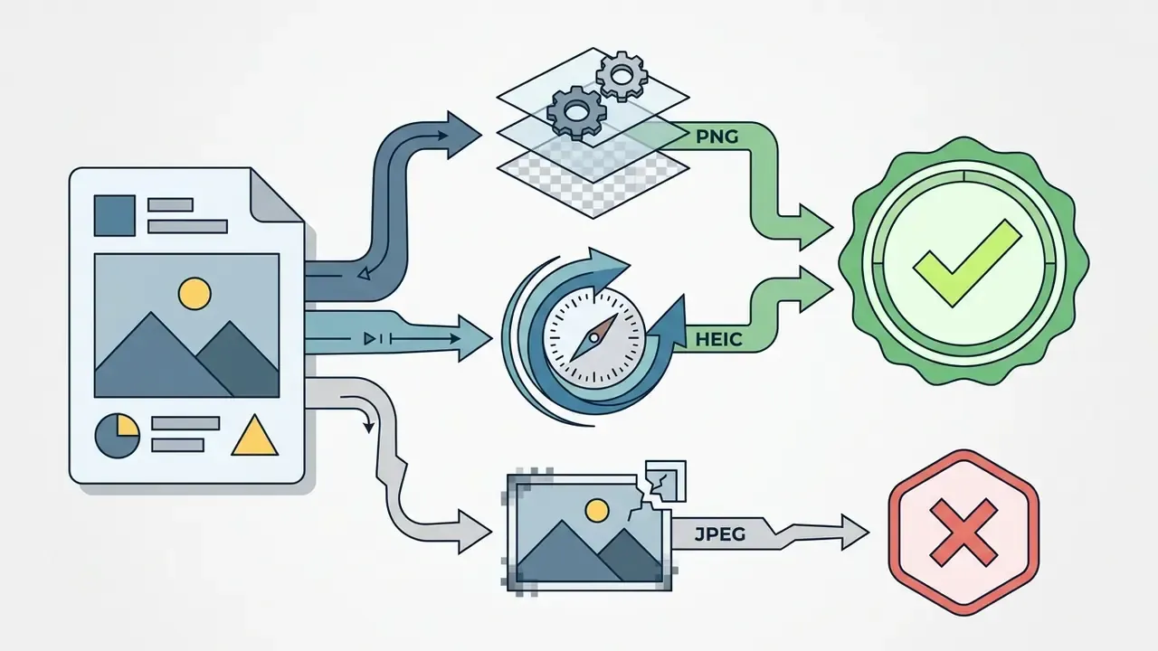
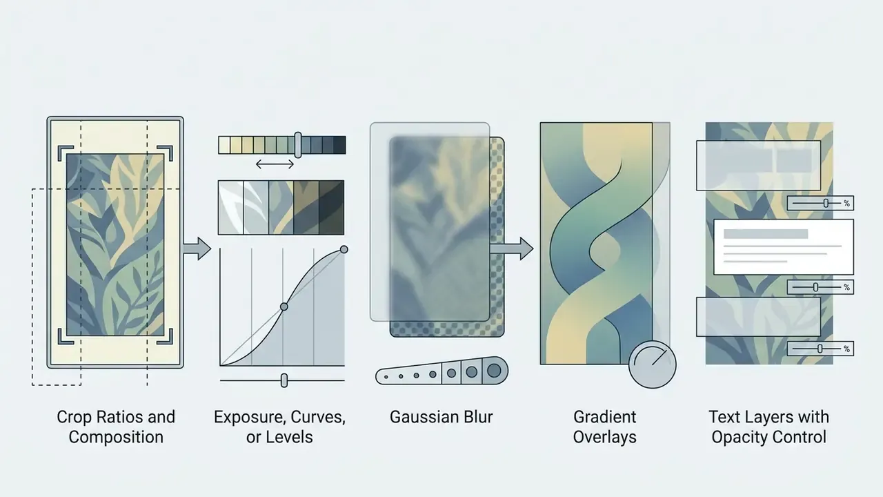
Prioritize platforms that export full-resolution PNG or HEIC files rather than heavily compressed JPEG outputs; a side-by-side view of quality caps and licence terms across free AI art generators is the fastest way to filter candidates. Ensure the editor includes baseline controls for exposure, blur, text scrims, and crop ratios. Run through this practical checklist:

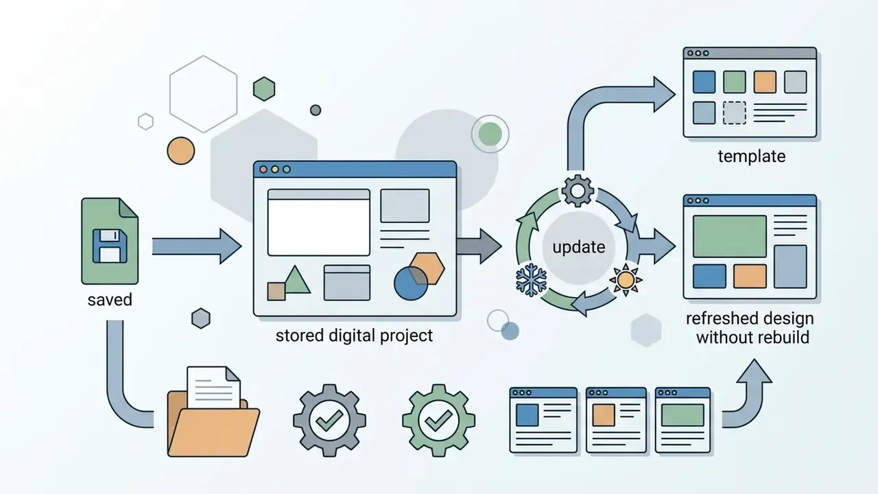
If you want a broader map of browser-based retouching capabilities before choosing, our guides to online photo editors and free photo editors break down feature limits and export restrictions by tier.
| Tool Category | Representative Platforms | Input Source | Creation Speed | Customization Depth | Text & Typography Support | Export Quality & Watermark Terms | Ideal Use Case |
|---|---|---|---|---|---|---|---|
| Wallpaper Template Editors | Canva, Adobe Express, Fotor, Template-library tools | Pre-made design layouts, stock assets | Fast (1–3 mins) | Moderate; element swapping & color tuning | High; pre-styled text templates & font pairings | Full resolution PNG; usually watermark-free on basic tiers | Quick name wallpapers, aesthetic quote graphics |
| Wallpaper Photo Editors | Fotor, Picsart, browser photo editors | User uploaded photos & pictures | Moderate (3–10 mins) | High; manual filters, cropping & blurs | Moderate; basic text overlays & scrim shapes | High-res download; verify platform compression policy | Converting personal photography into backgrounds |
| AI Wallpaper Generators | Midjourney, Adobe Firefly, NightCafe, Artguru-class tools | Text prompts & reference images | Variable (1–5 mins) | High initial variety; iterative prompt tuning | Low to Moderate; text generation often yields artifacts | Depends on credits; upscaling usually required for 4K | Generating unique anime, landscape, or abstract art |
| Live / Animated Wallpaper Builders | Lively Wallpaper (Windows), motion-loop exporters, animation tools | Static art plus motion layers or short clips | Slower (10–30 mins) | High; keyframes, loop points, particle layers | Low; moving text harms glanceability | MP4/WebM at 1080p or 4K; watch file-size caps | Animated desktops, dynamic lock screens |
Read the table as a decision tree: photo in hand means a photo editor, blank idea means a generator, deadline in five minutes means a template.
Choose the right idea and style for your custom wallpaper
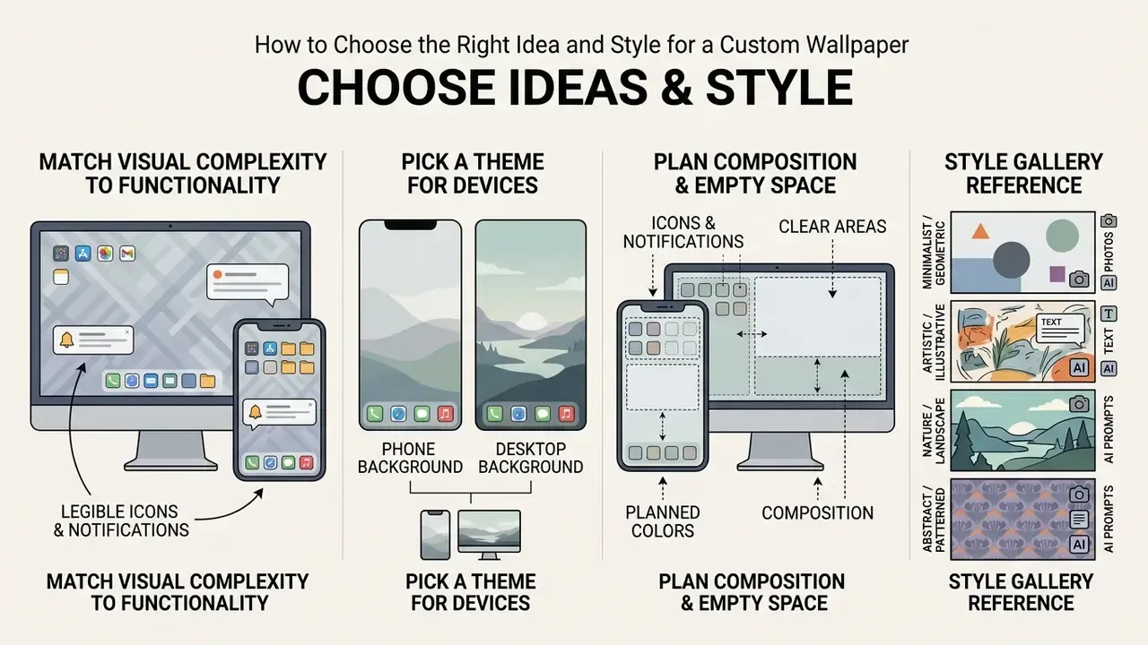
Choosing the right custom wallpaper style requires matching visual complexity to screen functionality so foreground icons and notifications remain legible. Selecting between minimalist, cute wallpaper, aesthetic wallpaper, or anime wallpaper designs, or generating them outright with AI art generators, ensures the background enhances personal device ergonomics rather than creating visual clutter.
A visual background serves as a continuous operational environment where application icons, system widgets, and lock-screen elements must remain distinguishable. When evaluating how to make a good wallpaper, design decisions should reflect personal taste alongside screen interaction patterns.
«Busy consumers prefer minimalist visual fields, driven by a desire for relaxation and avoidance of processing disfluency.»
That finding came from a multi-study program combining controlled experiments with field data, and the mechanism matters more than the headline: minimalism wins not because it is fashionable, but because busy viewers actively avoid the cognitive cost of decoding a crowded image. A device background is the most frequently re-viewed image in a person's day. Which makes it the worst possible place for high-effort visual processing. Complex visual assets can elevate initial aesthetic appeal, but excessive visual detail often introduces disfluency during routine navigation.
Selecting an appropriate direction requires balancing thematic elements against daily device usage. If you want to learn how to make a cool wallpaper or how to make a cute wallpaper, focus on how central shapes interact with hardware displays. A well-constructed custom wallpaper uses intentional color palettes and structural alignment to preserve utility across desktop and mobile screens. Two extra context rules are worth applying: OLED and AMOLED panels draw measurably less display power with dark or near-black backgrounds, and shared or professional machines benefit from neutral, non-cartoon imagery that reads as deliberate rather than personal.
Pick a theme that works as a desktop or phone background
A theme works effectively as a desktop wallpaper or phone background when it accommodates system UI elements without obscuring application icons or clock displays. A unique wallpaper balances focal points against workspace layouts to preserve visual clarity across mobile and wide screens.
Desktop setups require wallpapers with central or peripheral focal points that leave primary desktop icon channels clear. Mobile displays demand clean upper and lower zones to maintain legibility for system clocks and gesture navigation bars. Selecting scalable wallpaper designs prevents visual elements from directly colliding with active application shortcuts.
«Wallpaper background complexity reduces icon recognition accuracy and increases reaction time even at optimal icon brightness.»
The practical consequence is that you cannot compensate for a busy background by brightening icons. Complexity behind the icon grid degrades recognition speed regardless of foreground luminance, so the fix has to happen in the wallpaper itself: fewer competing edges, lower local contrast, and a quiet region wherever the icon matrix sits. Open-source desktop design guidelines converge on the same prescription, namely big shapes over fine detail, a limited palette, matte rather than glossy rendering, and an intentionally empty area in the top-left quadrant or top third.
Plan colors, composition and empty space for icons
Planning composition requires reserving negative space in high-density UI zones where app icons and widgets reside. Maintaining strong contrast and balanced color palettes ensures stunning wallpaper designs support daily navigation without visual processing disfluency.
Negative space should occupy a substantial portion of the canvas to allow foreground elements to stand out cleanly. Photography composition guidance puts a usable number on "substantial": negative space is typically expected to fill roughly half the frame or more, keeping the background simple so the focal subject reads instantly. For wallpapers, treat that half-frame allowance as the region you hand over to the operating system rather than to your artwork.
Positioning primary visual subjects away from standard icon placement grid locations minimizes visual distraction.
«Visual complexity increases an icon's initial appeal but hinders fast recognition during regular use.»
Because icon complexity and background complexity compete for the same perceptual budget, a detailed wallpaper effectively spends the attention that your app icons need. Utilizing low-saturation backgrounds or dark color palettes preserves legibility for light interface text and system notifications. Where informative icons sit on top of imagery, accessibility technique guidance requires at least 3:1 contrast against the adjacent background, and when that background is a gradient or pattern, the measurement is taken at the least-contrasting point, not the average. Average it and you will ship something that fails in exactly one corner.
Style gallery reference. A useful shortlist of wallpaper clusters and what each one demands structurally:
| Style Cluster | Visual Signature | Best Screen Fit | Composition Note |
|---|---|---|---|
| Cute | Rounded shapes, pastel pinks and creams, plush textures, smiling animal faces | Phone home screen | Keep characters below the clock band; compact framing |
| Aesthetic | Muted tones, minimal layouts, deliberate negative space | Phone lock screen, laptop | Half-empty canvas; one focal element only |
| Anime | Character portraits or scenery, clean linework, starry skies, blue-orange palettes | Phone and desktop | Scenery variants tolerate icon overlays better than portraits |
| Christmas / Seasonal | Snow overlays, warm white glow, muted reds, evergreen accents, glowing windows | Desktop, seasonal refresh | Keep the warm-glow highlight out of the taskbar strip |
| Landscape | Beaches, hills, cloud banks, water, bright natural light | Ultrawide and 4K desktop | Place the horizon on a thirds line; leave sky as icon space |
| Quote | Text-first layout over a simple or scenic backdrop | Phone lock screen | Text needs a scrim; never place it under the clock |
Figure: wallpaper style clusters mapped to screen type and the composition constraint each style imposes. Each gallery image should carry a descriptive alt attribute, for example "cute wallpaper design for phone wallpaper". Use the table to lock a visual direction before opening an editor.
Set the wallpaper size for your device
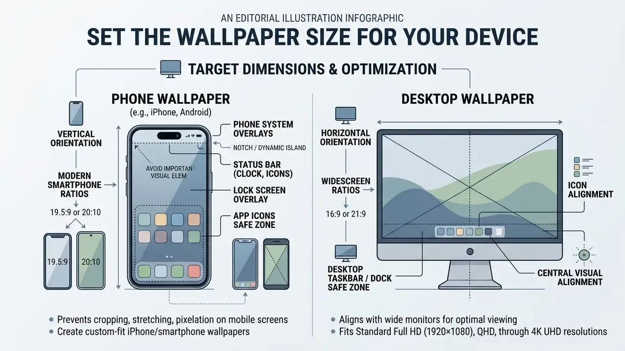
Setting the correct wallpaper size prevents unwanted cropping, stretching, or pixelation when applying digital artwork across different displays. Proper canvas dimensions guarantee crisp resolution for desktop background monitors, iPhones, and Android devices alike.
Display hardware relies on specific aspect ratios and pixel densities to display graphics accurately without visual artifacts. Preparing digital assets at native or higher resolutions prevents scaling degradation during display fitting. Evaluating device dimensions before beginning creative work ensures graphics fit target screen bounds. There is no single universal wallpaper standard. iOS asset pipelines expect @2x and @3x scaling, which means master artwork should always be authored above the nominal size for Retina-class panels.
Different screen configurations require distinct dimensional targets for phone wallpaper, iphone wallpaper, and desktop wallpaper assets. Modern high-density displays require graphics designed at high-resolution dimensions to retain sharpness on Retina and OLED panels. Aligning image proportions with physical screen hardware eliminates awkward automatic center-cropping.
Create a phone wallpaper for iPhone and other smartphones
Creating a vertical phone wallpaper requires targeting modern smartphone aspect ratios like 19.5:9 or 20:10 while avoiding top dynamic cutouts and bottom gesture bars. Designing an iphone wallpaper within 1290×2796 px bounds ensures system widgets remain readable over background visuals.
Smartphones feature hardware cutouts, dynamic islands, and system clocks that occupy dedicated top screen regions. Main visual subjects must sit below the clock boundary and above lower dock icon zones. Verifying spatial margins before exporting prevents hardware sensors from overlapping critical visual details. Note that Apple does not publish one fixed wallpaper safe-zone pixel map covering every model; commonly circulated figures such as a "200 px top exclusion band" are practical estimates that shift with device generation, so always confirm against a live preview on the target handset.
Create a desktop wallpaper that fits wide screens
A high-resolution desktop wallpaper must align with 16:9 or 21:9 monitor displays to ensure central visual subjects remain clear of taskbars and desktop shortcuts. Matching display specs prevents graphical distortion and maintains visual hierarchy across wide displays.
Widescreen monitor configurations range from Standard Full HD (1920×1080) and QHD (2560×1440) through 4K UHD (3840×2160) and 5K (5120×2880) to Ultrawide formats (2560×1080 and 3440×1440). Operating systems like Windows reserve bottom screen areas for taskbars, while macOS utilizes top menu bar zones. Placing visual subjects in the central third of the canvas maintains balance across various wide screen layouts, and on Windows 11 specifically, platform design guidance recommends a centered composition that radiates outward from the bottom, because the Start menu panel (roughly 642×724 px) opens directly above the 48 px taskbar with a 12 px gap between them. For 21:9 displays, author natively at ultrawide dimensions rather than cropping a 16:9 source, which otherwise sacrifices vertical detail.
| Device Category | Orientation & Aspect Ratio | Standard Export Dimensions (px) | Primary UI Overlay Exclusion Zones | Composition & Framing Priority |
|---|---|---|---|---|
| iPhone Wallpaper | Vertical (19.5:9 / 20:10) | 1170×2532 to 1320×2868 | Top clock overlay, Dynamic Island, bottom home indicator bar | Center-weighted focal area; generous empty top space |
| Android Smartphone | Vertical (20:9 / 19:9) | 1080×2340, 1080×2400 to 1440×3120 | Top status bar, clock widget area, bottom navigation bar | Neutral upper background; focal subject anchored mid-canvas |
| Widescreen Desktop | Horizontal (16:9) | 1920×1080 (FHD), 2560×1440 (QHD) to 3840×2160 (4K) | Bottom taskbar (48 px on Win 11), Start panel ~642×724 px, desktop app icon columns | Centered or rule-of-thirds subject placement; clear margins |
| 5K Desktop / iMac-class | Horizontal (16:9) | 5120×2880 | Top menu bar (macOS), dock zone, corner shortcuts | High-detail master art; avoid upscaled sources |
| Ultrawide Monitor | Horizontal (21:9 / 64:27) | 2560×1080 to 3440×1440 | Taskbar, persistent system dock widgets, corner app shortcuts | Horizontal balance; main interest focused away from corners |
| Universal Safe Export | Vertical | 1080×1920 | All common phone overlays | Fallback size when the target device is unknown |
How to make a wallpaper from a photo or picture
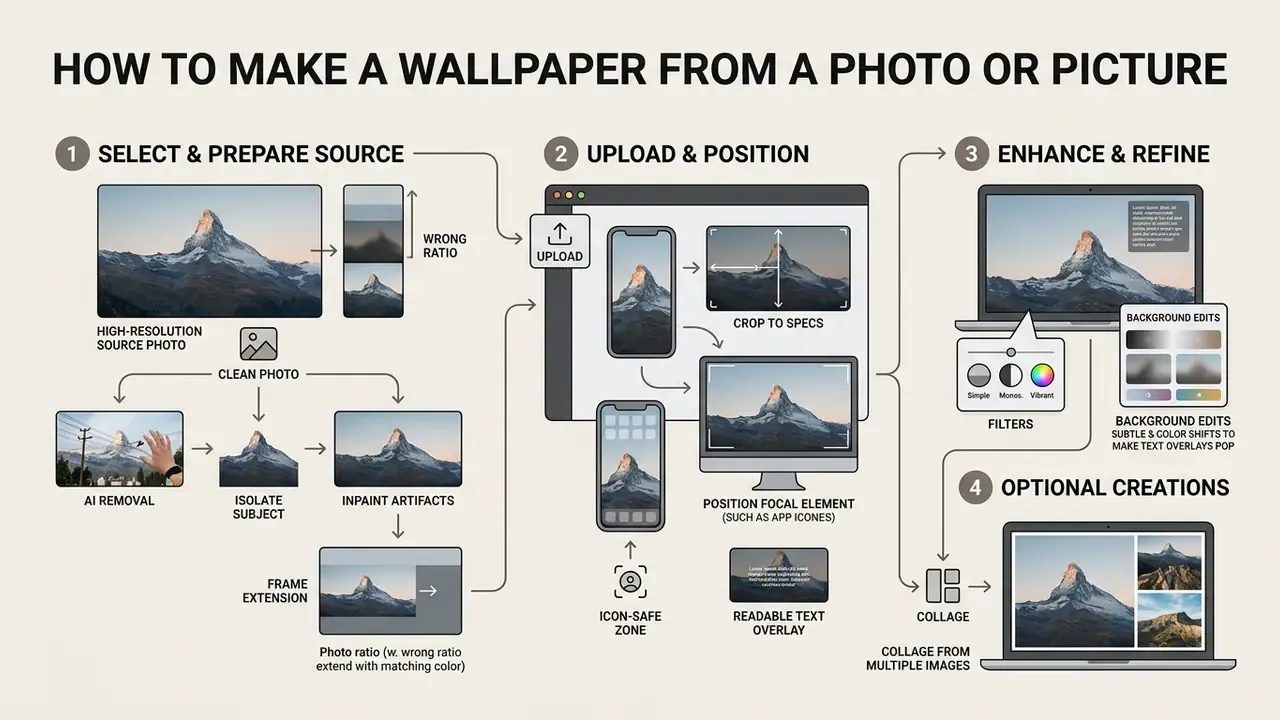
Learning how to make a photo wallpaper or how to make a picture wallpaper involves selecting high-resolution source images, cropping focal elements to device specs, and refining contrast. Utilizing a wallpaper photo editor allows users to transform personal photography into a polished background for any screen.
Personal photographs require structural adjustment before functioning reliably as digital device backgrounds. Unmodified camera photos often feature complex background details that compete visually with operating system text and app icons. Converting personal picture files into usable wallpapers requires deliberate cropping, exposure leveling, and color adjustments.
Online editing workflows streamline image adjustments to help users create wallpaper assets from raw photo files. Adjusting photographic framing ensures central subjects align with display geometry without losing essential details. Using a specialized wallpaper photo editor, see our reference on AI photo editors for capability comparisons, helps establish contrast balance so personal memories serve as stunning background graphics.
Clean source photos using AI background and object removal
Personal photographs often contain unwanted background clutter, photobombers, or high-contrast elements that clash with desktop shortcuts and system widgets. Utilizing automated background removal or localized object inpainting before cropping isolates primary subjects, creating a clean canvas for customized background colors or scrim overlays.
Documented research pipelines follow the same order of operations: mask-driven local editing for removing or replacing regions, then super-resolution between coarse and refinement passes, then a return to the target output size. Running removal before upscaling avoids amplifying artefacts you were about to delete.
- Isolate the primary subject.
- Run automated portrait masking to separate foreground people or objects from chaotic environments.
- Inpaint unwanted artifacts.
- Use smart object erasure to eliminate high-luminance background distractions located within clock overlay boundaries.
- Re-anchor to solid scrims.
- Place isolated subjects onto low-saturation background gradients to guarantee optimal icon contrast.
- Extend the frame if the ratio is wrong.
- When a horizontal snapshot has to become a vertical phone wallpaper, generative expansion adds plausible canvas instead of forcing a destructive crop; our overview of AI outpainting and image expansion tools covers how the background-fill models differ.
Upload, crop and position your image
Transform your own wallpaper by uploading a clear source image and applying rule-of-thirds grid alignment during the cropping phase. Strategic positioning ensures the main subject remains visible behind system UI overlays on both desktop and mobile screens.
When you upload an image, align primary subject lines with grid intersections to construct a balanced visual layout. Divide the frame into three vertical and three horizontal bands, place the main subject near an intersection, and set the horizon on a third line rather than the centre. For portrait-style crops, established practice puts the eye line on the upper gridline, centres the subject between the vertical lines, and leaves roughly one-twelfth of the frame height above the head so the composition reads consistently across screens.
Positioning facial features or structural subjects outside of central clock zones preserves overall composition. Crop tools that expose numeric offsets make this repeatable: an offset of 0 pins the crop to the left or top edge, 0.5 centres it, and 1 pushes it to the right or bottom edge. Useful when you need the same source photo cropped identically for several device ratios.
Improve a photo wallpaper with filters and background edits
Enhancing a photo background requires applying soft filters, exposure adjustments, or selective Gaussian blurs to reduce visual noise behind interface elements. A wallpaper photo editor helps establish contrast ratios that elevate simple snapshots into stunning wallpaper visuals.
High visual busyness in camera photographs can degrade foreground readability and icon recognition. Applying subtle background blurs isolates primary subjects while smoothing out distracting details in icon regions. Adding dark gradient overlays over high-luminance zones ensures system text maintains necessary contrast standards, and federal accessibility guidance on text over imagery explicitly recommends a solid background or dark overlay as the documented remedy, rather than relying on font weight alone.
Make a collage wallpaper from several images
Creating a multi-image collage wallpaper relies on structured grid layouts that maintain consistent spacing and hierarchical focal points. Combining curated photos into a single wallpaper design prevents visual clutter while displaying multiple memories on one screen.
Grid compositions function best when anchored by a single dominant photo surrounded by secondary supporting images. In a nine-cell layout the centre image is read first, with corner and edge images acting as support, which is what keeps the arrangement from feeling random. Maintaining uniform margins between picture frames prevents chaotic overlapping on mobile and desktop displays: even spacing makes a collage read as one unified object, while wider gaps make the images feel separate. Restricting total image counts per canvas ensures the resulting desktop background remains visually clean and organized. And always re-check a desktop-optimised grid at phone size, because dense layouts that work on a 27-inch monitor turn into noise on a 6-inch panel.
Add text, quotes or your name to a wallpaper
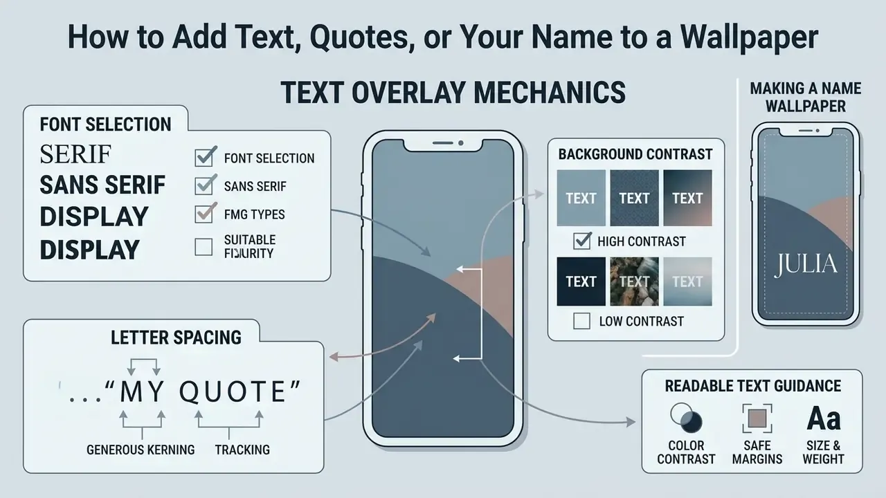
Adding text, quotes, or personalized typography to a background requires precise font selection, generous letter spacing, and high background contrast. Knowing how to make a wallpaper with your name on it ensures personal branding remains sharp and legible across all digital devices.
Integrating readable typographic elements onto a digital background requires adhering to established visual legibility standards. Placing raw text directly over detailed photo background regions frequently causes visual crowding and letter blending. Creating readable personalized wallpapers involves balancing font weights against background complexity.
Design workflows prioritize text contrast to ensure quote wallpapers and name wallpaper graphics remain glanceable. Selecting appropriate typefaces and line heights prevents text blocks from distracting during device navigation. Combining custom text with aesthetic wallpaper graphics produces unique background artwork tailored to individual style preferences.
How to make a wallpaper with your name on it
To make a name wallpaper, position stylized typography within low-detail visual zones using single or dual-font combinations. Combining personal text with cute wallpaper or aesthetic wallpaper graphics creates a clean, personalized background tailored to individual tastes.
Select one or two complementary font families to maintain clean visual hierarchy without cluttering the screen; typographic guidance for minimalist layouts is explicit that contrast should come from weight and scale, not from adding typefaces. Set line spacing at least 25% greater than the x-height, and keep body-scale text no smaller than 12 pt equivalent so it survives downscaling on dense panels.
Position personalized name text within lower-third or central screen areas where icons do not reside. On a phone, the band between the widget stack and the dock is the only reliably unobstructed strip. Applying bold letter weights combined with generous negative space produces an elegant, professional custom wallpaper design, and consistent margins on both sides prevent the name from reading as accidentally off-centre.
«Text legibility on digital displays depends directly on luminance contrast and background uniformness.»
Make text readable on a detailed background
Text legibility on complex backgrounds depends on maintaining at least a 4.5:1 WCAG contrast ratio through semi-transparent scrims, drop shadows, or background blurs. Controlled studies of glanceable typography over busy imagery converge on the same conclusion: uniform treatment of the region directly behind the letterforms outperforms any change to the letterforms themselves.
According to WCAG 2.2 contrast standards (Technique G18), text placed over background imagery requires deliberate luminance separation to ensure legibility: 4.5:1 for normal text, 3:1 for large-scale text, and 7:1 where enhanced contrast applies. Note also that text baked into a picture with significant other visual content is treated differently by the specification, and logotypes are exempt. That exemption is a legal nuance, not a licence to ship unreadable type.
Updated guidance on the mechanics. Rather than relying on a single 2020 legibility experiment, treat the following as the working recipe and verify it visually on the target device: place a semi-transparent dark scrim (start near 30% opacity and adjust to measurement) behind the text block, add a light background blur in the same region to suppress competing edges, and finish with a soft drop shadow for letter separation where the underlying imagery must stay visible. The scrim solves the contrast ratio, the blur solves the edge noise, and the shadow solves the residual ambiguity at the glyph boundary.
Supporting evidence for the "uniform background behind text" principle comes from inclusive-reading research:
The transferable insight is that a controlled, low-noise band behind a line of text measurably improves reading throughput, which is exactly what a scrim does on a wallpaper. Implementing soft drop shadows provides crisp letter separation without obscuring underlying aesthetic details. Older W3C guidance goes further and advises against placing text directly on images at all where it can be avoided, which is precisely why a dedicated text container or treated background zone is the documented workaround rather than a stylistic preference.
Create an AI wallpaper from a text prompt
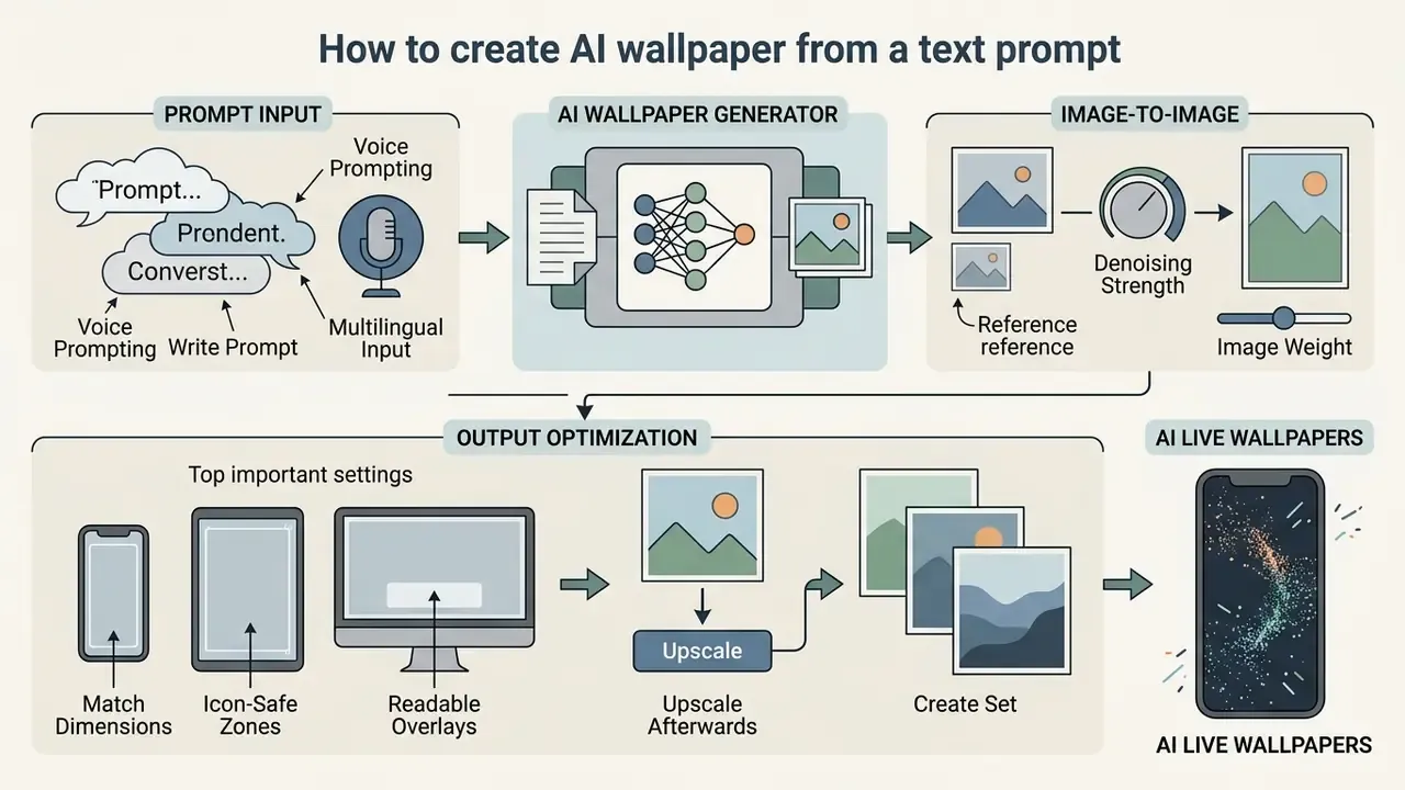
Creating an ai wallpaper involves submitting descriptive text prompts to an ai wallpaper generator that synthesizes original visual assets from structured parameters. Relying on a modern wallpaper generator allows users to produce custom wallpaper variations across varied style frameworks in seconds.
Generative artificial intelligence tools synthesize high-resolution digital art from detailed textual input specifications. Text-to-image diffusion models convert structural prompts into distinct visual styles, ranging from anime wallpaper graphics to photorealistic landscapes. Utilizing an ai wallpaper generator streamlines asset creation by generating bespoke artwork tailored to display aspect ratios; if you are still choosing a model, our evaluation of Midjourney image generation versus competing tools compares quality, controls, and licensing side by side.
Effective AI generation relies on structured prompt formulas that explicitly define subjects, lighting, composition, and constraints. Users can generate multiple ai generated iterations to explore unique aesthetic directions rapidly. Post-generation adjustments ensure the generated output aligns with precise hardware screen dimensions and utility demands. Most official generators also expose an aspect-ratio selector and a per-generation credit cost. Adobe Express, for example, returns four candidates per generation and accepts reference images alongside the text prompt, so budget your credits around iteration, not around single attempts.
Write a prompt for the wallpaper generator
Writing an effective text prompt requires structuring parameters into subject, visual detail, environmental background, lighting mood, and stylistic constraints. Formulating explicit descriptive inputs enables the AI generator to output tailored cute wallpaper, anime wallpaper, or landscape wallpaper concepts reliably.
Construct prompts using a structured sequence: [Subject] + [Visual Details] + [Environment] + [Lighting/Mood] + [Style] + [Negative Constraints]. For example, a landscape prompt might read: "Wide mountain peak, alpine lake reflecting morning light, cinematic natural atmosphere, minimalist digital painting, 16:9 aspect ratio, no text, no watermarks." Specifying explicit exclusions prevents unwanted visual clutter in the output.
«Automatic prompt adaptation via reinforcement learning consistently outperforms manual engineering on aesthetic scores and user preference.»
In practice that means two things for wallpaper work. First, do not treat your first prompt as final; iteration and automated rewriting both beat one careful hand-written attempt. Second, let the model's own reformulation handle stylistic vocabulary while you keep strict manual control over the structural parameters that determine usability: aspect ratio, empty-space placement, and negative constraints.
Ready-to-use prompt templates for high-demand themes:
| Theme Category | Target Display | Structured AI Prompt Template | Exclusion / Negative Prompt Constraints |
|---|---|---|---|
| Minecraft / Voxel Art | Desktop (16:9) | Voxel landscape, isometric green mountains, blocky waterfalls, warm sunset lighting, low-poly aesthetic, 4K resolution | No UI text, no realistic textures, no oversaturated glare |
| Cyberpunk / Neon City | Smartphone (19.5:9) | Futuristic rain-slicked street, blue and magenta neon signs, misty atmosphere, dark lower dock region, cinematic portrait composition | No central text, no cluttered foreground objects, no blurry lines |
| Fine Art / Van Gogh Style | Desktop (21:9) | Swirling night sky over calm mountains, impasto oil painting textures, deep indigo and golden yellows, wide panoramic framing | No smooth digital vectors, no hyper-realism, no sharp edges |
| Minimalist Aesthetic / Preppy | iPhone (20:10) | Soft pastel clay shapes, smooth 3D render, neutral beige background, generous upper empty space for clock overlay | No complex detail, no harsh contrast, no busy patterns |
| Cute / Kawaii Character | Smartphone (20:9) | Cute baby fox, pastel fur, big sparkling eyes, sitting on a cloud, pink and lavender palette, chibi illustration, clean composition | No text, no watermark, no busy background |
| Anime Scenery | Desktop (16:9) | Anime cherry blossom street at sunset, wind-blown petals, cel-shaded linework, warm golden light, wide establishing shot | No logo, no extra text, no character close-up |
| Christmas / Seasonal | Desktop (16:9) | Cozy Christmas living room, decorated tree, glowing fireplace, wrapped gifts, warm golden lights, festive illustration | No watermark, no text, no harsh white highlights near taskbar |
| Space / Minimal Night Sky | Any (16:9 or 9:16) | Minimalist space wallpaper, deep navy sky, subtle stars, glowing moon, centered composition, high contrast | No text, no planets crowding edges, no lens flare |
| Gaming / Streamer Setup | Ultrawide (21:9) | Dark studio desk scene, RGB rim lighting, soft bokeh background, wide horizontal balance, corners kept empty | No overlay graphics, no logos, no bright corner highlights |
| Nature Landscape (photoreal) | 4K Desktop | Wide mountain landscape, snowy peaks, alpine lake, morning mist, dramatic natural light, cinematic realism | No buildings, no text, no visible people |
Generate AI wallpapers from reference images (Image-to-Image)
Image-to-Image AI generation allows creators to transform personal photographs or visual sketches into completely stylized digital backgrounds while locking original spatial proportions. Uploading a source image establishes structural geometry, enabling the diffusion model to apply stylistic transfers, such as converting a city street photo into a cyberpunk anime wallpaper, without disrupting predefined UI clear zones.
To maintain aspect ratio integrity and composition balance:
- Set denoising strength / image weight. Use a medium control value (0.4–0.6) to preserve key subject contours while allowing full texture synthesis. Below 0.3 the output is a filtered photo; above 0.7 the original geometry collapses and your carefully planned empty space disappears.
- Match target canvas dimensions. Ensure the source image aspect ratio aligns with the final display resolution (for example, 9:16 for smartphones) to prevent automatic prompt warping.
- Reuse the reference for a set. One uploaded photo plus three style prompts produces a coherent seasonal collection with identical framing across devices, which is how you keep a phone, tablet, and desktop visually consistent.
- Upscale afterwards, not before. Generate at the model's native comfortable size, then run super-resolution to reach 4K, rather than feeding an already-upscaled reference into the diffusion pass.
Create AI live wallpapers and animated backgrounds
Generating an animated wallpaper or live wallpaper requires creating seamless motion loops (MP4 or WebM formats) tailored to operating system video background engines. While static artwork targets fixed pixel matrices, animated backgrounds rely on subtle canvas kinematics, such as floating atmospheric particles, flowing liquid gradients, or slow looping camera pans, to avoid high GPU/CPU consumption.
When producing live wallpapers for Windows (via Lively Wallpaper) or iOS/Android lock screens:
If you are building motion loops rather than converting them, our guide to animation makers covers keyframe tools, template libraries, and export options relevant to looped background work. The same production habits carry over from short-form video work, so the notes in our walkthrough on how to edit videos apply directly to trimming and looping a clean background clip.
Refine and customize AI generated wallpaper designs
Refining ai generated wallpapers involves applying super-resolution upscaling, localized masking, and aspect ratio re-framing to fix structural artifacts. Post-generation edits convert raw diffusion outputs into functional, high-resolution custom wallpaper files ready for device deployment.
Initial diffusion outputs may contain compositional errors, soft edges, or misplaced visual elements.
«An analysis of more than 3 million prompts showed users focus on surface aesthetics and popular themes, reproducing cultural norms.»
«Neutral prompts in Stable Diffusion produce images closer to male prompts than female ones, including differences in objects and layout.»
For a decorative background this rarely causes harm, but it matters for anything client-facing or brand-adjacent: if you write a neutral prompt and expect a neutral result, check what the model actually staged, props, clothing, and scene composition included, before shipping the asset.
Practical AI generation quality control (field-tested). Generating functional wallpapers via AI requires validating aspect ratio framing before export. Testing identical prompts across 16:9 widescreen and 9:16 vertical modes shows diffusion models redistribute compositional weight: 16:9 expands horizontal scenery, whereas 9:16 vertically stacks subjects, often placing main details in top clock zones. Platform documentation confirms these are separate generation targets rather than a post-export crop, since Vertex AI and Firefly both expose 16:9 and 9:16 as distinct presets, so regenerate per ratio instead of cropping one master. Manual re-framing or localized inpainting is regularly required to establish empty space behind system UI elements, and on vertical output the main subject usually needs to be nudged downward to clear the status bar.
Edit, download and use your wallpaper
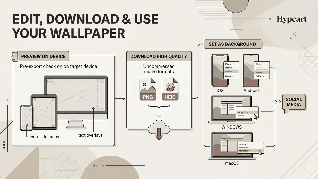
Finalizing a background requires previewing target device overlays, selecting uncompressed image file formats like PNG or HEIC, and applying proper OS display settings. Completing these validation steps ensures your finished desktop background or phone wallpaper maintains crisp clarity without scaling distortion. For last-mile retouching before export, browser-based online photo editors handle curve adjustments and scrim opacity without a desktop install.
The final phase of wallpaper creation converts raw visual designs into active operating system assets. Skipping final device checks can lead to unexpected subject cropping or obscured text overlays once set on active screens. Conducting a mock preview ensures visual elements line up smoothly with system hardware bounds.
Choosing appropriate file export formats prevents visual compression artifacts across high-density digital displays. Downloading native PNG files preserves crisp line work and accurate color saturation, and where the output is still short of native panel resolution, AI outpainting and image expansion tools can extend or enlarge the canvas before you commit. Applying correct display alignment settings within system preferences completes the workflow across desktop and mobile platforms.
Preview the wallpaper on the target device
Conducting a device preview allows designers to verify that lock-screen clocks, status bar icons, and home-screen widgets do not obscure primary subject imagery. Testing asset scaling prior to download ensures proper margin clearance and text readability across native hardware screen resolutions.
Before applying graphics system-wide, preview the artwork under active device UI overlays. Practical preview methods fall into three categories: overlay a lock-screen frame that marks the zones occupied by the clock, status bar, date, and shortcut icons; measure contrast specifically in the band behind the clock against both white and black clock text; and check that the exported file is not smaller than the native screen pixel count, since undersized assets are upscaled by the OS and read as soft. Note that Photoshop removed its built-in Device Preview feature in October 2017, so current workflows rely on browser-based safe-zone checkers or on simply testing the file on the handset itself.
Check that lock-screen clocks maintain high contrast against underlying background imagery, and confirm that any name or quote text still clears the widget stack when notifications are present rather than on an empty lock screen. That last detail catches more designs than anything else. If the preview reveals softness or banding, run the file through AI outpainting and image expansion tools or a dedicated upscaler before export rather than accepting OS-side interpolation.
Download a high-quality wallpaper and set it as your background
Downloading an uncompressed high-resolution file and applying it directly through native OS settings prevents visual artifacts caused by third-party compression. Preserving source file integrity guarantees your custom wallpaper displays sharp detail on desktop background screens and personal social media profile channels alike.
Save finalized files in uncompressed PNG format to maintain crisp image clarity; HEIC is an acceptable alternative on Apple platforms, and JPEG should be a last resort because re-saving compounds compression loss.
A final legibility pass is worth the minute it costs:
- iOS
- save the image to Photos, then apply it via Settings → Wallpaper → Add New Wallpaper, configuring independent lock screen and home screen variants so framing and readability stay intact on both.
- Android
- export at the device's native aspect ratio (1440×3120 px for current flagships, 1080×1920 px as a universal safe size) and apply through Wallpaper & style → Change wallpaper.
- Windows
- open Settings → Personalization → Background and choose "Fill" or "Fit" to prevent image stretching; author at the display's native resolution in 16:9 or 16:10.
- macOS
- use System Settings → Wallpaper, and supply Retina-class dimensions so the image is not interpolated upward on high-density panels.
- Social media
- upload the largest source file you have, because platform-side re-encoding is unavoidable and starting from a compressed copy compounds the loss. If the source and target ratios differ, crop deliberately before upload instead of allowing the platform to stretch or auto-crop.
«A readability visualization tool reveals zones with insufficient contrast and font size directly on the page, allowing problems to be fixed before publication.»
The same principle applies to wallpapers with typography: inspect the finished file for low-contrast regions and undersized lettering before you install it, not after you have looked at it for a week.
Pre-export checklist
Run this list once before every download. It takes under two minutes and catches the defects that are expensive to fix after installation.
Checklist0 / 14
FAQ about making custom wallpapers online
How can I make a custom wallpaper for free online?
You can make a custom wallpaper for free by using browser-based wallpaper makers like Canva, Adobe Express, Fotor, Picsart, or NightCafe. These platforms allow you to upload personal photos, apply stock templates, edit color settings, or generate AI artwork, and export high-resolution wallpaper files without requiring payment. NightCafe lets you start generating with free daily credits before creating an account, while Canva and Adobe Express tie free AI generations to a signed-in account and a credit allowance.
What is the best wallpaper size for iPhone and desktop monitors?
Modern iPhones typically use a vertical wallpaper canvas of 1290×2796 pixels (roughly 19.5:9 to 20:10 aspect ratio, with current models ranging from 1170×2532 to 1320×2868). Widescreen desktop monitors require horizontal resolutions of 1920×1080 (Full HD), 2560×1440 (QHD) or 3840×2160 (4K UHD) at a 16:9 aspect ratio, 5120×2880 for 5K panels, and 3440×1440 for 21:9 ultrawide displays.
How do I make text readable on a photo wallpaper?
To keep text readable over complex photos, apply a semi-transparent dark overlay scrim starting around 30% opacity and add a subtle Gaussian blur to the background image behind the text. Maintaining high luminance contrast, at least 4.5:1 for normal text and 3:1 for large text, ensures typography remains clear over detailed graphics, and a soft drop shadow adds letter separation where the underlying image must stay visible.
Can I create an AI wallpaper without design experience?
Yes. AI wallpaper generators convert simple text prompts into original visual artwork. By entering descriptive phrases specifying the subject, style, lighting, and aspect ratio, the generator synthesizes polished background designs in seconds without requiring manual illustration skills. Several tools also accept voice input and non-English prompts, and most return several candidates per generation so you can pick the best framing.
Can I turn my own photo into an AI wallpaper?
Yes, that is image-to-image generation. Upload the photo as a reference, set denoising strength or image weight between 0.4 and 0.6 to keep the original subject contours, and match the reference aspect ratio to the target screen so the model does not warp the framing. The result keeps your composition but adopts an entirely new style, such as oil painting, cyberpunk, or 3D render.
Can I make a live or animated wallpaper?
Yes. Export a seamless motion loop as MP4 or WebM at 30 FPS using H.264 or HEVC at 1080p or 4K, then apply it through Lively Wallpaper on Windows or the native live-wallpaper option on iOS and Android. Keep motion in secondary layers, hold focal points static behind the clock zone, verify the loop seam frame-by-frame, and test battery drain before adopting it permanently.
How do I upscale a wallpaper to 4K without losing detail?
Generate or edit at the model's comfortable native size first, remove unwanted objects and clean the background, then run super-resolution as the final step. Upscaling before retouching amplifies the artefacts you were about to delete. Avoid enlarging small JPEGs, because the missing detail cannot be recovered, only invented.
Is it safe to upload personal photos to a free wallpaper maker?
Treat it as a data decision. Check the retention and model-training clauses, strip EXIF metadata that may carry GPS coordinates, and never upload confidential, client-owned, or regulated imagery to an unvetted free tool. For corporate devices, route the request through whatever approval process your organisation uses for third-party SaaS.
What sizes and ratios do online generators usually support?
Common presets are 1:1, 3:4, 4:3, 9:16, and 16:9, which cover square social assets, tablets, phones, and widescreen desktops. Some tools additionally match the dimensions of an uploaded reference image, which is the fastest way to get an exact device fit.
Appendix A: superseded notes, methodology and verification