Positioning an image directly beside text is a fundamental building block of modern web development. Whether you are building media cards, aligning product thumbnails, or wrapping descriptive paragraphs around an illustration, the right combination of HTML elements and CSS layout properties keeps your web pages visual, structured and accessible on every screen size.
The frustrating part is that four different CSS models can produce a visually similar result, and only one of them is correct for your specific case. Pick wrong, and the layout breaks at 360 pixels wide.
Which layout method should you use?
| Your goal | Use this | One-line snippet |
|---|---|---|
| Image and text block side by side (cards, list rows) | Flexbox | display: flex; gap: 16px; align-items: center; |
| Paragraph text flowing around an image (magazine style) | Float | float: left; margin-right: 16px; |
| Multi-column or multi-row structured sections | CSS Grid | display: grid; grid-template-columns: 200px 1fr; |
| A small icon on the same text line | Inline plus vertical-align | vertical-align: middle; |
| Text rendered on top of an image (hero, caption) | Relative and absolute positioning | position: relative parent, position: absolute text |
Three decisions to make before you write any CSS
Most alignment bugs are decided before the first declaration is typed. Settle these three questions first:
- Does the text need to wrap around the image contour, or just sit beside it?True wrapping (lines shortening around the picture, then returning to full width) only comes from
float. Everything else places two rectangles next to each other. - What must the source order be?Screen readers and keyboard focus follow the DOM, not your visual columns. Decide the semantic order once, then move pixels with CSS.
- What happens at 320 CSS pixels?Every method in this guide needs a stacking fallback. Build that fallback first and the desktop row second.
How to put an image next to text in HTML: the basic markup
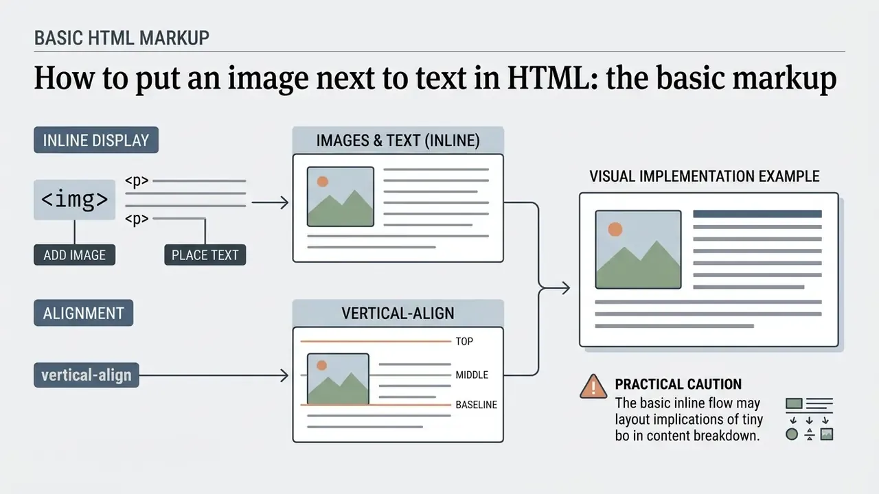
Placing an image next to text in HTML starts with browser display defaults for inline and block elements. By default the img tag behaves as an inline-replaced element, so simple text sits on the same baseline without any CSS framework at all.
«By default
<img>is an inline-level element: the browser lays it out inside the text line instead of creating a new block.»
A <div>, by contrast, is a block-level element: it starts on a new line and consumes the full available width. That single difference explains the most common beginner problem, where text drops below the image instead of sitting next to it.
Add an image using the img tag
The img tag embeds visual assets into an html file, and the src attribute declares the image path. Pair every img src declaration with a descriptive jpg alt attribute, which supplies fallback content when the media fails to load and gives screen readers something to announce. Preparing assets in a photo editor before export keeps file sizes predictable and dimensions stable inside the layout. If the shot still needs a cleaner backdrop, the routine steps are covered in how to change the background of a picture, and mobile shooters can follow how to change photo background on iphone before the file ever reaches your repository.
<img src="example.jpg" alt="html image next to text" width="200" height="150">
Always declare width and height (or reserve the space in CSS) so the browser can allocate the correct box before the file finishes downloading. This is the cheapest Cumulative Layout Shift fix available.
Place text beside an image with inline elements
Inline arrangement puts short text fragments next to an image inside a shared block container, such as a paragraph or a div tag. Because inline elements flow horizontally across the line box, short content naturally sits beside the image until the line runs out of room.
<p>
  <img src="icon.jpg" alt="html image next to text" width="32" height="32">
  This text aligns next to the image on the same horizontal line.
</p>
Visual implementation example
<!-- Basic inline layout example -->
<div class="inline-container">
  <img src="thumb.jpg" alt="html image next to text" width="100" height="100">
  <span>Sample descriptive text rendered directly next to the image.</span>
</div>
<!-- Live visual preview component -->
<div style="border: 1px solid #ccc; padding: 12px; display: block; background-color: #f9f9f9; border-radius: 4px;">
  <img src="thumb.jpg" alt="Media thumbnail" width="60" height="60"
       style="vertical-align: middle; margin-right: 8px; background-color: #e0e0e0;">
  <span style="font-family: sans-serif; font-size: 14px; color: #334155;">Inline text positioned horizontally adjacent to the media element.</span>
</div>
The vertical-align: middle declaration in that preview is not decorative. It is the property that decides exactly where the inline image sits relative to the text line, and the next section walks through every value you can use.
Align inline images vertically with text using vertical-align
When you drop an <img> tag straight into a line of text, browsers align the bottom edge of the image to the text baseline. That default leaves a few pixels of visible descender space below the image, which usually reads as a misalignment next to icons or badges. The CSS vertical-align property fixes the relationship without Flexbox:
/* Center the image against the middle of the lowercase text */
.inline-img-middle {
  vertical-align: middle;
}
/* Align the image top with the tallest element on the line */
.inline-img-top {
  vertical-align: top;
}
/* Explicit default: image bottom sits on the text baseline */
.inline-img-baseline {
  vertical-align: baseline;
}
/* Fine-tuned nudge for icon fonts and small badges */
.inline-img-nudge {
  vertical-align: -0.15em;
}
<p>
  <img src="icon.jpg" alt="Icon" class="inline-img-middle" width="24" height="24">
  This text is vertically centered with the image icon.
</p>
<p>
  <img src="icon.jpg" alt="Icon" class="inline-img-top" width="24" height="24">
  This text aligns with the top edge of the image box.
</p>
vertical-align value | Rendering behaviour | Typical use case |
|---|---|---|
baseline (default) | Image bottom sits on the text baseline | Legacy default; leaves a descender gap |
middle | Image centre aligns with the middle of lowercase text | Inline icons, flags, avatars, rating stars |
top | Image top aligns with the top of the line box | Tall images inside short captions |
bottom | Image bottom aligns with the bottom of the line box | Footnote markers, inline logos |
text-top / text-bottom | Aligns with the parent font's top or bottom | Precise typographic control |
Length or % (for example -0.15em) | Manual offset from the baseline | Optical correction for icon sets |
Older tutorials achieved the same effect with the deprecated align="middle" attribute on the <img> tag. Modern documents must express it in CSS, and the legacy refactoring table further down maps every attribute to its replacement.
Use CSS Flexbox to align text next to an image
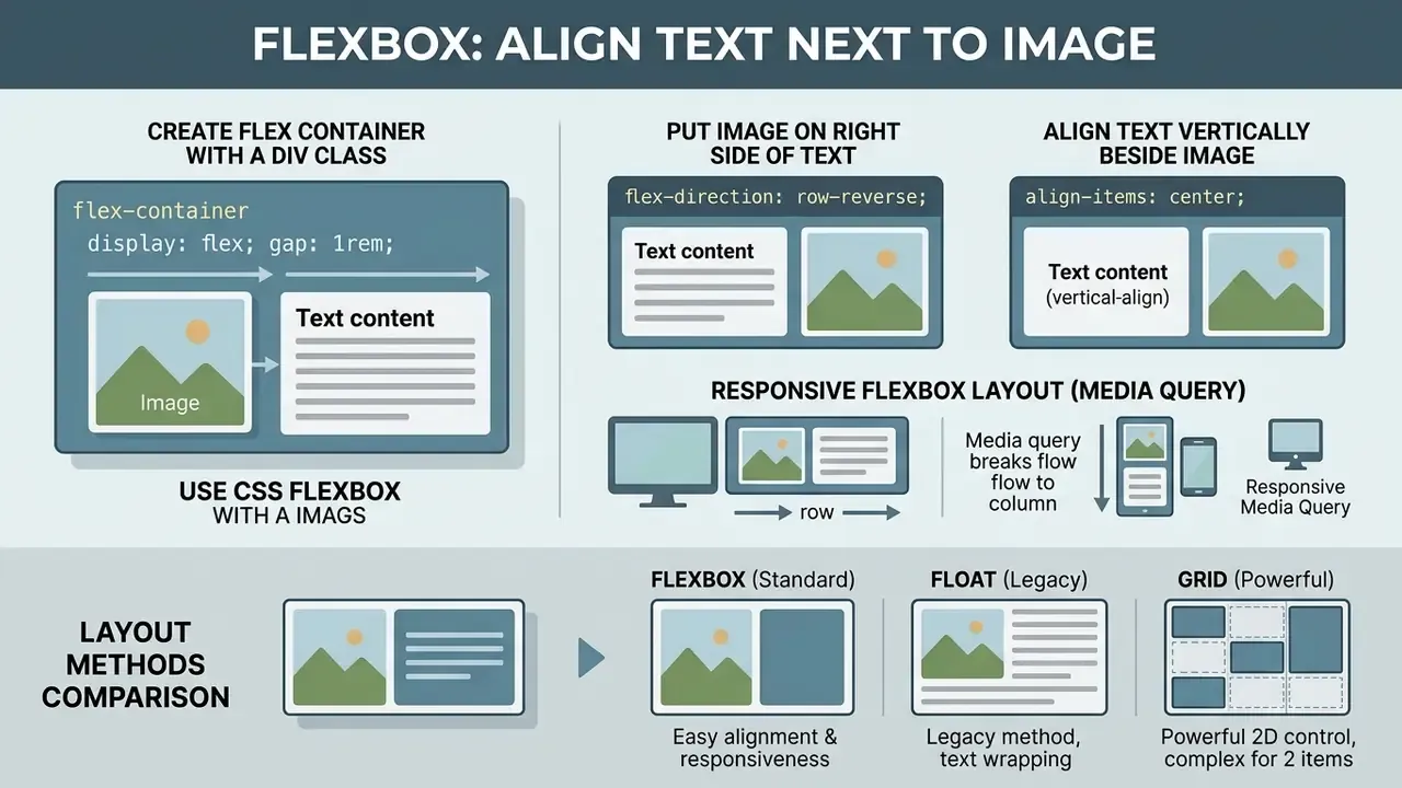
CSS Flexbox is the standard one-dimensional layout system for aligning text next to an image inside a shared wrapper. Setting display: flex establishes a flex container and hands you direct control over alignment, spacing and visual order, without breaking element flow.
«The flex container establishes a new formatting context: floats do not intrude into it, and items are aligned along the main and cross axes.»
Alignment in Flexbox is always declared on the container, never on the children. justify-content distributes items along the main axis; align-items aligns them along the cross axis. Remember that one rule and half of the confusion disappears.
Create a flex container with a div class
Make the Flexbox layout responsive with a media query
A two-column media row that looks composed on a 27-inch monitor will squeeze text into unreadable ribbons on a 360 pixel phone. Build the component mobile-first, stacked by default, then switch to a horizontal row only when there is room:
/* Responsive mobile-first reflow */
.media-card {
  display: flex;
  flex-direction: column;   /* Stacked on phones */
  gap: 16px;
}
/* Switch to side-by-side on tablet screens and above */
@media (min-width: 768px) {
  .media-card {
    flex-direction: row;
    align-items: center;
  }
  .media-card img {
    width: 200px;
  }
}
Prefer a breakpoint-free solution? Let the items wrap on their own terms:
.media-card-fluid {
  display: flex;
  flex-wrap: wrap;
  gap: 16px;
}
.media-card-fluid .media-content {
  flex: 1 1 320px;   /* Wraps to a new line below 320px of available space */
}
Confirm the component reflows cleanly at 320 CSS pixels with no horizontal scrolling, and that text stays readable at 200% zoom. Both are explicit WCAG reflow and resize expectations, not stylistic preferences.
Align text vertically beside the image
Vertical positioning is controlled by align-items on the flex container. align-items: center centres the text block against the vertical axis of the image, while flex-start and flex-end pin content to the top or bottom edge.
.media-card {
  display: flex;
  align-items: center; /* Options: flex-start, center, flex-end, stretch, baseline */
  gap: 20px;
}
Use align-items: flex-start when the text block is much taller than the image, as in article teasers. Use center for equal-weight card rows. Use baseline when a heading beside an icon must share the same typographic baseline. For specialised media preparation, such as isolating a subject or swapping a backdrop before it enters the layout, a free photo editor handles the routine cropping, background and compression steps.
Put the image on the right side of the text
To move an image to the right side while keeping a logical source order for screen readers, apply flex-direction: row-reverse to the container. The CSS order property on individual children does the same job with more granularity.
.media-card-reverse {
  display: flex;
  flex-direction: row-reverse;
  align-items: center;
  gap: 16px;
}
/* Order-based alternative, same DOM, different visual sequence */
.media-card-ordered { display: flex; gap: 16px; }
.media-card-ordered img { order: 2; }
.media-card-ordered .media-content { order: 1; }
One caveat, documented by the W3C: order and row-reverse change visual order only. Keyboard navigation and screen-reader reading order still follow the DOM. So never use them to paper over a genuinely wrong source order. Fix the HTML instead.
Layout comparison: Flexbox vs float vs Grid
| Layout method | Alignment axis | Text wrapping support | Setup complexity | Primary web development use case |
|---|---|---|---|---|
| Flexbox | One-dimensional (row or column) | No (wraps items across flex lines, not text lines) | Low | Aligning media thumbnails side by side with text blocks inside components. |
| Float | Inline content flow | Yes (text lines wrap around the image box) | Low, but requires clearing | Flowing multi-paragraph body text around inline illustrations or callouts. |
| Grid | Two-dimensional (rows and columns) | No (items occupy distinct grid cells) | Medium | Building complex multi-column cards, page sections and dashboard panels. |
Inline plus vertical-align | Baseline of a single line box | No (only the first line stays beside the image) | Very low | Icons, badges and avatars inside a sentence. |
| Relative and absolute overlay | Free positioning inside a container | No (text sits on top of the image) | Medium | Hero banners, captions and labels drawn over media. |
«Creators who invest time in understanding layout fundamentals consistently produce more professional results. The technical knowledge of how elements relate spatially is as important as the creative vision itself.»
If you are still choosing between component patterns for a whole page, our AI Media Comparison hub lays out the trade-offs side by side, and the calculators section helps estimate asset volume before you commit to a grid density.
Wrap text around an image with CSS float
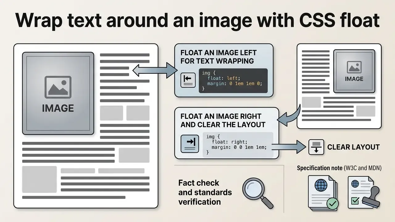
The CSS float property pulls an image out of normal block layout so running text lines flow around its boundary. Modern structural layout belongs to Flexbox and Grid, yet floating is still the only technique that produces true text wrapping around images.
«The
floatCSS property places an element on the left or right side of its container, allowing text and inline elements to wrap around it.»
MDN is explicit that float was designed for magazine-style image wrapping and is not recommended as a general page-layout mechanism. That role now belongs to Flexbox and Grid.
Float an image left for text wrapping
float: left pushes the image against the left container margin. Surrounding text wraps around its right side, buffered by an explicit right margin so the copy never touches the graphic edge.
.float-left-image {
  float: left;
  margin-right: 16px;
  margin-bottom: 12px;
  max-width: 100%;
  height: auto;
}
Here is a complete working example with real multi-paragraph body copy, so you can see the wrap effect immediately:
<article class="clear-container">
  <img src="illustration.jpg" alt="Diagram of a floated image layout"
       class="float-left-image" width="220" height="160">
  <p>
    This first paragraph wraps around the right-hand side of the floated image.
    Because the image has been removed from normal block flow, every line box in
    this paragraph is shortened by the image width plus its right margin.
  </p>
  <p>
    The second paragraph continues wrapping until the bottom edge of the image is
    passed, after which line boxes return to the full container width, exactly the
    behaviour you see in newspaper and magazine columns.
  </p>
</article>
/* Keep the float contained and readable on small screens */
@media (max-width: 600px) {
  .float-left-image {
    float: none;
    display: block;
    margin: 0 auto 16px;
  }
}
Float an image right and clear the layout
float: right shifts the image to the right side and forces paragraph text to wrap along its left boundary. To stop later sections from creeping into the floated area, clear the flow with clear: both, or give the parent container display: flow-root.
.float-right-image {
  float: right;
  margin-left: 16px;
  margin-bottom: 12px;
}
.clear-container {
  display: flow-root; /* Establishes a new block formatting context */
}
/* Legacy-compatible fallback if flow-root support is a concern */
.legacy-clearfix::after {
  content: "";
  display: block;
  clear: both;
}
The clear property accepts none, left, right, both and inherit. Use clear: both on the element that must begin below every preceding float. Use display: flow-root on the wrapper when the container collapses to zero height because all of its children float. The old <br clear="all"> pattern from 1990s tutorials does the same job and should be refactored out of any maintained codebase.
Fact check and standards verification
Arrange image and text with CSS Grid
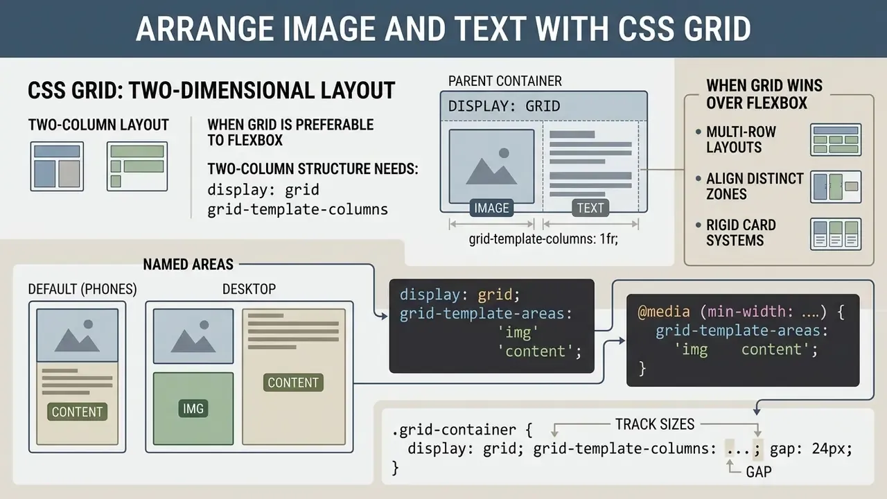
CSS Grid gives you a two-dimensional layout framework for web pages. Grid earns its place when media elements and textual content must line up precisely across explicit columns and rows inside structured page components.
«Grid layout is a two-dimensional layout system: items are aligned across rows and columns simultaneously, unlike one-dimensional flexbox.»
Build a two-column image and text layout
A two-column structure needs display: grid on the parent container plus track sizes in grid-template-columns. Mixing fractional units (1fr) with fixed lengths keeps the scaling predictable.
<div class="grid-container">
  <img src="banner.jpg" alt="html image next to text" width="200" height="200">
  <div class="grid-text">
    <h2>Grid section title</h2>
    <p>Grid structures two-dimensional content across strict columns and rows.</p>
  </div>
</div>
.grid-container {
  display: grid;
  grid-template-columns: 1fr;   /* Single column on phones */
  gap: 24px;
  align-items: start;
}
@media (min-width: 768px) {
  .grid-container {
    grid-template-columns: 200px 1fr; /* Fixed media column, fluid text */
  }
}
The same structure reads better with named areas, and reordering becomes trivial:
.grid-named {
  display: grid;
  grid-template-areas:
    "img"
    "content";
  gap: 20px;
}
@media (min-width: 768px) {
  .grid-named {
    grid-template-areas: "img content";
    grid-template-columns: 220px 1fr;
  }
}
.grid-named img { grid-area: img; }
.grid-named .grid-text { grid-area: content; }
When Grid is preferable to Flexbox
Grid wins over Flexbox when you manage multi-row layouts, align distinct content zones, or build rigid card frameworks where image and text boundaries must line up vertically across many card instances. Flexbox is content-out and sizes items along one axis. Grid is layout-first and drops content into predefined slots, which is precisely what a repeating image-plus-text card grid needs.
.card-grid {
  display: grid;
  grid-template-columns: repeat(auto-fit, minmax(280px, 1fr));
  gap: 20px;
}
/* Auto-fit responsive media grid without a single media query */
.responsive-grid {
  display: grid;
  grid-template-columns: repeat(auto-fit, minmax(250px, 1fr));
  gap: 20px;
}
.responsive-grid img {
  width: 100%;
  height: auto;
  aspect-ratio: 4 / 3;
  object-fit: cover;   /* Preserves proportions inside the cell */
}
Scaffolding an entire page rather than a single component? The patterns in how to create a website with ai show how generated markup usually needs a grid pass before it survives real content.
«Flexbox and Grid are the central tools of modern layout; browser vendors now use developer survey data directly in the Interop initiative.»
«For web developers, understanding how AI-generated images integrate into HTML and CSS layouts is increasingly important. Images need to be properly sized, formatted and attributed within Flexbox, Grid or float-based approaches.» Source: Dreamina Editorial Team, via Superbase, AI Media Tool Evaluation Framework.
Rendering and delivery numbers for generated assets sit in our AI Media Benchmarks; pipeline integration details live in the AI Media API Guides; and licence questions for client work are covered in AI Media Commercial-Use.
How to position text over an image (text overlay)
Side-by-side is not the only intent behind “image and text together”. Hero headers, promotional cards and photo captions often need text drawn on top of the image. That is the one legitimate use of absolute positioning here: a positioned container plus absolutely positioned text layers.
<div class="image-overlay-container">
  <img src="hero.jpg" alt="Mountain landscape at sunrise" class="overlay-media"
       width="1200" height="600">
  <div class="overlay-text centered">
    <h2>Card headline</h2>
    <p>Text rendered over the media graphic.</p>
  </div>
  <div class="overlay-text bottom-left">Bottom left</div>
  <div class="overlay-text top-right">Top right</div>
</div>
.image-overlay-container {
  position: relative;      /* Positioning context for the text layers */
  width: 100%;
  max-width: 600px;
  text-align: center;
  color: #ffffff;
}
.overlay-media {
  width: 100%;
  height: auto;
  display: block;          /* Removes the inline descender gap */
}
.overlay-text { position: absolute; }
.centered {
  top: 50%;
  left: 50%;
  transform: translate(-50%, -50%);
}
.bottom-left { bottom: 8px; left: 16px; }
.top-left    { top: 8px;    left: 16px; }
.top-right   { top: 8px;    right: 16px; }
.bottom-right{ bottom: 8px; right: 16px; }
Three practical requirements for accessible overlays:
.overlay-text h2 {
  font-size: clamp(1.1rem, 4vw, 2rem);
  text-shadow: 0 1px 3px rgba(0, 0, 0, .6);
}
Use position: absolute for text overlay elements only. For side-by-side positioning, stay with Flexbox or CSS Grid. When the same captioned stills later become motion assets, the sequencing notes in how to create a video with pictures keep the safe-area margins consistent with your web layout.
- Contrast.Text over photography rarely passes WCAG contrast on its own. Add a scrim:
background: linear-gradient(transparent, rgba(0,0,0,.6));on a wrapper, orbackground-color: rgba(0,0,0,.45);on the text layer. - Decorative versus informative media.If the headline lives in the HTML, the photograph behind it is usually decorative, and
alt=""is then correct. If the image itself carries meaning, describe it. - Small screens.Absolutely positioned text does not reflow. Scale
font-sizewithclamp()and test at 320 pixels so the overlay never overflows the image box.
Add accessible image text with src and alt attributes
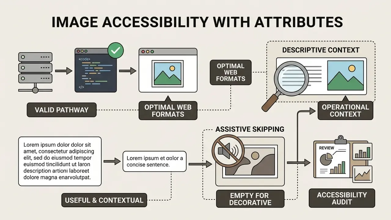
Accessibility and search visibility both lean hard on accurate image markup. Large-scale automated audits show how widespread the failure still is:
«Across 1,000,000 home pages, 55.6 million images were detected and 21.6% of them were missing alternative text; over a quarter of image links had no descriptive text.»
When adding images, hold to these standards:
- Always supply a valid pathway in the
srcattribute, and export web-optimised formats (WebP, JPEG, PNG) so the layout is never blocked by oversized files. - Write descriptive text in the
jpg altattribute that conveys the operational context of the image. WCAG technique H37 requires the alternative to carry the same meaning, including any important words rendered inside the graphic. - Reserve empty alt text (
alt="") for purely decorative graphics, so assistive technology can skip them. - Keep alt text useful and contextual rather than keyword-stuffed. Google's image SEO guidance treats over-optimised alt strings as unhelpful.
For hosting and delivery, see how to create a permanent asset URL for robust CDN delivery.
During one accessibility review (illustrative composite, not a client disclosure), a team found roughly 1,200 dynamic media cards shipping without alternative text. The fix was two-part: an automated DOM validation script in continuous integration, plus stricter CMS field requirements for editors. Missing-alt regressions stopped reaching production after that. Teams automating this kind of repetitive audit often script it with lightweight assistants, and how to create ai agents covers the guardrails such a helper needs: a defined owner, limited access, an audit trail and a shutdown path.
«95.9% of one million analysed home pages contained detectable WCAG 2 failures, and missing alternative text was present on 54.5% of pages.»
Implementation verification checklist
Checklist0 / 7
«Accessibility compliance isn't just ethical. It is increasingly a legal requirement in many jurisdictions, and it directly affects SEO performance.»
Common HTML and CSS mistakes when placing text next to image
Most image-text layout errors trace back to two things: misreading CSS display roles, or skipping the clearing rules. Avoid these failure patterns and cross-browser rendering stays boring, which is the goal.
- Expecting block elements to sit inline. Wrapping an image in a default
<div>with no CSS alignment pushes the adjacent paragraph onto a new line, because<div>is block-level by default.- Omitting float clearing. Unclear floats collapse the parent container to zero height, and footer content then overlaps the image. Fix it with
clear: bothon the following element, ordisplay: flow-rooton the wrapper.- Missing image dimensions. Without width and height constraints, an oversized file overflows its container and shoves text off-screen. Add
max-width: 100%; height: auto;and reserve intrinsic dimensions in the markup. When the source file is genuinely too small for the slot you designed, upscale it properly instead of stretching it in CSS: an AI image expander or upscaler preserves the edge detail that browser interpolation destroys.«Responsive images should be constrained with
max-width: 100%andheight: auto, withobject-fitpreserving proportions inside fixed containers.»
- Using absolute positioning for basic side-by-side alignment. Applying
position: absoluteto place a text block beside media breaks document flow and produces overlapping text on narrow screens. Clarification worth repeating: absolute positioning is the wrong tool for side-by-side layouts and the right tool for text overlays drawn on top of an image, where the parent carriesposition: relative. - Relying on empty-space hacks. Repeated non-breaking spaces (
&nbsp;) or hard-coded pixel margins instead of CSSgapproduce brittle web pages and unpredictable text formatting. - Mixing
floatinside a flex container. Floats do not intrude into a flex formatting context, sofloat: lefton a flex item silently does nothing. One layout model per component, please. - Forgetting the inline image descender gap. An
<img>inside a container leaves a few pixels below it because it sits on the text baseline. Fix withdisplay: block,vertical-align: middle, orline-height: 0on the parent.
Refactoring legacy HTML image alignment attributes to CSS
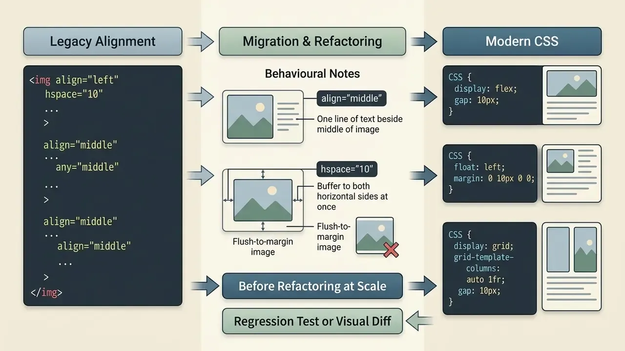
Legacy codebases, CMS templates and HTML email layouts still lean on presentational attributes to align images next to text. align, hspace, vspace and <br clear> arrived in the HTML 3.2 era and were deprecated in HTML 4.0. Browsers still render many of them, but modern standards expect CSS equivalents. Keep this table nearby when you inherit old markup:
| Legacy HTML attribute | Deprecated syntax | Modern CSS replacement |
|---|---|---|
align="left" | <img src="a.jpg" align="left"> | float: left; or display: flex; |
align="right" | <img src="a.jpg" align="right"> | float: right; or flex-direction: row-reverse; |
align="middle" / absmiddle | <img src="a.jpg" align="middle"> | vertical-align: middle; |
align="top" / texttop | <img src="a.jpg" align="top"> | vertical-align: top; or text-top; |
align="bottom" / baseline | <img src="a.jpg" align="bottom"> | vertical-align: bottom; or baseline; |
hspace="20" | <img src="a.jpg" hspace="20"> | margin-left: 20px; margin-right: 20px; |
vspace="20" | <img src="a.jpg" vspace="20"> | margin-top: 20px; margin-bottom: 20px; |
<br clear="left"> | <br clear="left"> | clear: left; on the following element |
<br clear="all"> | <br clear="all"> | display: flow-root; on the parent container |
border="0" | <img src="a.jpg" border="0"> | border: 0; |
width / height as styling | <img width="50%"> | Keep pixel width and height for CLS, size with CSS |
Two behavioural notes worth remembering during migration:
align="middle"only ever placed one line of text beside the middle of the image. Remaining lines dropped below it, which produced the jerky layout old tutorials warned about.vertical-align: middlereproduces that same single-line limitation, so move multi-line content to Flexbox instead.hspaceapplied the buffer to both horizontal sides at once, which made flush-to-margin images impossible. Individual CSS margins (margin-rightonly) finally solve that constraint.
Before refactoring at scale, wrap every converted block in a regression test or visual diff. Legacy attributes frequently masked missing clearing rules, and the breakage surfaces in a different section of the page than the one you edited.
FAQ: quick reference for image and text alignment
How do I keep text next to an image on mobile screens?
Use CSS Flexbox with responsive media queries. Start mobile-first with flex-direction: column, then switch to flex-direction: row inside @media (min-width: 768px) once there is enough horizontal room. Or skip the breakpoint entirely: flex-wrap: wrap with flex: 1 1 320px on the text block reflows automatically.
Why is my text appearing below the image instead of next to it?
Because the image or the text sits inside a block-level container (div or p) with no display: flex, display: grid or float applied. Block elements force a new line by default.
Should I use float or Flexbox to place an image next to text?
Use Flexbox when the image and the text block should sit side by side as separate components. Use float only when paragraph lines must flow and wrap around the image contour.
How do I align a small icon with the middle of a text line?
Keep the inline and apply vertical-align: middle. For pixel-perfect optical alignment with icon fonts, add a small negative length such as vertical-align: -0.15em.
How do I put text on top of an image instead of beside it?
Give the wrapper position: relative, give the image display: block; width: 100%, then position the text layer with position: absolute plus top and left offsets. For exact centring use top: 50%; left: 50%; transform: translate(-50%, -50%). Add a dark scrim behind the text to hold contrast.
Is the align attribute on still valid?
align attribute on still valid?No. align, hspace and vspace were deprecated in HTML 4.0 and removed from HTML5. Browsers may still honour them, but validators flag them, so use the CSS equivalents in the migration table above. The exception is HTML email, where patchy client support still justifies defensive inline attributes alongside inline CSS.
Why is there a gap below my image inside its container?
An inline sits on the text baseline, and the descender space beneath it stays visible. Set display: block on the image, or vertical-align: middle, or line-height: 0 on the parent.
Which method is best for repeating cards with an image and text?
CSS Grid with repeat(auto-fit, minmax(280px, 1fr)). It keeps image and text boundaries aligned across every row without a single media query, which Flexbox cannot guarantee once items start wrapping. Reviewed against the W3C CSS 2.2 Specification, CSS Flexible Box Layout Module Level 1, CSS Grid Layout Module, WCAG 2 technique H37 and MDN Web Docs. Accessibility statistics sourced from The WebAIM Million (2024). Footer navigation: Explore complete development workflows and layout implementation standards in our core hub, or review asset preparation options in the photo editor guide.