The short answer
Wrap an <img> and a text element inside one parent container, give the parent position: relative, and give the text position: absolute. Add a semi-transparent background (or a gradient scrim) behind the text so the contrast ratio stays at 4.5:1 or better. Set width: 100%; height: auto on the image to keep it responsive, then switch the overlay to position: static under 480px if the text starts to swallow the photo.
That is the whole trick. Use a server-side image API (ImageKit, Bannerbear) only when the text must be burned into a real bitmap file: Open Graph previews, email banners, or PDF exports that never execute CSS.
Pick the implementation before you write markup
Most overlay bugs are decisions, not syntax errors. Choose the row that matches your asset first, then copy the matching snippet from the sections below.
| Your scenario | Implementation | Why this one |
|---|---|---|
| Editorial photo with a caption on a web page | <figure> + <figcaption>, position: absolute | Caption stays indexable, selectable, and translatable |
| Marketing hero headline over a photograph | <div class="..."> wrapper with a scrim plate | The <h1> remains real text for search and screen readers |
| Purely decorative banner or texture | CSS background image on the container | No alt text needed, flexible sizing with cover |
| Price badge or discount tag on a product card | Real <span>, absolutely positioned | Commercially meaningful text must be readable by crawlers |
| Repeated ornamental ribbon across 200 cards | ::after with the content property | No extra DOM nodes, styling lives in one rule |
| Social preview, email banner, PDF export | Server-side image API | Crawlers and mail clients never run your stylesheet |
Keep that table nearby. Roughly half the questions developers ask about how to put text over an image HTML are actually questions about which of these six rows they are in.
How to overlay text on an image HTML with CSS
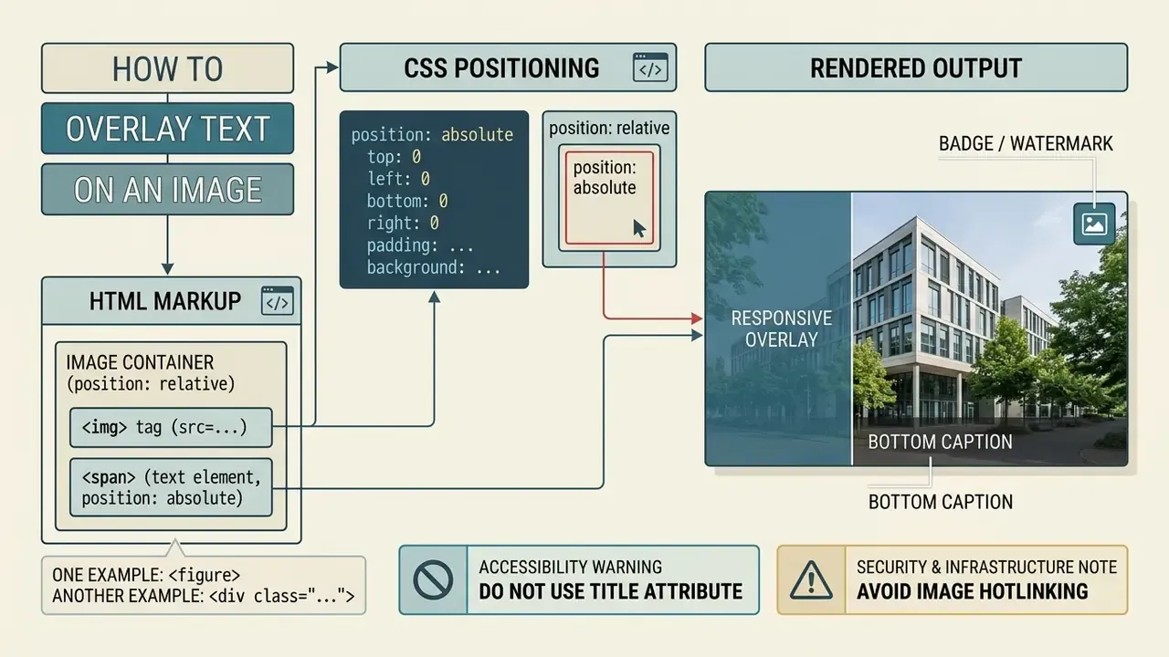
To overlay text on an image in HTML using CSS, wrap the <img> tag and the text element inside a parent container configured with position: relative, then assign position: absolute to the text element. This positioning framework removes the text layer from the normal document flow and anchors its coordinates directly to the parent container edges.
<!DOCTYPE html>
<html lang="en">
<head>
  <meta charset="UTF-8">
  <meta name="viewport" content="width=device-width, initial-scale=1.0">
  <title>How to Put Text Over an Image HTML Example</title>
  <style>
    .image-container {
      position: relative;
      width: 100%;
      max-width: 640px;
      margin: 0 auto;
    }
    .image-container img {
      width: 100%;
      height: auto;
      display: block;
    }
    .text-overlay {
      position: absolute;
      bottom: 1.5rem;
      left: 1.5rem;
      right: 1.5rem;
      padding: 1rem;
      background-color: rgba(0, 0, 0, 0.65);
      color: #ffffff;
      font-family: system-ui, -apple-system, sans-serif;
      font-size: 1.125rem;
      line-height: 1.4;
      border-radius: 4px;
    }
  </style>
</head>
<body>
  <figure class="image-container">
    <img src="/images/hero-overlay-demo.jpg"
         alt="how to put text over an image html"
         width="800"
         height="500">
    <figcaption class="text-overlay">
      How to overlay text on an image HTML using CSS position properties.
    </figcaption>
  </figure>
</body>
</html>
Save that as a single html file, open it in a browser, and you have a working answer to how to write text on image in html with example code. Nothing else required.
How the snippet works, line by line:
| Declaration | Element | Purpose |
|---|---|---|
position: relative | .image-container (<figure>) | Creates the positioning context that the overlay measures against. |
max-width: 640px; margin: 0 auto | .image-container | Caps the composition width and centers it in the page column. |
width: 100%; height: auto; display: block | img | Keeps the intrinsic aspect ratio and removes the inline baseline gap. |
width/height attributes | img | Reserve layout space and prevent cumulative layout shift (CLS). |
position: absolute + bottom/left/right | .text-overlay (<figcaption>) | Pins the caption to the lower band of the image container. |
background-color: rgba(0, 0, 0, 0.65) | .text-overlay | Stabilises luminance behind white glyphs for WCAG contrast. |
Implementing an image overlay using CSS gives you complete control over typography, responsiveness, and web accessibility. If you would rather composite the text directly into the pixels instead of the DOM, AI photo editors can bake captions into the raster file, but that output is invisible to crawlers and screen readers. Placing text inside actual HTML nodes lets search engines index the copy and lets screen readers parse the content naturally.
A pattern we keep running into in editorial codebases explains why the structure matters. Publishing templates that drop captions as loose inline elements next to an unsized <img> tend to accumulate cumulative layout shift and overlapping captions on narrow viewports. The fix is structural, not cosmetic: group the asset and its caption inside an explicit <figure> container with position: relative, bind the caption layer with position: absolute, declare width and height attributes on the image, and place a dark semi-transparent scrim behind the text. That refactor removes the unreserved-space problem behind the layout shift and brings contrast ratios into line with the W3C WCAG 2.2 Guidelines. (Note: figures for a specific named platform are not published, so treat this as an implementation pattern rather than a measured case study.)
The scale of the underlying problem is well documented at web-wide level:
So the overlay you ship today is, statistically speaking, more likely to fail contrast than to pass it. Worth checking before release.
HTML markup: image container, img src and text element
The standard semantic markup for an image overlay has three parts: a parent container element, an <img> tag with valid img src and alt attributes, and a block-level text node. Semantic containers such as <figure> or <div class="image-container"> group the visual asset and its associated text into a single logical DOM unit.
<div class="card-container">
  <img src="hero-banner.jpg" alt="Financial data analytics dashboard" class="card-image">
  <div class="card-text-overlay">
    <h2>Data Model Governance</h2>
    <p>Automated compliance tracking for enterprise systems.</p>
  </div>
</div>
Why <figure> in one example and a div class in the other? The choice is semantic, not stylistic. Use <figure> with <figcaption> when the image is editorial content and the overlay text is a caption that explains or labels that image; the pairing is defined for exactly that relationship in the W3C HTML specification. Use a neutral <div> wrapper when the "overlay" is really UI chrome: a marketing headline, a price badge, a CTA block, or a card title that would still make sense without the photo. Both wrappers need the same CSS (position: relative); only the meaning of the markup changes.
Keeping readable copy inside separate HTML text elements ensures screen readers announce the content correctly. According to W3C WAI Technique H37, text critical to understanding content must stay in real HTML nodes rather than being baked into raster image files. The same technique set (H37 together with G82) requires that non-text content carries a text alternative serving an equivalent function, which is why the alt attribute is never optional on a content image.
One more markup habit worth breaking: inline sizing. You will see tutorials that reach for style width attributes directly on the tag, as in <img src="hero.jpg" style="width: 100%">. It renders, sure. But it scatters layout decisions across the html file and makes responsive overrides painful, so keep sizing in the stylesheet and keep only width/height attributes on the element for CLS reservation.
CSS positioning with position relative and position absolute
The position relative declaration establishes a new positioning context for child elements without removing the parent container from the normal page layout. When a child element inside that container receives position absolute, its offset coordinates are calculated from the container padding box rather than the browser viewport.
/* Parent container establishes coordinate space */
.image-wrapper {
  position: relative;
  width: 100%;
}
/* Child layer anchors to parent boundaries */
.overlay-layer {
  position: absolute;
  top: 0;
  left: 0;
  width: 100%;
  height: 100%;
}
The W3C CSS Positioned Layout Module Level 3 defines absolutely positioned elements as out-of-flow boxes. Because the text box occupies no layout space in the parent container, the underlying <img> element determines the natural height and aspect ratio of the wrapper. If no ancestor carries a position value other than static, the absolute element falls back to the initial containing block, which is the classic reason an overlay suddenly jumps to the top-left of the viewport instead of sitting on the picture.
Seen it once, you will recognise it forever.
How to position text over an image: center, corners and bottom right
Positioning text over specific areas of an image means combining directional offset properties (top, right, bottom, left) with CSS 2D transforms or flexbox alignment. The relative container bounds the coordinate space, which lets you place text precisely across five primary anchor zones.
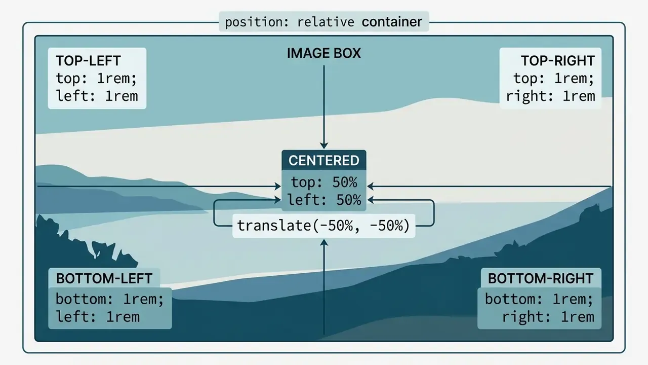
If you want the same map as a real vector illustration inside your documentation, the following inline SVG renders the five anchor zones natively in every modern browser:
<svg viewBox="0 0 400 225" role="img" aria-label="Five CSS text overlay anchor zones over one image container" width="400" height="225">
  <rect x="1" y="1" width="398" height="223" fill="#0f172a" stroke="#94a3b8"/>
  <rect x="12" y="12" width="96" height="24" fill="#2563eb"/><text x="20" y="29" fill="#fff" font-size="12" font-family="system-ui">Top Left</text>
  <rect x="292" y="12" width="96" height="24" fill="#2563eb"/><text x="300" y="29" fill="#fff" font-size="12" font-family="system-ui">Top Right</text>
  <rect x="150" y="100" width="100" height="26" fill="#dc2626"/><text x="168" y="118" fill="#fff" font-size="12" font-family="system-ui">Centered</text>
  <rect x="12" y="189" width="110" height="24" fill="#2563eb"/><text x="20" y="206" fill="#fff" font-size="12" font-family="system-ui">Bottom Left</text>
  <rect x="278" y="189" width="110" height="24" fill="#2563eb"/><text x="286" y="206" fill="#fff" font-size="12" font-family="system-ui">Bottom Right</text>
</svg>
Choosing the right overlay position depends on visual density, focal points, and interface context. Corner badges suit metadata tags. Centered text fits hero banners and call-to-action blocks. And a caption anchored bottom right reads as attribution, which is why watermarks almost always live there.
Centered text overlay with text align center
Two-axis centering over an image comes from combining percentage offsets with transform: translate(-50%, -50%). Setting top: 50% and left: 50% moves the element anchor point to the center of the container, and the translate shifts the element back by half its own width and height.
.centered-overlay {
  position: absolute;
  top: 50%;
  left: 50%;
  transform: translate(-50%, -50%);
  text-align: center;
  width: 80%;
  background-color: rgba(0, 0, 0, 0.7);
  color: #ffffff;
  padding: 1.5rem;
}
Applying text align center keeps multi-line blocks aligned along their horizontal center axis. Alternatively, you can align center on the parent container with Flexbox by declaring display: flex; justify-content: center; align-items: center;. The W3C centering guide documents both routes: text align handles inline content horizontally only, while the absolute-plus-translate and flexbox patterns handle both axes.
Which to pick? Flexbox when the container has a known height and several stacked children. Absolute plus translate when the text is a single floating plate over a photo of unpredictable height.
Text in the corners and bottom right of an image
Anchoring text to a specific corner requires absolute positioning plus two adjacent boundary offsets. Setting bottom: 0 and right: 0 places the text element flush against the lower-right edge of the image container.
/* Top Left Corner */
.overlay-top-left {
  position: absolute;
  top: 1rem;
  left: 1rem;
}
/* Top Right Corner */
.overlay-top-right {
  position: absolute;
  top: 1rem;
  right: 1rem;
}
/* Bottom Left Corner */
.overlay-bottom-left {
  position: absolute;
  bottom: 1rem;
  left: 1rem;
}
/* Bottom Right Corner: attribution, watermarks, timestamps */
.overlay-bottom-right {
  position: absolute;
  bottom: 1rem;
  right: 1rem;
}
Inner padding keeps glyphs from touching dark image edges. Positive pixel or rem offsets create balanced margins between the text container and the outer frame. Note that bottom and right have no effect on a non-positioned element, so the text node must receive position absolute before any offset applies. That single omission explains a surprising share of "my badge is in the wrong place" tickets.
The all-in-one five-position master snippet
If you want one block to copy once and adapt later, the snippet below renders all five anchor zones over a single image: four corners plus a centered plate. Every position inherits the same visual styling from .overlay-node, so only the coordinates change.
<div class="overlay-grid-container">
  <img src="landscape.jpg" alt="how to overlay text on image in html positioning map" width="800" height="450">
  <div class="overlay-node pos-top-left">Top Left</div>
  <div class="overlay-node pos-top-right">Top Right</div>
  <div class="overlay-node pos-center">Centered</div>
  <div class="overlay-node pos-bottom-left">Bottom Left</div>
  <div class="overlay-node pos-bottom-right">Bottom Right</div>
</div>
.overlay-grid-container {
  position: relative;
  width: 100%;
  max-width: 800px;
  margin: 0 auto;
}
.overlay-grid-container img {
  width: 100%;
  height: auto;
  display: block;
}
.overlay-node {
  position: absolute;
  background-color: rgba(15, 23, 42, 0.85);
  color: #ffffff;
  padding: 0.5rem 0.85rem;
  font-size: 0.875rem;
  font-family: system-ui, sans-serif;
  border-radius: 4px;
}
/* Positioning rules */
.pos-top-left     { top: 1rem; left: 1rem; }
.pos-top-right    { top: 1rem; right: 1rem; }
.pos-bottom-left  { bottom: 1rem; left: 1rem; }
.pos-bottom-right { bottom: 1rem; right: 1rem; }
.pos-center       { top: 50%; left: 50%; transform: translate(-50%, -50%); }
Delete the anchor nodes you do not need and keep the rest. The container rules never change, because all five positions share one positioning context. Teams building repeatable visual pipelines, for instance when they document how to create an ai model card gallery, usually ship this as a single design-system component rather than five separate ones.
Add text to an image in HTML using CSS background-image
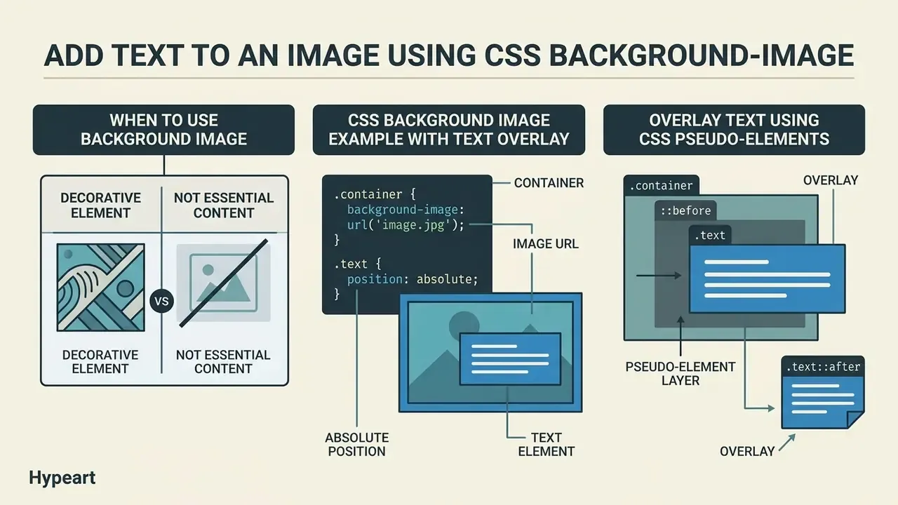
Another way to add text on image in html: assign the file path to a container background image instead of placing an <img> element in the markup. Child text elements rendered inside that container sit naturally on top of the background layer, no absolute positioning required.
<div class="hero-banner">
  <div class="hero-content">
    <h1>Enterprise Risk Controls</h1>
    <p>Deploy compliant AI models with automated audit trails.</p>
  </div>
</div>
.hero-banner {
  background-image: url('/images/hero-abstract-gradient.jpg');
  background-size: cover;
  background-position: center;
  background-repeat: no-repeat;
  min-height: 400px;
  display: flex;
  align-items: flex-end;
  padding: 2rem;
}
.hero-content {
  background-color: rgba(15, 23, 42, 0.85);
  color: #ffffff;
  padding: 1.5rem;
  border-radius: 6px;
  max-width: 600px;
}
This approach simplifies markup for dynamic layout sections, card grid headers, and background banners. Abstract or textured backdrops for such sections are frequently produced with AI image generators, since decorative backgrounds carry no informational load and therefore need no alt text. If you are still shortlisting tools for that job, our compare hub covers the current options side by side.
When to use background image instead of img src
| Feature / Requirement | Native <img> element | CSS background-image |
|---|---|---|
| Primary use case | Editorial content and diagrams | Decorative banners and backgrounds |
| Accessibility (alt text) | Native alt attribute supported | No native alt attribute support |
| Search engine indexing | Indexed by web crawlers | Ignored by image search crawlers |
| Exposure to assistive tech | Announced by screen readers | Not exposed to the accessibility tree |
| Sizing control | Responsive via CSS height/width, object-fit | Controlled via cover / contain |
| Layout space reserved | Yes, via width/height attributes (prevents CLS) | No; container height must be declared |
| WCAG compliance impact | Requires a concise description | Must be decorative only (WCAG F3) |
According to W3C WCAG Failure Technique F3, using a CSS background image to display informative content without an accessible text fallback violates Success Criterion 1.1.1. Screen readers bypass CSS background layers entirely during parsing. W3C Technique C9, by contrast, explicitly permits background images for purely decorative content.
«WCAG 2.2 SC 1.4.5 requires using real text instead of images of text whenever technology can achieve the same visual presentation.»
WCAG 2.2 Success Criterion 1.4.5 "Images of Text", W3C (2023). https://www.w3.org/TR/WCAG22/#images-of-text
In practice this means the headline should live in an <h1>, styled with CSS, not inside a PNG. Which is precisely what a CSS overlay makes possible.
CSS background image example with text overlay
A functional background image overlay combines background-size: cover, background-position, and semi-transparent background colors on the nested text elements. The cover value scales the image so it completely covers the container box, cropping overflow as needed.
.card-background {
  /* Combined shorthand syntax: position / size */
  background: url('hero.jpg') center / cover no-repeat;
  width: 100%;
  min-height: 320px;
  position: relative;
}
.card-text {
  position: absolute;
  bottom: 0;
  width: 100%;
  padding: 1.25rem;
  background: linear-gradient(180deg, transparent 0%, rgba(0, 0, 0, 0.9) 100%);
  color: #ffffff;
}
The shorthand pairs position and size with a forward slash (center / cover). Using a linear gradient as the scrim keeps upper image regions visible while still protecting contrast where the glyphs actually sit. A gradient reads more editorial than a flat plate, and it usually survives art-direction review better too.
How to overlay text using CSS pseudo-elements (::after and ::before)
When you need visual badges, labels, or decorative watermarks without adding extra HTML nodes, use pseudo-elements (::before or ::after) together with the content property. The label text then lives entirely in the stylesheet, which is convenient for design-system utilities applied across hundreds of cards.
.card-pseudo-overlay {
  position: relative;
  display: inline-block;
  max-width: 100%;
}
.card-pseudo-overlay img {
  display: block;
  width: 100%;
  height: auto;
}
/* Pseudo-element overlay layer */
.card-pseudo-overlay::after {
  content: "PRO MEMBER";
  position: absolute;
  top: 1rem;
  right: 1rem;
  background-color: #2563eb;
  color: #ffffff;
  padding: 0.35rem 0.75rem;
  font-size: 0.75rem;
  font-weight: 700;
  letter-spacing: 0.05em;
  border-radius: 4px;
  text-transform: uppercase;
  pointer-events: none;
}
<div class="card-pseudo-overlay">
  <img src="user-profile.jpg" alt="User account dashboard preview" width="600" height="400">
</div>
Adding pointer-events: none lets clicks pass through the decorative label to the underlying image link or control. One caveat, and it matters: text generated through content is decorative CSS output, and assistive-technology support for reading it is inconsistent. Anything a user genuinely needs, a price, a legal notice, a status that changes meaning, belongs in real HTML text, exactly as WCAG Technique H37 requires. Reserve ::after and ::before for ornamental ribbons, watermark strings, and repeated design flourishes.
Make image text readable and responsive on every screen
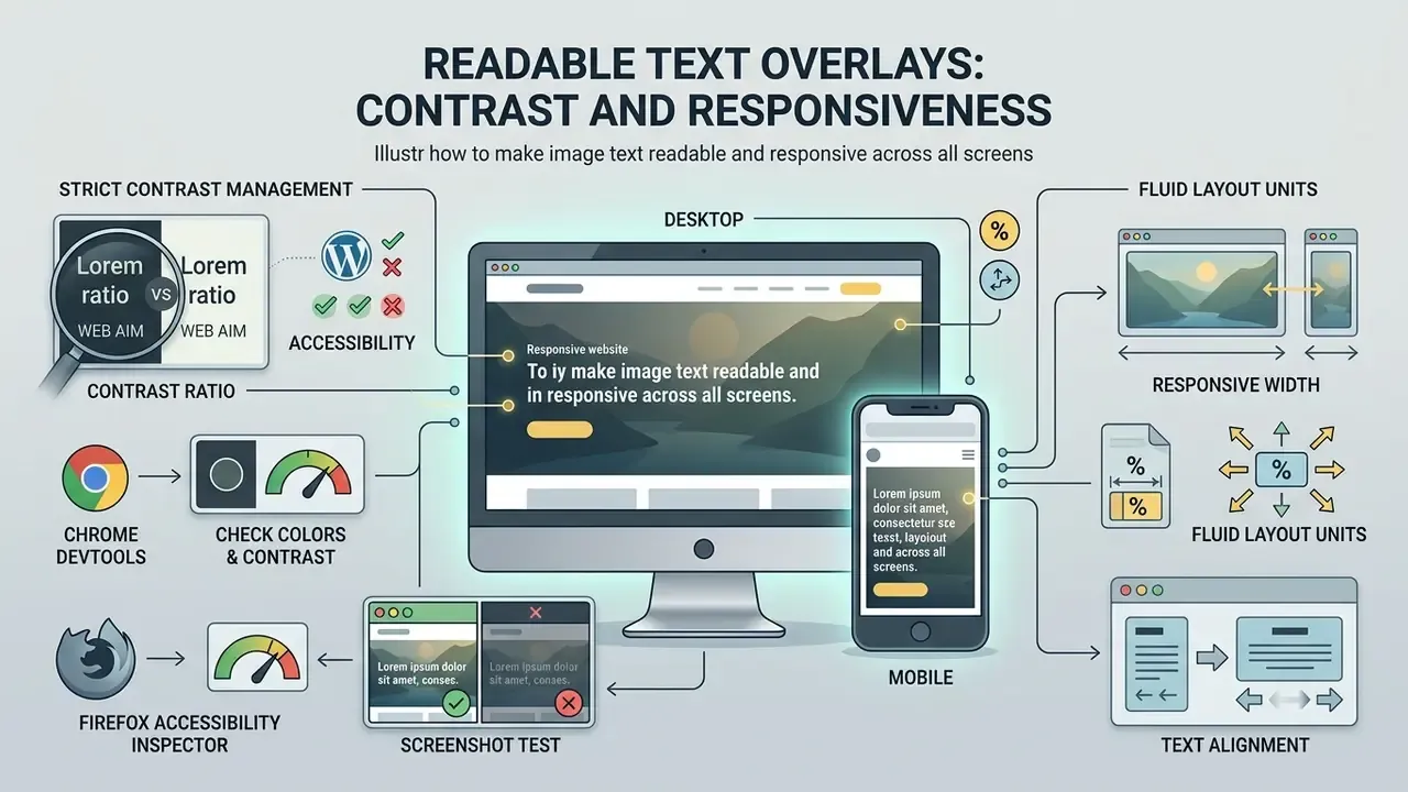
Keeping overlays readable across mobile and desktop takes two things: strict contrast management and fluid layout units. Background images vary in luminance across different zones, which makes solid or semi-transparent fills behind the text necessary rather than optional.
/* Accessible scrim overlay pattern */
.scrim-overlay {
  background-color: rgba(0, 0, 0, 0.75); /* Dark scrim for white text */
  color: #ffffff;
  padding: 1rem 1.25rem;
  font-size: clamp(1rem, 2.5vw, 1.5rem); /* Responsive fluid typography */
}
Unprotected white text over unpredictable photography fails legibility tests on small screens under bright light with depressing regularity. Visual contrast is only half of readability, though. Linguistic complexity matters just as much:
«A study of 3,000 German health websites found 84.63% contained structurally complex text and 89.70% scored low on the Flesch readability index (≤49).»
Exploratory study of the German Health Web (2023). https://doi.org/10.1007/s10209-023-00987-3
Short overlay lines, plain wording, and generous line height therefore do as much for comprehension as the scrim behind them. Six words beat sixteen on a hero banner, nearly every time.
Contrast, color white and background color behind text
Under WCAG 2.2 Success Criterion 1.4.3, standard text placed over images must maintain a minimum contrast ratio of 4.5:1 against its background, while large text (18pt, or 14pt bold) requires at least 3:1. When text sits directly over a photo, that ratio must hold against the lightest and darkest pixels directly behind the glyphs. W3C Failure Technique F83 makes the area behind each letter the unit of measurement, not the average of the whole image.
«Contrast ratio is calculated as (L1 + 0.05) / (L2 + 0.05), where L1 and L2 are the relative luminance of the lighter and darker colors.»
WCAG 2.2 Success Criterion 1.4.3, W3C (2023). https://www.w3.org/TR/WCAG22/#contrast-minimum
Practical tooling instead of manual math. You do not need to compute luminance by hand:
Vision research by Scharff and Ahumada at NASA established that background texture complexity creates visual masking, which degrades reading speed and word recognition. Their masking index formula demonstrated that high spatial frequency in background textures reduces effective contrast :

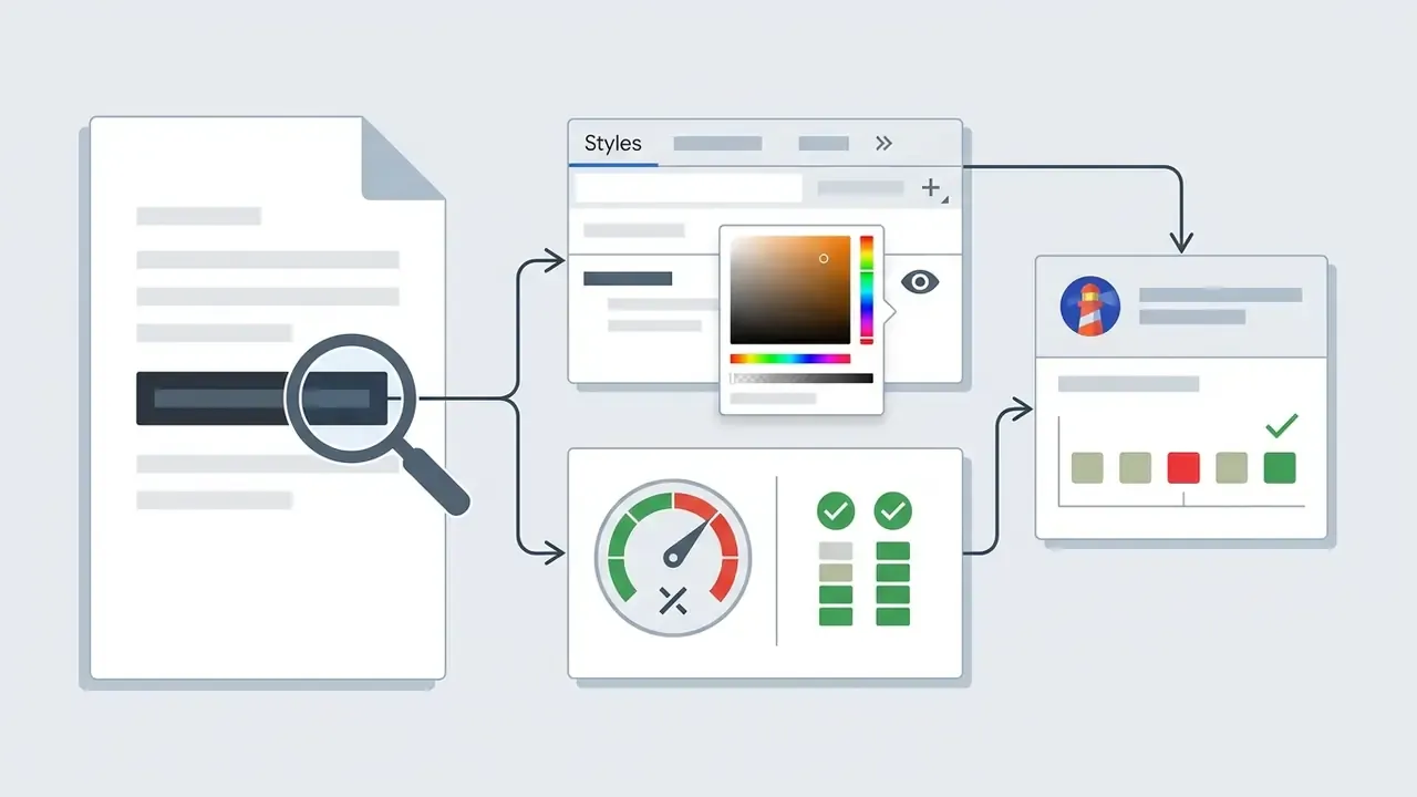

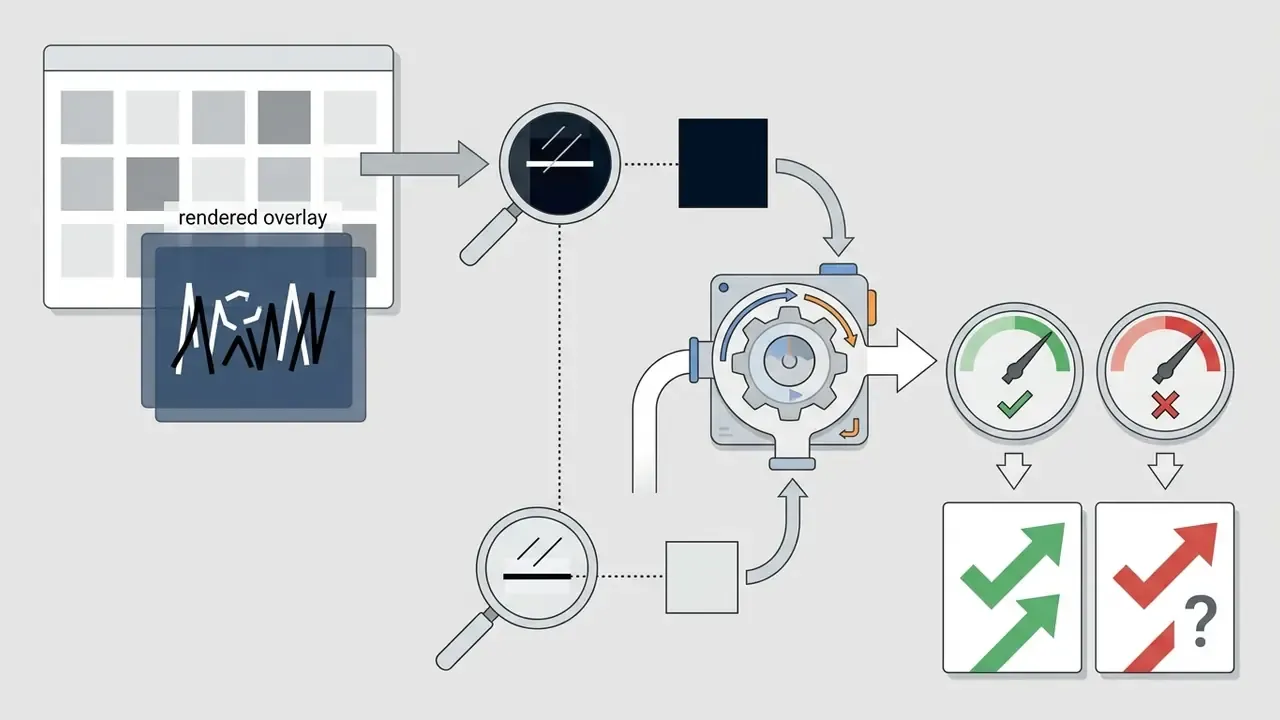
The practical translation of that research is blunt: the busier the photograph, the more the text needs a flat, predictable layer beneath it. As background contrast variation increases, text search times slow measurably. Adding a semi-transparent background color such as rgba(0, 0, 0, 0.7), or a backdrop-filter: blur(4px) behind color white text, stabilises luminance and preserves legibility. Bear in mind that backdrop-filter only blurs pixels behind a partially transparent element, and blurring alone never guarantees 4.5:1. Always verify the result with one of the checkers above.
Responsive image width and text alignment
Real-world use cases: e-commerce badges and image watermarks
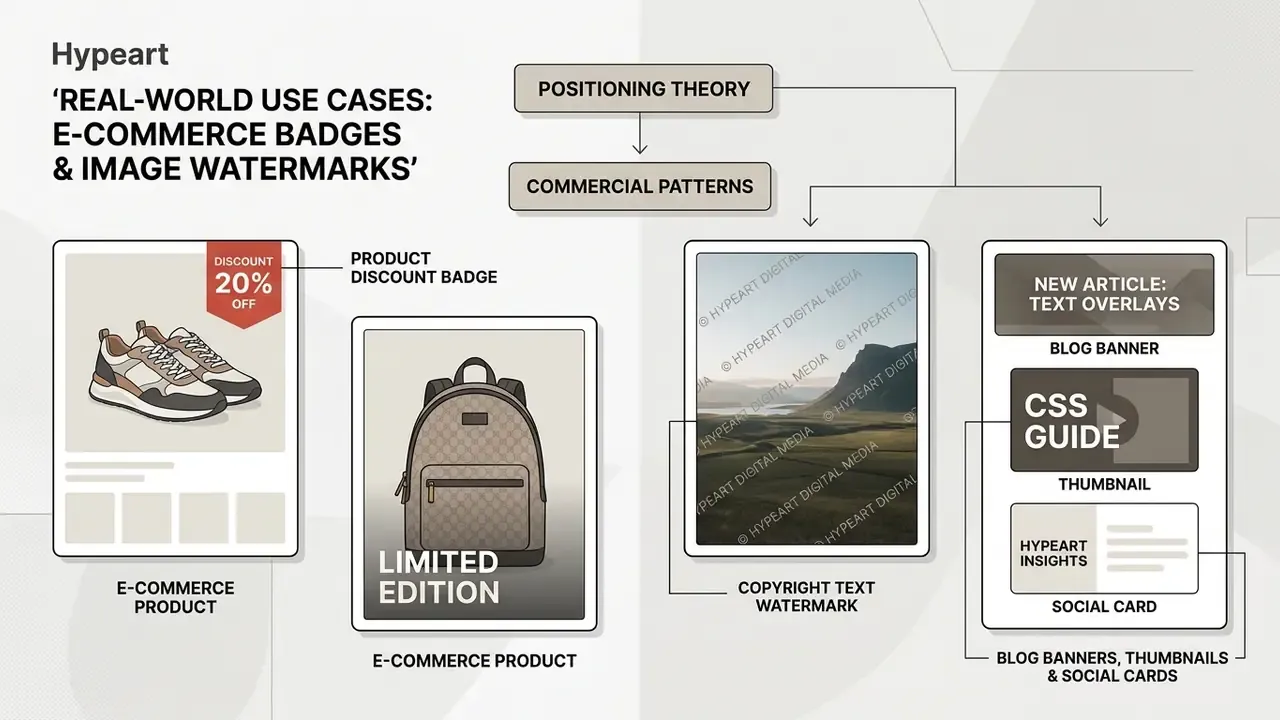
Positioning theory earns its keep the moment it is attached to a commercial pattern. The overlays that appear most often in production are promotional badges on product thumbnails, copyright watermarks on original media, and headline banners on blog cards.
1. E-commerce product discount badge
Overlaying promotional tags such as "-30% OFF", "BESTSELLER", or "Most popular" over product thumbnails lifts conversion without forcing the design team to burn text into product photography. Because the label is HTML, merchandisers can change the wording from a CMS field instead of re-exporting thousands of images.
<div class="product-card">
  <span class="badge-sale">-30% OFF</span>
  <img src="sneakers.jpg" alt="Leather running sneakers" width="400" height="400">
  <div class="product-info">
    <h3>Pro Runner X</h3>
  </div>
</div>
.product-card {
  position: relative;
  width: 100%;
  max-width: 320px;
}
.badge-sale {
  position: absolute;
  top: 12px;
  left: 12px;
  background-color: #dc2626;
  color: #ffffff;
  font-weight: 800;
  font-size: 0.75rem;
  padding: 4px 8px;
  border-radius: 2px;
  z-index: 2;
}
Keep the badge text inside a real <span> rather than a pseudo-element when the discount is commercially meaningful. Screen reader users and crawlers must be able to read it. Before promising a merchandising team a fixed cost per campaign, it is also worth running the numbers in our calculators first, because per-image generation fees add up fast at catalogue scale.
2. Copyright text watermark overlay
Protect original media from casual reuse by rendering a translucent copyright line in the lower-right quadrant. A CSS watermark deters copy-paste theft on the page, though it is cosmetic only: the downloaded file remains unmarked, so assets that must stay protected after download need a server-side burn-in.
.watermark-overlay {
  position: absolute;
  bottom: 0.75rem;
  right: 0.75rem;
  color: rgba(255, 255, 255, 0.6);
  font-size: 0.75rem;
  font-weight: 600;
  text-transform: uppercase;
  letter-spacing: 0.1em;
  text-shadow: 0 1px 2px rgba(0, 0, 0, 0.8);
  pointer-events: none;
}
<figcaption class="watermark-overlay">© 2026 Example Studio. All rights reserved.</figcaption>
Keep the notice short. A full legal paragraph in a watermark reads as clutter and, at 0.75rem over a photograph, nobody parses it anyway.
CSS text overlay vs image API: which implementation to choose
Choosing between a client-side CSS overlay and a server-side image API comes down to one question: does the output need to exist as a static raster file for external platforms, or can it stay dynamic HTML on a web page? CSS overlays render inside the browser DOM. Image APIs generate composite bitmap files on a server.
| Evaluation Metric | CSS Text Overlay | ImageKit API | Bannerbear API |
|---|---|---|---|
| Execution Layer | Client-side (Browser DOM) | Server-side (URL Transformation) | Server-side (REST API / Worker) |
| Implementation Complexity | Low (Native HTML/CSS) | Medium (URL syntax construction) | Medium-High (API integration) |
| SEO & DOM Accessibility | Excellent (Native HTML text & DOM) | Limited (Requires alt text) | Limited (Requires alt text) |
| Server Processing Load | Zero (Handled by client GPU) | Offloaded to ImageKit CDN | Offloaded to Bannerbear infrastructure |
| Works in email / social previews | No (no CSS execution) | Yes (flattened image URL) | Yes (flattened image file) |
| Batch generation | Manual per template | CSV / template-driven automation | Up to 100 images per batch request |
| Primary Use Cases | Hero sections, cards, web banners | Dynamic URL overlays, e-commerce | Social media cards, automated PDFs |
| Pricing Model | Free (Standard web stack) | Usage-based bandwidth plans | Credit-based per image generation |
| Third-party dependency | None | Service availability and egress | Service availability and credits |
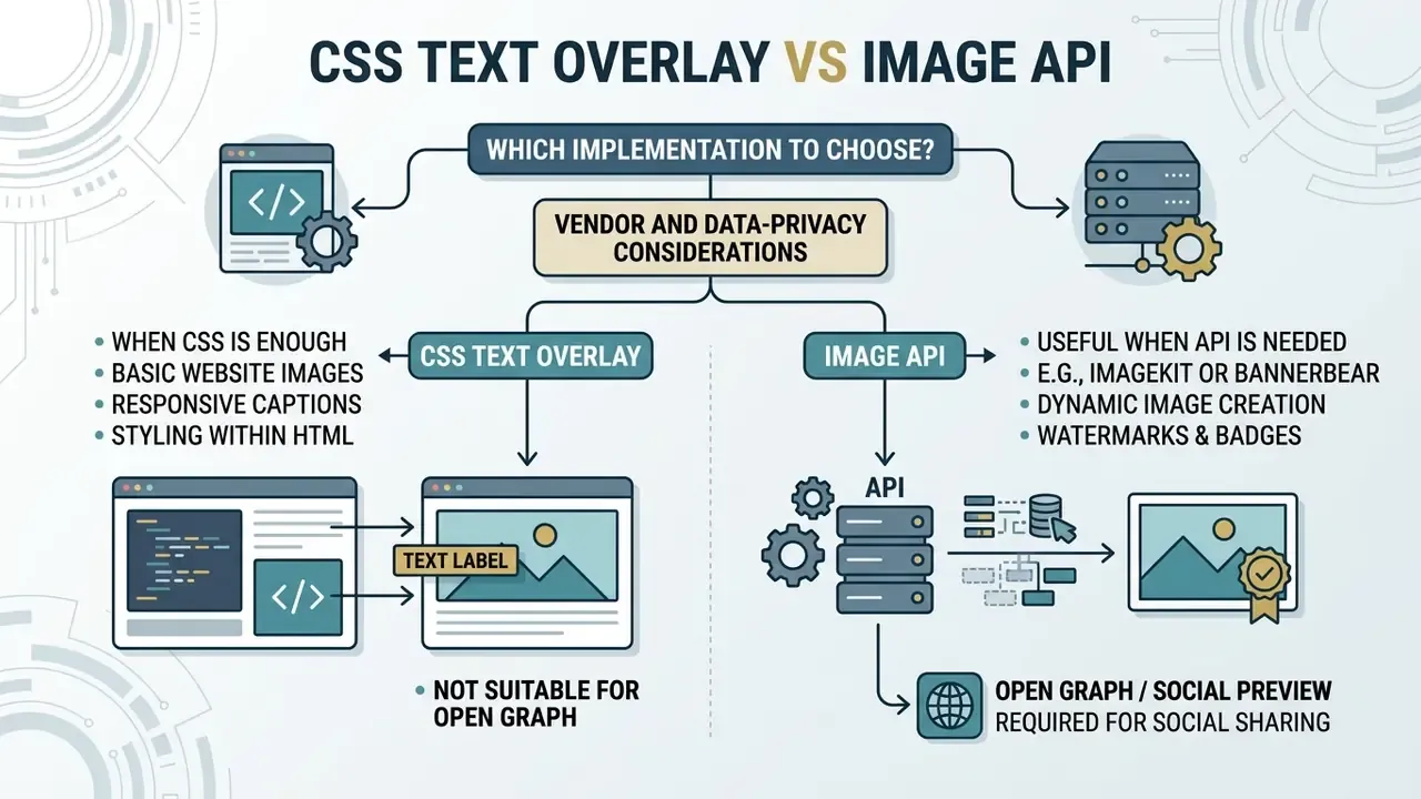
Read that table as a split, not a ranking. Client-side CSS overlays win on performance and accessibility for standard web pages. Server-side APIs become necessary when assets must reach channels that never execute HTML and CSS, a scenario closely tied to how teams license and deploy AI image generators for commercial use across paid channels. Our broader AI Media Commercial-Use library covers the licensing side of that decision.
One more argument for keeping the image in the DOM: the picture itself should be relevant to the copy on top of it.
«Research on health websites confirmed that irrelevant graphical content distracts readers and indicates low page readability.»
Study on graphical content relevance and readability of health websites (2023). https://doi.org/10.1007/s10209-023-00987-3
When CSS is enough for a website image overlay
CSS is the optimal choice for web pages, content management systems, and web applications where text overlays are primary UI elements. Native HTML text stays selectable, translates cleanly through browser localization tools, and scales on high-DPI displays without adding network bandwidth.
CSS overlays also let developers adjust typography, alignment, and hover states by editing one stylesheet, with no media file regeneration and no per-image API cost. The text is rendered by the browser's existing layout and paint pipeline instead of being fetched as a new binary asset. Because no additional HTTP request is created for the composited version, the overlay itself contributes no extra bytes to page weight. (That is an architectural property of client-side rendering; specific performance gains depend on your stack and should be measured with Lighthouse or WebPageTest rather than assumed.)
Plain CSS is also enough for simpler text-fitting problems that developers routinely over-engineer. Single-line truncation with text-overflow: ellipsis on a non-wrapping line plus overflow: hidden, and box-level clipping through overflow-x or overflow-y, are documented behaviours on MDN and web.dev. No JavaScript measurement loop required. This is the part of any css tutorial worth memorising, because it removes a whole class of layout hacks from your codebase.
When ImageKit or Bannerbear API is useful
Dynamic image APIs earn their place when you are generating assets for platforms that never render front-end HTML and CSS. Common cases: automated Open Graph preview images (og:image), personalised email banner graphics, and bulk e-commerce product badges.

ImageKit applies real-time text layers through URL transformation parameters: the layer opens with l-text, receives its content through i- (or ie- for base64 input), and closes with l-end. Styling parameters such as fs (font size), co (color), bg (background), and pa (padding) apply only inside that layer block, per the ImageKit image transformation and overlay documentation (imagekit.io/docs). Transformations can be passed as a path segment (/tr:w-1200,h-300/hero.jpg) or as the tr query parameter.
Bannerbear works from design templates instead. A POST request to the /v5/images endpoint carries a template UID plus a modifications array, returns 202 Accepted for asynchronous rendering, and supports batches of up to 100 images per request according to the Bannerbear API reference (developers.bannerbear.com/v5/). Both services output flat PNG or JPG files suitable for social media distribution and automated document generation. (Endpoint names, parameter syntax, and limits change between provider versions, so verify against the current official documentation before implementation. Our AI Media API Guides track these integration patterns in more depth.)
Why CSS cannot solve the Open Graph case. Social crawlers such as Facebookbot and Twitterbot read meta tags and fetch the referenced image file. They do not execute your layout or apply your stylesheet, so a CSS-positioned headline simply does not exist for them. The og:image value must therefore point at an already-flattened bitmap:
<!-- Open Graph tags require a flattened, static image URL -->
<meta property="og:image" content="https://ik.imagekit.io/your_account/tr:w-1200,h-630,l-text,i-Mastering%20CSS%20Overlays,fs-50,co-FFFFFF,bg-000000A0,pa-20/hero.jpg" />
<meta property="og:image:width" content="1200" />
<meta property="og:image:height" content="630" />
Server-side image APIs solve that constraint by delivering pre-rendered composites straight to social crawlers at the standard 1200×630 preview ratio, with no designer exporting a new file for every article.
Pre-publish checklist for image text overlays
Run through this list before shipping any overlay component:
- Semantic DOM: the wrapper is a
<figure>with<figcaption>for editorial captions, or a neutraldiv classwhen the text is UI chrome. - Positioning context: the parent container explicitly carries
position relative. - Out-of-flow text layer: the overlay element explicitly carries
position absolute, or relies on flexbox alignment inside the container. - Layout-shift prevention: the
<img>haswidthandheightattributes, plusheight: auto; max-width: 100%in CSS. - WCAG contrast: white text over variable photography sits on an
rgba()plate or alinear-gradientscrim delivering at least 4.5:1 (3:1 for large text), verified in WebAIM or DevTools. - Mobile behaviour: a
@media (max-width: 480px)rule unstacks the overlay toposition: staticwhere the photo is too small to host text. - Pseudo-element badges: decorative labels use
::afteror::beforewithpointer-events: none; meaningful text stays in real HTML. - Master snippet reuse: all five anchor positions derive from one shared
.overlay-noderule set. - Commercial patterns: discount badges and watermarks follow the documented
z-indexand offset conventions. img srcvsbackground image: informational images use<img>withalt; decorative-only images usebackground-image, never for content, per WCAG F3.- No hotlinking: every production asset is served from your own origin or CDN.
- No
titlesubstitution: supporting information lives in the overlay text or body copy, not in a tooltip. - API decision recorded: Open Graph, email, and PDF outputs use server-side generation; on-page overlays stay in CSS, with vendor-risk review completed for any external API.
FAQ about putting text on images in HTML
<img src="https://cdn.example.com/photo-abstract-gradient.jpg"
alt="Abstract gradient background"
class="remote-image">
Overlay on Remote HTTPS Image
New Version

Server Architecture
High-availability cluster deployment.
.multi-overlay-wrapper {
position: relative;
max-width: 500px;
}
.badge-top-left {
position: absolute;
top: 10px;
left: 10px;
background-color: #2563eb;
color: #ffffff;
padding: 4px 8px;
font-size: 0.75rem;
font-weight: bold;
}
.caption-bottom {
position: absolute;
bottom: 0;
left: 0;
right: 0;
background-color: rgba(15, 23, 42, 0.85);
color: #ffffff;
padding: 12px;
text-align: left;
}
Can I use an image URL with src https?
Yes. You can use any secure remote HTTPS image URL inside img src="https://..." or CSS url("https://...") for text overlays. The browser fetches the remote asset over TLS and renders client-side overlay layers above it without origin restrictions. An http:// image referenced from an HTTPS page, by contrast, is classified as mixed content by W3C and is blocked. Cross-Origin Resource Sharing (CORS) rules apply only when JavaScript tries to manipulate raw image pixels on an HTML5 element. In that case, add the crossorigin attribute and make sure the host returns a valid Access-Control-Allow-Origin header. For rendering alone, both and background image fetch in no-cors mode and need no special headers. Even so, prefer assets on your own domain or CDN over someone else's server. See the hotlinking warning above.
How do I add alt text to a JPG image?
Add the alt attribute directly on the tag. The jpg alt value should concisely describe the visual content for screen reader users and search crawlers. If you are working in the opposite direction, recovering wording already baked into a JPG or PNG so you can re-create it as real HTML text, image-to-text tools will OCR the file for you. According to W3C WAI Alt Decision Tree Guidance, if the text overlaid on the image already conveys the full information in surrounding HTML, use a concise visual description in alt to avoid redundant screen reader playback. When words are burned into the image and appear nowhere else, those words must be repeated in the alt value. Purely decorative images take alt="" so screen readers skip them. Descriptive file names help too: financial-chart.jpg outperforms img835.png in image search.
Can one image have more than one text overlay?
Yes. A single image container can host multiple independent overlay layers. Wrap the element inside a parent container with position: relative, then place several child text elements inside that wrapper using separate absolute offset rules. Separate class names and coordinates let badges, titles, and footers sit independently over different regions of the same asset. Use z-index when two overlays intentionally intersect and you need a deterministic stacking order.
Why doesn't my CSS overlay appear in the social media preview?
Because social crawlers never run your CSS. They request the URL in og:image or twitter:image and use that file exactly as delivered. Generate a flattened composite through an image API, or export a static banner, and reference that file in the meta tag. Your on-page hero can keep its CSS overlay independently.
Is a CSS watermark enough to protect my images?
No. A CSS watermark is a visual deterrent on the page only; the file downloaded from the network is unmarked. For assets that must stay attributed after download, burn the watermark into the bitmap server-side and keep the CSS layer as a secondary, on-page signal.
Does sending images to an external API create compliance exposure?
It can. Any transformation URL or API payload leaves your perimeter, so treat the provider as a processor: check contractual data-processing terms, hosting region, retention windows, and whether personalization parameters could leak customer data through the URL. Coordinate with your privacy and third-party risk teams before enabling such a service on regulated content. The guidance in this article is technical and does not constitute legal, compliance, or accessibility certification advice. More implementation guides, decision templates, and production workflows are collected in our hub, including step-by-step notes on how to create an art portfolio tips for teams publishing image-heavy pages.