In regulated corporate environments and financial institutions, presenting complex quantitative risk models, compliance updates, and operational workflows demands absolute visual clarity. An AI infographic generator lets organizations convert raw text, unstructured notes, and data tables into structured, publication-ready visual assets. But automated visual tools must hold data fidelity, visual hierarchy, and explicit human oversight before anything reaches executive reporting or public communication.
Key Takeaways
- What it does An AI infographic generator converts prompts, long-form documents, CSV/Excel tables, and URLs into an editable visual draft in roughly 15 to 45 seconds, replacing the blank canvas with a document-to-layout pipeline.
- Where the value sits Manual infographic production averages about 9 hours and roughly $315 at a $35/hour design rate. AI-assisted drafting compresses the same deliverable to minutes at credit-level cost. Only the drafting stage is automated, though, not verification.
- Non-negotiable control Every statistic, axis label, percentage, and quotation must be reconciled by a human against the primary dataset. Generative models still hallucinate numbers and mislabel scales.
- Legal position Under U.S. Copyright Office guidance, prompt-only AI visual output is not eligible for copyright protection. Only human-authored edits, arrangement, and text are protectable.
- Enterprise selection criteria Data ingestion breadth, brand-kit locking, export fidelity (SVG/PDF/PPTX), zero data retention for model training, SOC 2 / ISO 27001 attestation, SSO, and IP indemnity.
Who This Guide Is Written For
Three roles usually land on this page for different reasons, and the differences matter.
Communications and analytics teams want speed: fewer hours spent nudging boxes on a canvas. Risk and compliance leaders want a defensible chain: who generated the exhibit, from which dataset, approved by whom. Procurement wants the boring parts in writing: retention clauses, attestation reports, commercial rights per tier.
This guide tries to serve all three without pretending the interests are identical. Where a claim rests on vendor marketing rather than an audited fact, the text says so. Where the evidence is thin, that is flagged too. Consider the audience assumptions above a working hypothesis until your own analytics, interviews, or CRM data confirm them.
What Is an AI Infographic Generator and What Can It Create?
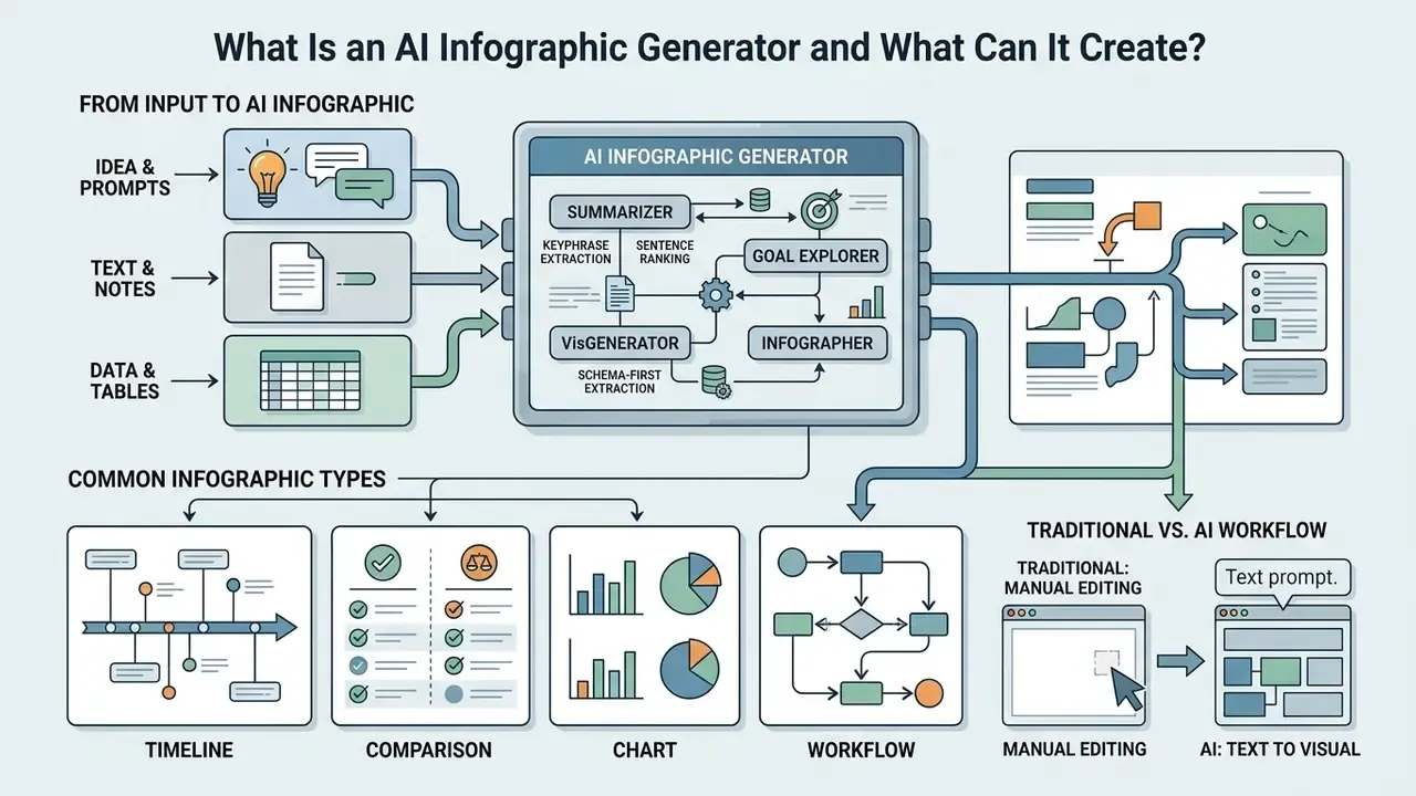
An AI infographic generator is a specialized software pipeline that transforms unstructured text, prompts, or tabular data into structured visual assets by combining large language models (LLMs) with automated design engines. Unlike traditional graphic editors that require manual asset placement and canvas formatting, an ai based infographic generator automates layout detection, content segmentation, and visual styling.
"A survey of 105 tools and papers classifies automated narrative-visualization systems into four levels of automation, from design spaces to full ML/AI generators."
Rather than a vague claim about "reducing human effort," the underlying research is methodologically explicit. The 2023 survey reviewed 105 tools and academic systems, then grouped them by automation depth: from template-driven design spaces to end-to-end machine-learning generators that handle both content selection and layout composition. That taxonomy is the practical benchmark for judging any ai info graphic generator you evaluate. The higher the automation tier, the more human verification the output requires. Not less. More.
Traditional design tools rely on blank canvases and manual template editing. An ai info graphic generator, by contrast, parses natural language inputs and constructs an initial layout on its own. Manual editors still win on custom artistic work; AI infographic creation platforms win on document-to-graphic conversion for report summaries, compliance briefs, and executive presentations. Teams that also produce non-diagrammatic visual assets can compare adjacent tooling in our overview of AI image generators and their licensing terms.
From an Idea, Text, or Data to an AI Infographic
An ai infographic creator converts textual descriptions, raw notes, or tabular files into structured visual blocks by extracting key themes into machine-readable schemas. Modern text-to-layout architectures use natural language processing to segment source documents into distinct conceptual units: primary statistics, sequential steps, contextual captions.
"The VL2NL framework reaches 89.4% accuracy for basic chart captions and 76.0% for complex descriptions generated from Vega-Lite specifications."
Extraction in production systems is schema-first rather than free-form. Document AI layout parsers (Google Document AI, Adobe PDF Extract API) convert PDFs into typed JSON blocks: paragraphs, headings, lists, tables, figures, and cell-level table structure, all before any visual composition begins. NVIDIA's PDF extraction research notes an important asymmetry. Charts and tables can be reconstructed structurally, while infographics themselves are typically processed with OCR-only text extraction, because they are far less structured. That distinction matters when your source material is already a graphic.
When processing unstructured text, automated systems apply sentence ranking and keyphrase extraction algorithms to isolate core ideas. In data-driven workflows, engines like LIDA (Dibia et al., ACL 2023) summarize raw data tables, enumerate explicit visualization goals, and generate executable visualization code, such as Vega-Lite or Altair specifications, to protect quantitative accuracy.
This structured extraction is what allows teams to ai create an infographic directly from policy docs, research summaries, or financial spreadsheets, without retyping a single figure by hand.
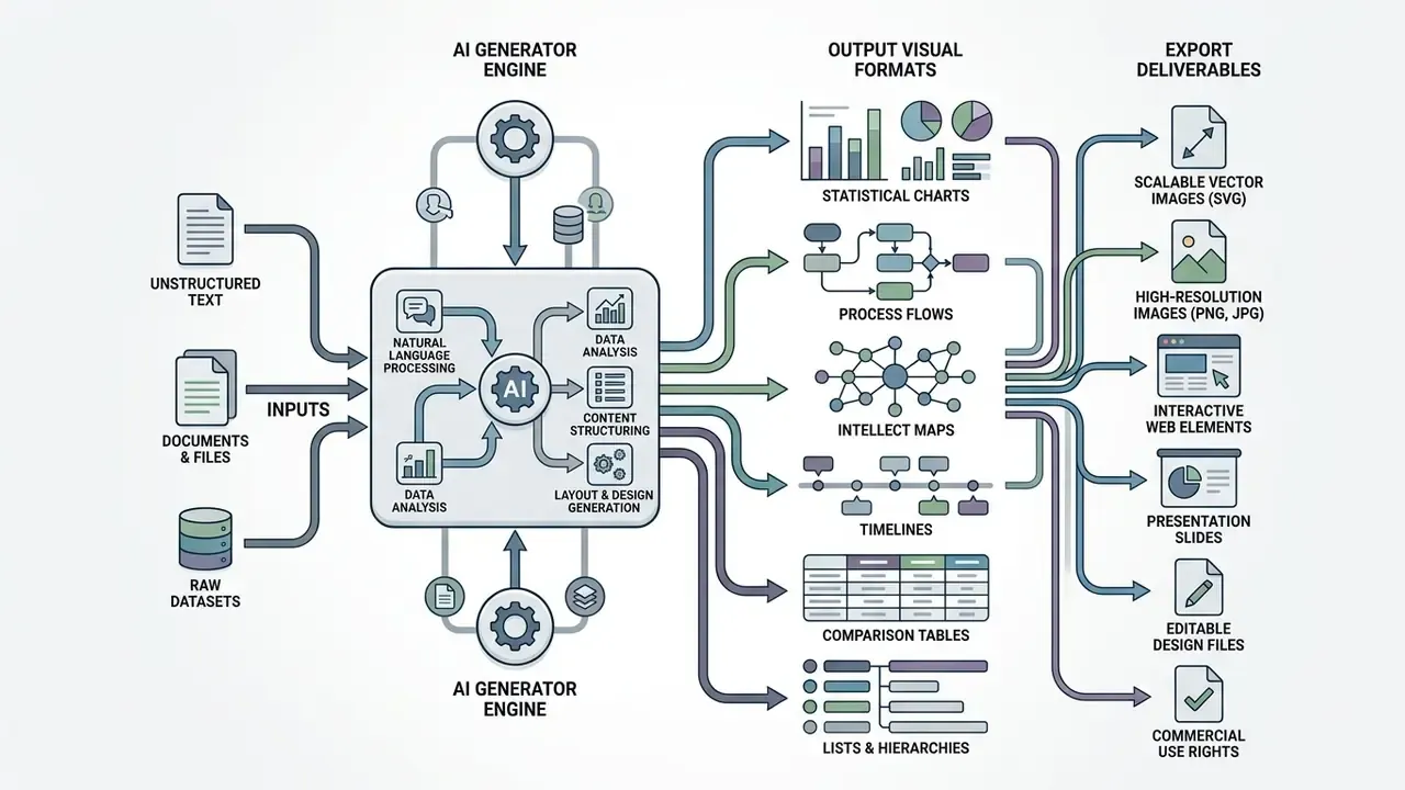
Common Infographic Types: Timelines, Comparisons, Charts, and Workflows
How to Create an Infographic With AI
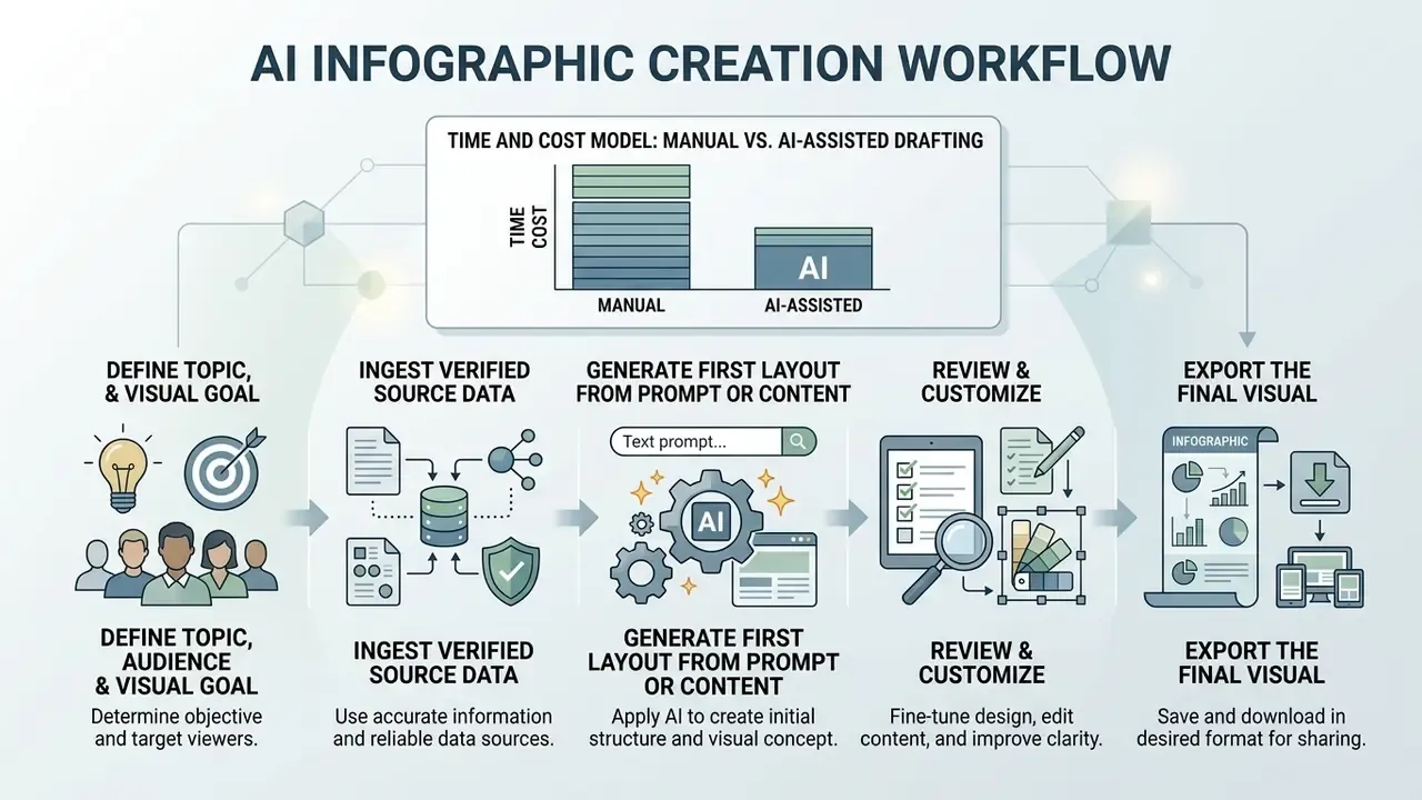
Creating an enterprise graphic with an ai generator for infographics takes a structured, five-step workflow: define the target objective, ingest verified source data, generate an initial draft via structured prompting, customize visual elements, export the verified file. A controlled sequence is what keeps model hallucinations out of the deck and visual treatment consistent across deliverables.
An operational review looked at an internal reporting team trying to accelerate compliance reporting. The team used an ai create infographic workflow to turn a 40-page regulatory update into executive one-pagers. A methodological note before the numbers: the figures below are an internal, self-reported operational benchmark from that engagement, not an externally peer-reviewed measurement. After standardizing input prompting and setting up an automated draft-to-review pipeline, the team logged a drop in visual production time from roughly eight hours to about 45 minutes per report, with no factual discrepancies recorded across subsequent audit reviews. Results are workflow-dependent. Re-measure in your own environment before citing them internally.
Time and Cost Model: Manual Design vs. AI-Assisted Drafting
| Stage / Parameter | Traditional design (manual) | AI-driven generation | Delta |
|---|---|---|---|
| Research & concept | ~3.5 hours (sourcing data, sketching) | ~30 seconds (automated document analysis) | −98% time |
| Layout & chart construction | ~4.0 hours (manual element placement) | ~2 minutes (automated layout allocation) | −99% time |
| Review & sign-off | ~1.5 hours | ~15 minutes (copy and color corrections) | −83% time |
| Total production time | ~9 hours | ~2 minutes to first draft | n/a |
| Average cost per asset | ~$315 (at a $35/hour design rate) | under $1 (token / credit cost) | ~99% cost reduction |
Read the table as a drafting economy, not a total-cost-of-ownership figure. Verification, fact-checking, brand QA, and legal review stay human line items. In regulated reporting they often exceed the generation cost by an order of magnitude. The defensible claim is narrower than the headline: AI removes the blank-canvas and layout-assembly labor, not the accountability layer.
Define the Topic, Audience, and Visual Goal
Before triggering an ai free infographic generator or an enterprise tool, articulate a single core takeaway, assess audience data literacy, and pick the primary visual objective. Framing these three parameters is what prevents unfocused clutter and keeps the asset inside institutional guidelines.
Public-sector visualization guidance converges on the same sequence. The U.S. Department of Labor E2A Tool Kit sections on infographics and data visualization instruct authors to define the target audience and their needs first, then the key goal and call to action, and only afterwards the visualization type. The U.S. National Center for Education Statistics Forum Guide to Data Visualization (2025) formalizes a six-step process (question, research, findings, customization, visualization, user feedback) alongside four principles: show the data, reduce clutter, integrate text and images, portray meaning accurately and ethically. Microsoft Research's guidance on communicating data adds a third pre-step: assess audience data literacy, domain knowledge, and expectations for tone and iconography before choosing a style.
Decide whether the graphic aims to inform, persuade, compare, or instruct. A technical audience analyzing financial model risk needs high data density and precise statistical charts. Executive stakeholders usually want high-level process workflows and a handful of summarized metrics. Same source data, two very different artifacts.
Generate the First Layout From a Prompt or Source Content
To ai create infographics, users feed structured prompts, raw text summaries, or source files (PDFs, Word documents, CSV spreadsheets) into the generator. Modern systems accept uploaded documents directly, using layout parsers like Google Document AI or Adobe PDF Extract API to convert unstructured content into typed structural blocks.
Once content is ingested, the ai generator infographic runs a coarse-to-fine layout generation process. The system reads heading levels, numerical figures, and bullet points, then assembles an initial multi-section draft. Platforms such as Piktochart AI and Gamma auto-generate structured pages complete with headers, visual blocks, and color schemes derived from the input document's semantic flow. Buyers evaluating adjacent generative tooling can also review our comparison of the best AI image generators before consolidating vendors.
Review, Customize, and Export the Final Visual
The final phase requires manual review of data labels, contrast adjustments, and brand alignment before export. Automated layout engines produce component-level assets well enough. Visual hierarchy and spatial arrangement, though, usually still need a human hand.
During review, keep typography hierarchy limited to three levels (title, section header, body text) and verify color contrast against WCAG thresholds: at least 4.5:1 for normal text and 3:1 for large text. Frontify's export guidance flags a practical trap worth checking twice: background graphics must be explicitly enabled in PDF or print export, otherwise brand colors and background blocks silently drop out of the final file. Social-ready assets can ship as standard-resolution PDF, while print and poster output should go out at high resolution, 600 DPI where the printer requires it. For broader design terminology and reference material, teams can explore our detailed glossary hub.
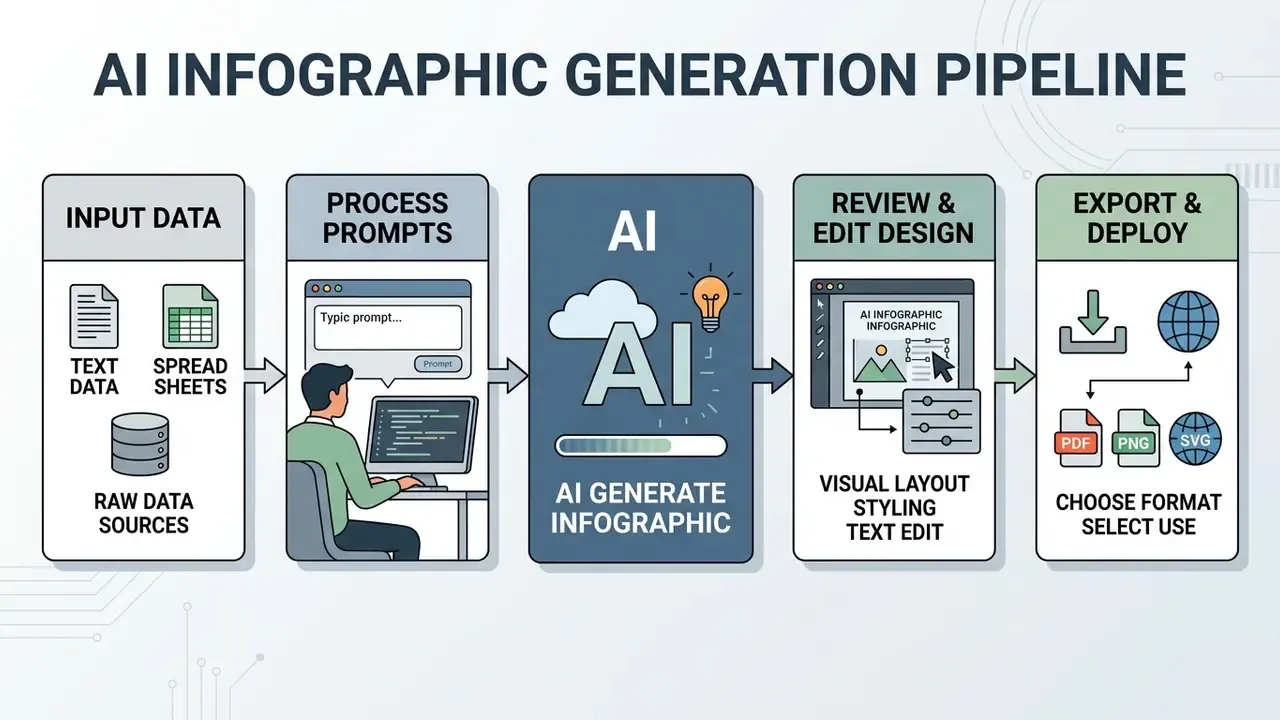
Create an AI Infographic From Text, Data, and Content
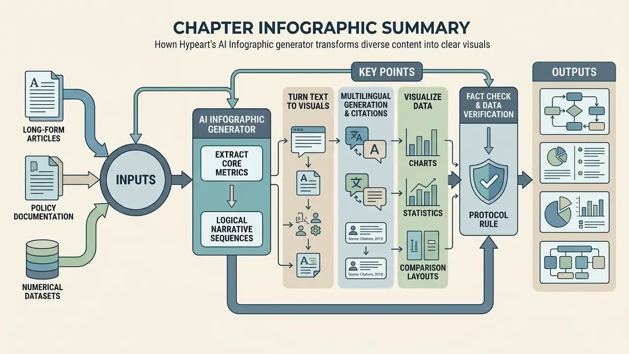
An ai infographic generator from text processes long-form articles, policy documentation, and numerical datasets to extract core metrics and logical narrative sequences. Multi-modal extraction pipelines let organizations streamline an ai content creation workflow infographic across complex business functions, turning dense documentation into digestible visual assets.
Turn Text, Articles, and Content Summaries Into Visuals
To ai create infographic from text, generative systems apply extractive summarization algorithms such as graph-based sentence ranking and keyphrase scoring, isolating primary findings from long-form articles. Long-document summarization research, including MemSum (ACL 2022) and unsupervised two-stage pipelines that first extract key noun phrases and then rank salient sentences, describes exactly the mechanism deciding which sentences survive into a visual block. Redundant prose falls away; crucial context, ideally, does not.
Research on message-first authoring tools like Epigraphics (CHI 2024) shows that authors achieve higher visual clarity when they start from a structured textual message. Users highlight key text fragments describing metrics or trends, and the model recommends corresponding visual primitives: bar charts, process icons, summary callout boxes. Done properly, every generated visual element traces back to a verified textual statement. Teams that need to pull copy out of scanned exhibits or legacy graphics first can review our guide to image-to-text tools.
Multilingual Generation and Automated Source Citations
Enterprise AI visual engines now support instant translation and cross-lingual layout generation across 20+ languages. Given a foreign-language document, the engine extracts key metrics, translates copy without breaking visual bounding boxes, and can embed standardized footnote citations (APA, IEEE, or an internal reference format) into the canvas footer bar, preserving academic and audit traceability.
Three operational cautions apply. First, translated strings expand or contract by 10 to 35% depending on the language pair, so multilingual masters need flexible text frames rather than fixed-width labels. Second, right-to-left scripts and CJK typography require font substitution that some generators handle silently and badly; inspect glyph rendering before export. Third, vendor marketing that promises "perfect citations every time" should be treated as a drafting aid, not an assurance. An auto-generated footnote that looks plausible but points to the wrong page is more damaging in a regulatory submission than a missing one.
Visualize Data With Charts, Statistics, and Comparison Layouts
Deploying an ai data infographic generator on numerical datasets means mapping quantitative variables to appropriate graphical encodings. Systems evaluate dataset parameters automatically: bar charts for category comparisons, line graphs for temporal trends, pie charts for part-to-whole relationships.
Automated visualization frameworks rely on rule-based engines or machine-learning models, such as VizML (Hu et al., CHI 2019), which learns chart specifications from large corpora of dataset and visualization pairs. The rule logic distilled from that line of work is straightforward. Quantitative variables map to axes. Temporal variables favor line charts. Category comparisons favor bar encodings. Pie charts get discouraged as the number of categories grows.
"Transformer models with BERT and T5 encoders successfully predict Vega Zero commands from natural-language descriptions, automating field, aggregation and chart-type selection."
When visualizing complex data, confirm that axes are properly scaled, categories are distinctly labeled, and clutter is minimized so a reader can process the point quickly. Accessibility checklists used by public agencies add two mandatory checks that AI drafts routinely fail: a clear, descriptive title, and correct rendering on mobile in both portrait and landscape orientation.
Fact Check & Data Verification Protocol
How to Choose an AI Infographic Generator
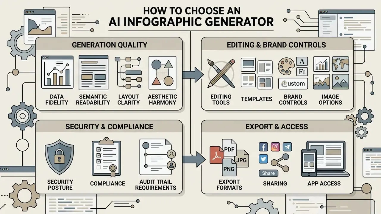
Selecting software from the available ai infographic creation tools means evaluating output quality, template flexibility, brand control, export formats, security posture, and commercial usage terms. Enterprise teams should weight data protection, precise editing, and integration with the existing stack ahead of demo polish.
When comparing vendor options, decision-makers can see the overview of available market tools to check core features, security protocols, and platform architecture side by side.
Generation Quality: Text, Data, Layout, and Visual Clarity
Assessing generation quality means scoring four distinct dimensions, defined in visualization research instruments such as VisJudge-Bench (2025) and PREVis (2025), which rate understandability, layout clarity, readability of data values, and readability of data patterns as independent criteria:
- Data FidelityExact numerical precision, with no altered values, distorted scales, or misaligned chart elements.
- Semantic ReadabilityClear typographic hierarchy, legible text sizing, proper label alignment across devices.
- Layout ClarityLogical spatial arrangement, balanced whitespace, intuitive reading order (top to bottom, left to right).
- Aesthetic HarmonyBalanced palettes, consistent icon style, clean composition.
"ChartFormer improves chart-component recognition by 3.2% mAP and raises chart question-answering accuracy by 15.4% over baseline models."
Component-level recognition accuracy is the hidden variable behind all four dimensions. If the engine misreads a legend or an axis tick during ingestion, every downstream visual claim inherits the error, and no amount of styling will fix it. An enterprise ai infographic creator has to score consistently well across all four, or critical business metrics get misread in the room.
Editing, Templates, Brand Controls, and Image Options
An effective infographic maker needs comprehensive post-generation editing. Automated drafts are rarely final. Teams require precise control over canvas elements, text placement, and asset grouping, and they need it without leaving the tool.
Enterprise platforms should support brand kit integration, letting organizations upload custom palettes, corporate typography, and official logo assets. Teams standardizing identity elements can also review how AI logo generators fit into the same brand system. Design systems like Adobe Express, Canva, and Figma allow style locking, so every AI-generated asset stays inside corporate identity guidelines: Adobe Express brand kits store colors, fonts, and reusable branded illustrations; Canva brand templates allow palette swapping on locked layouts; Figma style-guide files keep palettes and type scales editable for teams. For a feature-level view of one such stack, see our breakdown of the Canva AI Generator. Organizations that need to retouch or normalize raster assets before placement can review options in our guide to AI photo editors and to stylization tools such as AI art generators.
Security, Compliance, and Audit Trail Requirements
How to Write Prompts for Better AI Infographics
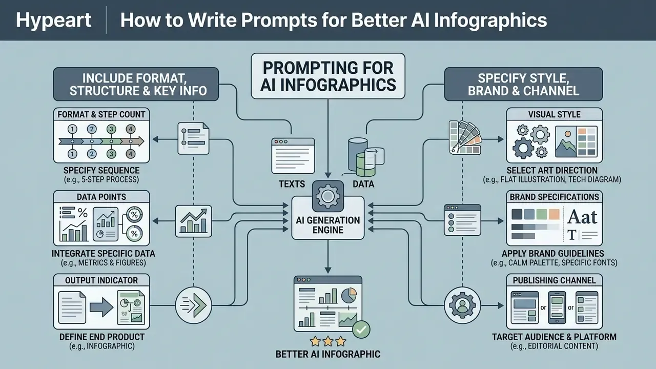
Prompt engineering for visual generation rewards precision. To get a clean, data-accurate layout from an ai art infographic prompt, define the artifact type, section structure, mandatory data points, color palette, and target publishing platform inside the instruction itself.
OpenAI's current prompting guidance for GPT image generation models recommends structuring visual prompts in a strict functional sequence: background and scene, then subject matter, then key structural details, then constraints. It also advises naming the intended artifact ("infographic"), calling out placement and framing when layout matters, and requesting high quality for dense layouts or heavy in-image text. A 2024 systematic survey of prompt-engineering techniques reaches the same conclusion from the LLM side: specificity, clear task framing, and iterative refinement drive output reliability.
"Structured few-shot prompts with explicit chart-data encoding allow LLMs to reach state-of-the-art results on chart QA and summarization tasks."
Include the Format, Structure, and Key Information
A high-performing prompt states the exact structural layout type, the number of visual sections, and the mandatory numerical facts. Vague prompts such as "make a finance infographic" produce generic, unstructured artwork. Every time.
"LLMs generate correct visualizations from free-form natural-language queries without explicit chart-type specification, provided prompts are carefully constructed."
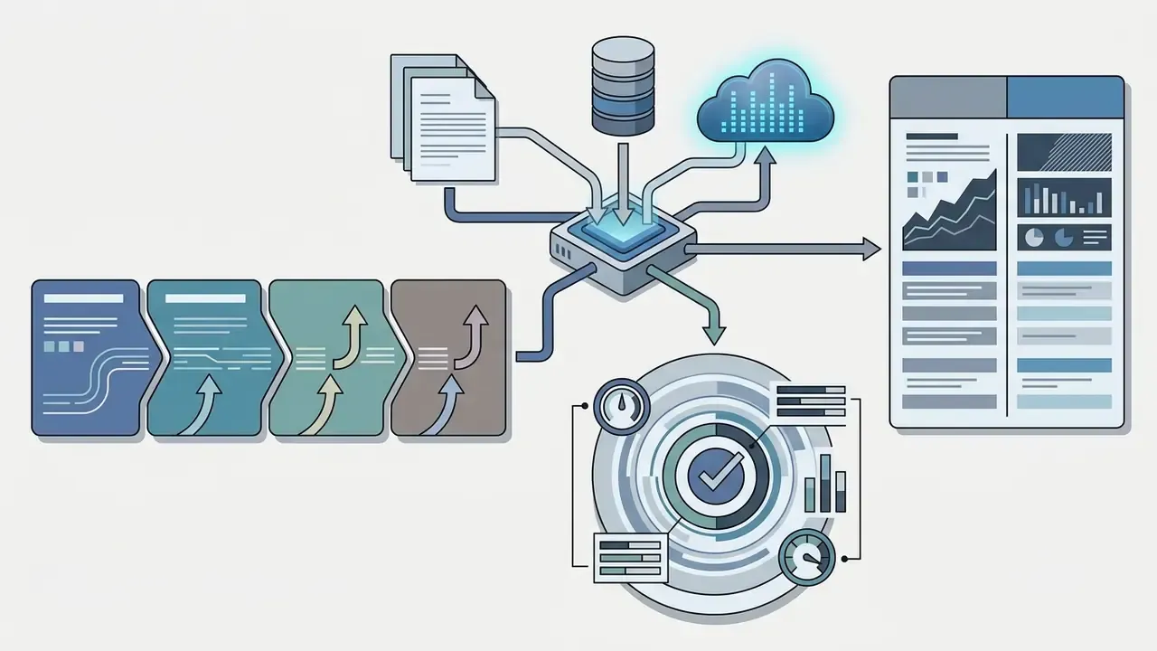
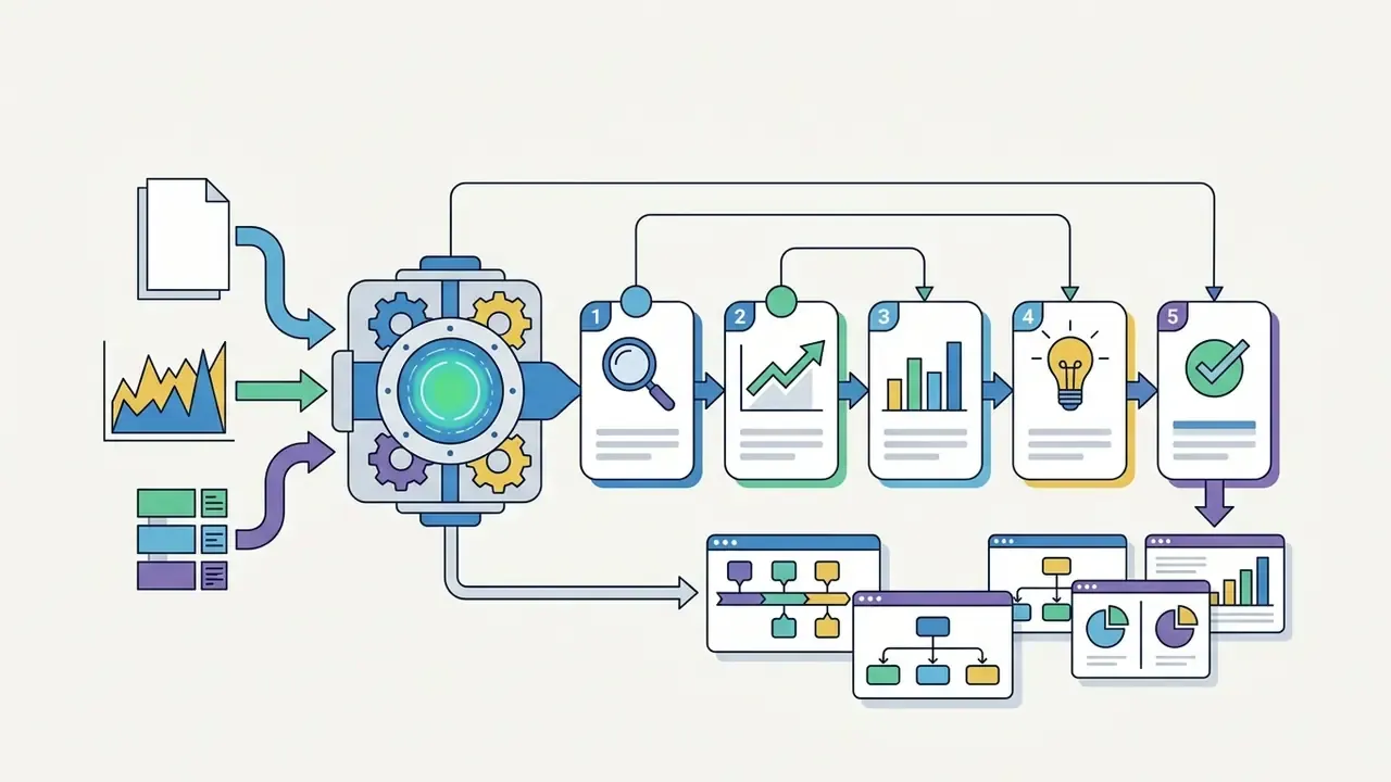
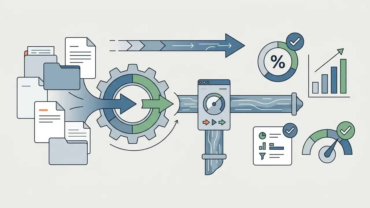
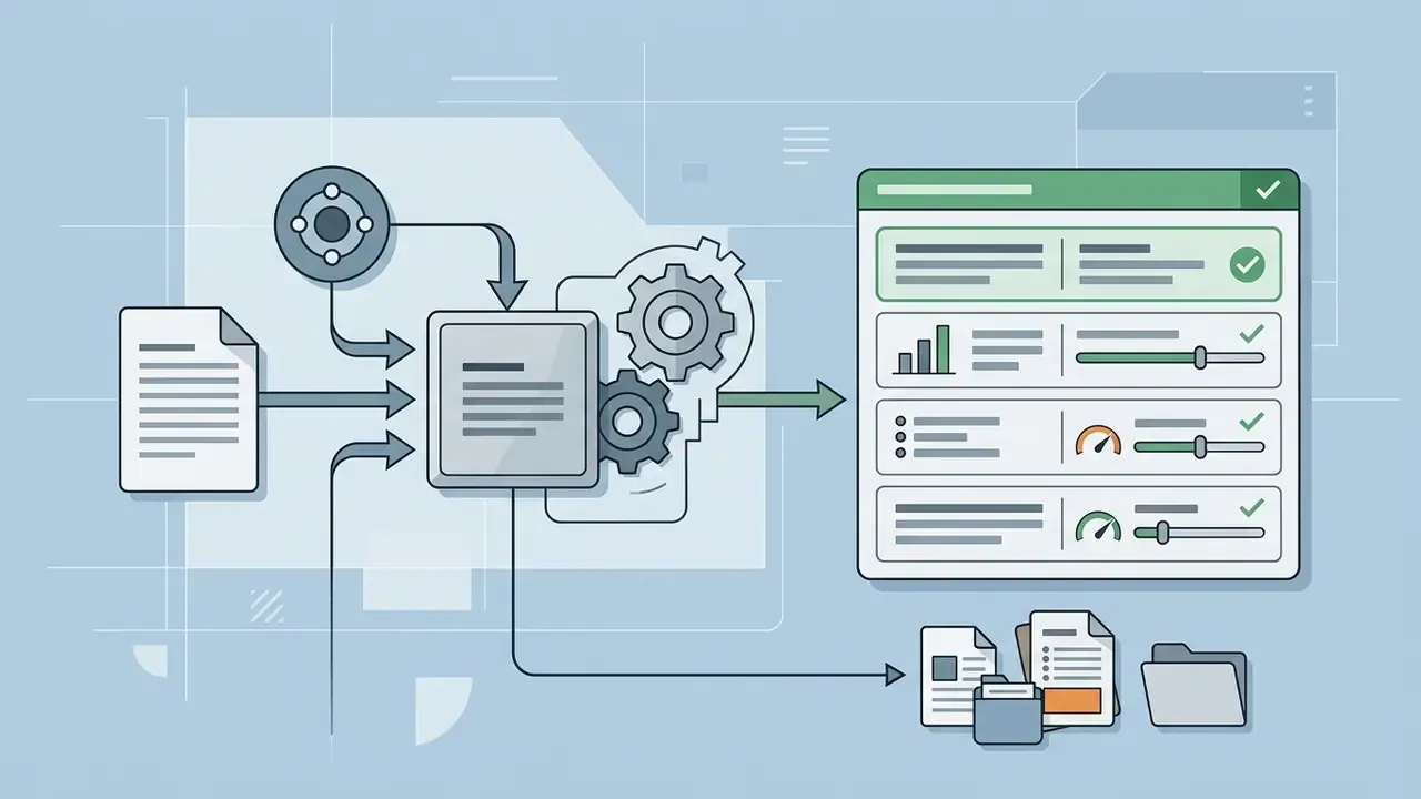
When drafting prompts, spell out the layout requirements:
Specify the Style, Brand, and Publishing Channel
Prompts should define aesthetic style, brand identity requirements, and target channel aspect ratio, so the resulting graphic scales cleanly on the screens that matter.
- Visual Style Request specific parameters, such as "flat vector design," "minimalist corporate infographic," or "clean line-art diagram." Avoid hyper-detailed artistic styles; they wreck text legibility.
- Brand Specifications Supply exact primary and secondary hex codes, for example "use primary navy #0A192F and accent teal #64FFDA."
- Channel Constraints Name the delivery medium: "16:9 aspect ratio for a PowerPoint presentation," "US Letter vertical for a board one-pager," or "1080x1350 vertical for the LinkedIn feed."
Checklist0 / 9
Ready-to-Use Prompt Templates for Business, Risk, and Analytics
Copy these directly, replace the bracketed values with your verified figures, then re-verify every number after generation. Yes, again after generation.
Template 1: "Myth vs. Fact" enterprise comparison
Create a vertical 2-column comparison infographic (1080x1350).
Topic: Corporate Cloud Migration Myths.
Left column (navy #0A192F background, white type): "MYTH: On-premise is always more secure."
Right column (teal #0E7C7B background, white type): "FACT: Zero-Trust cloud architecture mitigates the majority of identity-based attacks."
Add a 3-step "WHAT TO DO" strip: 1) Map data classification. 2) Enforce MFA and least privilege. 3) Log and review access quarterly.
Footer: include a source citation box with dataset name, publisher, and date.
Style: minimal vector line-art, three typographic levels only, WCAG-compliant contrast of at least 4.5:1 for body text.
Template 2: 4-step operational workflow
Generate a 4-step horizontal process flowchart in 16:9 widescreen format.
Steps: 1. Data Ingestion, 2. Automated Summarization, 3. Human Compliance Review, 4. Final Deployment.
Visuals: one clean tech icon per stage, numbered connectors, no decorative background imagery.
Color palette: primary #0A192F, accent #64FFDA, neutral #F4F6F8.
Constraints: high data density, three-level typography hierarchy, max 15 words of body copy per stage, leave a 60px footer band for source attribution.
Template 3: Risk / KPI executive one-pager
Create a US Letter vertical (8.5x11) executive one-pager infographic.
Headline metric block at top: "[METRIC NAME]: [VALUE] ([+/-X]% QoQ)".
Below: a 3-column KPI strip with these exact verified values: [KPI 1: value], [KPI 2: value], [KPI 3: value].
Middle section: one line chart showing [SERIES NAME] from [START PERIOD] to [END PERIOD]; y-axis starts at zero; label every axis and unit.
Bottom section: 3 bullet takeaways, max 18 words each.
Footer: citation line "Source: [dataset], as of [date]. Prepared for [committee]."
Style: conservative corporate, flat vector, no gradients on data marks, brand colors [HEX 1] and [HEX 2], contrast 4.5:1 minimum.
Template 4: Style clone / auto-remake of a recurring report
Use the uploaded reference image as a layout reference only. Detect its grid, block count, and typographic scale.
Recreate the same structure with my content: [SECTION 1 HEADING + data], [SECTION 2 HEADING + data], [SECTION 3 HEADING + data].
Do not reproduce the reference logo, illustrations, photographs, or any proprietary iconography; substitute generic vector icons.
Apply brand colors [HEX 1] / [HEX 2] and font family [FONT].
Output: SVG-friendly flat vector, 1:1 aspect ratio, source footnote bar at the bottom.
Customize and Export AI-Generated Infographics
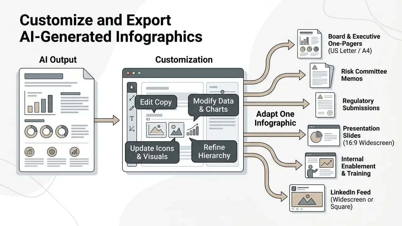
Customizing an AI-generated graphic is where copy gets clearer, chart scales get honest, default icons get replaced, and hierarchy gets enforced. Post-generation editing is what turns raw model output into corporate communication you would sign your name to.
Edit Copy, Data, Images, and Charts Before Publishing
When editing AI drafts, apply strict typographic rules. Restrict formatting to three hierarchy levels: main title (24 to 32pt bold), section subheadings (16 to 20pt semi-bold), and body text or captions (12 to 14pt regular). University design guidance warns that more than three levels dilutes the message. Keep body copy tight, roughly 15 to 20 words per visual section.
Chart data must be checked against the source spreadsheet by hand. Confirm that axis scales begin at zero where appropriate, so trends are not visually exaggerated, and that pie segments sum to exactly 100%. Follow federal visualization guidance on layout: short title, sparse horizontal text, high contrast, never color alone as a carrier of meaning, and section sizing proportional to importance ("must see / should see / can see"). Replace generic stock imagery or misaligned icons with verified corporate brand assets. For asset preparation and retouching workflows, teams can review our overview of online photo editors and their export controls.
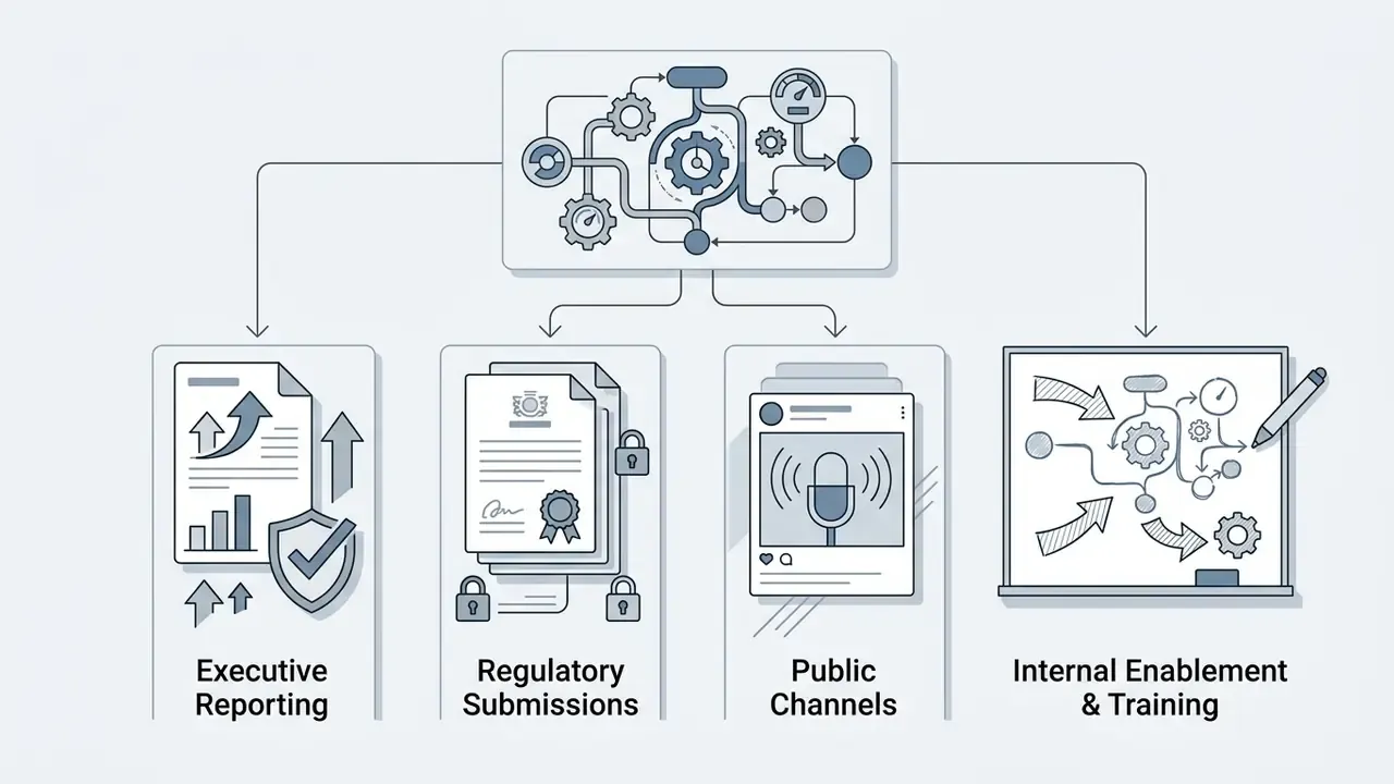
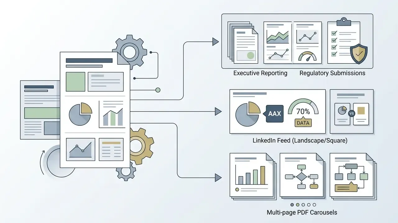
Adapt One Infographic for Executive Reporting, Regulatory Submissions, and Public Channels
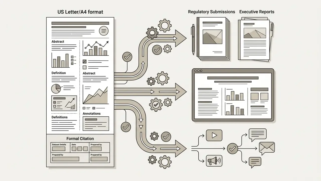
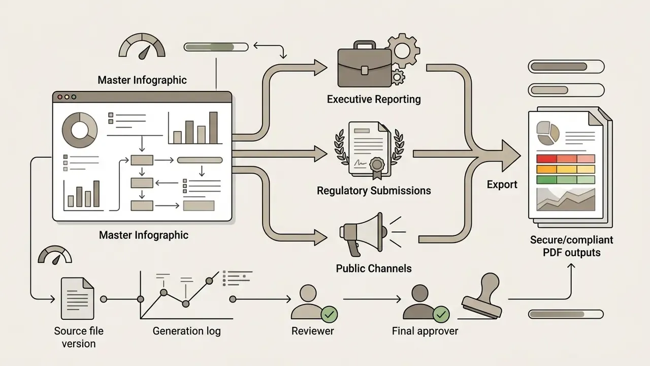
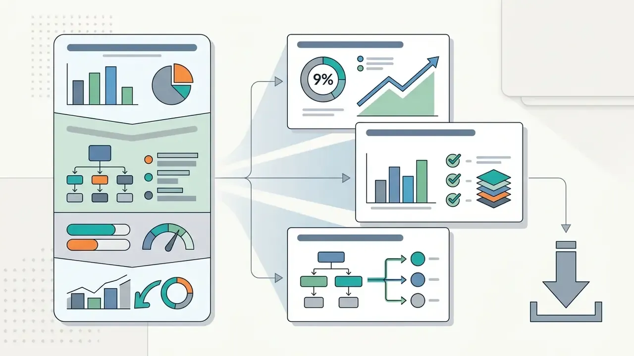
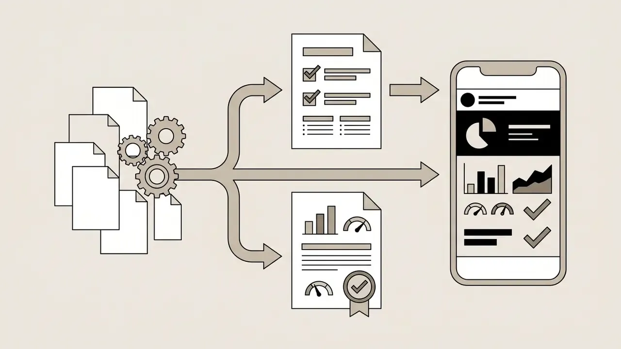
One master infographic can be repurposed across channels by resegmenting the core content. For regulated teams, the priority order runs from the board room outward:
Accessibility rules govern all of these variants, not just web pages. W3C/WAI guidance requires text alternatives matched to image function: brief meaningful alt text for informative graphics, action-describing alt for functional images, empty alt for decorative elements, and a full textual equivalent in surrounding content for complex charts. UNECE's 2025 guidance on AI-generated visuals adds two organizational rules: apply a corporate style and prompt policy across channels, and disclose AI involvement where the visual is published externally. Teams comparing free-tier export limits across adjacent tooling can review our roundup of free AI image generators.
Free AI Infographic Generators, Pricing, and Commercial Use
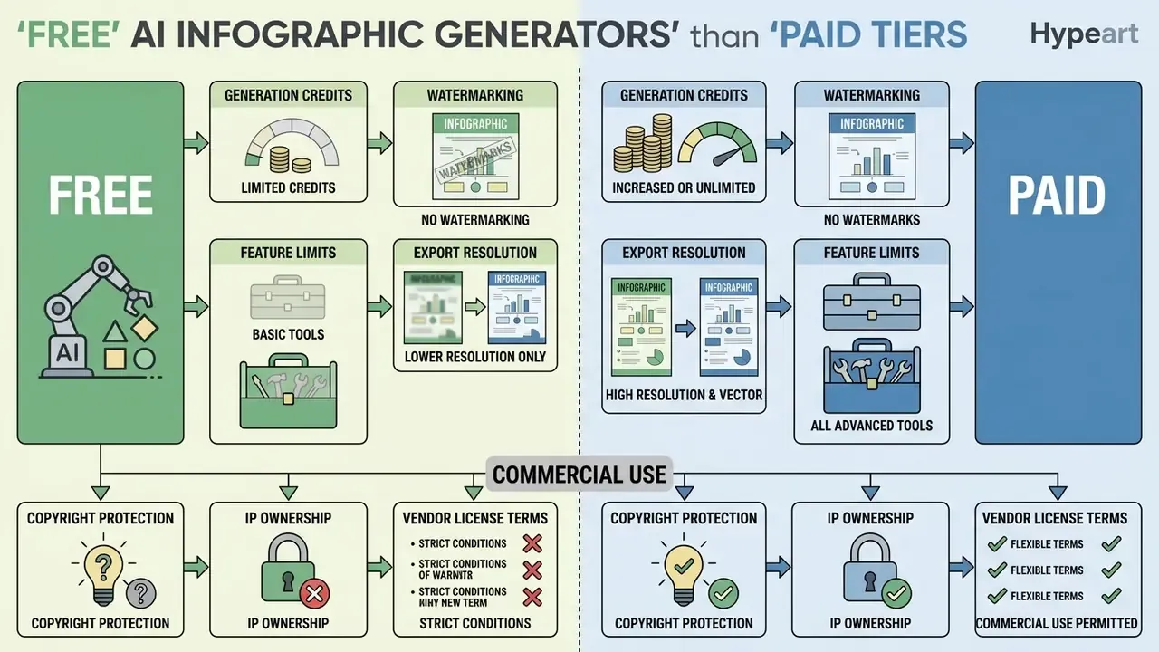
Comparing an ai infographic generator free plan against paid tiers comes down to credit caps, export restrictions, and commercial licensing terms. Free tiers are fine for testing a tool. Enterprise deployment usually needs a paid contract to secure data privacy and commercial ownership rights.
What a Free AI Infographic Generator Usually Includes
An ai infographic generator free online tier typically offers basic functionality with visible constraints:
- Generation Credits Free accounts commonly provide a small daily allowance (3 to 5 generations per 24 hours), a monthly credit pool (60 credits per month on some forever-free plans), or a fixed lifetime allotment, for example 400 credits at signup.
- Watermarking Free exports frequently carry vendor logos or "Made with AI" watermarks on web links and downloaded files.
- Export Resolution Downloads are often capped at standard-definition raster files (720p PNG/JPG), while scalable vector (SVG) and editable PowerPoint (PPTX) exports sit behind the paywall. That is the usual ceiling on an ai infographic generator from text free workflow.
- Feature Limits Advanced brand kit integration, custom font uploads, and team collaboration folders are disabled on most free plans.
- Request throttling Even bundled enterprise assistants apply caps. Adobe's Acrobat AI Assistant policy, for instance, allots 1,000 requests per user per month, after which usage may be throttled.
Credits are rarely consumed uniformly. Image synthesis costs an order of magnitude more than text structuring, which is the detail most teams miss when they budget. The matrix below reflects published per-action pricing patterns across mainstream platforms:
| Action performed | Typical credit cost | Notes |
|---|---|---|
| Topic / outline generation | 1 credit | Basic text parsing and structure proposal |
| Paste text or upload a document (PDF/DOCX/URL) | 3 to 5 credits | Table and text extraction, layout mapping |
| Vector graphic rendering | ~10 credits | SVG element and icon generation |
| Diffusion image generation | 25 credits | Backgrounds, illustrations, raster hero visuals |
| Language variant / re-layout of an existing asset | 1 to 3 credits | Translation with bounding-box preservation |
On a 60-credit monthly free plan, that arithmetic allows roughly two image-heavy generations or up to twenty structural drafts. Which is exactly why an ai infographic creator free tier works for evaluation and fails for recurring reporting cycles. Credit expiry policies differ too: some vendors roll unused credits into the next cycle, others reset monthly, a few never expire. Read that clause before you model annual cost.
To assess budget requirements across design tool categories, teams can compare options on our subscription pricing hub.
What to Check Before Using AI Infographics for Business or Marketing
Legal Alert: Enterprise Commercial Licensing Review
Limitations and Open Questions
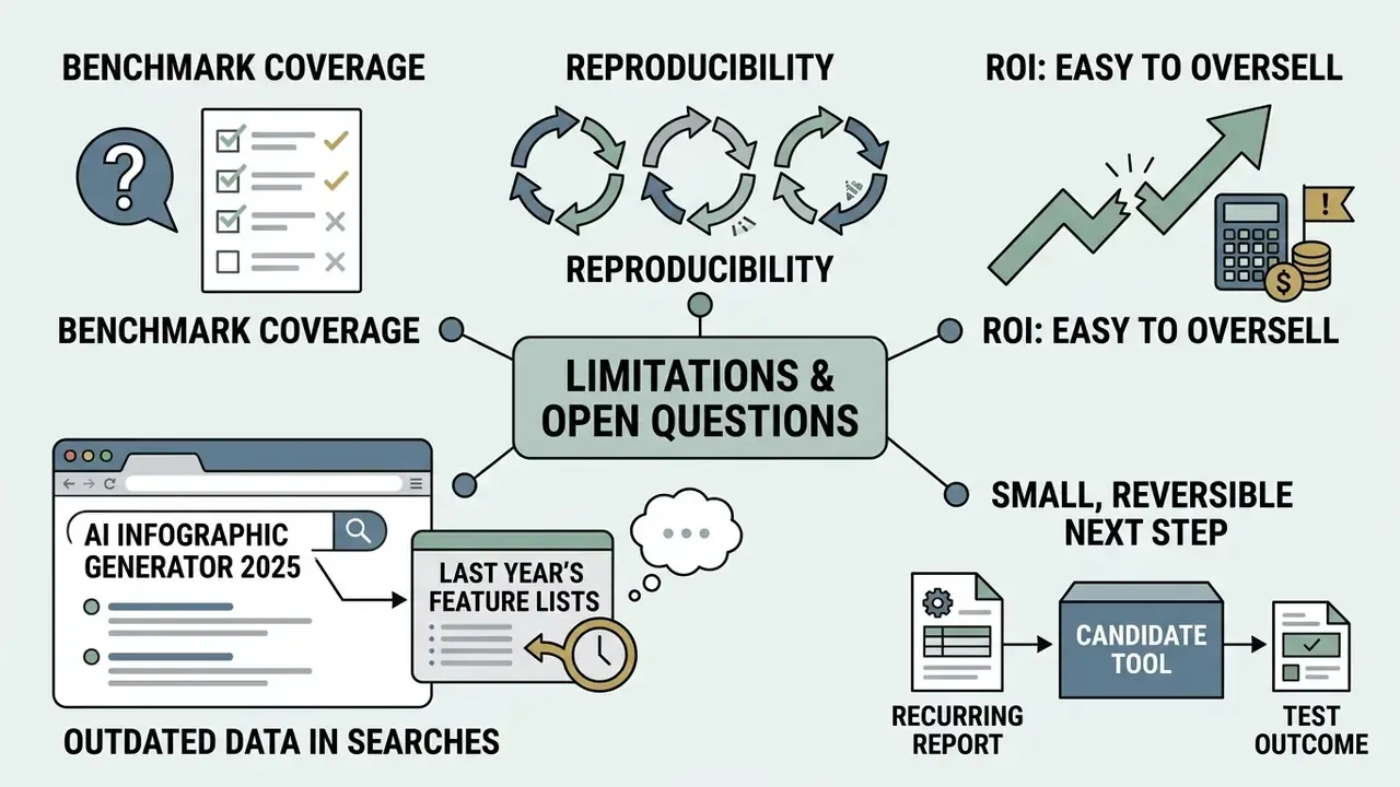
A few things are still unsettled, and pretending otherwise would be a disservice.
First, benchmark coverage. Instruments like VisJudge-Bench and PREVis score chart and layout quality, but there is no widely accepted benchmark for infographic quality that combines factual fidelity, accessibility, and brand conformance in one score. Vendor demos fill that vacuum.
Second, reproducibility. Most consumer-grade tools do not version-lock the model behind the generate button. Regenerate the same prompt in six weeks and you may get a different layout, sometimes a different rounding. For audit purposes, the exported file and its evidence log are the record, not the tool.
Third, ROI. The drafting savings are easy to measure and easy to oversell. Control costs, review time, and residual risk rarely appear in the business case. Until they do, treat any "99% cost reduction" figure, including the one in the table above, as a partial view of a single stage.
Searches for phrases like "ai infographic generator 2025" still return last year's feature lists, which is worth remembering when you benchmark. Pricing tiers, credit costs, and retention clauses have moved since then. Re-check them against current vendor documentation rather than a cached comparison post.
A reasonable next step is small and reversible: pick one recurring report, run it through a candidate tool for a single cycle, log the evidence chain, and compare reviewer hours against the manual baseline. No enterprise rollout required to learn something useful.
AI Infographic Generator FAQ
Short answers on registration, generation speed, export caps, and commercial rights for automated infographic software.
Is user registration required to use an AI infographic generator?
Most enterprise AI infographic tools require an account to save draft projects, access custom brand kits, and manage export history. Some basic web tools offer limited instant preview demos without registration. Downloading high-resolution files, removing watermarks, or exporting editable vector files, though, needs an authenticated account.
How fast does an AI infographic generator produce an initial visual layout?
Initial draft generation typically takes 15 to 45 seconds after prompt submission or document upload. A few vendors advertise a first structural draft in under 10 seconds for short prompts. Speed varies with input length, model architecture, server load, and whether the system renders raw vector layouts or diffusion-based background imagery. Worth noting: generation speed is not the bottleneck in regulated workflows. Verification and approval are.
Are there limits on how many infographics I can create for free online?
Yes. Free plans usually apply daily usage limits (3 to 5 generation requests per 24 hours), a monthly credit pool (commonly 60 credits), or a one-time lifetime allotment such as 400 credits at signup. Since a diffusion image can consume 25 credits while a topic outline costs 1, the number of finished assets is far lower than the raw credit figure suggests. Once credits run out, you upgrade or buy a credit pack.
Can I generate multiple visual style variants from the same text prompt?
Yes. Modern infographics ai platforms let you regenerate layouts with different themes, palettes, or structures while preserving the core source text and quantitative data. One-click theme switching previews the same content in corporate, minimalist, modern line-art, hand-drawn whiteboard, or dark-mode styles.
Can an AI tool recreate the layout of an existing infographic?
Yes. Style-cloning or "auto-remake" features accept an uploaded reference image, detect its grid and block structure, and rebuild an equivalent layout with your own data and copy. Use it for internal consistency across a recurring report series, and confirm ownership or licensing of the reference asset before cloning anything you did not create.
Can I generate infographics in other languages, and will sources be cited automatically?
Leading platforms support 20+ languages and can translate an existing layout while preserving text bounding boxes. Several also insert automated footnote citations into the canvas footer. Treat both as drafting aids: check glyph rendering and text-expansion overflow after translation, and reconcile every auto-generated citation against your source list before publication.
Can I access AI infographic creation platforms via a mobile app?
Many major design platforms, including Adobe Express, Canva, and Gamma, ship dedicated iOS and Android apps. On mobile you can review generated drafts, make minor copy edits, apply brand kit updates, and share finalized graphics to social channels or messaging apps. Full editing of a dense ai infograph maker layout is still a desktop job.
Can I legally use free AI-generated infographics for business and marketing?
Commercial usage rights depend entirely on the vendor's terms of service. Some platforms grant full commercial rights on free outputs; others restrict commercial use to paid subscribers. Separately, under U.S. Copyright Office guidance, purely AI-generated visual outputs cannot be registered for copyright protection without substantial human-authored editing and creative refinement.
How do I make an AI-generated visual auditable?
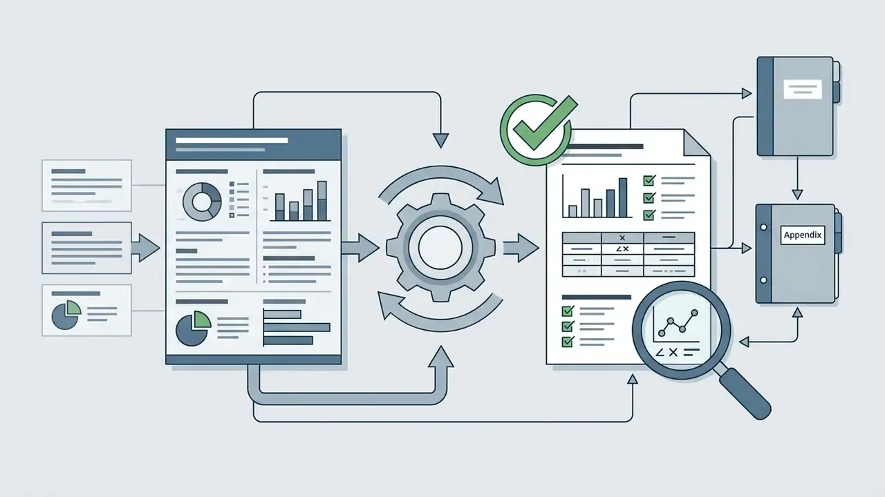
Log five items alongside the exported file: the exact prompt, the source dataset or document version, the model and version identifier, the generation timestamp, and the named human reviewer and approver. Attach the verified source table as an appendix. Without a version-locked prompt-and-source pair, the visualization cannot be reproduced on request, which is the practical requirement for using AI visuals inside a Model Risk Management or GRC process. For technical documentation, developer tools, and workflow integration resources, teams can open the hub to review system integration options. For platform questions, contact our support team. Buyers benchmarking generative visual tooling can review our comparison of the best AI art generators. For legal considerations around digital content rights, browse the hub for compliance guidelines, or check our policies on commercial use rights. To model design ROI and team resource savings, view the guide on our resource portal, or start from the terminology in our glossary.
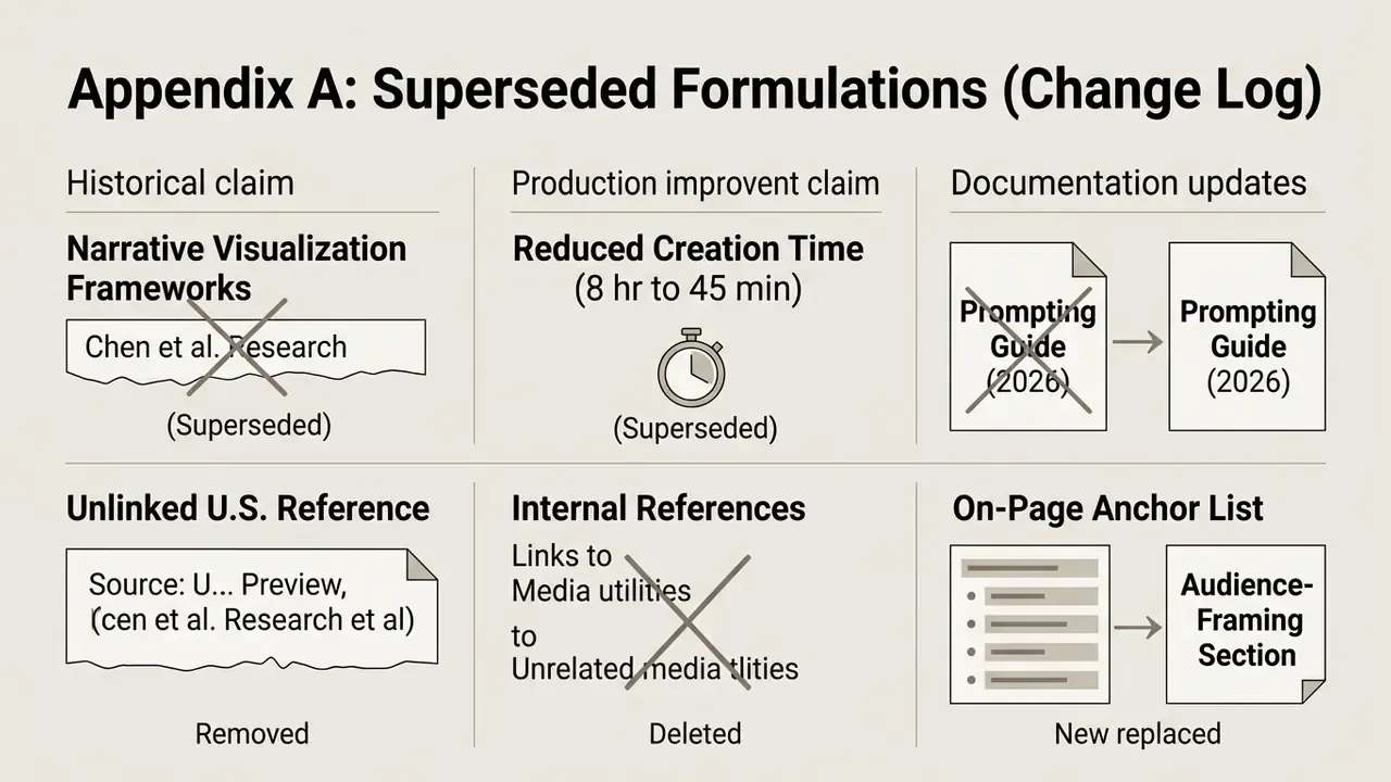
Appendix A: Superseded Formulations (Change Log)