A business letterhead is the closest thing a document has to a signature before anyone signs it. It carries corporate identity and legal metadata, yet it still has to leave room for the actual letter. Official agency standards and visual identity research both point the same way: a structured stationery design establishes authority quickly and keeps output consistent across print and digital channels. Layout prototypicality, meaning how closely a document matches the conventions readers already expect, accounts for a large share of perceived trustworthiness. That is why quietly breaking header, footer, and margin conventions carries a measurable reputational cost.
The Technical Summary at a Glance
| Parameter | Recommended Specification |
|---|---|
| Trim size | 8.5 × 11 in (US Letter) or 210 × 297 mm (ISO A4) |
| Side margins | 0.75 in (19 mm); minimum clearance 0.25 in (6.3 mm) per NIST FIPS Pub 89 |
| Header band | 1.5–2.0 in top zone; logo clearance no less than 0.25 in (6.35 mm) |
| Footer band | 0.75–1.0 in bottom zone for legal identifiers and contact metadata |
| Body type | Arial, Calibri, Verdana or Cambria at 10–12 pt for print (14 pt equivalent for screen reading) |
| Line length | 45–90 characters, roughly 110 mm, never exceeding 115 mm |
| Background tint | Unprinted white, or a tint below 10% density; dark text on light background only |
| Print prep | 3 mm (0.125 in) bleed, crop marks, CMYK, PDF/X-1a or PDF/X-3 |
| Digital master | PDF/A or PDF 2.0 with embedded fonts (ISO 19005-4), locked .dotx for Word users |
How to read this guide. If you are browsing for inspiration, jump straight to the fifteen annotated designs and their palettes. If you are setting a company-wide standard, start instead with the layout comparison table further down, decide on one structural archetype, then use the compliance checklist near the end as an approval gate. Two different jobs, two different reading orders. Mixing them is how organizations end up with nine unofficial letterheads and no owner.
What Makes a Good Business Letterhead?
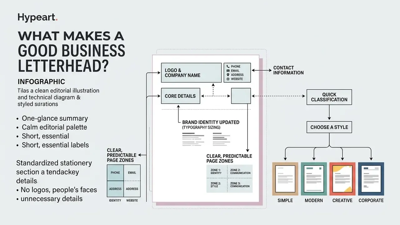
A good business letterhead is a standardized stationery template that places the company name, logo, and core contact details in clear, predictable page zones. Nothing exotic. Research on visual prototypicality shows that standardized layout conventions drive user trust directly, explaining between 29% and 68% of the variance in perceived trustworthiness across organizational documents, in a study of 1,530 respondents analyzed with structural equation modeling (Miniukovich & Figl, 2023).
To keep structural clarity, formal stationery divides the page into defined zones for branding, essential metadata, and body text.
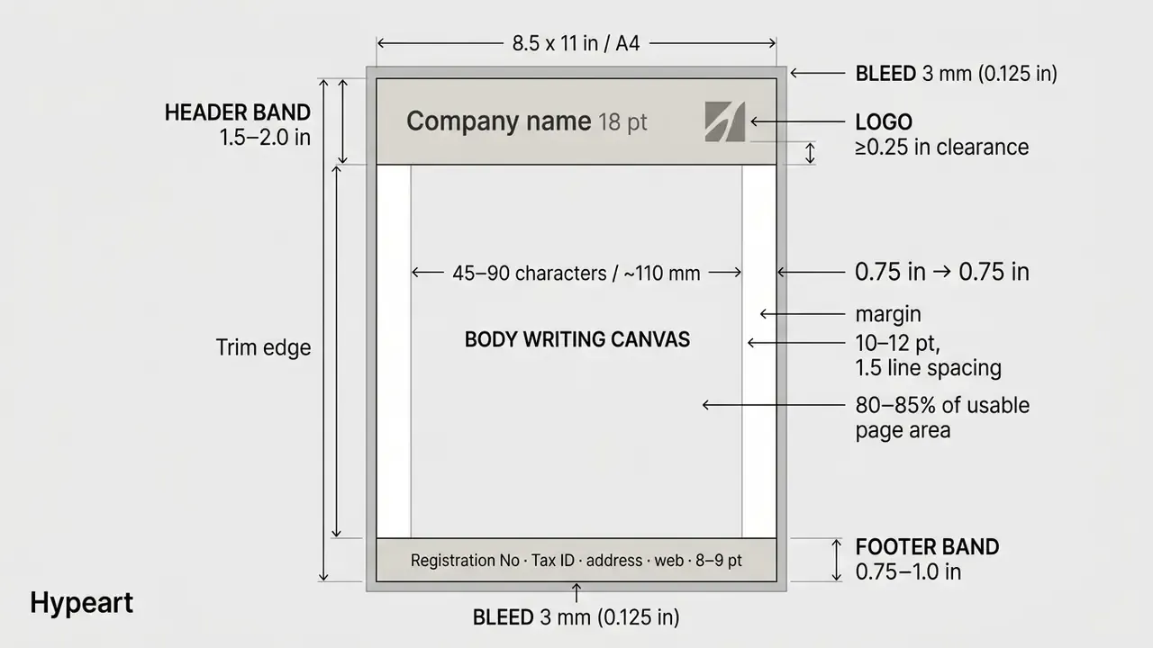
Figure 1. Standard structural breakdown of a corporate business letterhead: header band (logo lockup and primary branding), 0.75-in safe margins, body writing canvas, and footer band carrying legal requisites. Alt text for implementation: "letterhead design examples showing header, footer, and body layout bounds."
Quick classification before you choose a style. Every letterhead example in this guide reduces to one of four structural archetypes: top header band, vertical sidebar, footer-centric, and full background tint. Their trade-offs in writing space, ink consumption, and OCR reliability are compared in the layout configuration table later in the article. Scan that table first if you are selecting a company-wide default rather than hunting for ideas.
Logo, Contact Information and Brand Identity
Logo placement and contact information should occupy predictable locations, so recognition happens before reading begins. Institutional identity guidelines, such as those from the PIC Corporate Identity Manual and IEEE Standards, specify placing the primary logo lockup in the top-left corner or the top branding band with a minimum clearance of 0.25 inches (6.35 mm) to prevent visual crowding (IEEE Identity Guidelines; PIC Manual). The PIC manual also sets a printed logo floor of 10 mm, while the EPWP Corporate Identity Manual reserves the bottom branding zone strictly for footer copy.
Essential contact fields, including mailing address, telephone number, official email, and web URL, belong in a dedicated header block or in the bottom footer. The Isle of Man Government Corporate Identity Guidelines list address, telephone, fax, email, and website as stationery-layer fields rather than body copy. That single decision keeps correspondence text free of repeated administrative data, which matters more than it sounds when a letter runs to three pages.
Standardizing these elements means every official business letter carries complete legal and operational metadata without intruding on the reading canvas. Teams that still need to produce a primary mark before laying out the header can review current tooling in our overview of AI logo generators, or, if the wider identity system is still unsettled, in our notes on using an ai brand generator for palette and mark exploration.
Layout, Typography and Color Balance
Color palettes should stay restrained. Use full-brightness brand hues for small accent lines or logos, and keep background areas unprinted or tinted below 10% density to preserve contrast (Victorian Digital Form Guidance). Body text should be black or very dark grey, left-aligned, and set in a sans-serif face; where a background colour cannot be avoided, that guidance caps it at a 10% tint. One practical note: a tint that looks delicate on a calibrated monitor often prints two shades heavier, so proof on the actual stock.
Best Letterhead Examples by Design Style
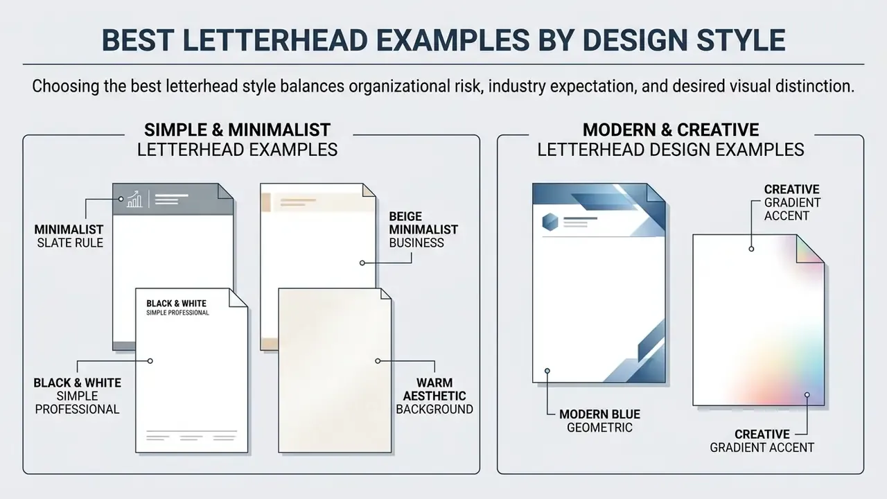
Choosing the best letterhead style is really a balance of organizational risk, industry expectation, and how much visual distinction you can afford. Reviewing letterhead examples across minimalist, modern, creative, and corporate families lets a team pick a layout framework that fits its operating context. The fifteen numbered designs below sit in four groups, each annotated with palette values, font pairings, structural archetype, and the sectors where the layout tends to perform best.
Simple and Minimalist Letterhead Examples
A simple letterhead relies on generous white space, restrained typography, and one accent element to convey quiet authority. Updated: in an empirical study surveying 31 agency creative directors, "white execution" layouts, those built on large uninterrupted areas of blank page, were consistently rated as more prestigious and more effective at focusing reader attention on core brand marks (Pieters & Wedel, 2011).
Typical simple letterhead examples use a neutral colour scheme (slate grey, deep navy, beige), a subtle horizontal rule beneath the masthead, and one legible typeface such as Calibri or Cambria. Because there are no decorative background fills, minimalist letterheads keep text contrast pristine, transmit cleanly by low-resolution fax or scan, and behave predictably on ordinary office laser printers.
1. Minimalist Slate Rule. Palette: Slate #2F3E46 with a 0.5 pt hairline rule under the masthead. Fonts: Calibri masthead over Calibri body at 11 pt. Archetype: top header band. Best for: consultancies, accountants, engineering practices that need a neutral, printer-friendly default.
2. Beige Minimalist Business. Palette: warm sand #EDE0D4 tinted at 8% density with charcoal #333333 text. Fonts: Cambria masthead with Calibri body. Archetype: top header band. Best for: interior design, hospitality, and boutique professional services where warmth matters more than austerity.
3. Black & White Simple Professional. Palette: pure #000000 on unprinted white, no accent colour at all. Fonts: Arial masthead with wide letter-spacing over an Arial 11 pt body. Archetype: footer-centric. Best for: single-colour offset runs, legal notices, and any correspondence that must survive photocopying and faxing without degrading.
4. Warm Aesthetic Background. Palette: peach #FFE5D9 or warm ochre #E9C46A held under 10% density, text in #2C3E50. Fonts: Verdana body at 11 pt for maximum legibility on tinted stock. Archetype: full background tint (light variant). Best for: education, wellness, and non-profit communications where reading comfort beats corporate severity. Warm low-saturation tints are the only background family that reliably preserves the positive-polarity contrast advantage documented in text-presentation research.
Bonus variation, Modern Personal Serif: Cambria body copy, a lightly tracked masthead, and a single sky-blue #8ECAE6 ornament produce a warmer but still restrained composition, suitable for founder-level correspondence and personal professional stationery.
Modern and Creative Letterhead Design Examples
Modern letterhead design examples introduce controlled visual variety through contrasting geometric shapes, subtle background patterns, and asymmetrical alignment. Updated: recent marketing research shows that gradient colour treatments in brand marks raise perceived brand innovativeness and consumer interest in forward-looking sectors, an effect replicated across six pre-registered experiments in the United States and China (Wei, Liu & Hung, 2025).
Creative letterheads used by technology firms or media studios often carry a bold vertical accent band along one edge, or a contrasting colour block in the header. Design teams sourcing abstract shapes, patterns, or illustrative marks for these accents can compare production options in our review of AI art generators, and licensing questions around generated artwork are worth checking against the AI Media Commercial-Use Hub before anything reaches a print vendor. To keep professional credibility, those accents must leave the central document canvas completely clear, achieving what visual researchers call "unity in variety" (Tuch et al.).
5. Modern Blue Geometric. Palette: clean white ground with contrasting blue #1D4ED8 geometric shapes in the upper-right corner. Fonts: Helvetica Neue masthead, Arial body. Archetype: top header band. Best for: SaaS, fintech, and B2B technology firms. Where shapes overlap text, place a white rectangle at 10–20% transparency beneath the copy to protect contrast.
6. Creative Gradient Accent. Palette: gradient sweep from #0A2540 to #2E86AB applied only to the logo and a 6 mm top rule. Fonts: Poppins masthead, Calibri body. Archetype: top header band. Best for: innovation-positioned brands, studios, and product launches. Gradients must terminate before the writing canvas begins.
7. Bold Typographic Header. Palette: monochrome with one accent hue. Fonts: an 18–24 pt display or grotesque face carrying the company name in place of a graphic logo, paired with a neutral 11 pt body. Archetype: top header band. Best for: publishers, agencies, and word-driven brands. A weak display face damages credibility faster than no logo at all, so restrict this option to organizations with a licensed brand typeface.
8. Asymmetric Modern Tech. Palette: #101828 text with a single 1 pt accent line. Layout: logo displaced to the top-right corner, balanced by a vertical hairline on the left margin. Archetype: top header band with sidebar accent. Best for: developer tools, R&D departments, and architecture practices.
9. Vertical Left-Border Strip. Layout: a 0.5 in (12.7 mm) vertical colour band down the left edge carrying contacts and social handles rotated 90°. Archetype: vertical sidebar. Best for: creative studios and marketing teams. Requires bleed verification, because sidebar edges clip on office printers without a 3 mm allowance.
10. Illustrative Frame & Accents. Layout: minimal vector illustrations at the page corners framing header and footer without touching the text block. Palette: two accent hues at most. Best for: creative agencies, children's brands, lifestyle and education organizations that want correspondence to feel human rather than corporate. Publishers reusing the same illustration style across covers and stationery often start from the workflows described in our ai book illustration reference.
11. Logo Geometry Watermark. Layout: the logo's geometry repeated or centred as a watermark at 3–5% opacity. Best for: simple geometric marks, monograms, and abstract icons; complex illustrated logos degrade into noise. Always test at print size rather than in digital preview, since screen and paper opacity readings diverge sharply. Anything above roughly 6% starts competing with body text and OCR capture.
12. Creative Footer-Framed. Layout: all contact data, geometric elements, and legal identifiers pushed into a 1.5 in bottom band, leaving about 85% of the upper page open. Archetype: footer-centric. Best for: multi-page proposals and contracts, because the footer repeats cleanly on continuation sheets.
Bonus variation, Eco-Conscious Light Ink: no fills at all, 0.5 pt rules, text-only branding. Designed for toner and ink economy on high-volume internal print runs, and the safest choice for organizations reporting on print-consumption reduction.
Corporate, Executive and Hybrid Letterhead Examples
13. Traditional Corporate Gold/Black. Palette: black #000000 dominant with gold #B08D57 as secondary, applied to seals, rules, and the masthead. Fonts: Times New Roman or a transitional serif at 18 pt for the organization title, 11 pt serif body. Archetype: top header band. Best for: banks, universities, chambers of commerce, and institutional boards using a two-colour (2/0) print technique.
14. Executive Monochrome with Foil Detail. Palette: a single deep monochrome family (charcoal, oxblood, or navy) with foil-stamped or embossed detailing on premium uncoated stock. Fonts: a licensed serif masthead with Cambria body. Archetype: top header band, generous 25 mm margins. Best for: law firms, investment houses, and private-client advisory, where tactile production quality signals seniority.
15. Dual-Use Invoice & Letterhead. Layout: standard branded header, an integrated line-item table in the middle third, payment details and tax identifiers in the bottom third. Best for: freelancers, studios, and small practices that want one stationery asset covering correspondence, quotations, and billing. Keep table borders at 0.5 pt and the totals row at 100% brand colour, so scanning software segments the table reliably.
Annotated gallery index: 15 letterhead examples by style family, palette, and structural archetype
| # | Design name | Family | Palette anchors | Archetype | Primary use case |
|---|---|---|---|---|---|
| 1 | Minimalist Slate Rule | Simple | #2F3E46 / white | Top header | Consulting, engineering |
| 2 | Beige Minimalist Business | Simple | #EDE0D4 / #333333 | Top header | Design, hospitality |
| 3 | Black & White Simple Professional | Simple | #000000 / white | Footer-centric | Legal notices, copy-heavy mail |
| 4 | Warm Aesthetic Background | Simple | #FFE5D9 / #E9C46A | Light tint | Education, wellness, non-profit |
| 5 | Modern Blue Geometric | Modern | #1D4ED8 / white | Top header | SaaS, fintech |
| 6 | Creative Gradient Accent | Modern | #0A2540 → #2E86AB | Top header | Innovation-led brands |
| 7 | Bold Typographic Header | Modern | Mono + 1 accent | Top header | Publishers, agencies |
| 8 | Asymmetric Modern Tech | Modern | #101828 + hairline | Header + accent | Dev tools, architecture |
| 9 | Vertical Left-Border Strip | Creative | Brand band 0.5 in | Sidebar | Studios, marketing teams |
| 10 | Illustrative Frame & Accents | Creative | Two accents max | Corner frame | Lifestyle, children's brands |
| 11 | Logo Geometry Watermark | Creative | Logo at 3–5% opacity | Centred watermark | Reports, certificates |
| 12 | Creative Footer-Framed | Creative | Brand band 1.5 in | Footer-centric | Proposals, contracts |
| 13 | Traditional Corporate Gold/Black | Corporate | #000000 / #B08D57 | Top header | Banks, universities |
| 14 | Executive Monochrome + Foil | Corporate | Deep mono + foil | Top header | Law, investment |
| 15 | Dual-Use Invoice & Letterhead | Hybrid | Brand + 0.5 pt table | Header + table | Freelancers, small practices |
Figure 2. Annotated examples of simple, modern, creative, corporate, and hybrid letterhead designs. Alt text for implementation should incorporate "good letterhead examples" and "modern letterhead design examples."
Examples of Letterhead for Business and Company Use
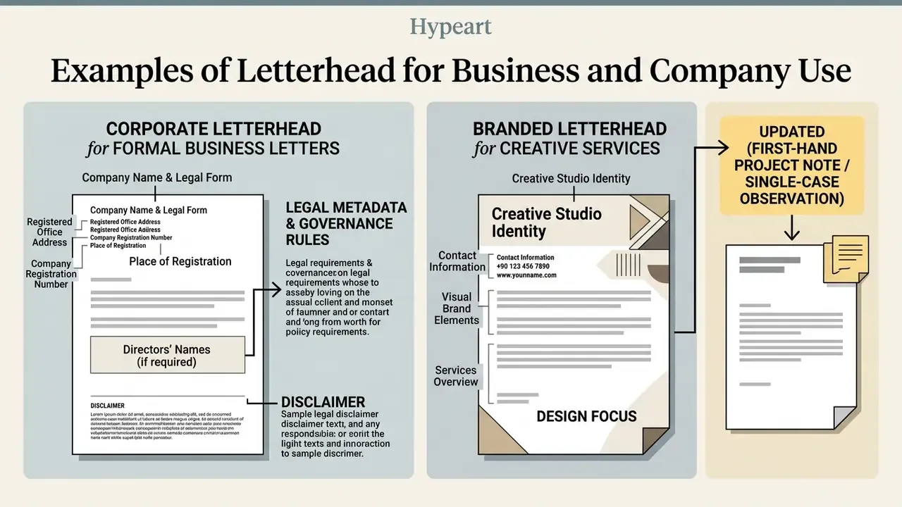
Adapting stationery for formal business letters means following corporate governance rules and legal metadata requirements closely. A business letterhead has to work as an authoritative communication instrument for contracts, executive correspondence, and regulatory disclosures. Decoration is secondary. Evidence of consistency is the point.
Corporate Letterhead for Formal Business Letters
Corporate stationery for banks, legal practices, and healthcare institutions demands high prototypicality and precise structural discipline. Official guidelines, including the U.S. Department of the Interior Manual and Ohio State Administrative Standards, require the official organization title centred or left-aligned at 18 pt, with secondary lines no larger than 12 pt, plus official seals or logos placed strictly in the upper branding zones (U.S. Dept. of the Interior). The Interior guidance also fixes ink to PMS 281 blue or black, specifies 8.5 × 11 in recycled stock, and advises omitting telephone numbers unless the stationery is laser-printed or produced in small batches. Michigan's state format is comparably prescriptive: coat of arms, department names, address, phone, and web address, printed in black on 24# watermarked stock, a rule that explicitly extends to electronically generated letterhead.
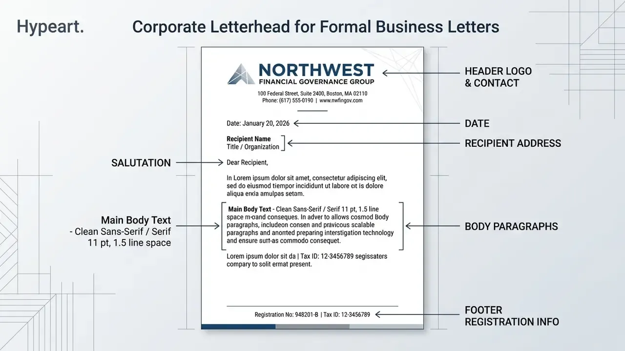
Figure 3. Callout example: a regulated financial services letterhead with legal identifiers isolated in the footer band. Company name and identifiers are illustrative and fictional.
For formal correspondence, the letterhead applies to the first page only, while continuation sheets use matching blank stock with identical margins (Purdue OWL; Guidelines for Business Correspondence). Continuation sheets should match page one in size, colour, quality, layout, and margins; where no letterhead exists at all, the sender's address goes at the top, one line above the date. Legally required identifiers, such as tax registration numbers or corporate headquarters addresses, sit in a clean footer band so the executive visual hierarchy survives.
Branded Letterhead for Creative Services
Creative agencies, design consultancies, and digital production studios need stationery that signals visual capability without sacrificing document utility. Brand identity standards for creative firms maintain precise grid systems and margins (typically 10–15 mm) while using dynamic vertical compositions or custom brand typography (OpenActive Brand Guidelines, 2025; OMK Guide, 2024). Production constraints tighten further in institutional style guides: the RISA guide fixes A4 stock, FSC-certified paper, Helvetica Neue, 10–12 pt body text, and a 7.5 pt footer, while OpenActive prescribes 120 g/m² uncoated white stock and offset CMYK printing.
When evaluating visual assets for commercial stationery, creative teams have to check that custom graphics do not fight readability or break software automation workflows. Where legacy logo files are low-resolution, most teams remaster them before layout using AI image enhancers or a standard photo editor, then re-export as vector or 300-dpi assets.
Updated (first-hand project note, single-case observation). During a corporate identity overhaul for a regional financial consultancy, our design group replaced a heavy background graphic with a streamlined top-header band and a 12 pt sans-serif grid. On that specific fleet of office laser printers, measured toner consumption per page fell by roughly 35% after the change, scanner optical character recognition (OCR) errors on returned signed copies were eliminated, and document processing sped up across legal departments. To be clear, that figure is an internal before-and-after measurement from one engagement, not a benchmark. Toner savings depend on device, coverage settings, and paper stock, so run your own coverage test before putting a number in a business case. If you need a first-pass estimate of run cost across formats, the AI Media Calculators can frame the arithmetic.
Designing Matched Stationery: Envelopes and Double-Sided Letterheads
A professional letterhead never really exists alone. Award-winning stationery systems, from minimalist cabinetry brands pairing a grey letterhead with a contrasting grey envelope, to identity systems placing the full logo top-left and a cropped version of the same mark on the reverse, treat the envelope and the back of the sheet as part of one document. The rules below govern a complete business correspondence set.
- Matching envelopes (#10 and DL).Reproduce the header palette and typeface exactly on the envelope face, with the return address in the upper-left corner. Reduce the logo footprint by roughly 20% relative to the letterhead so the mark reads as a companion rather than a duplicate, and keep all print at least 5 mm clear of the envelope edges.
- Double-sided letterhead printing.For representative correspondence, keep the front strictly restrained, white ground and clean text canvas, then print the reverse with a brand pattern or a 100%-density brand colour. Working page stays quiet; brand impact lands the moment the sheet leaves the envelope.
- Full-bleed back pattern (bonus variation).Where the reverse carries a full-bleed geometric pattern, extend artwork 3 mm past the trim on all four edges and control show-through with stock of at least 100–120 g/m². Lighter paper will telegraph the reverse pattern into the front text area.
- Second-page and dual-purpose stock.Order continuation sheets in the same weight and shade as page one, with the reverse either blank or carrying the same pattern, so multi-page contracts stay visually consistent.
- Cross-format consistency.Business cards, compliment slips, and invoice variants should reuse the same margin logic and type scale. That reuse is the practical mechanism behind corporate-identity congruence, not a separate design exercise.
Letterhead Format and Layout Examples for Print
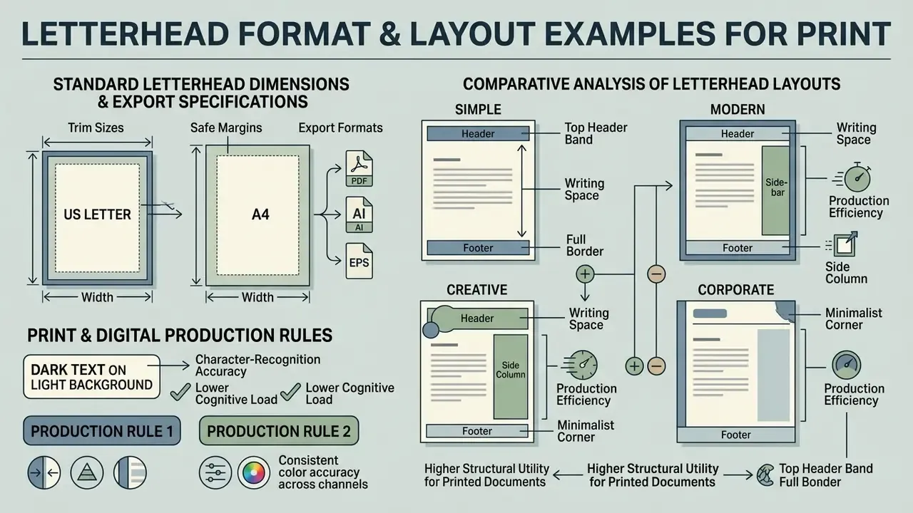
Choosing the right letterhead layout means judging how header, footer, and sidebar configurations affect available writing space and print production efficiency. Federal document guidelines prefer standard 8.5 × 11 inch (US Letter) or A4 dimensions with minimum 0.25-inch margin clearances for physical printing (NIST FIPS Pub 89), and NIST OCR form guidance names 8.5 × 11 in as the preferred size for machine-readable federal forms, advising against larger formats except where genuinely necessary.
Comparative analysis of letterhead layout configurations for print and digital use
| Layout Archetype | Branding & Logo Placement | Contact Data Location | Writing Canvas Space | Print & Digital Usability |
|---|---|---|---|---|
| Top Header Band | Horizontal band at top page edge (left or centred) | Top right or bottom footer band | High (80–85% of page canvas available) | Excellent. Compatible with standard laser printers, scanners, and screen PDF viewers. |
| Vertical Sidebar | Vertical margin strip along left edge | Integrated into left vertical margin column | Moderate (reduces horizontal line width) | Good for digital PDFs; requires print bleed verification to avoid edge clipping. |
| Footer-Centric | Minimal top logo lockup | Prominent multi-column footer block | Very high (maximum top-of-page canvas) | Strong for multi-page contracts; repeats cleanly across continuation sheets. |
| Full Background Tint | Integrated into background image or gradient | Overlaid across upper background graphics | Low (background can obscure body text) | Poor. High ink consumption, potential OCR scanning failure, screen legibility risks. Remaster any raster background with AI image upscalers before print if resolution falls below 300 dpi. |
As the comparison shows, the top header band gives the highest structural utility for printed documents and digital PDF delivery alike. Sidebar layouts look contemporary but shorten effective line length, and full background designs create real printing friction while lowering readability score metrics (ISO/TS 21328:2022). If you standardize on one archetype across an organization, the header band is the least regrettable default.
Standard Letterhead Dimensions & Export File Specifications
Trim sizes, safe margins, and export formats by region and delivery channel
| Region / Standard | Trim Size (Width × Height) | Safe Print Margins | Recommended File Formats | Primary Software Target |
|---|---|---|---|---|
| North America (US Letter) | 8.5 × 11.0 in (215.9 × 279.4 mm) | 0.5 in to 0.75 in (12.7 to 19.0 mm) | .DOCX, .DOTX, .PDF/X-1a, .INDD | MS Word, Adobe InDesign |
| International (ISO A4) | 8.27 × 11.69 in (210 × 297 mm) | 15 mm to 20 mm | .PDF/A, .AI, .SVG, .PNG (header asset) | Google Docs, Canva, Adobe Illustrator |
| Digital / Email Attachment | Screen canvas, RGB-optimized, no bleed | N/A (responsive padding) | .PDF (interactive), .DOCX / .DOTX template | MS Copilot, Google Workspace |
| Design source masters | Trim size plus 3 mm bleed on all edges | Crop marks visible | .PSD, .AI, .INDD, .EPS (vector logo) | Photoshop, Illustrator, InDesign |
Two production rules cut across every row here. First, any .DOCX or .DOTX distributed to staff must rely on system-safe typefaces, meaning Arial, Calibri, Verdana, Times New Roman, or Cambria, because a licensed brand font missing from the recipient's machine triggers substitution and shifts the whole header grid. Second, files intended for both print and email should be exported twice from a single master: a CMYK print-ready PDF with bleed and crop marks, and an RGB screen PDF without bleed. Two exports, one source of truth.
Letterhead Templates: Free, Custom or Designed from Scratch?
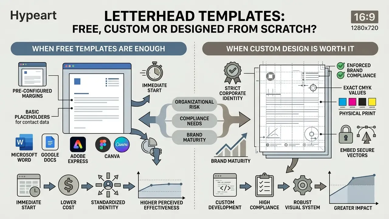
Choosing between free pre-made templates, customized frameworks, and bespoke agency work depends on organizational risk, compliance needs, and brand maturity. The trade is implementation speed against brand protection, and most teams underestimate how quickly free templates fragment.
When Free Letterhead Templates Are Enough
Free letterhead templates in Microsoft Word, Google Docs, Adobe Express, or Canva give you an immediate, low-cost route for routine work. Federal small business guidance and administrative standards confirm that standardized open templates are fully sufficient for internal drafting, non-regulatory communications, and preliminary business plans (U.S. Small Business Administration). The boundary is filing. Grants.gov, for example, states that its forms repository is for reference only and cannot be submitted with an application package, which is the clearest available signal that free templates suit internal or reference use rather than statutory submission.
Free templates arrive with pre-configured margins and basic placeholders for contact metadata. Before rollout, verify that font selections stay standard across operating systems so layouts do not shift when files are shared, and replace placeholder marks with a real primary logo. That task is increasingly handled with an AI logo generator or a template-based editor such as those covered in our Canva AI Generator overview.
When a Custom Letterhead Design Is Worth It
A custom letterhead design becomes necessary once an organization must enforce strict corporate identity governance, protect brand equity, or meet regulated filing requirements. Corporate brand manuals call for custom stationery when correspondence carries legal disclaimers, specialized tax identifiers, or strict trademark application rules (Loginom Brandbook, 2025; Overstrand Municipality Policy). Overstrand's branding policy, for instance, mandates that all externally used forms carry the current logo only, a rule that is simply unenforceable with ad-hoc templates edited by individual employees.
Custom development also lets an organization fix exact CMYK values for physical print, embed secure vector assets, and build locked digital templates that block unauthorized layout changes by internal staff. In governance language: one owner, one approved artefact, one audit trail.
Teams planning custom asset workflows can consult our pricing benchmarks, and design leads preparing brand imagery for a bespoke header will find the current tool landscape mapped in our guide to AI photo editors.
How to Create a Letterhead from an Example
Turning an inspiring reference into a compliant, production-ready document takes a systematic four-step process. Treat the reference as a structural model covering page size, margins, and field placement, never as artwork to be copied (NIST Usability Reporting; Adobe Document Guidance, 2025). Following that sequence prevents the usual failures: improper font substitution, cropped margins, illegible contact text after low-resolution printing.
- Establish page architecture and margins.Select target output dimensions (A4 or US Letter). Define 0.75-inch (19 mm) side margins and reserve a top header band of 1.5 to 2.0 inches for primary branding.
- Integrate logo and contact metadata.Place high-resolution vector logo assets in the top-left or centred header position. Insert primary contact fields (address, phone, web domain) in clean 8–9 pt type with strong contrast against the background. Where the existing mark is unusable at print resolution, regenerate or remaster it first; our comparison of AI image generators covers current options for producing supporting graphics.
- Configure typography and colour hierarchy.Apply approved brand fonts, restricting body text to standard, highly legible faces at 10–12 pt. Limit brand colour accents to logos, thin rules, or footer backgrounds. Specify two or three typefaces maximum with exact hex and CMYK values, as brand style guide standards require.
- Apply pre-press and digital export settings.Set physical print specifications with 3 mm (0.125 in) bleed and visible crop marks for professional print runs (University of Cambridge Print Standards). Export digital masters as PDF/A or PDF 2.0 with embedded fonts for long-term preservation (ISO 19005-4), and print files as PDF/X-1a or PDF/X-3.
Step-by-Step Implementation in Microsoft Word and AI Workflows
Building a locked template in MS Word:
Google Docs and Canva variants: in Google Docs, place assets inside Insert → Headers & footers, then share the file as a template link with view-only permissions. In Canva or Adobe Express, lock the header and footer layers, publish as a brand template, and restrict palette swatches to approved hex values before granting team access.
Using AI assistants (Copilot, ChatGPT) for structure and copy: once the layout is frozen, an AI assistant is genuinely useful for drafting the letter body, tightening flow, and generating variant wordings for recurring correspondence types. Same principle applies as with any ai bot maker deployment: a defined owner, a narrow role, and human review before release. For structural scaffolding, the following prompt produces a standards-aligned starting point, and titling long enclosures is a related job covered in our notes on the ai book title workflow.
Prompt: "Act as a corporate graphic designer. Generate an HTML/CSS flexbox
template for an A4 business letterhead following ISO 21328. Include a top
header band, 20 mm margins, primary accent color #0A2540, dark gray body text
#2C3E50, and a locked 2-column legal footer."
Always validate AI-generated layouts against the margin, contrast, and font-embedding rules above before releasing them to staff. No evidence, no autonomy.
Letterhead Compliance and Pre-Press Checklist
Use this as the final gate before a letterhead is approved for enterprise-wide use or sent to a print vendor.
Checklist0 / 18
FAQ About Letterhead Examples and Templates
Can I Use One Letterhead for Print and Digital Letters?
Yes. A single master layout can serve physical print and digital distribution, provided the technical file specifications are separated properly (ISO/TS 21328:2022, https://www.iso.org/standard/70908.html). Physical offset or digital print runs need CMYK colour profiles, 300 dpi resolution, and explicit 3 mm (0.125 in) bleed margins to prevent white edge artifacts (Franklin Graphic Guidelines). For email attachments or screen distribution, export the letterhead as an RGB-optimized PDF or a locked Word document with no bleed settings. Sticking to digital PDF standards preserves the visual layout across operating systems and mobile viewports (ISO 19005-4). Keep the same positive-polarity contrast in both versions.
«Positive polarity, meaning dark text on a light background, significantly improves reading outcomes on screen and in print alike.» Source: AEM Education and Training (2023). https://doi.org/10.1002/aet2.10875
Can I Customize a Letterhead Template with My Brand?
Yes, pre-designed templates can be customized with your brand assets as long as you follow core brand identity guidelines (Adobe Brand Style Guide, 2026). Focus customization on three things: replacing placeholder logos with high-resolution vector artwork, setting exact brand hex or CMYK values, and updating contact fields.
«Gradient logos consistently increase perceived brand innovativeness, an effect replicated across six pre-registered experiments.» Source: Wei, Liu & Hung, International Journal of Research in Marketing (2025). https://doi.org/10.1016/j.ijresmar.2025.01.002 To keep visual integrity, avoid piling on unapproved typefaces, enlarging the logo beyond its header margin, or dropping decorative watermarks across the central body area (Vlad Museum Firm-Style Manual). Fine adjustments to imported artwork belong in a dedicated AI image editor rather than inside the document itself.
What File Formats and Sizes Should a Letterhead Be Delivered In?
Deliver an editable office template (.DOTX for Word, or a locked Google Docs or Canva brand template), a print-ready PDF/X-1a with 3 mm bleed and crop marks, an archival PDF/A master, and the design source file (.AI, .INDD, or .PSD) plus a vector logo (.SVG or .EPS). Sizes follow the dimensions table above: 8.5 × 11 in for North America, 210 × 297 mm for A4 markets.
Should the Letterhead Appear on Every Page of a Letter?
No. Conventional business-letter formatting applies the full letterhead to page one only; continuation sheets use blank matching stock with identical size, colour, quality, layout, and margins. Footer-centric designs are the one exception worth considering for long contracts, since a slim footer band repeats cleanly on every page without eating top-of-page writing space.
How Do I Stop Employees Creating Their Own Versions?
Publish one locked .dotx (or cloud template) in a shared gallery, restrict header and footer editing, limit the font set to system-safe families, and document the approved palette with exact hex and CMYK values. Organizations with more standardized visual identity systems report higher perceived effectiveness of their corporate materials, which is the governance argument for centralizing the template rather than emailing files around. Add a quarterly spot check of outbound PDFs; that habit catches drift earlier than any policy memo. For further technical guidance on configuring digital assets and managing media production workflows, visit our AI Media Support and Troubleshooting portal, review the AI Media Comparison Matrices for tool selection, consult developer specifications in the AI Media API Guides, or explore term definitions in our AI Media Glossary.