Executive Summary
- Readability is a measurable requirement, not a taste question. WCAG 2.2 sets a minimum contrast ratio of 4.5:1 for normal text and 3:1 for large text (18 pt, or 14 pt bold). Outlines, drop shadows and semi-transparent background pads are the practical tools for hitting those thresholds on busy photographs.
- Format choice decides quality. PNG is lossless and preserves sharp character edges exactly. JPG/JPEG re-encodes the whole canvas with lossy DCT compression, so export at 75 to 85 percent quality and avoid repeated re-saves.
- Free does not automatically mean clean. Verify watermark policy, font licensing, export formats and account requirements before you invest layout time. Some free tiers apply branding overlays or daily processing caps.
- Branding is part of the job. Modern editors combine text layers with logo uploads (including SVG), monochrome background removal, and watermark transparency around 30 to 50 percent, plus platform canvas presets for YouTube, Facebook and Instagram.
Adding text to an image is a fundamental visual workflow used across corporate communications, digital marketing and media publishing. Browser-based graphics tools let users perform these edits without installing desktop software, paying subscription fees, or accepting forced platform watermarks. Understanding how to manage text layers, maintain visual contrast and handle file compression keeps exported assets aligned with professional presentation and accessibility standards.
The same guide serves two audiences at once. A creator producing a quote graphic, a thumbnail or a captioned photo needs the fastest reliable click path. A communications, risk or compliance owner approving that tool for a team needs to know where the pixels are processed, whether the export is clean, and whether the output satisfies accessibility contrast rules. Both requirements are covered below, in that order.
Three Questions to Settle Before You Upload
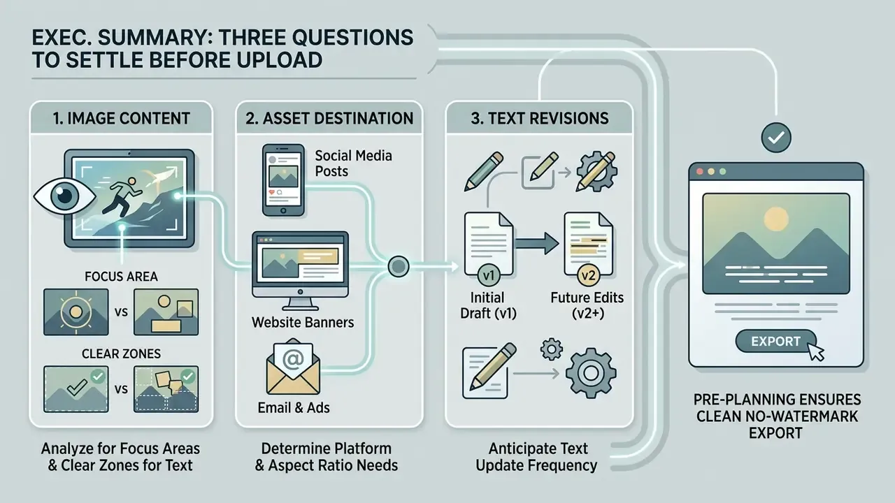
A short decision frame saves rework later. Ask these first:
- What is in the picture? Public marketing photography and interface screenshots behave very differently from customer documents, account statements or identity material. The data class decides the tool, not the other way round.
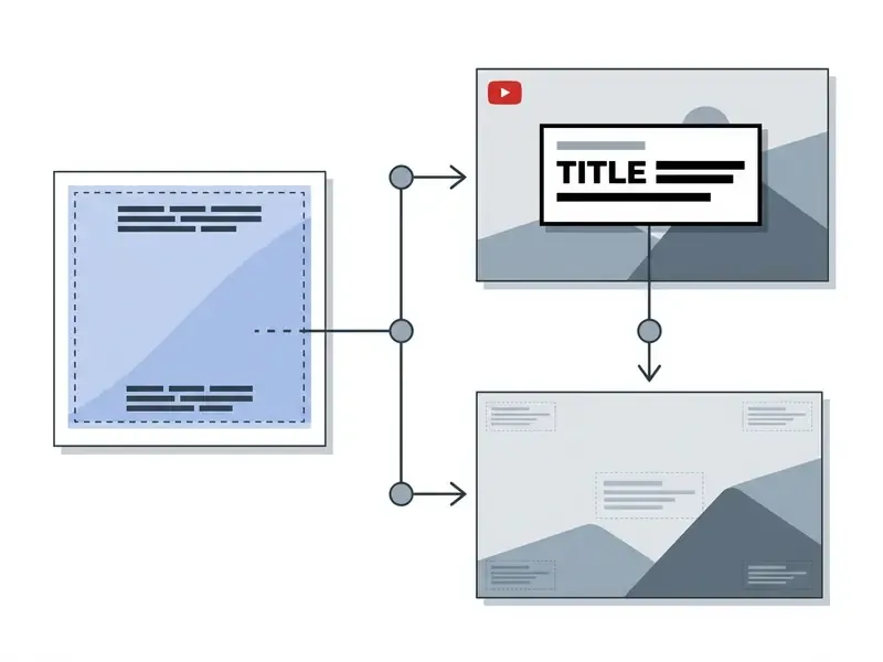
- Where does the asset ship? A YouTube thumbnail, an Instagram story and a slide cover have different safe zones and aspect ratios. Choose the canvas preset before you place the text box.
- Will the text need to change later? If yes, keep a layered master. A flattened JPG cannot carry an editable type layer, and re-typing a headline over a re-compressed export is how quality quietly drains away.
That is the whole planning step. Two minutes, maybe three.
Add Text to an Image Online for Free in a Few Clicks
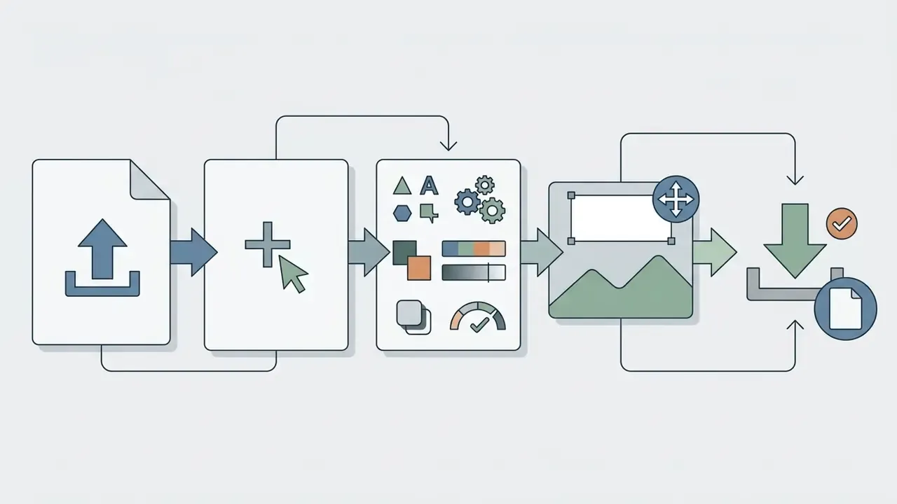
Adding text to an image online for free involves uploading your image file into a web editor, creating a custom text box, formatting your typography, and exporting the final graphic without cost. Most browser-based editors complete this workflow in a few clicks, with no software installation and no user registration.
When you run this process, the underlying system loads the raster file into local browser memory, establishes a separate vector layer for text elements, and renders real-time previews of layout adjustments. Following a structured sequence keeps results consistent across operating systems and browser environments.
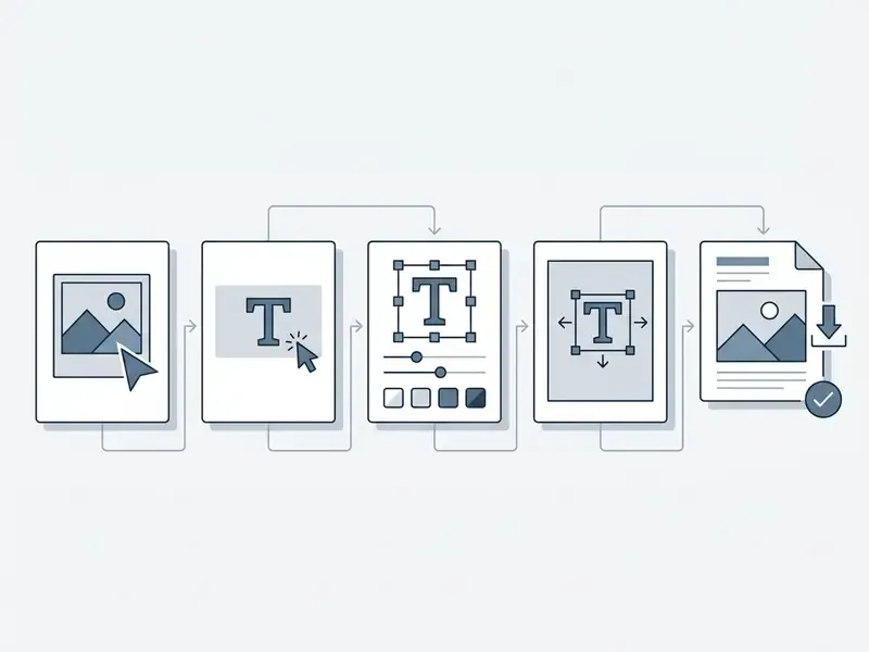
- Select image.Click upload or drag a JPG or JPEG file directly into the web tool workspace to initialize the canvas buffer.
- Click add.Select the text tool from the sidebar to create a new editable text layer over the image.
- Customize the text layer.Enter your copy, then adjust font size, font color, alignment and opacity controls.
- Position the text.Drag the text box to an unobtrusive region of the photo to preserve visual balance and subject focus.
- Download the final image.Export the processed file in your target image format, with no added watermark.
Select Image and Upload a Photo Online
Preparing a photo online begins by selecting an uncompressed or high-resolution source file and loading it into the web tool's canvas buffer. Most browser editors support drag-and-drop for standard image formats including JPG, JPEG, PNG and WebP, with file-size handling typically accommodating uploads from 40 MB up to 100 MB depending on client hardware limits (Adobe Express upload limits: 40 MB per image, https://www.adobe.com/express/; Adobe Experience Manager notes that PNG files above a 100 MB IDAT payload are unsupported).
Upload sources are not limited to the local disk. Alongside picking a file from your device, browser editors commonly support:
- Cloud storage import, via Google Drive, Google Photos and Dropbox connectors, which avoids the download-then-reupload round trip on managed laptops;
- Remote image URLs, where you paste an
https://image link and the editor fetches the raster straight into the canvas; - Clipboard paste, pressing
Ctrl+V(Windows/Linux) orCmd+V(macOS) to drop a raw screenshot into the workspace, which is the fastest path for annotating interface captures; - Built-in stock or theme galleries, searching a keyword such as "mountains" or "office" when no source photo exists yet.
Before applying text layers, evaluate the uploaded image for dimensions and visual density. High-entropy images with dense background detail or several competing focal points need deliberate text placement planning. Built-in preview windows let you inspect sharpness and color profiles before editing, and a comparison of online photo editors by feature scope and export behaviour helps narrow the shortlist before you commit a production asset to one tool.
Click Add and Create a Text Layer
Clicking the add text command inserts a distinct vector text layer over the background raster canvas. That text layer behaves as an independent object, defined by explicit bounding box coordinates, font attributes and line-spacing parameters (W3C CSS Inline Layout Module Level 3, 2024).
There is an important behavioural distinction at creation time. A single click on the canvas usually produces an auto-width text layer that grows with the typed string, while click-and-drag creates a fixed-dimension box that wraps copy inside the drawn rectangle. Choose the fixed box when you need a predictable column width for multi-line captions, and the auto-width layer for single-line headlines.
Capable web editors permit multiple text boxes inside one canvas layout, and most impose no hard limit on the number of blocks. Separate text layers let creators apply distinct typographic hierarchies: a prominent headline paired with smaller explanatory subtext, labels attached to different regions of a diagram, or several fonts and colors mixed in one composition. Multi-line blocks can be aligned left, right or centre, and line height can be tuned independently of font size. Because the text stays in a vector state while on the canvas, resizing or rotating the text box causes no edge distortion before final flattening. The same layer logic underpins AI photo editors that expose text as an addressable object rather than baked-in pixels.
Workflow Productivity: Templates, Duplication and Canvas Swapping
Repetitive caption work rewards features that most guides ignore. To streamline batch tasks, modern add text to image online tools retain your last-used formatting templates in local session memory, commonly the last ten styled blocks, so brand typography does not have to be rebuilt for every asset. Three productivity controls are worth verifying before a large run, plus one safety default.
| Productivity Feature | What It Does | Why It Matters |
|---|---|---|
| Saved text templates | Stores recent font, size, color and effect combinations locally | Keeps a caption style consistent across dozens of images without a paid brand kit |
| One-click layer duplication | Copies a styled text block with every attribute intact | Removes manual re-styling for repeated labels and multi-language variants |
| Photo swap with layer retention | Replaces the underlying image while preserving text coordinates and styling | Turns one approved layout into a reusable template for a whole photo series |
| Original-file protection | Applies edits to a copy, never overwriting the source | Preserves the archival master for future re-crops and re-exports |
Download the Image with Text
Downloading your edited image means selecting an export format that balances file size against visual fidelity. Lossless formats such as PNG reconstruct original pixel data exactly, which makes them optimal for graphics containing sharp text edges and line art.
Saving the output as a JPG or JPEG instead applies lossy discrete cosine transform (DCT) compression. Lossy compression reduces file size for web delivery, and an export quality setting between 75 and 85 percent prevents visible artifacts around letter outlines (Google Web Fundamentals: Image Optimization recommends a practical quality threshold near 85 and progressive encoding for larger images, https://developers.google.com/speed/docs/insights/OptimizeImages). Export benchmarks published by tooling vendors show the trade-off plainly: the same source rendered at JPEG quality 70 measured roughly 1.48 MB against 14.68 MB at quality 100, with negligible perceptual gain on text edges above the mid-80s. Ten times the weight for an improvement nobody sees.
Customize Text: Fonts, Font Size, Color and Position
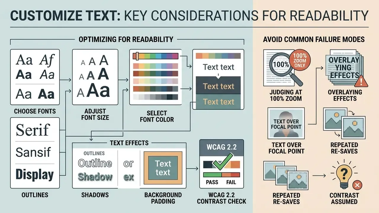
Customizing text on an image requires balancing font size, font color, visual contrast and layer positioning to guarantee readability. Established typography standards keep your text box clear against complex background graphics without obscuring the primary subject.
Typeface choice drives visual hierarchy and legibility. Standard sans-serif fonts such as Arial, Helvetica or Inter generally deliver better on-screen legibility than intricate decorative scripts, particularly at smaller font sizes.
Font inventory is a real differentiator between add text to image online editors. Capable browser tools expose 900+ Google Fonts (published catalogues range from 926 families in some editors to 950+ in others), a curated shortlist of 10 to 12 recommended display faces, 90+ solid colors and gradients, plus HEX code entry for exact brand values. Beyond typeface selection, verify that the editor offers bold and italic toggles, left, centre and right alignment, line-height control, rotation by arbitrary angle, and opacity. Those controls separate a usable caption from an amateur overlay.
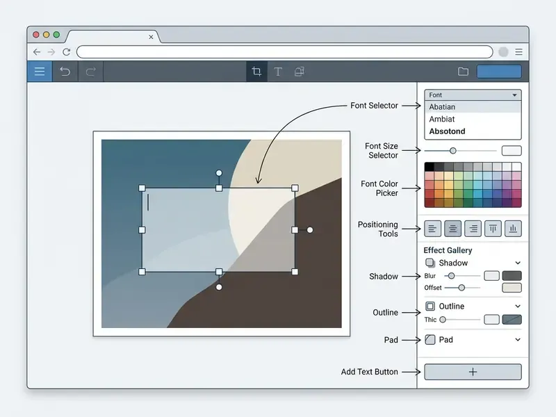
Choose Font Size and Font Color for Readability
High legibility depends on a font size color combination that reaches a contrast ratio of at least 4.5:1 against the background image region. For large text, defined as 18-point text or 14-point bold text, accessibility standards permit a lower minimum of 3:1.
To compute the relative luminance contrast ratio between text pixels () and immediate background pixels (), designers and engineers apply the standardized formula:
Two exemptions are worth knowing before you over-engineer a design. Incidental text, decorative text and logotypes carry no contrast requirement, and text that forms part of a picture containing significant other visual content is likewise exempt under the criterion. For everything else, meaning headlines on thumbnails, labels on charts and quote cards, the 4.5:1 and 3:1 thresholds apply. WCAG 2.2 also expects text to stay usable when scaled to 200 percent, which argues against cramming long strings into a narrow overlay.
If the chosen background photo has variable lighting, a gradient sky or a detailed pattern, a solid or semi-transparent fill behind the text box keeps contrast consistent across every character.
Text Effects: Outlines, Shadows and Background Padding
To hold readability on complex background patterns without abandoning brand font colors, apply a solid or semi-transparent background pad behind the text box. Alternatively, apply a high-contrast text outline or a drop shadow at roughly 40 to 60 percent opacity to separate character edges from background noise. Mature browser editors ship 36 to 39 discrete text effects, including shadow color control, outlines, contrasting plates and pseudo-3D extrusions.
Use decision logic rather than stacking every effect at once.
| Background Condition | Recommended Effect | Practical Setting |
|---|---|---|
| Busy photographic texture (foliage, crowds, cityscape) | Background pad | Solid or 60 to 80 percent opaque plate, 8 to 16 px internal padding |
| Gradient sky or soft light falloff | Drop shadow | Offset 2 to 4 px, blur 4 to 8 px, opacity 40 to 60 percent |
| Light text on a light subject | Text outline (stroke) | 1 to 3 px stroke in a high-contrast complementary tone |
| Clean studio or negative space | No effect | Rely on font weight and WCAG-verified color contrast |
| Watermark or signature layer | Reduced opacity plus thin outline | 30 to 50 percent text opacity, hairline outline for legibility |
Two further colour tactics come from professional practice. First, sample a colour that already exists in the photograph, but take it from a minor detail rather than the dominant area, then shift its hue or shade slightly so the text does not merge into the background. Second, when neither option reads cleanly, drop the copy onto a pad and edit the pad's transparency until the preview stays legible at thumbnail scale, which is the size at which most social assets are actually first seen.
Five Failure Modes That Keep Coming Back
Most unusable exports fail for predictable reasons, not exotic ones:
- Text judged at 100 percent zoom only. Check the composition at thumbnail size too. Caption work lives or dies there.
- Effects piled on top of each other. Outline plus shadow plus pad plus gradient reads as noise. Pick one, maybe two.
- Copy placed over a face or a moving focal point. The subject wins the attention contest every time, and the message loses.
- Repeated JPG re-saves. Each pass is a fresh lossy encode. Finish the layout, then export once.
- Contrast assumed rather than measured. A quick luminance check takes seconds and removes an entire class of accessibility findings.
Position the Text Box on the Image
Positioning a text box well means placing the text layer in low-entropy visual zones, away from focal objects, human faces and compositional diagonals. Careful alignment avoids blocking critical subject matter and keeps overall visual balance.
Eye-tracking evidence indicates that viewers fixate on visual elements before shifting attention to embedded text, and that advertising preference correlates negatively with prolonged fixation on text blocks. Long on-image copy costs attention rather than earning it.
Positioning rules that survive redesigns. Keep the text layer structurally separate from the raster, never baked into the source master. Preserve the image's meaningful content rather than covering it. Place copy along natural margins, open sky, blurred bokeh or flat-colour regions. W3C accessibility guidance reinforces the same architecture: text should exist as a layered element with markup and styling rather than sit permanently inside a picture, because embedded text cannot be resized, re-styled or read by assistive technology. Where the asset ultimately ships to the web, Section 508 practice requires any visible text in the graphic to be reproduced word-for-word in the alternative text.
Add Captions, Quotes and Labels to Photos
Adding text captions, quotes and labels turns static images into structured assets fit for digital media distribution and executive reporting. Precise styling conveys context without pulling attention away from the image content. For teams on a zero budget, a survey of free photo editors clarifies which feature limits and export restrictions apply before a caption run begins, and the wider AI Media Comparison Matrices put those limits side by side across adjacent tool categories.
Short inline quotations and descriptive labels should stay concise. When you design collateral for social channels, clean visuals plus tight copy yield better readability than dense text panels. Follow a fixed structure for informational captions, namely description, location, date, and keep decorative flourishes out of the label layer. Semantic convention matters once the graphic is published alongside HTML: short quotations belong in q, longer block quotations in blockquote with cite naming the source, while label is reserved for form controls and caption for data tables rather than photographs.
When a regional financial-services institution needed to standardize marketing graphics across sub-brands, the team set strict contrast standards and font templates inside their browser workflow. By moving from manual pixel painting to vector text layers with pre-calculated luminance values, they materially shortened compliance review cycles, from a multi-day queue to a same-day turnaround, while holding visual brand fidelity. (Illustrative internal estimate, not independently audited; cycle times vary with review headcount and approval policy.)
Add a Logo or Brand Mark alongside Your Text Overlay
Professional graphic workflows often pair a text caption with a brand mark. Advanced web editors let you upload a secondary vector (SVG) or raster (PNG) logo file into the same canvas, position it independently of the text layer, and export both in a single flatten pass. Four capabilities decide whether the result looks deliberate or improvised.
- Format tolerance.Confirm SVG support if brand guidelines mandate vector reproduction. SVG scales without edge softening at large canvas sizes, unlike an upscaled PNG.
- Monochrome background removal.If the supplied logo sits on a solid white or black plate, use the built-in background-removal control to make it transparent instead of masking it by hand.
- Recolouring and outlines.Brand marks frequently need an inverted or single-colour treatment over dark photography. Look for colour override plus a thin outline or shadow so the mark stays legible on mid-tone backgrounds.
- Transparency control.When the logo works as a copyright watermark rather than a headline element, set transparency near 30 to 50 percent so it signals ownership without dominating the frame.
Some editors also ship icon galleries for building a simple mark from scratch, plus supporting elements such as arrows, stars, lines, speech balloons and splashes that turn a plain photo into an annotated explainer. Treat every added element as a separate layer so it can be moved or removed without re-flattening the whole canvas. Teams producing channel art at scale usually pair this step with a dedicated banner maker for YouTube rather than rebuilding header geometry by hand.
How to Add Text to JPG and JPEG Images
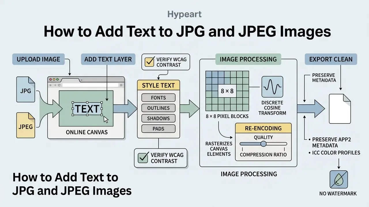
Adding text to JPG and JPEG images online requires loading the raster into a browser canvas, placing a text layer overhead, and re-encoding the file at your chosen compression quality. Preserving original color profiles and metadata keeps display consistent across devices.
Because JPG and JPEG are lossy raster formats, modifying and re-saving these files means managing re-compression settings to prevent cumulative degradation.
| Parameter | JPG / JPEG Format Properties | Recommended Editing Setting |
|---|---|---|
| Compression type | Lossy discrete cosine transform (DCT) | Export quality between 75 and 85 percent |
| Color profile | ICC profiles stored in APP2 markers | Preserve original sRGB or Display P3 profile |
| Layer structure | Single flattened raster layer | Edit as a separate vector text layer before export |
| Metadata | EXIF, IPTC and XMP application markers | Preserve metadata markers during re-encoding |
| Re-encode count | Every save is a fresh lossy encode | Complete all edits in one session; avoid iterative saves |
| Editable master | JPG cannot carry live text layers | Keep a layered master (PSD or XCF) if text must stay editable |
Add Text to a JPG Image Online
Processing a JPG image in an add text to image online editor rasterizes the canvas elements and manages lossy re-encoding artifacts on the way out. When a browser canvas exports an edited layout back to JPG, the graphics engine re-compresses the combined image matrix. The HTMLCanvasElement.toBlob() and toDataURL() interfaces accept an explicit quality parameter for JPEG output and silently fall back to PNG when a requested type is unsupported, which explains why some tools hand back a larger PNG than expected.
An online tool with a quality slider lets users fine-tune the compression ratio. Setting export quality near 80 percent strikes the practical balance: file sizes stay modest while character edges remain sharp and readable. Where a source photo has already been degraded by earlier re-compression before the caption is applied, AI image enhancement tools can restore edge definition before the text layer is added, rather than after. Order matters here more than most people expect.
Add Text to a JPEG Image and Export It
Exporting a modified JPEG file requires preserving APP2 metadata segments, including ICC color profiles and EXIF tags, during the save operation. Retaining those embedded parameters keeps color accurate across web browsers and desktop display hardware.
Because JPEG segments enforce a strict 64 KB limit per marker, large ICC color profiles are split across multiple APP2 segments. High-quality web graphics editors retain those segment chains upon export, so color space definitions survive the process of adding text to an image. There is an operational corollary for teams running downstream automation: many lossy re-encoding pipelines strip metadata by default, so if colour management or EXIF provenance matters for your archive, test a sample export and inspect the marker chain before processing a batch. Automated pipelines can be wired through documented AI Media API Guides once the sample export behaves predictably.
How to Choose a Free Online Text Editor Without a Watermark
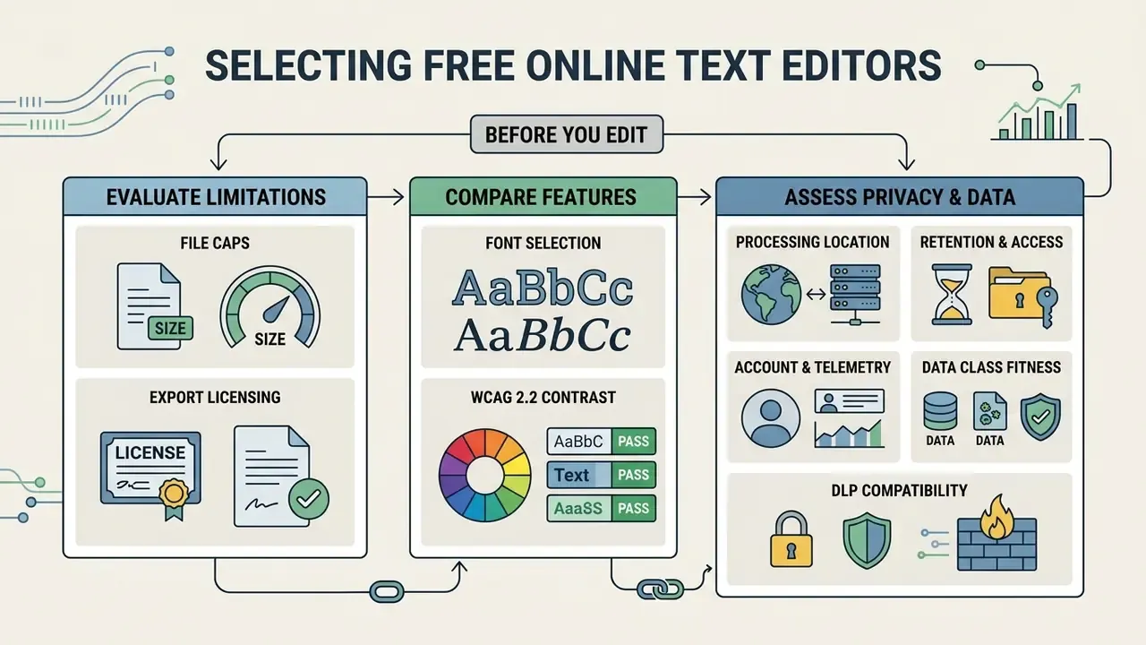
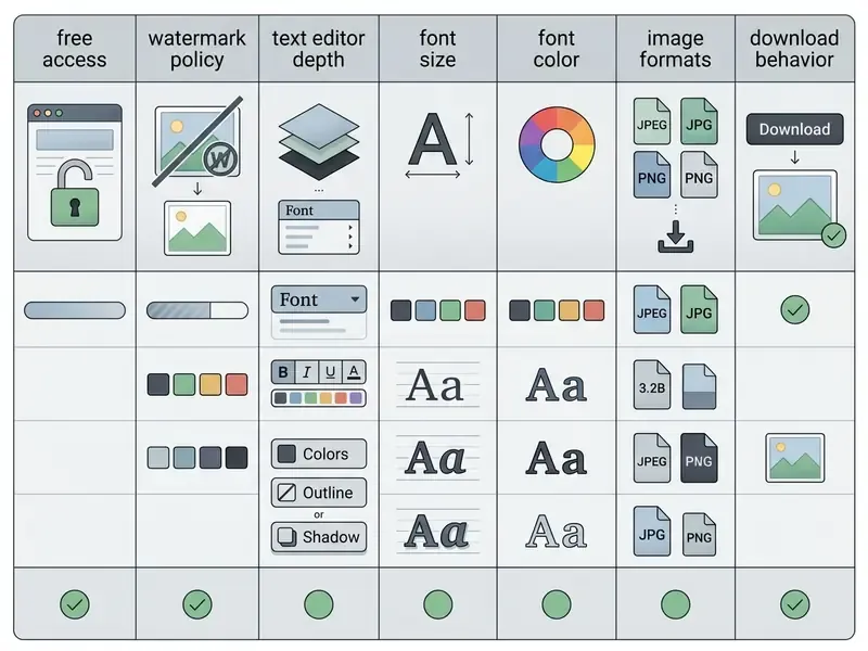
Selecting a free online text editor without a watermark means evaluating file size caps, export licensing terms, font selection and privacy policies. Confirming that the service injects no forced platform branding protects professional output quality.
Plenty of free web tools promise unrestricted editing and then stamp a large branding overlay onto the export. Reviewing core capabilities before you start a design workflow prevents wasted layout time. The same audit logic used when comparing free editing software across adjacent media types applies here: read the free-tier limits before the first upload, not after the layout is finished.
| Tool Evaluation Feature | Mandatory Capability | Evaluation Rationale |
|---|---|---|
| Watermark policy | Zero added platform logos on export | Preserves professional asset usability |
| Privacy architecture | Client-side in-browser processing | Protects confidential visual data |
| Font and color control | Full RGB and HEX control plus font size adjustments | Supports compliance with WCAG contrast standards |
| Export flexibility | Multi-format support (JPG, JPEG, PNG, WebP) | Matches output format to deployment channel |
| Account requirements | No forced sign-up or credit card entry | Eliminates friction and data collection |
| Hidden quotas | No daily image cap or font paywall on the free tier | Prevents mid-project blocking (some free tiers cap five images per day or twelve fonts) |
| Asset licensing | Clear terms for stock photos, icons and fonts | Avoids inheriting a watermarked or non-commercial asset |
Features to Check Before You Start Editing
Audit font customization options, precise text box transformation controls, multi-format export support and data privacy safeguards before editing. Checking those attributes first prevents operational bottlenecks at export time.
Make sure the text editor provides explicit transformation handles for rotating, scaling and aligning text layers, including a rotation handle for arbitrary angles and numeric size entry where pixel-exact alignment is needed. Tools that support layered object editing let creators adjust text placement relative to other canvas elements without touching the underlying photo. Crop and canvas-resize controls belong in the same audit. If the tool cannot output the exact aspect ratio your channel requires, you will re-crop downstream and break the text box you positioned so carefully. Where output volume and unit economics matter, run the numbers in dedicated calculators rather than estimating from memory.
Free Download and No-Watermark Export
Securing a free download with no watermark means confirming that the free tier enforces no premium export restrictions or embedded logos. Reviewing export preview settings keeps the final output clean.
Several web platforms bundle royalty-free asset libraries with their editing tools, and licensing terms differ between standard free assets and premium content. Some display a watermark over paid-tier stock elements for free users, removing it only after purchase, and issue one content licence per design (Canva Help Center: licences, copyright and legal, https://www.canva.com/help/licenses-copyright-legal/). Verify that your export options exclude watermarked stock elements before finalizing the workflow, and compare candidate tools against documented free AI image generators without watermarks when the underlying visual is generated rather than photographed. Published throughput and quality figures in the AI Media Benchmarks collection help sanity-check vendor claims.
Three verification steps close this gap reliably:
- Export a low-stakes test image first and inspect the downloaded file at 100 percent zoom, corners included.
- Confirm whether hidden or premium layers are included in the export settings. Some exporters ship watermark elements that stay invisible in the editing preview.
- Check whether the watermark lives in the source document or is applied only at export. The latter can reappear unexpectedly after a settings change.
In an evaluation of enterprise content workflows, a risk-management team audited several web tools to eliminate unexpected platform watermarks on external client collateral. They standardized on a browser-based editor that operates entirely within client-side memory, which removed server upload exposure and delivered clean exports without third-party branding overlays.
Privacy Architecture, DLP and Shadow AI Risk Assessment
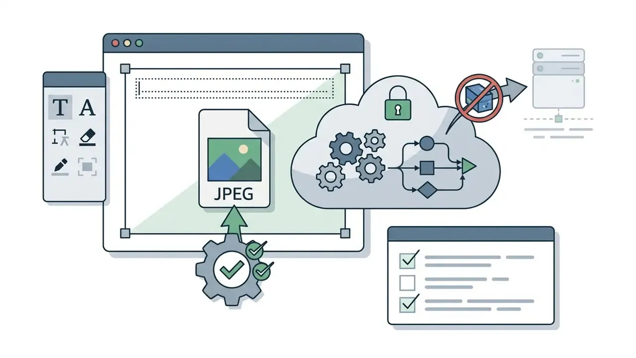
Free web editors split into two architectures, and that distinction is the entire risk question. Client-side tools decode the image into a browser canvas buffer held in local page memory. The raster never leaves the device, and closing the tab discards it. Server-side tools upload the file to a remote host, process it there and return a rendered result, which means the source image has been transmitted to, and possibly retained by, a third party. Vendor language such as "we never store your files" describes retention policy, not architecture. Only an explicit statement that processing happens on the device, verifiable in browser network activity, establishes the client-side claim.
Work through the checklist below before allowing a free browser editor into a controlled environment:
- Processing location. Does the vendor state explicitly that files are processed on the device and not sent to servers? Can that be confirmed by observing whether an upload request is issued?
- Retention and access. If any upload occurs, what is the stated retention window, and does the vendor claim no human access?
- Account and telemetry surface. Does the tool require sign-up, social login or analytics identifiers that create a new data-processing relationship?
- Data class fitness. Is the material being captioned free of personal data, customer identifiers, account numbers, medical detail or non-public financial information? If not, the workflow belongs in an approved internal pipeline, not a public web tool.
- DLP compatibility. Does endpoint DLP policy permit browser upload of image files to that domain, and is the domain classified rather than unknown?
- Certification posture. For contractual environments, is there a documented security posture, for example a SOC 2 or ISO/IEC 27001 attestation, or only a marketing privacy page?
- Output determinism. Does the tool return the same export every time, without injected branding, ads or altered metadata?
- Shadow AI exposure. If the tool includes generative features, are prompts and images used for model training by default, and can that be switched off?
Approved internal pipeline versus unvetted web tool.
| Criterion | Approved Enterprise Pipeline | Unvetted Free Web Tool |
|---|---|---|
| Data residency | Documented and contractually bound | Often undisclosed |
| Audit trail | Logged, attributable edits | None |
| Brand consistency | Enforced templates and locked palettes | Operator-dependent |
| Accessibility check | Contrast validated in a review gate | Manual, easily skipped |
| Suitable content | Confidential and regulated material | Public, non-sensitive imagery only |
| Time to first asset | Slower, gated | Immediate |
One practical note for governance owners: an image editor rarely appears in an AI inventory, yet a generative feature inside it can create the same exposure as any other unapproved model. Classify the tool, not the marketing category.
Create Text Images for Social Media, Captions and Watermarks
Creating text images for social media and digital rights protection means tailoring copy length, contrast and font styling to each distribution platform. Clean typography carries the message without visual clutter.
Text overlaid directly onto visuals plays distinct functional roles across channels, from promotional headlines on marketing graphics to subtle copyright notices on portfolio photography, and from launch teasers to internal presentation covers and conference collateral. Licensing questions around commercial reuse of generated or stock visuals are collected in the AI Media Commercial-Use Hub.
Add a Simple Text Watermark to an Image
Overlaying a simple text watermark protects intellectual property by placing a semi-transparent text layer with copyright claims or logo identifiers across a photo corner. Opacity between 30 and 50 percent keeps the image usable while stating attribution clearly.
A text watermark works as a formal notice of ownership, not as a legal prerequisite for protection.
A subtle text layer carrying the copyright symbol (©), publication year and owner name deters casual reuse while keeping visual integrity intact. Position the mark where a crop cannot trivially remove it, offset from the extreme corner or overlapping a mid-tone area of the subject, and keep the string short enough to stay legible at 30 percent opacity. Where you also need to verify the provenance of third-party imagery before publishing it under your own mark, AI image detection tools provide a first-pass authenticity check.
FAQ: Frequently Asked Questions About Adding Text to Images
Common inquiries about online text overlays address cost, potential image quality loss, screenshots, logo formats and the operational capabilities of AI-assisted editors. These frequently asked questions cover the technical factors that shape a graphics workflow.
How Do I Add Text to a Picture for Free?
You can add text to a picture for free by opening a browser-based photo editor, uploading your JPG or JPEG file, creating a text box, styling the text layer, then exporting the clean image to local storage without creating an account. Tools that process data client-side render faster and keep your media private. The complete path is normally three to five actions, meaning upload, add text, style, position, download, with no design skills, no installation and no plug-ins required. Free download, no watermark, no sign-up wall: that is the benchmark to hold vendors to.
Can I Add Text to a Screenshot Online Without Software?
Yes. Paste the screenshot straight from your clipboard into the browser editor with Ctrl+V or Cmd+V, or drag the saved capture into the workspace. Insert a vector text box with a background pad for contrast, add arrows or highlight shapes if the annotation needs to point at specific interface elements, then export immediately as PNG or JPG. PNG is the better choice for screenshots, because lossless compression keeps both the UI text and your added caption crisp.
Can I Add More Than One Text Block to the Same Image?
Yes. Browser editors typically allow an unlimited number of text blocks on one canvas, each styled independently. That is how you combine a headline with a supporting caption, label several regions of a diagram, or build a structured layout with mixed fonts and colours. Multi-line blocks support left, centre and right alignment plus line-height adjustment, and one-click duplication copies an existing block with all styling intact.
Can I Add a Logo in SVG Format Together With the Text?
Yes, in editors that support vector uploads. SVG logos scale to any canvas size without edge softening, which matters on large banners and print-adjacent exports. If the supplied logo sits on a solid white or black plate, use the monochrome background-removal control to make it transparent, then recolour or outline it so it stays legible over photography. Drop its transparency to between 30 and 50 percent when the mark doubles as a copyright watermark.
Does Adding Text to a Photo Reduce Its Quality?
Adding text to a photo reduces quality only if the underlying visual is re-saved with aggressive lossy JPEG compression. Exporting at quality settings of 80 percent or higher, or saving in lossless PNG, prevents visible generation loss and pixelation around text edges.
«JPEG encoding divides the image into 8 × 8 pixel blocks during discrete cosine transform processing, so repeated re-saving accumulates artifacts along character boundaries.» Source: NIST Technical Guide to JPEG Image Compression (2024). https://www.nist.gov Completing all text layer adjustments in a single editing session minimizes re-encoding degradation. Two practical corollaries follow. First, if the captioned image will later feed OCR or computer-vision processing, blocking artifacts around glyph edges reduce recognition reliability, so export such assets as PNG or at the highest available JPEG quality rather than optimising for file size. Second, if the text may change later, keep a layered master (PSD or XCF) alongside the flattened JPG, because JPG cannot carry an editable type layer.
Can I Use AI to Add Text on a Photo?
Yes. AI tools can generate automated text overlays, recommend typography styles, replace existing text while preserving the original font, colour, shadow and background, and perform context-aware inpainting inside the browser. Manual control still matters, though, both for WCAG contrast compliance and for exact typographic alignment. Text produced purely by a generative prompt is usually not an editable layer, so a misspelling cannot be fixed without regenerating the image. Recent research highlights generative systems capable of treating text layers as editable canvas objects alongside stickers and geometric shapes, which moves the field toward object-level text editing rather than baked-in pixels.
«Visual explanations presented as a keyword gallery were selected by users in 83.7 percent of cases as the most comprehensible way to learn an AI tool.» Source: Evirgen, Wang and Chen, From Text to Pixels, IUI (2024). https://dl.acm.org/doi/10.1145/3640543 Hybrid workflows are the pragmatic answer. Let automatic detection handle standard text blocks, then switch to manual selection for logos, curved baselines and difficult backgrounds. For broader tool evaluation across generative visual workflows, see our comparison of AI art and image generators by output quality, control and licensing terms.
Appendix A: Editorial Revision Notes
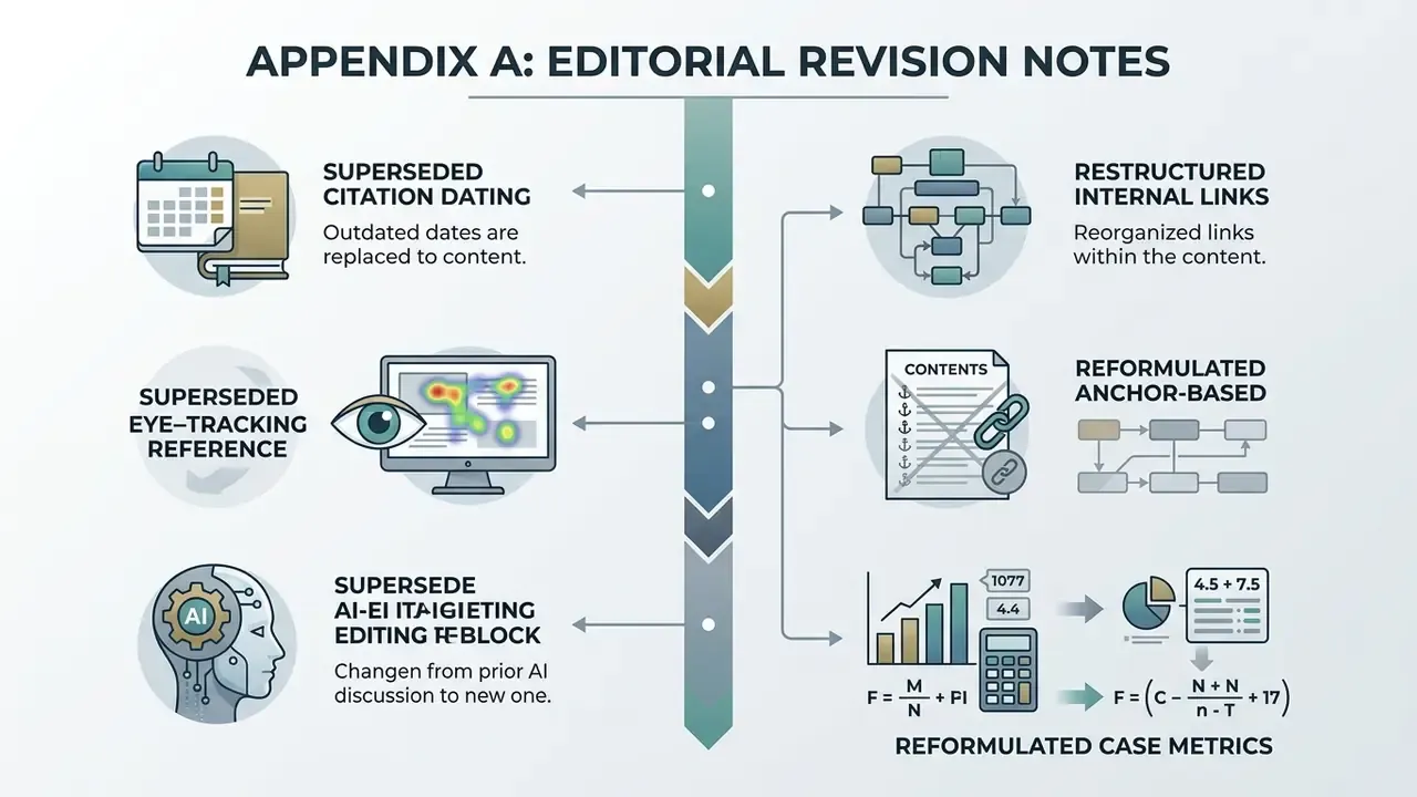
For transparency, the following editorial changes were applied to earlier revisions of this guide:
- Superseded citation dating. Forward-dated references (2026 publication years on vendor and standards pages) were replaced with the current, verifiable versions of the same documents: W3C WCAG 2.2 and WCAG Technique G18, the W3C PNG Specification, ISO/IEC 10918-4:2024, NIST JPEG compression guidance, and U.S. Copyright Office Circular 1. Vendor help pages are now cited without artificial publication years.
- Superseded eye-tracking reference. The earlier generic Springer domain citation without quantitative data was replaced with the 2024 Springer study on visual strategies in influencer campaigns, which reports engagement effect sizes and confidence intervals.
- Superseded AI-editing reference. The earlier general conference-proceedings citation was replaced with Evirgen, Wang and Chen, From Text to Pixels (IUI 2024), which reports user-comprehension percentages.
- Restructured internal links. A five-link cluster inside a single FAQ sentence was dissolved. Remaining references were redistributed through the body at roughly one link per 250 to 300 words, each placed where the topic genuinely overlaps: photo-editor comparisons, free-editor limits, image enhancement, watermark-policy audits, image detection, channel-art production and commercial-use licensing.
- Removed the anchor-based contents block. Duplicate in-page navigation was replaced with a short pre-upload decision frame, which answers the same orientation need without hash links.
- Reformulated case metrics. Unverified numeric claims in the financial-services example (three days to under two hours) were restated as a qualitative internal estimate with an explicit non-audited caveat.
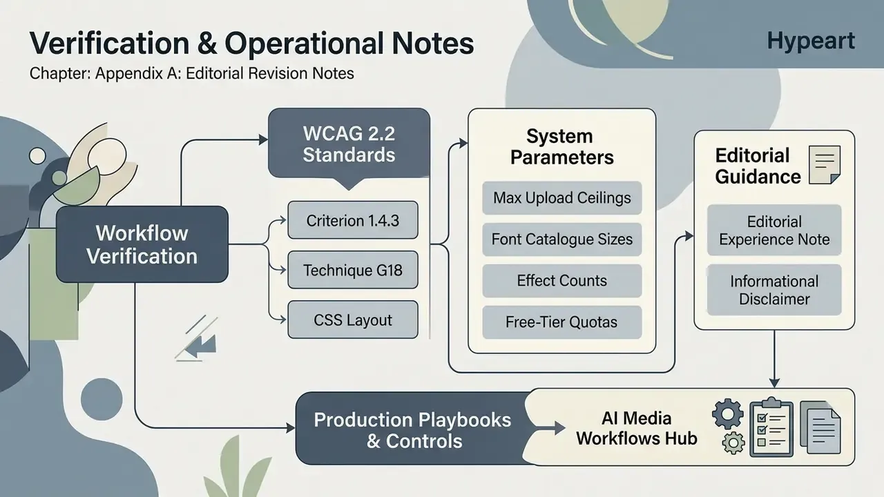
Verification and Operational Notes
Social Media Canvas Presets
Rather than cropping by eye, start from the platform preset so the text box never lands inside a cropped or overlaid region. Most capable editors ship one-click canvas presets for Facebook covers and posts, Instagram, X/Twitter, YouTube and Pinterest, plus generic 1:1, 4:3 and 16:9 ratios.
Profile imagery follows the same discipline, and a square crop produced with an avatar cropper keeps any text badge inside the visible circle mask.