Official document design is one of those unglamorous controls that quietly protects an institution. In a bank, an insurer or a mature fintech, an official letterhead is visual proof of document provenance: who issued the paper, under which legal entity, and with what authority. Auditors ask that question. So do regulators, courts and clients.
Whether the document is a commercial proposal, a formal claim, an internal order or a signed contract, the letterhead is the first element a recipient processes, often before a single line of body text is read. And when 40 uncontrolled variants circulate across subsidiaries, the question stops being aesthetic. It becomes a records-management and authenticity problem.
Seven rules that decide whether a letterhead works
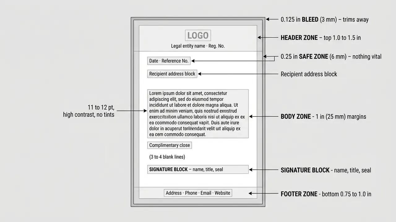
- Reserve zones, not decoration.Branding lives in the top 1 to 1.5 inches and the bottom 0.75 to 1 inch; the centre of the page stays clear for correspondence.
- One logo, one approved position.Upper-left or top-centre placement matches natural left-to-right reading order and avoids competing with the body text.
- Colour is an accent, not a background.Restrict accent colours to roughly 25% of the page area and keep body copy dark on a light field.
- Margins are functional.1 inch (25 mm) on all sides; a 1-inch bottom margin protects signature blocks, titles and official seals.
- Simple beats elaborate.Single-page, low-ornament layouts consistently outperform multi-page, heavily boxed designs in measured response tests.
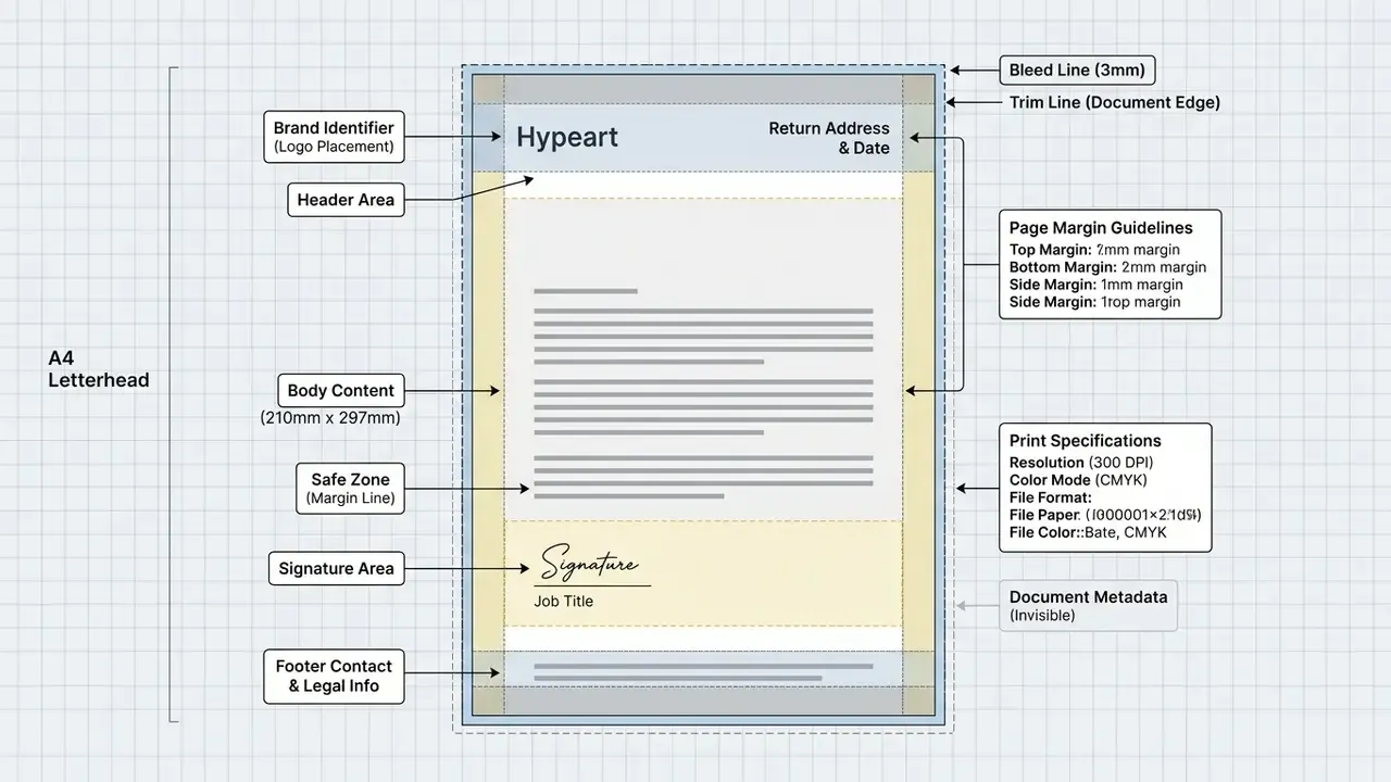
- Print specs are non-negotiable.US Letter 8.5 × 11 in or A4 210 × 297 mm, 0.125 in (3 mm) bleed, 0.25 in (6 mm) safe zone inside the trim.
- Lock the master file.Distribute a
.dotxtemplate with the logo anchored in a protected header so staff cannot shift the grid.
Who this guide is for
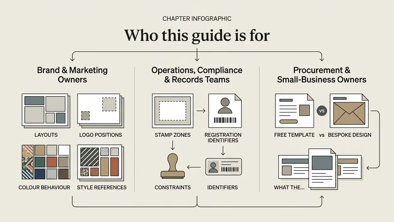
Three groups usually land on a page like this, and they want different things.
- Brand and marketing owners need visual patterns: layouts, logo positions, colour behaviour, style references for a rebrand.
- Operations, compliance and records teams need constraints: stamp zones, registration identifiers, signature-block clearance, versioned masters.
- Procurement and small-business owners need a decision: free template or bespoke design, and what the difference actually buys.
The guide covers all three, in that order. Design patterns first, then industry rules, then production and governance. If you only have five minutes, read the seven rules above and the pre-press checklist near the end. Everything in between explains why those two lists look the way they do.
15 letterhead examples with logos
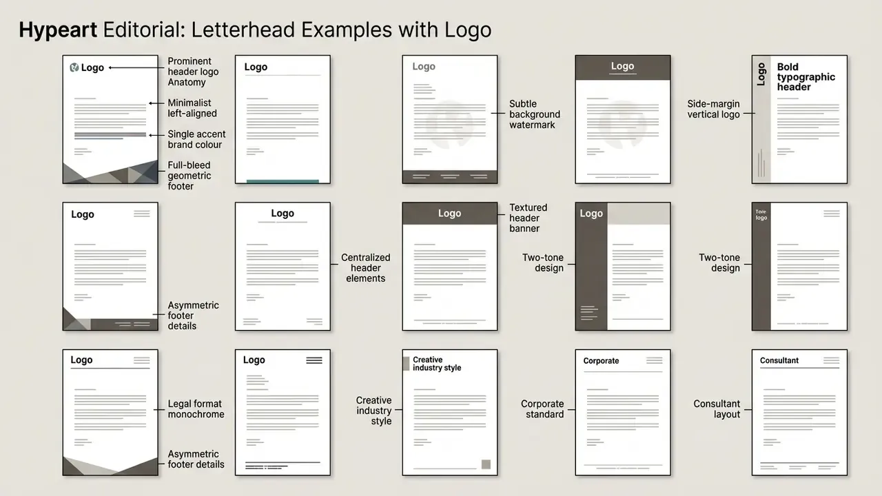
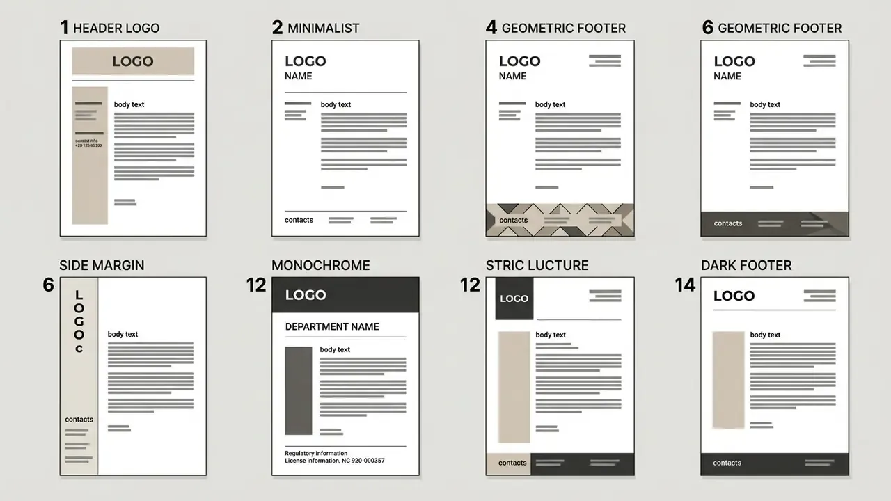
The fifteen construction patterns below cover the practical range of professional stationery: from monochrome legal formats to full-bleed geometric footers. Each entry describes where the logo sits, what carries the brand, and which organisations the layout suits. Every pattern respects the same underlying grid: a branded header band, a clear writing area, and a contact footer.
1. Prominent header logo
The logo is enlarged and centred (or hard left-aligned) inside a filled header band, typically 1.25 to 1.5 inches deep. The coloured band frames the mark without spilling into the reading area, giving immediate focal hierarchy while white space keeps body copy legible. Best for organisations with a mature, recognisable identity system where the mark itself carries authority.
Anatomy: header band 1.5 in · logo height ≈ 0.5 in · clear space around the mark = 2× the logo x-height.
2. Minimalist left-aligned
Strict left alignment, no rules, no ornament: logo, legal entity name and a two-line address stack flush to the left margin. Nothing competes with the letter itself. This is the easiest layout to produce in-house and the hardest to get wrong, which is why it dominates consulting, accountancy and B2B services.
3. Single accent brand colour
One brand colour is used for a slim contact plate, the horizontal rule under the header, or the footer bar. A single hue unifies the page and reduces visual clutter; three or more colours start to overwhelm the reader. A single indigo, oxblood or forest green tone reads as deliberate rather than decorative.
5. Subtle background watermark
The logo is reproduced large and centred at 5 to 10% opacity behind the body text. Transparency is the entire craft here: too opaque and the watermark fights the copy; too faint and it disappears in print. Always proof at final print size rather than on screen, because paper absorbs ink differently from a monitor. Common on financial statements, audit reports and certificates.
6. Side-margin vertical logo
The logo and contact stack rotate 90° and run along the left page margin, freeing the entire top band for the date, reference number and recipient address block. The layout looks contemporary and preserves a very generous writing area. Verify that the vertical strip clears the left punch or binding zone.
7. Bold typographic header
No icon at all: the company name is set as a display wordmark in a distinctive typeface, sized to act as the logo. Serif faces signal heritage and authority; grotesque sans faces read modern; display faces read memorable. Typography-led letterheads stand out sharply from generic stationery, but a poorly chosen display face damages credibility instantly.
8. Asymmetric colour block
A colour block sits in the top-right corner and is counterbalanced by the left-aligned logo and text column. The asymmetry creates movement while the reading column remains rectangular and predictable. Well suited to marketing agencies and creative consultancies. One caution: if recipients stamp incoming documents in that corner, move the block.
9. Framed border design
A thin brand-colour rule (0.5 pt minimum for reliable reproduction) traces the page perimeter. The frame reads formal and ceremonial, so it fits diplomas, award letters, invitations and board-level correspondence. Keep the border outside the 0.25 in safe zone so trimming never clips it unevenly.
10. Dual-brand parent and subsidiary lockup
Two marks appear in a controlled lockup: the dominant parent brand in the primary position and the subsidiary identifier in a secondary, smaller position, separated by a fixed divider. Brand hierarchy rules require the master brand to stay visually dominant over sub-brands. Essential for holdings, banking groups and multi-entity structures.
11. Illustrative corner accents
Hand-drawn or organic shapes mark two or four corners of the page, framing the letter without touching the copy. Illustration adds a human, non-corporate tone that photography and geometry cannot. Favoured by lifestyle brands, hospitality, education and non-profits.
12. Monochrome corporate format
Black or near-black type on white stock, classic serif or restrained sans (Times New Roman, Georgia, Arial), centred or left-aligned departmental header, and registration numbers and licence identifiers in the footer. No background graphics, no tints. The standard for law firms, notaries, financial institutions and government departments.
13. Integrated icon pattern
A single element extracted from the logo is repeated at low opacity as a pattern band in the footer or as a tint across the page. This works only with simple geometric marks, monograms and icons; complex illustrated logos turn to mud when tiled. The repetition signals design intentionality on otherwise routine documents.
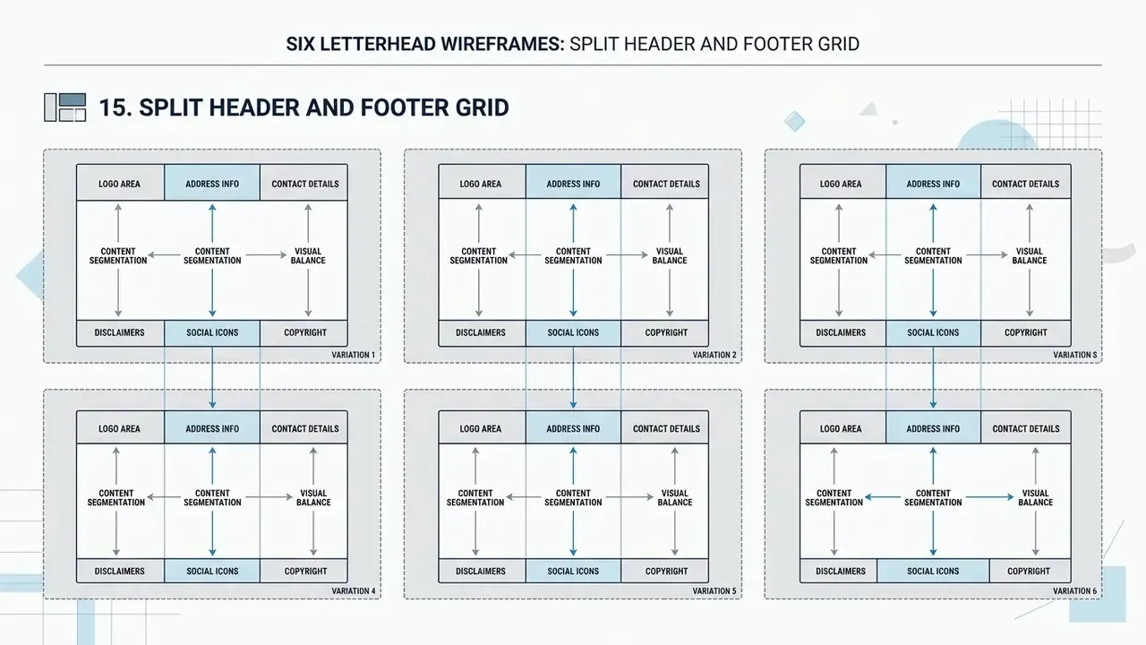
15. Split header and footer grid
Strict division of labour: logo and entity name strictly at the top, all requisites (address, phone, email, website, registration numbers, bank details) strictly at the bottom, with nothing in between. This is the most versatile pattern for enterprise use, because the same master accommodates letters, invoices, memos and legal notices without modification.
Letterhead requirements by industry
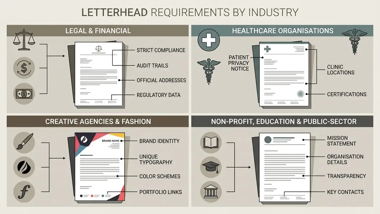
Letterhead requirements diverge sharply by sector, because the document has to satisfy regulators, auditors and recipients at the same time. The four groups below cover the majority of commissioned stationery work.
Legal and financial firms. Strict monochrome or near-monochrome palettes, classical typefaces (Times New Roman, Georgia, Caslon), and mandatory footer disclosure: registered legal name, company registration number, licence or bar-admission identifiers, and regulated-entity statements. Layout must leave clean, unprinted space in the top-right and lower-left corners for registration stamps, incoming-document marks and notarial seals. Reference numbers and dates need dedicated, consistently positioned fields so correspondence can be indexed in an audit trail. For institutions where documents may end up as exhibits in litigation, that indexing is not cosmetic. It is evidence hygiene.
Healthcare organisations. Calming blues, teals and soft ochres with generous negative space dominate this sector, because the recipient often reads the document under stress, after an assessment or alongside an invoice. Practical requirements include a clearly delineated area for patient identifiers, space for a physician's signature and stamp, and a footer that separates clinical contact routes from billing enquiries. Avoid dark background tints: clinical documents are frequently photocopied and faxed.
Creative agencies and fashion brands. Bold typography, asymmetry, full-bleed graphics and, in some identity systems, a fully printed reverse side of the sheet. The reverse-print approach doubles brand surface while keeping the face of the letter clean. Because these designs use heavy coverage, always specify uncoated or high-white matte stock and check ink dry-time before large runs.
Non-profit, educational and public-sector bodies. Official crests, emblems or seals in the upper-left or centred position, restrained colour, and a footer listing the board of trustees, charity registration number and, where applicable, funding acknowledgements. Government stationery rules are the most prescriptive of all: some public-sector manuals fix the departmental name, ink colour, font family and even the point offsets of each element.
| Sector | Palette | Typography | Mandatory footer data | Design constraint |
|---|---|---|---|---|
| Legal / Finance | Monochrome + one dark accent | Serif, 10 to 12 pt | Registration & licence numbers | Clear zone for stamps and seals |
| Healthcare | Blues, teals, soft ochre | Humanist sans, 11 to 12 pt | Clinical vs. billing contacts | Photocopy-safe, no dark tints |
| Creative / Fashion | Bold, 2 to 3 colours | Display + neutral text face | Studio address, socials | Reverse-side printing, bleed control |
| Non-profit / Education | Institutional crest colours | Traditional serif or sans | Charity/registration ID, trustees | Fixed emblem placement, clear space |
What makes a professional letterhead with logo effective?
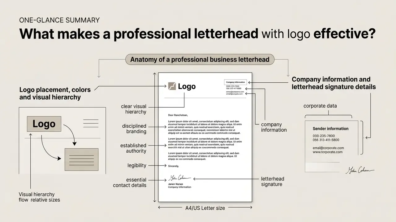
A professional letterhead with a logo combines clear visual hierarchy, essential contact details and disciplined branding to establish immediate document authority and legibility. Everything else, ornament included, is optional.
According to market research published by Grand View Research in 2024, the global custom-printed letterhead market reached USD 962.0 million in 2024 and is projected to reach USD 1,733.7 million by 2030. This growth underscores the ongoing commercial necessity of formal business stationery across both physical and digital channels.
«The global letterheads custom printing market was estimated at USD 962.0 million in 2024 and is projected to reach USD 1,733.7 million by 2030, growing at a CAGR of 10.4%.»
Effective stationery design relies on a structured header and footer framework that frames the body text without crowding the page. Interdisciplinary readability studies demonstrate that preserving clear white space and 1-inch margins improves document scanning speed and comprehension.
Organisations that maintain consistent brand typography, aligned address details and structured contact blocks present a polished image that strengthens client trust and regulatory compliance. Institutional brand manuals reinforce this: several corporate standards documents require that letterhead logo position, margins, type styles and footer information remain exactly as supplied, with no local re-editing permitted.
Anatomy of a professional business letterhead
Logo placement, colors and visual hierarchy
Strategic logo placement, typically upper-left or top-centre, establishes immediate brand recognition without intruding into the reading area. Institutional style guides such as the University of San Francisco Brand Standards recommend placing primary logos in the upper-left corner (or bottom right on print media) to align with natural left-to-right reading habits, and permit only the full-name university logo on letterhead. Teams that still need to produce or refine a mark before locking the stationery grid often start with AI logo generators and then rebuild the final artwork as clean vector geometry.
Colour selection must balance brand expression with document contrast. Neuromarketing research published in 2024 in the Journal of Consumer Sciences quantified the trade-off between attention-grabbing marks and text recall:
«A dynamic logo icon scored 71.38% full recall versus 65.73% for a text-only variant, but reduced verbatim text reproduction to 48.21%.»
The practical conclusion is simple. Let the mark do the recognition work in the header band, and let dark, high-contrast typography carry the message in the body. Primary brand colours should be restricted to logo marks and minor structural accents, ensuring that secondary accent colours comprise no more than 25% of the total page area, a threshold used verbatim in several public-sector brand guidelines, including the Idaho Department of Education Brand Guidelines (2025), which also sets minimum clear space around the mark at twice its x-height.
Consistency compounds. Repeated exposure to the same mark in the same position measurably strengthens recognition:
«Repeated exposure to a visual logo significantly increased brand recall and purchase intention: F(2,297) = 29.25 for the effect of repetition level on recall.»
That is the strongest argument against ad-hoc letterhead variants. Every unauthorised layout dilutes the repetition effect the brand has already paid for.
Company information and letterhead signature details
Essential company information includes the registered legal name, physical address, primary phone number, official website, and registration identifiers structured within dedicated header or footer bands. Formal standards such as GOST R 7.0.97-2016 and its 2025 revision define the composition and placement of organisational requisites, including the field reserved for the signature and, where a seal is used, the space allocated for the stamp. These standards are mandatory for state bodies and budget-funded institutions in their jurisdiction, and commercial companies often borrow them as a reference framework. GOST-based guidance specifies A4 and A5 formats with minimum margins of at least 20 mm left, 10 mm right and 20 mm top and bottom. Practical templates in that tradition also add taxpayer and registry identifiers, phone, email and website as contact requisites.
In formal business correspondence, the signature block is positioned three to four blank lines below the complimentary close. Federal correspondence standards specify a 1-inch bottom margin so signature blocks, job titles and official legal seals remain clearly separated from footer contact data. US Department of State letter guidance, for example, uses 8.5 × 11 in paper with at least 1 inch on the side, top and bottom, while FEMA's template mandates 12 pt Times New Roman, flush-left paragraphs, 1-inch top, bottom and left margins, and a three-quarter-inch right margin. When preparing the graphic assets that sit inside those margins, say cleaning up a scanned seal, flattening a signature scan, or correcting a low-quality supplied mark, production teams typically rely on standard online photo editors before importing the file into the template.
Business letterhead design examples by style
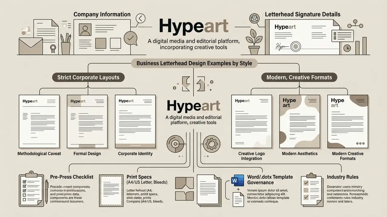
Methodological caveat. DANFLU-2 is a clinical vaccine trial, and these figures describe patient-recruitment mailings rather than commercial marketing collateral. Read the result as directional evidence that restrained layouts do not suppress response, not as a marketing benchmark. Where commercial design decisions are involved, corroborate with document-readability and typography research such as the white-space and font-size studies cited elsewhere in this guide.
Formal and corporate letterhead examples
Formal corporate letterheads prioritise restrained typography, monochrome or dark colour schemes, and standardised alignment to signal organisational authority. Public sector guidelines, such as Pennsylvania Commonwealth templates and FEMA correspondence standards, mandate 1-inch margins, 8 to 12 pt sans-serif or serif fonts, and centred or left-aligned departmental headers. Pennsylvania's templates go further, fixing black text, Arial at 8 to 10 pt, and the exact placement of office name, address, phone and website on state-seal stock. US Department of the Interior guidance specifies a centred department name in Times Roman or a similar face, blue or black ink, and restrained use of seals and emblems on 8.5 × 11 in paper.
Legal firms, financial institutions and government agencies rely on these traditional corporate letterhead design examples to maintain compliance and solemnity. The layout avoids decorative background elements, reserving space for formal reference numbers, dates, recipient addresses and official seals. Where an incoming-document registration stamp is applied by the recipient, the top-right corner must be left deliberately empty. It is a small rule, and it is broken constantly.
Creative and modern letterhead logo examples
Creative and modern letterheads use logo-led geometry, accent colour palettes and asymmetric layouts while maintaining readable body space. Design platforms showcase modern letterhead designs with colour accents that integrate icon fragments along page borders or use subtle background watermarks. Contemporary identity manuals, the UN Global Compact Brand Guidelines (2024) among them, formalise this approach by defining a primary palette that "works well as accent colours" for print collateral, while manuals such as the Shakti Visual Identity Guidelines (2024) forbid recolouring or editing the master mark and specify neutral backgrounds and white or uncoated stock. That combination of a locked logo plus a flexible accent system is the defining trait of current creative stationery.
In creative industries, letterhead logo examples often feature bold graphic elements paired with clean typography. Designers still need a clear central safe zone so decorative shapes never interfere with message legibility. Studios sourcing or drafting illustrative accents and background textures for these layouts increasingly prototype options with AI art generators before redrawing the chosen direction as print-ready vectors, and use outpainting tools for expanding images when a supplied graphic lacks the extra area needed to run off the bleed edge.
Company letterhead examples for different business identities
Adapting letterhead design to business scale ensures visual consistency for large corporations while offering lightweight, cost-effective templates for small enterprises. A company letterhead serves as an official touchpoint across all business correspondence, and in financial operations and risk management, document standardisation prevents unauthorised communications and supports audit trails.
Corporate and organization letterheads
Enterprise corporate letterhead examples enforce strict brandbook compliance, multi-brand architecture and standardised master templates across global subsidiaries. Corporate guidelines such as MCC Corporate Marking Standards require fixed anchor placement for logos (36 points from the top and left margins), place contact data 36 points from the bottom and centred, and define separate CMYK and one-colour master style sheets. ThoughtWorks brand guidelines take the same line from a production angle: corporate letterheading may be reproduced only from approved artwork files, formatted on A4, and printed on 120 gsm high-white matte stock or a local equivalent.
Multi-brand organisations use master templates that establish a dominant parent brand while accommodating sub-brand identifiers in secondary positions. This structured approach maintains corporate governance while allowing operational units to conduct official correspondence under approved visual guidelines. Brand-hierarchy rules from institutional manuals are explicit: the master brand stays visually dominant over sub-brands, light backgrounds use the multicolour mark, dark backgrounds use the reversed version. Corporate design teams producing supporting brand imagery for these master templates frequently work with AI image generators under documented commercial-use terms, and standardise executive portraiture through AI headshot generators so signatory pages match across entities. Licensing questions on that material are worth checking against the AI Media Commercial-Use Hub before anything reaches printed stationery.
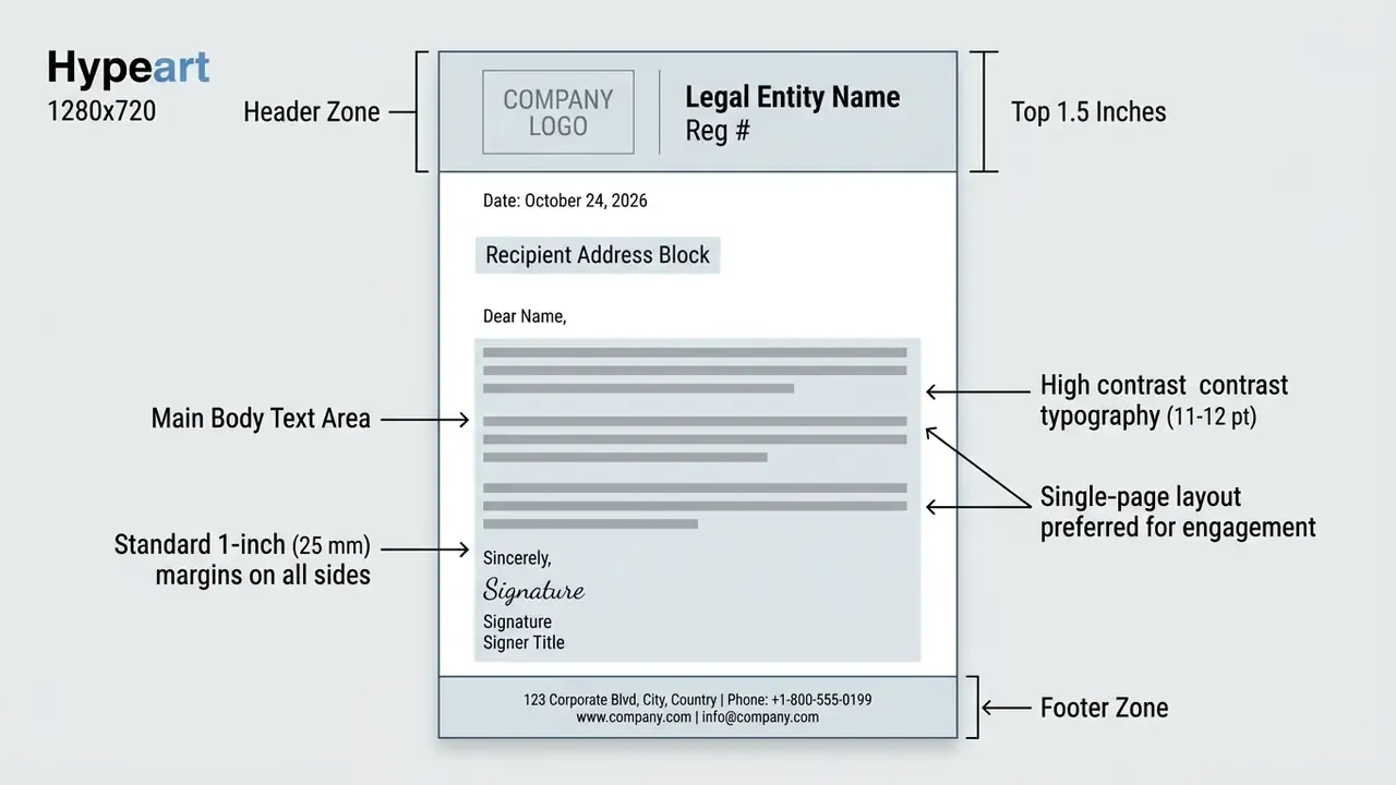
Multi-entity case pattern (illustrative, composite). A common consolidation exercise in banking and insurance groups looks like this: an audit finds 40 to 50 uncontrolled letterhead variants across subsidiaries and regional offices, each with its own margins and footer wording. The remediation is a single master grid (pattern 15, split header and footer), one parent-brand lockup with a fixed subsidiary slot, a controlled .dotx distributed through the document management system, and withdrawal of all legacy .doc files. The measurable outcomes teams track afterwards are the number of approved variants in circulation, the share of outgoing correspondence produced from the master template, and the number of print-vendor queries about artwork. Cost modelling for consolidation runs of that kind is easier with the AI Media Calculators and the AI Media Pricing Guides as a starting reference.
Small business letterhead with a recognizable brand
Small business letterheads focus on high contact clarity and versatile header-only layouts that adapt easily to both print and digital invoicing. A small business letterhead with logo typically concentrates branding elements in the top 1.5 inches of the page, leaving the footer clean or dedicated to basic contact details, the pattern described in practical stationery guides as a "header-only" design.
Simple stationery templates let growing companies maintain a professional brand presentation without paying for expensive custom printing. The universal contact block that suits almost every small business consists of five lines: trading name, street address, phone, email and website. VAT or company registration numbers are appended where legally required. Owner-operators preparing their own artwork without a design retainer generally get sufficient results from free photo editors for cropping and cleaning the logo file, provided the final mark is exported at 300 dpi or higher, or, ideally, kept as vector.
Institutional manuals arrive at the same conclusion from the opposite direction. The OpenActive Corporate Brand Guidelines (2020) state that there is "only one approved design format" for corporate and business-unit stationery, with specified typography, colour, printing method and paper stock. The Noble Brand Guidelines (2024) place contact information in a single dedicated block with one person, one address, one email and one phone number rather than repeating brand elements across the page.
How to choose and customize letterhead templates
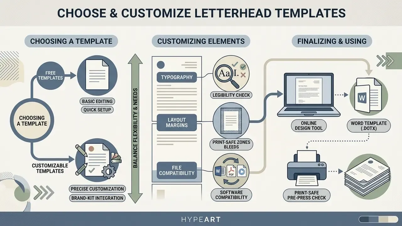
Choosing a letterhead template means balancing customisation flexibility, font legibility, print-safe margins and file compatibility across office software. Templates provide pre-formatted structures that streamline document creation for commercial teams. But the real decision is about who controls the grid after distribution.
Choosing between free and customizable letterhead templates
Free letterhead templates offer immediate setup and basic text editing for standard business correspondence. Browser-based editors from Adobe Express, Canva and Word for the web allow editing of text, colours and logos with free export to PDF or image formats. Free template libraries do carry brand-uniqueness risk, though, because identical layouts are accessible to thousands of public users. The larger the template pool, the higher the probability that a competitor mails your client on the same layout.
Customisable professional letterhead templates provide vector artwork precision, brand-kit integration and unconstrained high-resolution export formats. Platform analyses show that while free tools allow basic PDF downloads, premium tiers unlock advanced export formats, custom typography uploads and automated brand governance controls; several platforms explicitly gate high-resolution PDF output and multi-format download behind paid plans. Side-by-side feature checks are easier in the AI Media Comparison Matrices than in vendor marketing copy.
Typography settings deserve as much scrutiny as layout. Controlled reading experiments support conservative choices:
«Subjective and objective readability, along with comprehension, improved as font size increased up to 18 points; both very tight and very loose line spacing reduced comprehension.»
For letter-format documents this translates to 11 to 12 pt body copy with 1.15 to 1.5 line spacing, 8 pt as the absolute minimum for footer requisites, and rules no thinner than 0.5 pt so they survive reproduction.
| Criterion | Free template | Paid / custom template |
|---|---|---|
| Setup time | Minutes | Days to weeks |
| Brand uniqueness | Low (shared library) | High (bespoke grid) |
| Export formats | PDF, PNG, JPG (often limited) | PDF/X, DOCX/DOTX, SVG, EPS |
| Colour management | RGB only in many tools | CMYK, Pantone, one-colour variant |
| Bleed & crop marks | Frequently unavailable | Standard |
| Governance controls | None | Brand kit, locked assets, versioning |
Creating letterheads in Word and online design tools
Creating letterheads in Microsoft Word relies on native header editing and editable text fields. The desktop workflow is: create a blank document, then Insert → Header, then Pictures to place the vector or high-resolution logo, resize and align to the grid, set top and side margins to 1 inch, and finish with Save As → Word Template (.dotx). Word for the web follows the same logic: open a letterhead template, double-click to edit, personalise copy, colours and logo, then save, download and share as PDF. In Google Docs the sequence is identical in substance: blank document, insert Header, insert image, resize and position, save as a template.
Enterprise template governance (protecting the grid). Ad-hoc edits are the main cause of letterhead drift, so lock the file before distribution:
Larger organisations sometimes push this further and generate correspondence programmatically, pulling entity data and reference numbers from a document service through an api rather than trusting manual entry. That removes a whole class of typos in registration identifiers. It also adds a new control question: who reviews the template the service renders?
Online design platforms provide drag-and-drop interfaces for logo uploads and visual customisation, with brand kits that store approved colours, fonts and marks centrally. Teams standardising on browser workflows usually evaluate the Canva AI Generator and the Microsoft AI Image Generator for supporting graphics, then export the final sheet as a print-ready PDF. Adobe Express supports direct logo upload into a brand kit in JPEG, SVG, PSD and AI formats, which is the cleanest route when the mark exists only as a designer file.
Brand teams rarely work on stationery alone, so the glossary covers adjacent production topics from the same asset library: microsoft video editor for internal explainer clips about template use, microwave ai filter and midjourney video generation for campaign visuals, and, for education and community accounts, minecraft animation maker, minecraft parkour video generator and minecraft pixel art references. Different medium, same discipline: one approved master, documented licence, named owner.
Print sizes and download formats for business letterheads
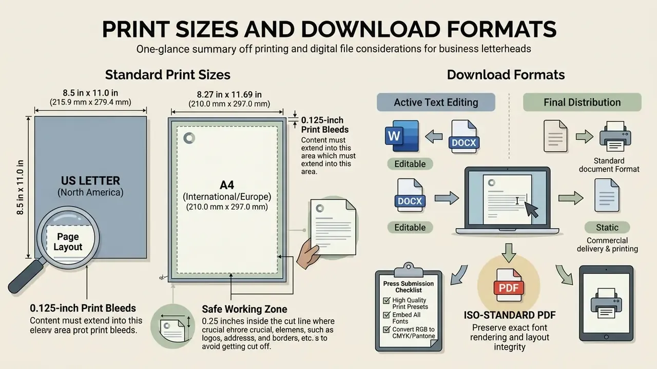
Professional letterheads require exact regional page sizing, 0.125-inch print bleeds and standardised digital file exports to maintain visual fidelity across physical paper and electronic delivery.
«The global stationery custom printing market was estimated at USD 2,488.0 million in 2024 and is projected to reach USD 4,135.8 million by 2030, at a CAGR of 8.9%.»
Standard print sizes and page layout
North American business stationery uses US Letter dimensions (8.5 × 11 inches, 215.9 × 279.4 mm), whereas European and international standards mandate A4 paper dimensions (210 × 297 mm). Print production guidelines specify a 0.125-inch (3 mm) bleed area past the trim edge when graphics extend to the border; state print services describe bleed as the area beyond the trim edge and require files to be exported with crop marks and document bleed settings enabled.
US Letter (North America):  8.5 in  x 11.0 in  (215.9 mm x 279.4 mm)
A4 (International/Europe): 8.27 in x 11.69 in (210.0 mm x 297.0 mm)
Standard Print Bleed:       0.125 in (3.0 mm) on all exterior edges
Document size with bleed:   8.75 in x 11.25 in (US Letter)
Safe Working Area:          0.25 in  (6.0 mm) inside the final trim line
Minimum text size:          8 pt  |  Minimum line weight: 0.5 pt
Raster image resolution:    300 dpi or higher
Maintaining a safe working zone 0.25 inches inside the cut line ensures that logos, addresses and border accents are never clipped during commercial trimming. Standard body text margins should remain at 1 inch to preserve visual balance. When a supplied logo is too small for print, a common problem with marks recovered from websites, an AI image upscaler can raise usable resolution as an interim measure. The correct fix is always to obtain or rebuild the vector master. If the origin of a supplied mark is unclear, AI reverse-image-search tools help trace the original asset and its licensing before it is committed to a printed run.
Download formats for editable and final letters
Selecting the correct file format depends on whether the letterhead requires active text editing or static distribution. Editable document drafting relies on DOCX or DOTX formats, letting staff compose correspondence while header graphics remain anchored.
For commercial print production and official digital delivery, ISO-standard PDF formats preserve exact font embedding, vector logo clarity and layout geometry. ISO 15930-7:2008 defines PDF/X-4 for the dissemination of digital data intended for print reproduction, and ISO 19005-1:2005 (PDF/A) addresses long-term preservation of documents containing character, raster and vector data. SVG is defined by the W3C as a language for two-dimensional vector and mixed vector or raster graphics in XML, while PNG is standardised in ISO/IEC 15948:2003 as a lossless, well-compressed raster format with optional alpha. Powerful for screen use, never a substitute for vector logo artwork.
| File Format | Editability | Visual Stability | Primary Use Case | Output Orientation |
|---|---|---|---|---|
| DOCX / DOTX | High (Microsoft Word) | Moderate (version dependent) | Internal drafting & daily letters | Office printing & email attachments |
| PDF / PDF/X-4 | Low (static) | High (ISO standardised) | Official correspondence & contracts | Commercial print & digital archiving |
| SVG / EPS | High (vector editors) | High (resolution independent) | Logo master asset embedding | Template graphic pre-production |
| PNG / JPG | Non-editable raster | High (fixed pixels) | Header background graphic insertion | Screen previews & web display |
For press submission, export with High Quality Print or Press Quality presets, embed all fonts, convert brand colours to CMYK (retaining a Pantone reference for spot printing), and include crop marks plus the document bleed. Keep a one-colour version of the logo on file: fax, photocopy and internal laser output all reproduce solid single-colour marks more reliably than gradients or tints. If a supplied PDF behaves strangely on one printer and not another, the AI Media Support and Troubleshooting notes cover the usual font-embedding and colour-profile culprits.
Pre-press and compliance checklist
Run this list before a letterhead goes to press or into a template gallery.
Checklist0 / 32
Common letterhead mistakes and compliance risks
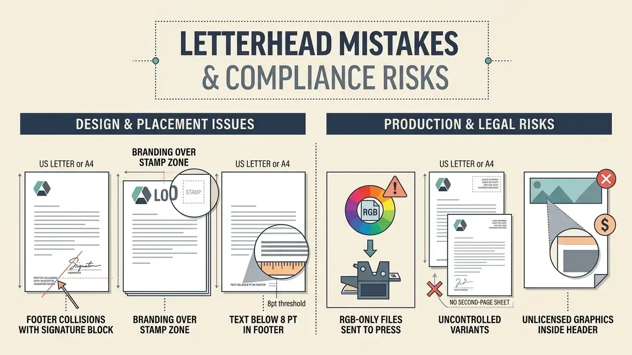
Branding over the stamp zone. The single most frequent compliance failure in formal correspondence: a decorative element or oversized logo occupies the top-right corner where the recipient's registration stamp must go. Reserve roughly 70 × 40 mm of clear space there for any document destined for a registry, court or government office.
Footer collisions with the signature block. When a high-contrast dark footer creeps above the 1-inch bottom margin, signatures, titles and seals land on top of it. Enforce the footer boundary in the template rather than trusting each author.
RGB-only files sent to press. Bright screen blues and greens shift noticeably in CMYK. Convert and proof before committing to a run, and keep a Pantone reference for spot printing.
No second-page sheet. Multi-page letters printed entirely on the full letterhead look amateurish and waste ink. Supply a continuation sheet with a reduced mark and no full footer.
Uncontrolled variants. Every unofficial copy of the letterhead weakens the recognition effect that repeated, consistent exposure creates, and in regulated sectors it raises questions about document authenticity during audit. Version control is a branding measure and a risk measure at the same time.
Text below 8 pt in the footer. Requisites set at 6 or 7 pt to "fit everything in" become unreadable after photocopying and fail accessibility expectations; several public guidelines set 12 pt as an accessibility minimum for body content.
Unlicensed graphics inside the header. A background texture pulled from an unclear source can survive years of internal use and then surface in a dispute. Record the licence for every visual element that ships with the template.
FAQ about letterhead examples with logo
Do businesses still use letterheads?
Yes. Organisations still use physical and digital letterheads as official correspondence templates for contracts, formal notices and executive communications. Market data confirms that the custom letterhead printing market generated USD 962.0 million in 2024, which points to steady global demand for branded stationery. In digital workflows, official letters are composed on digital letterhead templates and exported as PDFs for secure email transmission. Georgia Tech, for example, distributes a Word-based digital letterhead for everyday digital communication, exportable to PDF and compatible with digital signatures. Public-sector policy is often stricter than private practice: the US Department of Homeland Security maintains an administrative directive (updated in 2024 and still active) stating that letterhead is reserved for Department correspondence, the Indiana State Police SOP restricts departmental letterhead to official use and requires it for any letter or memorandum leaving the department, and Ohio guidance permits only approved organisational letterhead for all correspondence, pre-printed or computer-generated. USDA NRCS 2025 correspondence rules define external letters as letterhead documents with a sender address and formal signature block, while FSIS guidance confirms that a signed paper letter may be scanned and emailed as a PDF. Where digital letterhead graphics need cleaning or resizing before export, standard image enhancement tools are sufficient, though the underlying logo should always come from the vector master.
How many letterhead variants should a company maintain?
Most organisations need between three and six approved variants: primary portrait, second-page continuation, one-colour (fax, photocopy, laser), landscape where used, a dual-brand version for subsidiaries, and a digital-only version optimised for on-screen PDF reading. Anything beyond that range usually indicates drift rather than genuine need.
Can one logo letterhead template work for every business letter?
A single master letterhead layout can serve as a universal page framework, but the document body structure has to adapt to specific operational and legal requirements. Commercial proposals, executive orders, formal claims and thank-you notes follow distinct structural conventions. Purdue OWL guidance is explicit that a business letter should open by stating its purpose and then move into content specific to that letter's goal, which means the body cannot be universal even when the page format is. Internal administrative orders require formal reference numbers and legal requisites, often on a separate administrative-document form with date, number and heading, whereas external commercial offers emphasise clear service terms and calls to action. So organisations keep a unified header and footer layout while customising document body fields for each communication purpose.
What is the correct logo size for a letterhead?
As a working range, 1.25 to 2 inches (32 to 50 mm) wide for a horizontal lockup, keeping total logo height under about 0.75 inch so the header band stays within 1.5 inches. Always preserve the clear-space rule from the brand manual, commonly 2× the mark's x-height, rather than optimising for size alone.
Should the letterhead be printed or applied digitally?
Both, with one master design. Pre-printed stock delivers the best colour fidelity and paper feel for contracts and external formal correspondence; a digital .dotx or PDF version covers everyday email-delivered letters and remote signing. Keep the two visually identical so recipients cannot distinguish channels, and never print a digital letter onto pre-printed stock, which produces doubled headers.
Which file should be sent to the printer?
A PDF/X-4 export at final trim size plus bleed, with fonts embedded, colours in CMYK, crop marks enabled and the logo present as vector artwork. Supply the one-colour variant and a Pantone reference alongside it.
What is still unresolved?
Two things, honestly. First, there is little published research on how digital-only letterheads affect perceived authenticity compared with printed stock; most evidence here is anecdotal. Second, response-rate data on layout complexity comes largely from non-commercial mailings, so treat the DANFLU-2 figures as directional. If your organisation runs A/B tests on outbound correspondence, your own data will beat any benchmark in this guide.
Navigation & Glossary
Explore complete term definitions, operational guides and framework documentation in our comprehensive AI Media Glossary, and compare production tooling for brand graphics in the best AI art generator comparison. Editorial note: figures cited from Grand View Research, ISO and W3C specifications, institutional brand standards manuals and published readability research are attributed inline. Recruitment-response data from the DANFLU-2 programme is reported with its methodological limitation stated. Marcus Hale, author. Regulatory and records-management requirements differ by jurisdiction; verify local standards with a qualified specialist before finalising official stationery.