If your marketing, investor-relations, or product team is already generating images, then style is no longer a taste question. It is a control question. In modern visual production, ai art styles represent controllable distributions of visual attributes (texture, lighting, color palette, medium) that steer how a model renders an image. Selecting and governing the right ai image generation styles lets technical teams and creative directors turn raw prompts into consistent, reproducible brand assets that survive legal review.
For regulated organizations the stakes are mundane but real: an unlogged prompt, an artist name pasted into a style field, a palette that drifts across twelve assets. None of that is exotic risk. It is simply uncontrolled process.
Executive Summary
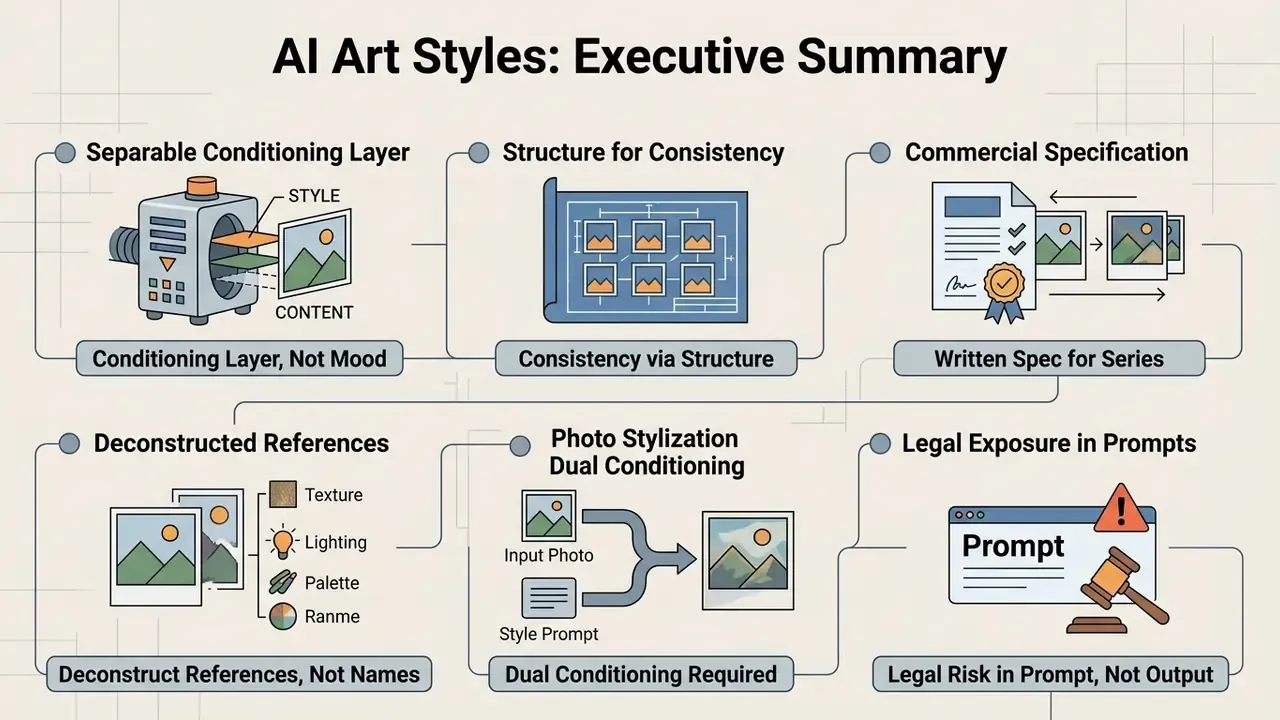
For decision-makers scanning this guide before delegating implementation, the operational core reduces to six statements:
- Style is a separable conditioning layer, not a mood. Style tokens control medium, linework, shading, palette, texture, light, and framing independently from subject matter.
- Consistency comes from structure, not luck. Build every prompt as an explicit 8-Layer Style Stack and freeze that stack across a series.
- Commercial series need a written specification. A one-page Style Bible with hex codes, line rules, and an Always/Never list converts a good-looking sample into a repeatable asset pipeline.
- Reference images must be deconstructed, not imitated by name. The 9-Point Style Fingerprint lets teams reverse-engineer an unlabelled look without invoking a living artist's name.
- Photo stylization requires dual conditioning. Structure control (edge and depth maps) preserves identity; style conditioning supplies texture and palette.
- Legal exposure sits in the prompt, not the output. Generic movement descriptors are defensible; named living artists create right-of-publicity and unfair-competition risk.
Who This Guide Is For and How to Read It
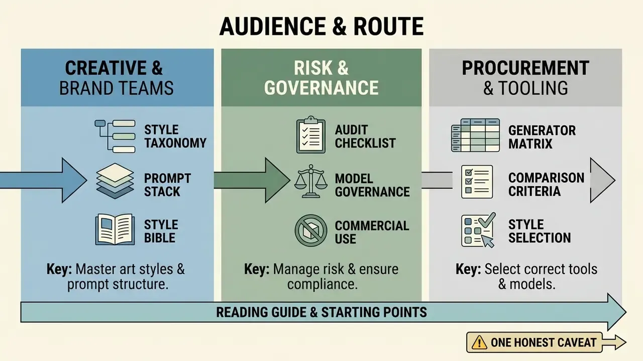
Three groups tend to arrive at this page with different questions, so it helps to say plainly which parts matter to whom.
Creative and brand teams need the style taxonomy, the prompt stack, and the Style Bible. Those three sections cover roughly 80% of day-to-day work: picking a direction, writing a prompt that reproduces, and keeping a twelve-asset campaign visually coherent.
Risk, compliance, and model-governance functions should start at the audit checklist and the commercial-use section. The relevant control objects are the prompt record, the model version, the reference-image licenses, and the human contribution log. The image itself is the least interesting artifact in the file.
Procurement and tooling owners will get the most from the generator comparison matrix, where style capability and data handling are assessed together rather than separately.
One honest caveat before we go further. Parts of this guide are peer-reviewed research with citations. Other parts are practitioner heuristics gathered from production work, and they are labelled as such. Treating the two as equivalent is exactly the failure mode governance teams are supposed to catch.
What Are AI Art Styles in Image Generation?
An ai art style is a learned distribution of visual features inside an image model latent space that dictates the aesthetic execution of a generated image independently from its core subject. In ai image generation, style tokens govern brushwork, surface texture, and lighting behavior without changing what object or entity is depicted.
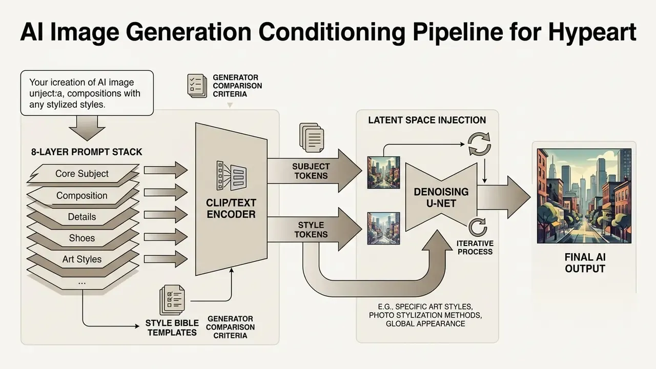
When an art generator processes a text prompt, style descriptors inject specific high-level feature maps during intermediate denoising stages. Empirical evidence for this separation comes from the largest public style dataset assembled to date.
Rather than asserting latent clustering in the abstract, that dataset supplies scale and method: millions of paired prompts and outputs from real users, grouped into identifiable, reusable clusters. Consequently, applying targeted ai generated art styles lets operators hold a repeatable visual language across varying operational prompts, and lets systems isolate visual execution from semantic content. Teams building a tooling stack from scratch can start by reviewing the landscape of AI image generators before committing to any prompting methodology.
How Art Style Differs from Subject Matter, Object, and Composition
Art style defines the visual medium and surface rendering of an image. Subject matter identifies the underlying entity, person, or scene portrayed. Composition light and framing parameters specify spatial layout, camera angle, and illumination without touching the visual genre.
- Subject Matter the central entity or everyday objects present in the frame (a corporate office desk, a financial analyst, a product box).
- Composition and Framing spatial orientation, such as a medium shot or rule-of-thirds alignment, which dictates object placement.
- Art Style the visual execution layer (traditional art, vector illustration, photorealism) that governs how the image looks across different art styles.
Separating these conditioning layers prevents style bleed, where visual descriptors quietly distort the subject. A practical diagnostic: if changing a token alters what is in the frame rather than how it is drawn, that token belongs in the subject layer, not the style layer.
It is also worth flagging a common vocabulary error, because it wastes more production hours than any model limitation. Many labels pasted into "style" fields are not styles at all:
- "Watercolor" is a medium. Loose botanical watercolor and opaque storybook watercolor are entirely different looks.
- "Portrait" or "fantasy" are genres. They describe subject categories, not rendering.
- "Digital art" or "AI art" are production categories carrying almost no visual information.
- "Children's book art" is a publishing field containing dozens of distinct styles.
A style is a system of visual decisions: line, shape, proportion, color, light, texture, and composition operating together. Prompts that unpack that system into concrete tokens outperform prompts leaning on one ambiguous word. Every time.
Visual Parameters That Define an AI Image Style
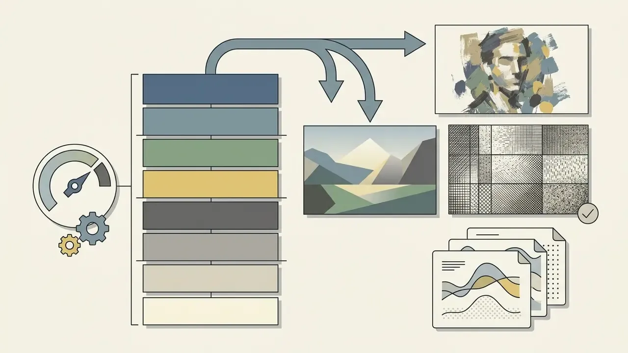
An art style for ai is built from six technical variables that control surface rendering and atmosphere in the ai output:
- Medium the foundational material class, such as oil painting, watercolor painting, pixel art, or 3d render.
- Color Palette constrains chroma, temperature, and primary color relationships. Precision pays here:
saffron yellow,peacock blue,jewel tones,earth tones,cool tones, and explicit hex codes such as#0A192Fall produce measurably tighter results thannice colors. - Texture Lighting surface grain, canvas weave, or specular highlights under targeted illumination.
- Dramatic Lighting contrast ratios, directional key lights, and shadow depth.
- Render Style output processing, from flat cel shading to ray-traced volume rendering.
- Aspect Ratios frame geometry (1:1, 16:9, 4:5), which dictates composition pressure.
Style keywords also carry social artifacts that risk teams should account for before a campaign ships.
Working glossary of AI image generation terms


Primary Types of AI Art Styles: Categorized List with Examples
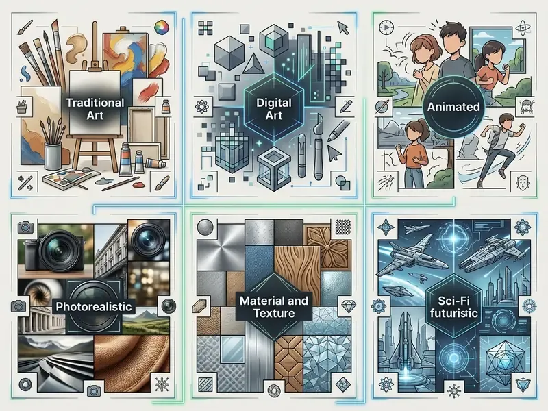
Categorizing ai art types lets creators select established visual paradigms aligned with delivery goals. A workable art style list spans historical fine art, graphic illustration, high-fidelity rendering, synthetic digital aesthetics, and physical-material transformations. These are also the most useful art styles examples for ai to test first, because each behaves differently under the same prompt structure.
Traditional Painting, Drawing, and Classic Art Movements
Classical ai image types simulate physical media, paint viscosity, and historical art movement conventions. Models recreate canvas grain, ink diffusion, and pigment layering from learned artistic distributions documented in large-scale user datasets (StyleBreeder, NeurIPS 2024).
- Oil Painting thick impasto brushwork, rich color depth, visible canvas texture. Specify handling, because
impasto oilandsmooth classical oildiverge sharply. - Watercolor Painting translucent pigment washes, soft bleeding edges, exposed paper grain. Add
cold-press paper textureorloose botanical washfor control. - Charcoal Sketch high-contrast monochrome shading, smudged graphite textures, rough draft lines.
- Line Art clean, unbroken vector-like contours with minimal internal shading.
- Ink Wash & Gouache diluted ink gradients or opaque matte color fields with visible brush edges.
- Art Nouveau flowing organic curves, botanical motifs, decorative border framing.
- Art Deco geometric symmetry, metallic gold or bronze accents, streamlined architectural lines.
- Pop Art high-saturation primary colors, halftone dot patterns, heavy black outlines, direct borrowing from popular culture.
- Cubism fragmented geometric shapes, multi-angle perspectives, abstract spatial structure.
- Mosaic, Collage, and Quilling tessellated tile fields, torn-paper layering, rolled-paper relief.
Teams matching a specific traditional painting tradition to a specific engine can shortcut testing by consulting a structured comparison of the best AI art generators before running large batch jobs.
Anime, Cartoon, Comic, and Book Illustration
Illustrative styles prioritize clear silhouette boundaries and expressive character design over physical material accuracy. As an art form they are also the most forgiving in serial production.
Note that cel shading is defined by discrete lighting bands rather than gradients. Prompting soft gradients and cel shaded in the same string produces exactly the visual conflict that causes inconsistent series. I have watched a team burn a full afternoon on that single contradiction.
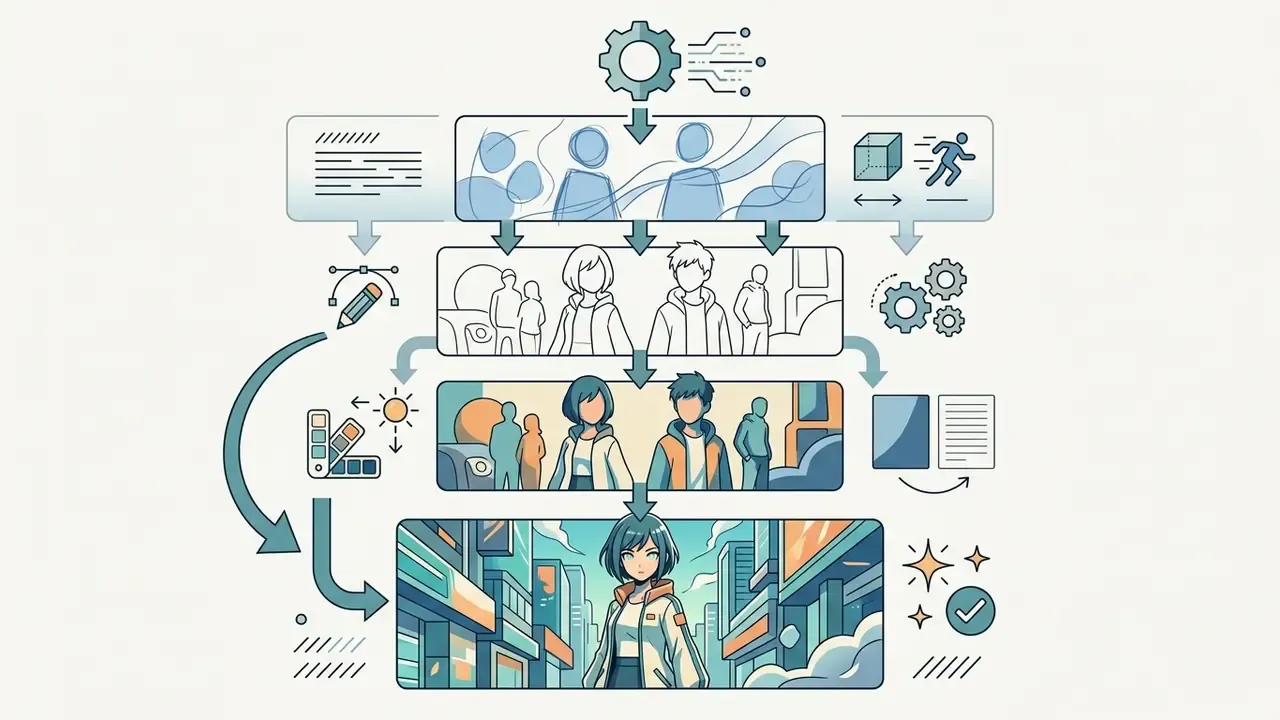
clean line art, hard cel shading, two-tone shadows, crisp outlines.
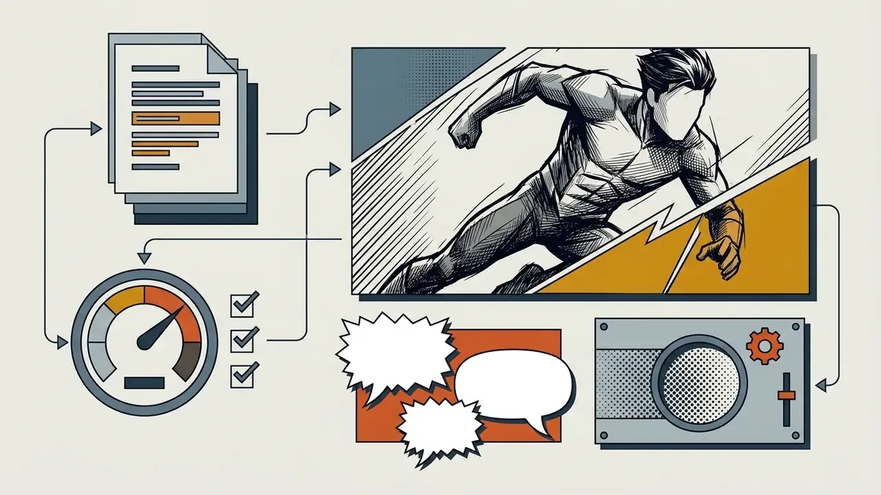
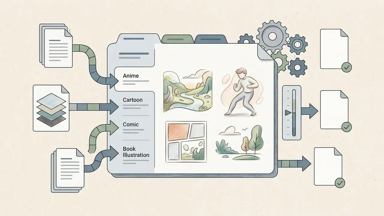
Digital Painting, Concept Art, and 3D Render Styles
Digital mediums serve entertainment development, video games, and cinematic pre-visualization.
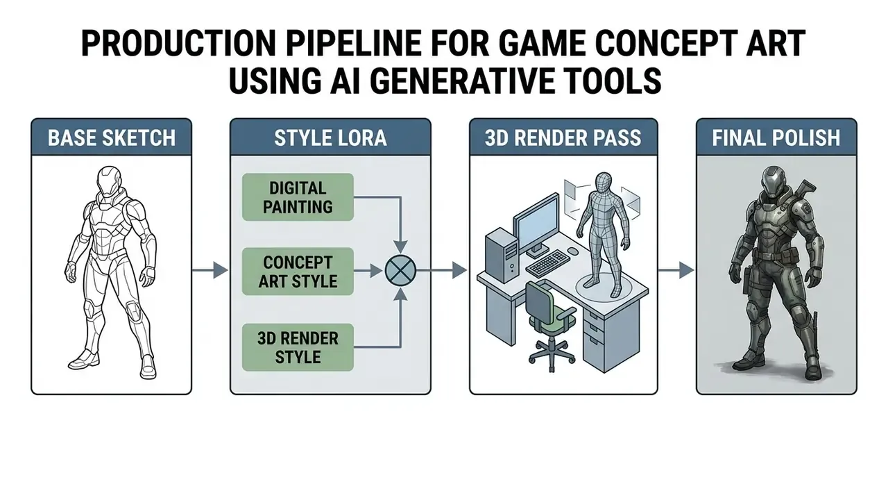
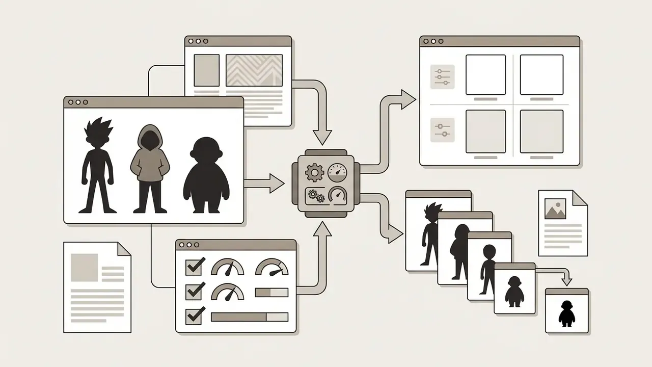
For multi-asset game and film work, lock 3 to 5 style descriptors and vary only pose, expression, and environment. That separation of identity from scene is the single highest-leverage habit in serial generation.
textured brushstrokes to stop the model defaulting to airbrushed CGI.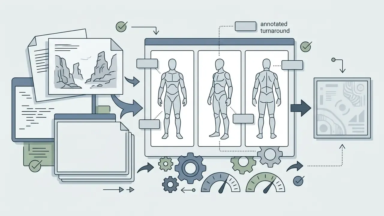
front view, three-quarter view, back view, annotated turnaround) because sheet format is a composition instruction, not a mood.
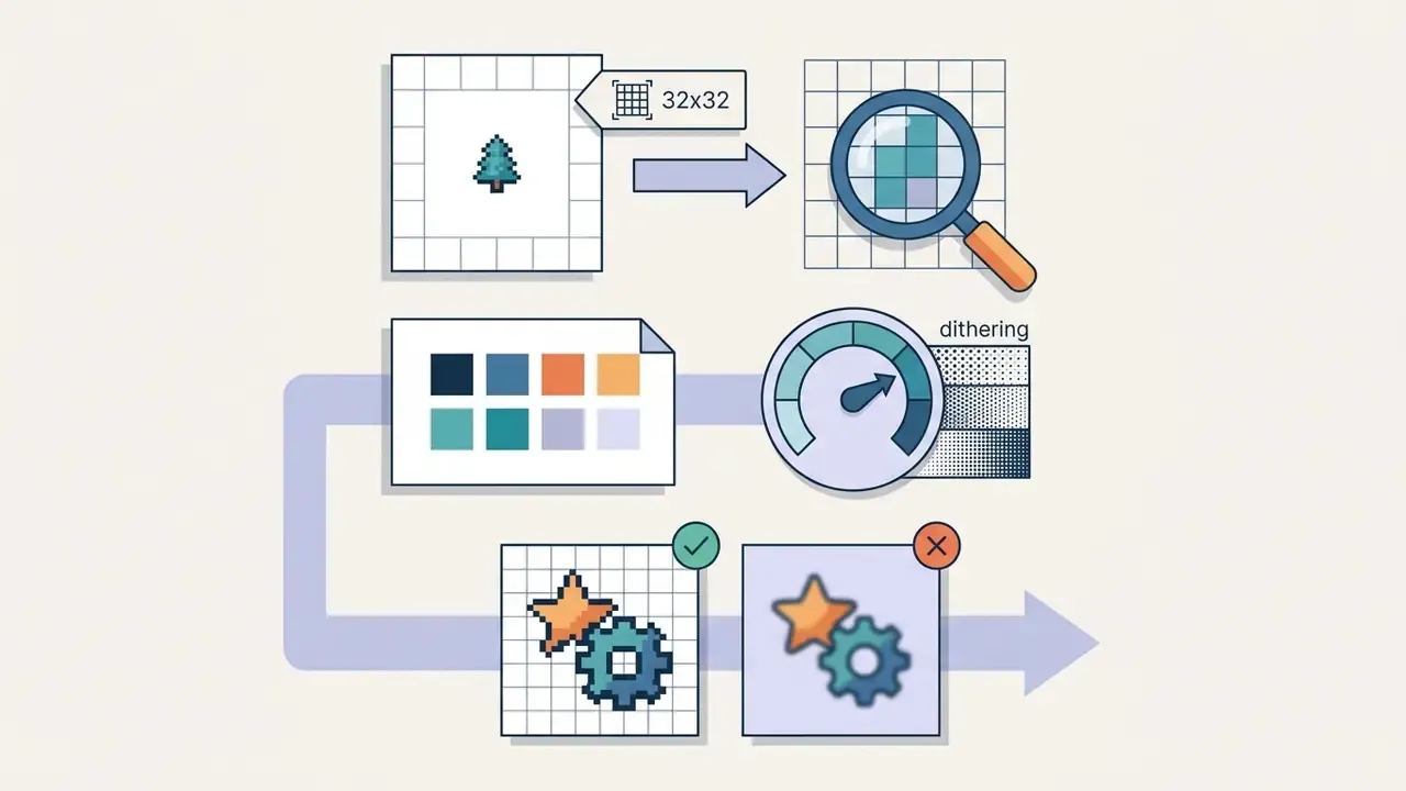
32x32, 64x64) or the model will fake pixels with soft edges.Photography, Cinematic, and Photorealistic Styles
Photorealistic generation emulates optical camera mechanics rather than artistic brushwork.
Key modifiers steer depth of field, lens distortion, and sensor behavior. Because photoreal work often begins from an existing plate rather than pure text, teams should also evaluate image-to-image AI generators alongside text-to-image engines.
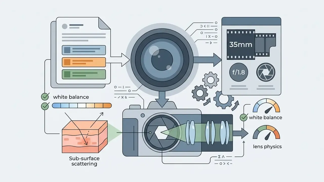
photorealistic, photo, realistic, 35mm, natural lighting.
cinematic, dramatic lighting, film grain.
Optical and Lighting Prompt Controls (High-Key, Low-Key, Camera Angle)
Photography vocabulary is the most underused precision lever in AI prompting. These modifiers work on illustration and 3D outputs too, not only photoreal renders:
- High-key photograph: subject evenly illuminated, minimal hard shadows, clean and optimistic commercial feel.
- Low-key photograph: dominant shadows, narrow highlight range, moody tone.
- Low-angle shot: camera below the subject, rendering it imposing and authoritative. Useful for executive and product hero framing.
- High-angle shot: camera above the subject, rendering it vulnerable or isolated.
- Extreme close-up: frame filled by a single detail, often cropping the subject boundary.
- Golden hour / blue hour: warm low-sun raking light versus cool post-sunset ambience.
- Chiaroscuro, god rays, rim light, softbox lighting, candlelight, moonlight: directional structure controls that set contrast ratio and shadow edge hardness.
- Shallow depth of field / bokeh: subject sharp, background dissolved into circular highlight discs.
Futuristic, Fantasy, and Experimental AI Styles
Experimental styles push generative models into non-standard visual domains and synthetic abstractions. Science fiction territory, mostly.
- Cyberpunk high-tech dystopian urban environments, neon signs, wet asphalt reflections, cyan-magenta palettes.
- Retro Futurism chrome surfaces, atomic-age rocket designs, 1950s visions of tomorrow, the future imagined from an earlier era.
- Papercraft layered paper-cut depth, drop shadows, quilled textures, shadow-box construction, physical craft material physics.
- Psychedelic Art & Street Art fluorescent swirls, surreal transformations, spray-paint textures, stencil cutouts, mural-scale urban work.
- Risograph & Screenprint limited 2 to 3 ink layers, slight misregistration, visible ink coverage variance.
Material & Physical Transformation Styles
Targeted material conditioning forces diffusion models to replace default surface shaders with physical substrate properties. This category is distinct from medium: medium describes how the image was made, while material describes what the subject is built from. Prefix the descriptor with made of so the model treats it as a substrate rather than a prop sitting in the scene.
- Porcelain & Ceramics
"made of celadon porcelain, glossy glaze, fine crackle, soft white studio lighting"for smooth decorative structures. Named variants such asblue and white porcelainreproduce specific historical glazes. - Ethereal Light
"sculpture made of solid white light, volumetric glow, high-contrast black background"produces radiant, weightless assets. Specify light color for brand alignment (made of warm gold light). - Candy & Confection
"made of candy, glossy sugar shell, bright saturated palette"for cheerful campaign visuals, typography, and whimsical landscapes. - Bubbles & Translucent Films
"made of bubbles, iridescent translucent refractions"for surreal output;made of bubble wrapyields more uniform, repeating cells. - Crystals & Minerals
"made of faceted crystal, internal caustics", optionally specified as ruby, emerald, or amber for chromatic control. - Other Substrates wood, brushed metal, sand, water, rain, glass, plastic, leather, and woven textile all behave as stable, repeatable material tokens.
Material prompting is particularly valuable for brand campaigns that must avoid any artist-style reference, because novelty comes from physics rather than from a person's visual signature. That is a legal advantage as much as a creative one.
Comparative Overview of AI Art Style Categories
| Style Category | Visual Markers | Recommended Creative Projects | Key Style Prompt Tokens | Style Lock Difficulty |
|---|---|---|---|---|
| Traditional Art | Canvas texture, impasto brushstrokes, translucent watercolor washes | Editorial illustration, gallery prints, book covers | oil painting, impasto, translucent wash, charcoal shading | Moderate |
| Anime & Cartoon | Clean line art, flat color fills, discrete cel-shaded shadows | Graphic novels, character design, animation storyboards | cel shading, bold outlines, anime style, flat colors | Low |
| Digital & 3D Render | Volumetric light, ambient occlusion, polished surface roughness | Game concept art, product visualization, film pre-vis | 3d render, Octane render, character sheet, digital painting | Moderate |
| Photorealistic | Optical lens blur, sub-surface skin scattering, natural sensor grain | Advertising, mockups, corporate visual assets | photorealistic, 35mm lens, shallow depth of field, natural lighting | High |
| Material Transformation | Substrate physics: glaze, refraction, caustics, sugar shell | Product concepts, campaign key art, typographic hero assets | made of porcelain, made of light, made of candy, made of crystal | Low |
| Futuristic & Sci-Fi | High-contrast neon, metallic chrome, atmospheric smog, glowing interfaces | Key art, album covers, event branding | cyberpunk, neon signs, retro futurism, volumetric fog | Low |
Read the last column first if you are working to a deadline. Constrained styles (flat, cel-shaded, material) reproduce more predictably than photorealism, which has to hold identity, optics, and light steady at the same time.
How to Write AI Prompts for Predictable Art Styles
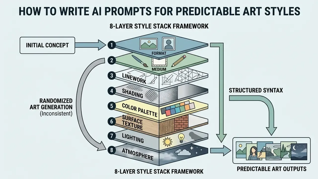
Generating consistent ai prompts requires structured syntax. Placing style tokens in a predictable sequence helps the diffusion model weight aesthetic instructions correctly relative to subject descriptors.
An earlier version of this section attributed token-order guidance to a prompting guide that could not be verified. The empirical study above replaces it and confirms the same structural behavior across real user sessions.
The 8-Layer Style Stack Framework
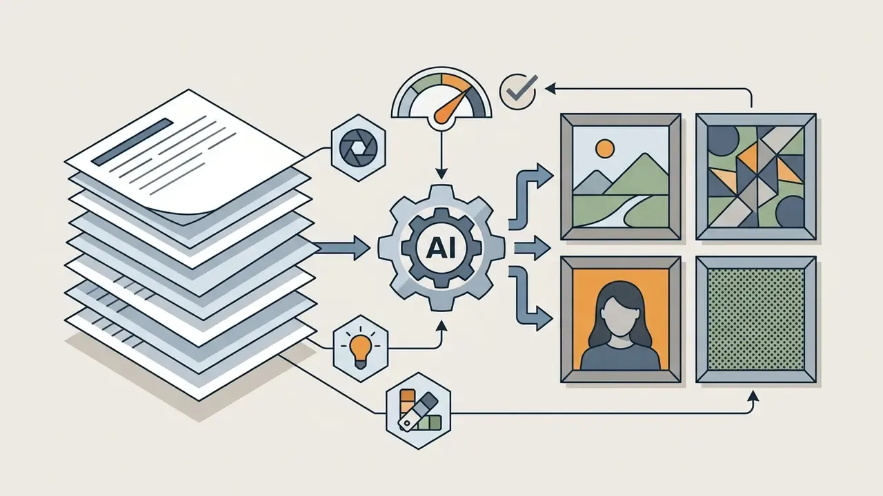
To eliminate visual drift across a series, construct prompt strings using an explicit 8-layer parameter stack. Order matters because diffusion models need context before modifiers: describe subject, action, and setting first, then move from broad (format) to specific (composition).
- Formateditorial vector illustration, character sheet, comic panel, sticker, poster, 3D render.
- Mediumopaque gouache, cold-press watercolor, impasto oil, ink pen, pastel, clay, pixel art.
- Linework2px tapered ink line, thin pencil contour, brush pen, smudged charcoal, lineless.
- Shadingdiscrete 2-tone cel shading, soft volumetric gradient, crosshatching, halftone dots.
- Color Palettelimited 4-color pastel, high-chroma primary, muted earth tones, 3-color risograph.
- Surface Textureheavy canvas weave, cold-press paper grain, screenprint noise, clean digital flat.
- Lighting & Atmosphererim-lit golden hour, harsh low-key shadows, diffused daylight, cozy interior light.
- Composition & Framingmedium shot, rule-of-thirds, centered character sheet, dynamic low-angle framing.
The critical improvement over generic five-part templates is the separation of linework from shading. Most inconsistent series fail because a single token like "watercolor storybook" leaves contour weight and shadow banding unspecified, so the model re-rolls both on every generation.
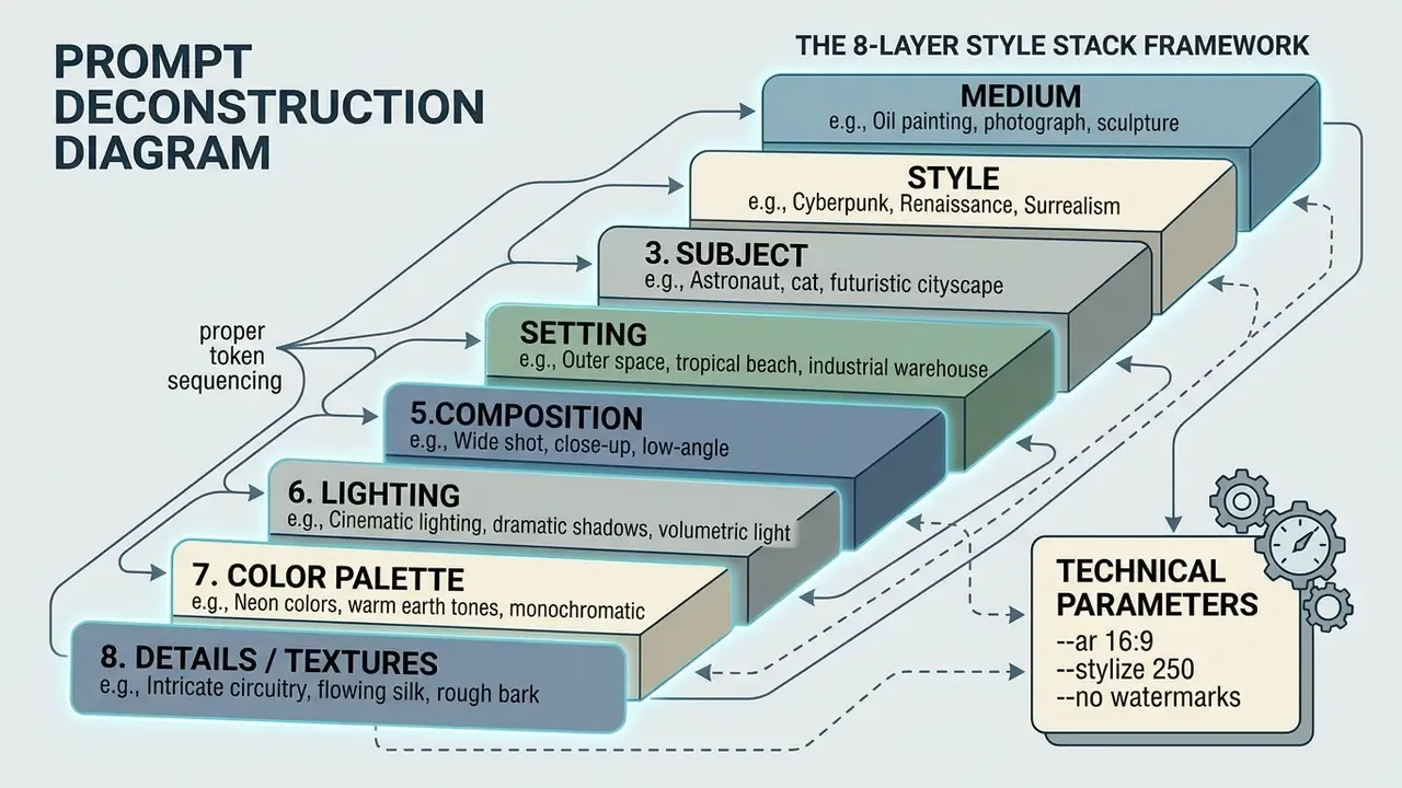
Weak versus strong style strings
Weak (adjective soup):
Soft watercolor fights clean vector; high detail fights minimalism. Nothing in that string is a concrete visual decision.
Strong (stack-based):
Every token encodes one decision, which is precisely why it reproduces.
Universal Style Prompt Template: Subject, Medium, Light, Palette, Render Style
For shorter production tasks the condensed hierarchy stays fully valid, and it is faster to type:
[Subject Matter] + [Medium] + [Lighting & Atmosphere] + [Color Palette] + [Render Style & Texture] + [Aspect Ratio]
Example Prompt Breakdown
- Subject a financial analyst reviewing data charts on a tablet
- Medium digital painting with clean vector overlays
- Lighting soft volumetric lighting with subtle rim highlights
- Color Palette cool blue
#0A192Fand slate gray#1E293Bwith gold#F5A623accents - Render Style polished concept art, subtle canvas grain
- Aspect Ratio
--ar 16:9
Full Prompt String:
Reusable production template (structured fields)
For teams running batch generation, splitting the prompt into named fields makes constant and variable segments auditable:
DESCRIPTION: [subject DNA: age, build, face, hair, outfit, signature props]
ACTION:      [single clear action + camera distance + angle]
BACKGROUND:  [simple location + time of day + mood]
STYLE:       [8-layer stack line, pasted unchanged across the series]
PARAMETERS:  [aspect ratio, seed, style weight]
Everything in DESCRIPTION and STYLE stays frozen; only ACTION and BACKGROUND vary. That is the structural reason serial output stays coherent.
Exact Parameter Syntax by Engine
Copy-paste syntax removes the most common source of failed reproduction, which is guessing at parameter names:
- Midjourney V6:
--sref --sw 250 --ar 16:9 --v 6.0(style weight accepts 0 to 1000, default 100; multiple--srefURLs can be chained; style codes lock an aesthetic numerically). - Stable Diffusion XL / ComfyUI:
, sharp lineart, flat colorwith negative promptphotorealistic, 3d render, complex gradients, lens flare. - Stability API:
style_presetfor text-to-image and image-to-image, plus Control Style and Style Transfer endpoints for image-derived aesthetics. - Flux.1:
raw photo style, shutter speed 1/1000s, natural lighting, 35mm. Flux responds strongly to camera-metric phrasing. - DALL·E 3:
style: "vivid"orstyle: "natural"(two values only), with square, widescreen, or vertical aspect ratio selection. - LoRA style adapters: style-specific LoRAs add only 1 to 128 MB of weights; style-mode training (for example
is_style=true) disables auto-captioning and binds the aesthetic to a trigger word.
Style Combinations and Maintaining Visual Consistency
Combining visual styles (cyberpunk neon lighting with traditional oil impasto, say) requires careful token management to avoid contradictory instructions.
- Limit primary descriptors restrict major style tokens to two dominant genres per prompt string.
- Freeze style anchors keep medium, lighting, and palette segments identical across serial generations, altering only the subject text.
- Use weighted tokens in stable diffusion workflows, apply prompt weighting such as
(oil painting:1.2), (neon lighting:0.8)to establish visual hierarchy. - Audit for contradictions remove pairs that cancel each other, like
flat vectorplussoft painterly gradients, orminimalistplushighly detailed. - Sample multiple seeds prompt-design research recommends testing 3 to 9 seeds before judging a style string, because single-seed evaluation confuses seed variance with prompt failure.
Brand teams producing serial assets usually need matching identity marks as well, which is why style specifications often sit alongside outputs from AI logo generators. When flat graphic assets have to scale for print, creators frequently convert generated files with an image to vector ai free converter to preserve sharp line boundaries.
How to Select an AI Art Style for Project Requirements
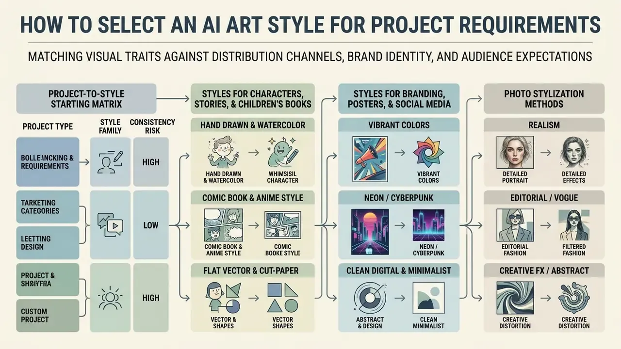
Selecting a style means matching visual traits against distribution channels, brand identity, and audience expectations. A mismatch between ai art style options and delivery goals degrades clarity or, worse, quietly alienates the audience you paid to reach.
A related governance consideration: stylized AI output is now frequently indistinguishable from human work to non-expert reviewers, which affects disclosure policy as much as aesthetics.
Risk and compliance teams should therefore validate published assets with AI image detectors rather than trusting human review alone. Before locking a style for a commercial campaign, also read the copyright and right-of-publicity constraints described later in this guide. For regulated industries, legal clearance is a pre-filter on style choice, not a post-production check.
Project-to-Style Starting Matrix
Matching Project Type to Style Family and Consistency Risk
| Project | What it needs | Good starting styles | Main caution |
|---|---|---|---|
| Picture book (ages 3 to 5) | Large silhouettes, clear emotion, low clutter | Bold-outline cartoon, flat vector, cut-paper, simple gouache, 3D cartoon | Detail must not compete with the action |
| Picture book (ages 6 to 9) | Richer setting, strong character readability | Watercolor, gouache, cel-shaded, painterly cartoon, collage | Keep proportions stable in complex scenes |
| Educational worksheet | High contrast, literal actions | Line art, flat vector, bold-outline cartoon | Avoid tiny details and ambiguous gestures |
| Brand mascot | Instant silhouette, few colors, scales small | Flat vector, chibi, bold cartoon, simple 3D | Design for many expressions and outfits |
| Corporate report / IR deck | Restraint, legibility, brand palette fidelity | Editorial vector, muted digital painting, photoreal portraiture | Photorealism has the highest style-lock difficulty |
| Social campaign | Thumb-stopping contrast at small size | Pop art, neon and street art, retro futurism, material transformation | Verify legibility at 1:1 and 4:5 crops |
Styles for Characters, Stories, and Children's Books
Narrative projects need consistent visual traits across multiple generated panels. Illustrative mediums with explicit line boundaries reproduce better across sequential frames.
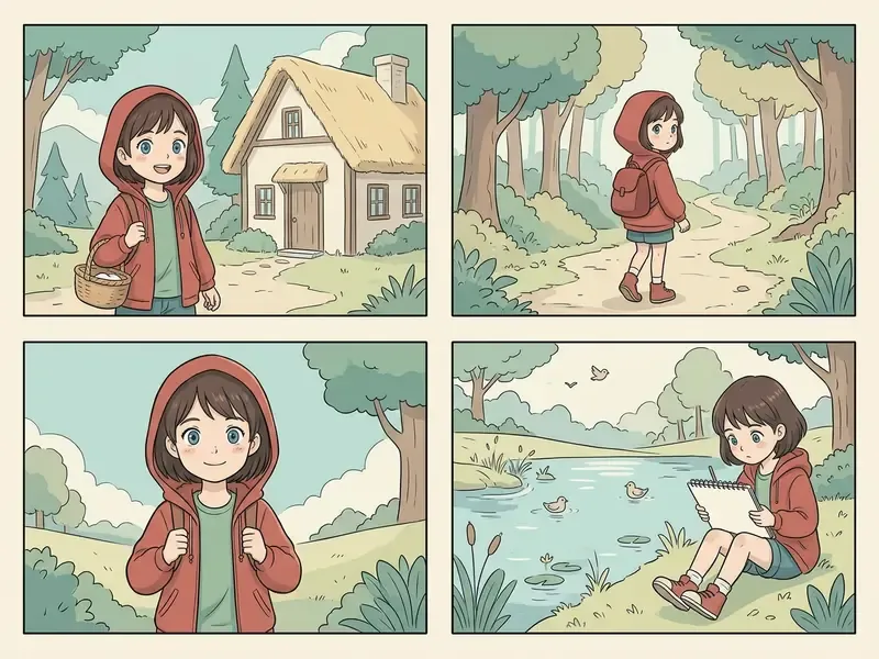
In serial publishing workflows, check early whether a generator allows consistent seed tracking or style reference locks. If it does not, the style question is already decided for you.
- Hand Drawn & Watercolor
- excellent for children's publishing, with warm textures and non-threatening character outlines.
- Comic Book & Anime Style
- ideal for graphic novels requiring action, dynamic perspective, and clear character silhouettes.
- Flat Vector & Cut-Paper
- the most consistency-tolerant options for long series, because both constrain shading and palette by construction.
- Vibrant Colors
- explicit color limits stop backgrounds from overpowering central cartoon characters.
Creators exploring tool options can compare options across dedicated generative platforms to evaluate style preservation, and budget-constrained narrative projects can start with free AI image generators that still expose reference locking. For terminology and adjacent definitions, you can also compare options across the reference library.
Operationalizing Style Consistency: The 1-Page Style Bible
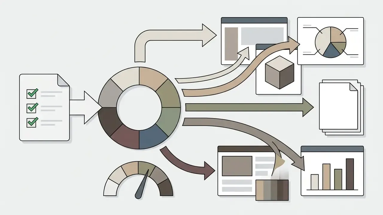
For multi-asset marketing campaigns, storybooks, or documentation illustration sets, create an immutable Style Bible block and paste it into every prompt without modification. A Style Bible is a specification, not a mood board.
Minimum viable Style Bible (one line):
Full one-page Style Bible fields:
Why the Always/Never list matters operationally: it converts taste into a reviewable rule set. A junior operator, a contractor, or an automated pipeline can then produce compliant assets without re-litigating aesthetic decisions every sprint.
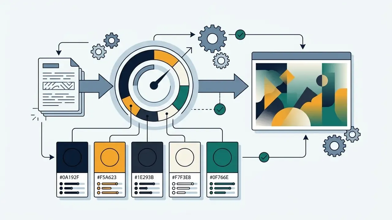
#0A192F, Gold #F5A623, Slate #1E293B, Cream #F7F3E8, Teal #0F766E).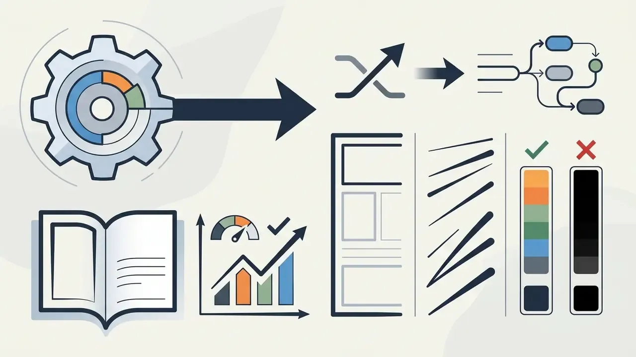
#1E293B contours; never pure black #000000."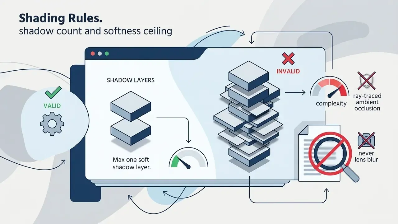
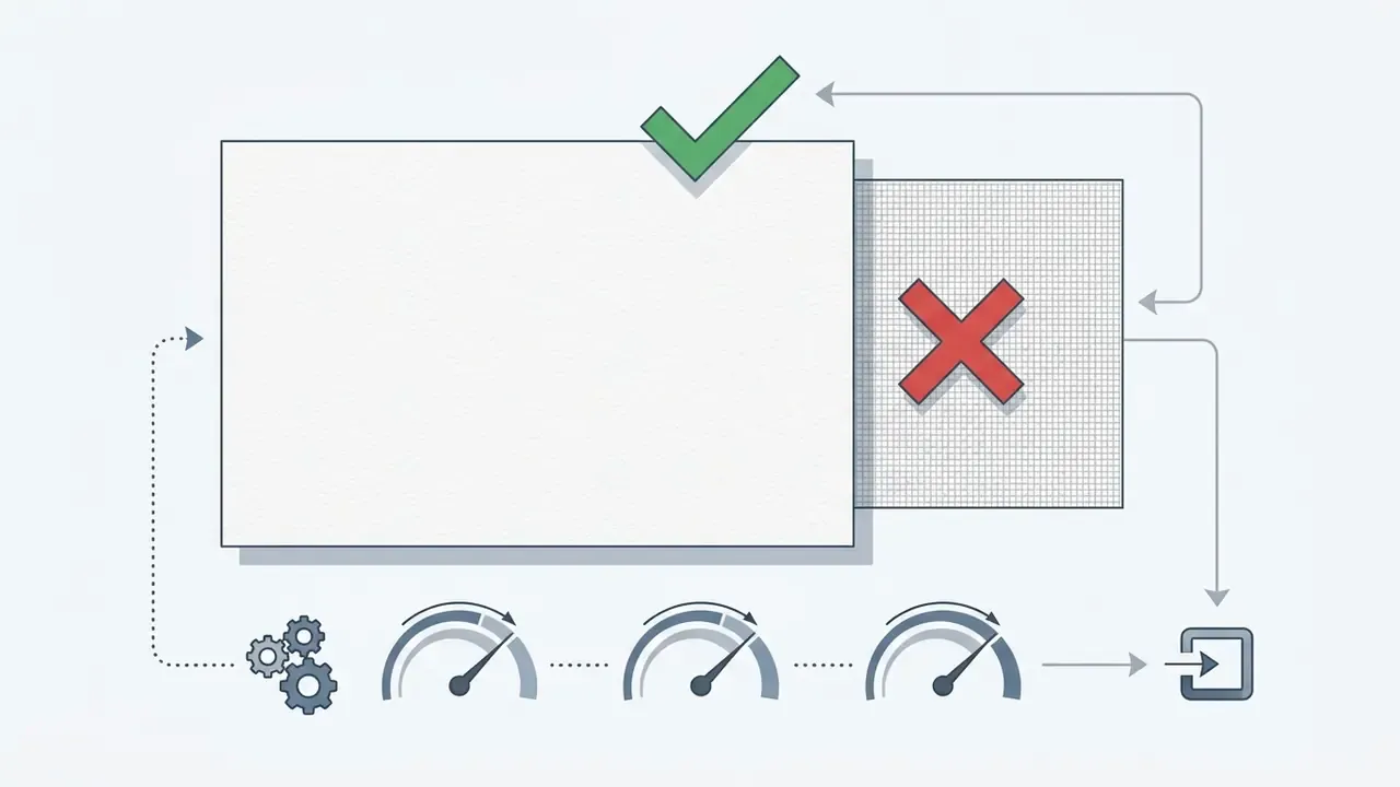
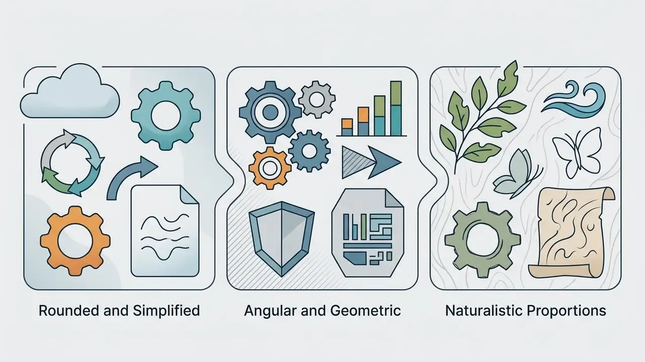
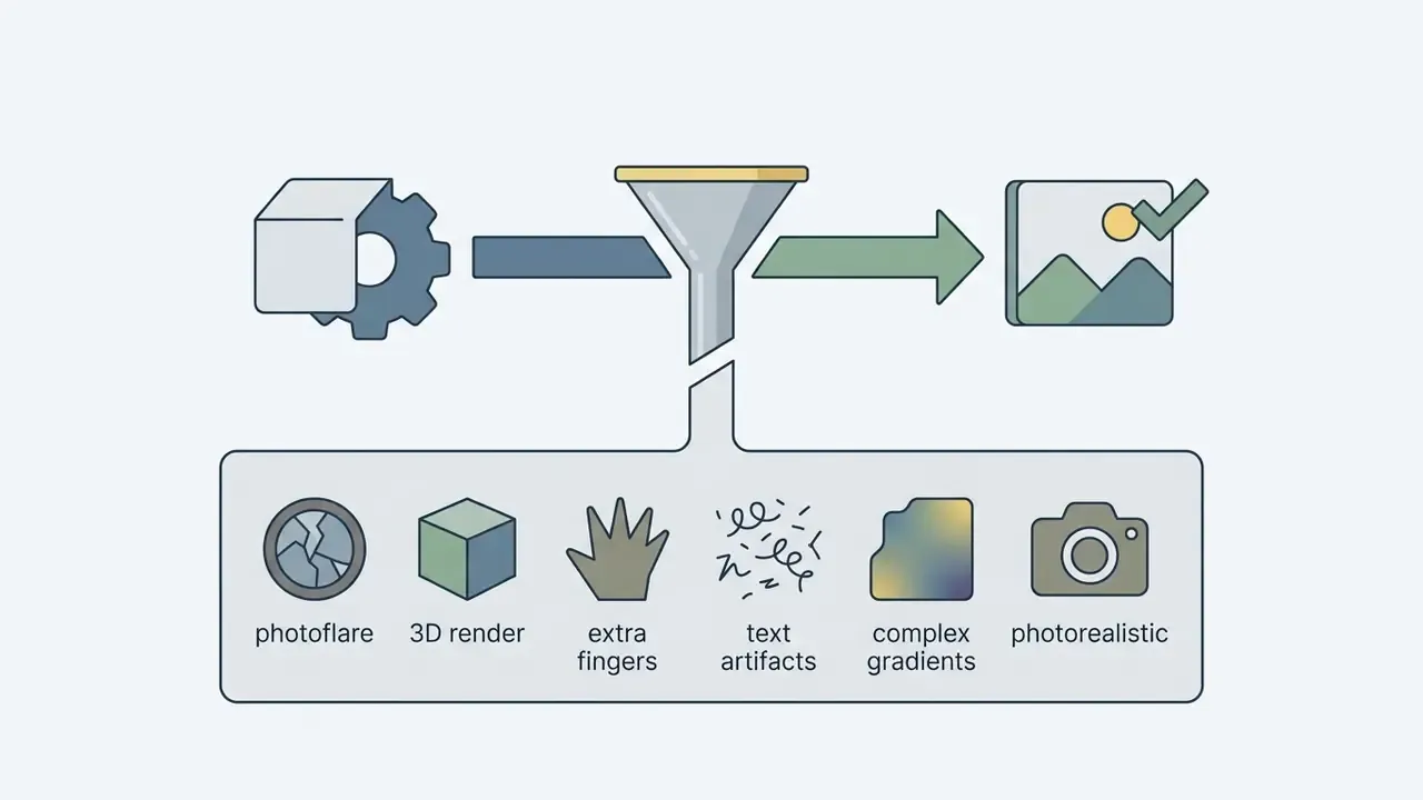
photorealistic, 3d render, complex gradients, photoflare, text artifacts, extra fingers.
AI Art Styles for Photos: How to Stylize Reference Images
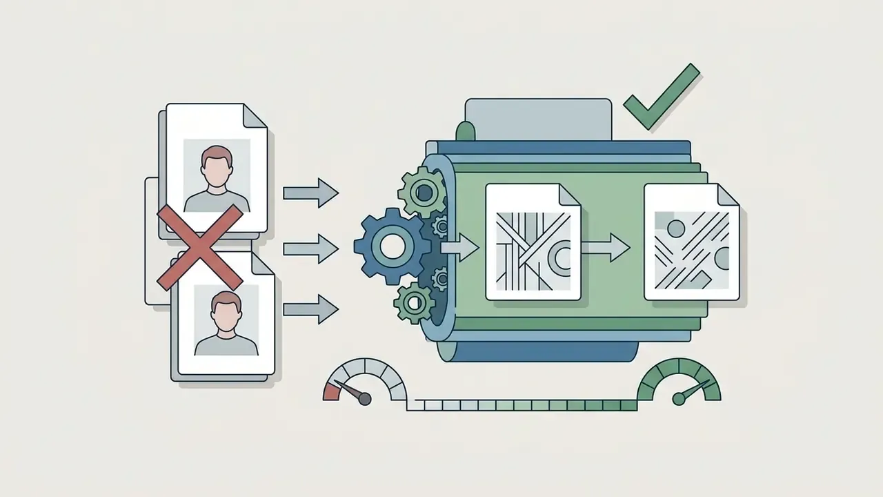
Applying ai art styles for photos means transferring stylistic attributes, paint texture or lighting for instance, from a target reference onto a source photo while preserving subject identity. Technically this depends on two separate conditioning channels: structure conditioning (ControlNet-style edge, depth, and pose maps that freeze geometry) and style conditioning (IP-Adapter or style-reference injection that supplies texture, palette, and light). Identity preservation is not default behavior for ai styles for images. It is an explicit engineering objective requiring the structure channel.
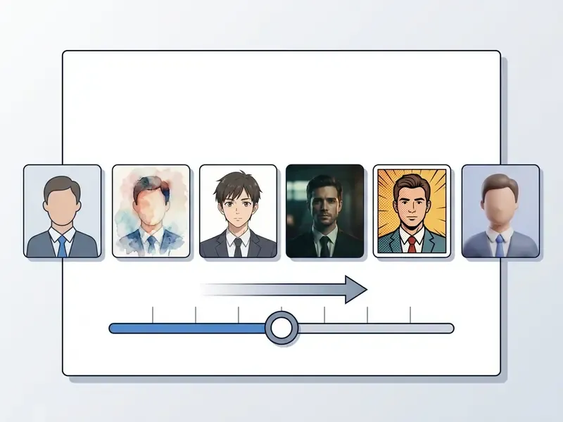
When to Maintain a Photorealistic Look vs. Transforming Style
Whether to retain photographic realism or apply full style transfer depends on the destination:
- Retain photorealistic lookwhen subject recognition, facial identity, or product accuracy is paramount: executive headshots, real estate listings, e-commerce catalog assets. Photorealistic transfer changes style while preserving content, and usually relies on guided filters, local affine constraints, or photorealism regularization to protect edges and structure.
- Transform to artistic stylewhen producing stylized avatars, editorial campaign visuals, or creative collateral where brand expression outweighs exact photographic reproduction.
One illustrative case, composite and hypothetical: an agency needed 50 executive headshots converted into stylized avatar illustrations for an annual report without losing individual recognizability. Using an image-to-image pipeline with ControlNet edge detection paired with a soft watercolor reference image, the team held facial geometry steady while applying painterly brushwork across the batch in under two hours. Teams handling comparable portrait volumes often finish with conventional AI photo editors for retouching and export normalization.
Effective Use of Reference Images and Style References
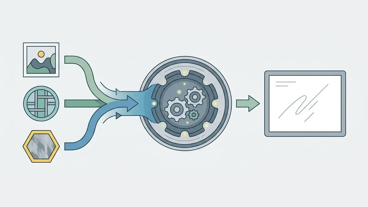
Image-to-image workflows rely on dual conditioning: a content reference anchors spatial structure, while style references supply color, lighting, and surface texture. Assign each reference exactly one role (identity, style, layout, product, or lighting) because overlapping roles are the main cause of unintended content carryover.
- Structure control
- use depth maps or edge extraction such as ControlNet to freeze composition so subject features do not warp.
- Style injection
- supply clean references with distinct texture lighting, a specific color palette, and clear artistic grain. Choose style references that are visually "pure": texture, palette, and brushwork without a competing subject.
- State preservation rules first
- write what must stay identical before writing what should change. Composition anchors are protected by explicit instruction, not by hope.
- Conditioning balance
- calibrate style weight (typically 0.3 to 0.7) to stop style transfer from distorting anatomy. Note: that range is a practitioner heuristic, so treat it as a starting bracket and validate per model.
To analyze visual inputs or pull textual prompts out of existing creative references, production teams frequently use an image to text translator to streamline style token extraction, and a plain image to text pass is often enough for archiving prompt metadata from legacy assets.
Deconstructing Reference Images: The 9-Point Style Fingerprint
To recreate an unlabelled style without naming a living artist, audit the reference across nine visual axes. Answer all nine and the output is a Style Bible, derived from observation rather than from a person's name.
How to convert the audit into a prompt: concatenate the answers as concrete tokens in Style Stack order. "I want it to feel like that book I loved" becomes 2D storybook cartoon, tapered ink contours, rounded simplified shapes, five-color warm palette, flat color with one soft shadow, subtle paper grain, uncluttered medium shot. A string that repeats reliably and contains no protected names.
- Medium & Substrate
- physical media markers such as paper grain, digital vector, canvas weave, clay, print noise.
- Edge & Contour
- line thickness, taper, contour color, presence or absence of outlines.
- Shape Language
- predominance of rounded, sharp, or geometric forms; proportion conventions.
- Color Structure
- palette harmony, number of hues, saturation ceiling, approximate hex range.
- Light Behavior
- directionality, key softness, highlight specularity.
- Shadow Treatment
- flat cel boundaries versus soft painterly gradients; shadow count.
- Dimensionality
- 2D flat composition versus 3D volumetric depth and modeling.
- Surface Texture
- noise level, impasto relief, halftone dots, or clean specular smoothness.
- Spatial Perspective & Mood
- isometric, deep vanishing-point perspective, or flat decorative framing, plus intended tone and audience.
Comparing AI Image Generator Styles and Tool Capabilities
Different AI tools implement style control through different architectural mechanisms, from simple text modifiers to dedicated LoRA adapters and image reference pipelines. Comparing ai image generation style options is therefore a comparison of control surfaces, not of sample galleries.
Style Presets, Image Models, and Managing Style Options
Evaluating ai image generator styles starts with how each platform exposes aesthetic parameters:
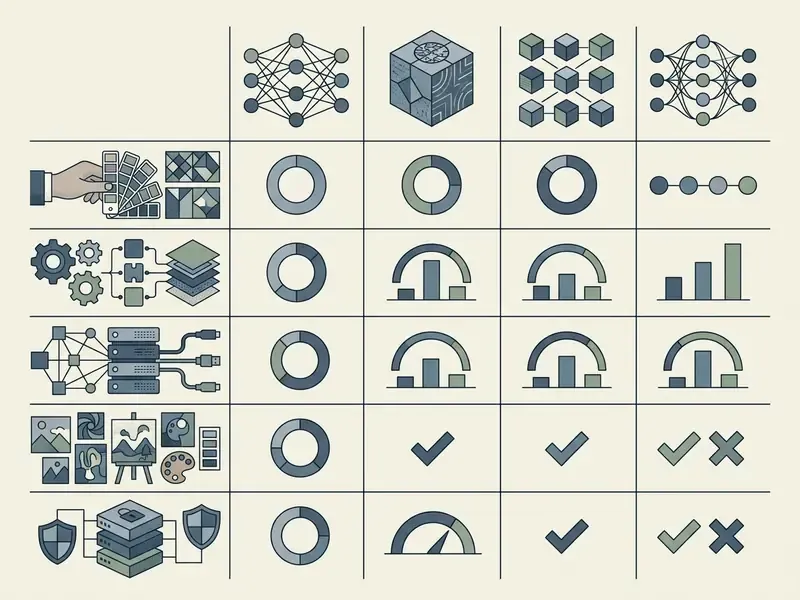
Teams evaluating specialized platforms can review assessments of the leonardo ai image generator, or look at consumer-facing options via the magic ai generator overview and the magic hour ai image generator analysis.
AI Generator Style Selection Matrix (with Exact Parameter Syntax and Enterprise Controls)
| Project Requirement | Primary Target Style | Recommended AI Model / Tool | Key Style Control Feature | Exact Parameter Syntax | Enterprise Security / Data Handling Check |
|---|
| Corporate photorealism | Photorealistic, natural lighting | Midjourney V6 / Flux.1 | Anamorphic parameters, --sref image locking | `--sref
Commercial Use of AI Art Styles and Copyright Considerations
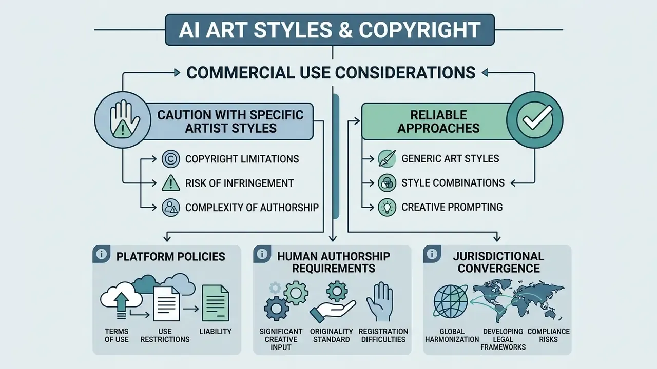
Deploying AI-generated visual media in commercial products requires careful evaluation of intellectual property law and platform terms of service.
Why Requests for Specific AI Artist Styles Require Caution
Prompting models with names of living artists ("in the style of [Living Artist]") introduces substantial legal and reputational exposure. The phrasing feels harmless in a creative brief. It is not harmless in a discovery request.
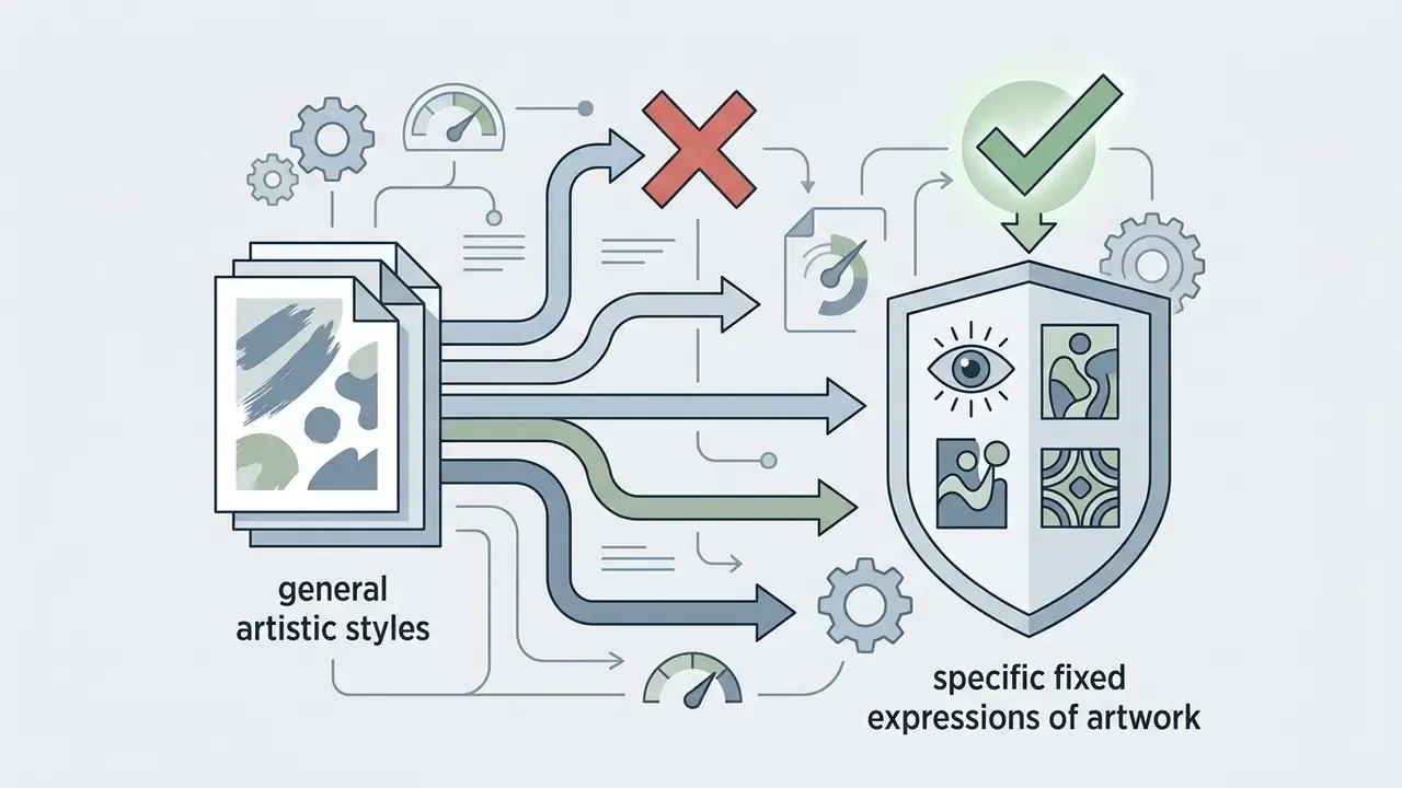
- Copyright limitations while general art styles are typically not copyrightable under US precedent (US Copyright Office, 2025 Report), imitating a living artist's visual signature can trigger claims under right of publicity, unfair competition, or trademark law.
- Platform policies leading enterprise platforms such as Adobe Firefly explicitly ban living artist names, real people, imaginary characters, and "in the style of" phrasing in prompts, titles, and keywords for commercial content.
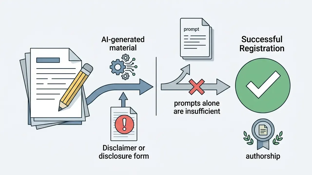
- Human authorship requirements the US Copyright Office states that purely AI-generated output lacking substantial human creative input cannot be registered; registrants must identify and disclaim AI-generated portions of mixed works.
- Jurisdictional convergence European Parliament analysis similarly concludes that purely ai generated output lacks copyright protection in the EU and that style imitation alone is unlikely to infringe, while still raising fairness and reputational concerns. EU AI Act transparency obligations additionally require marking AI-generated output.
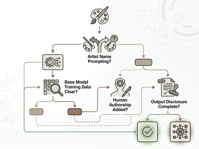
There is a technical mitigation path too, not only a policy one:
Legal Fact Check: Commercial Rights and Style Protection
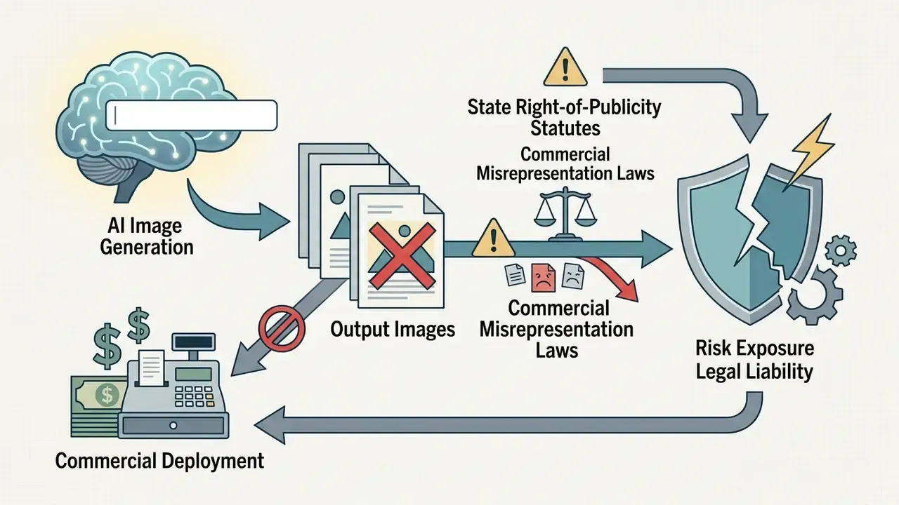

A hypothetical but typical sequence: a fintech firm prepares a national campaign using AI illustrations. Initial prompts name active commercial illustrators, which creates legal risk. The risk team intervenes, strips the artist names, and substitutes broad movement descriptors ("mid-century modern graphic illustration, flat geometric vectors"). The revised workflow ships compliant assets and removes right-of-publicity exposure, with no visible loss of quality. Studio-adjacent aesthetics carry comparable exposure, which is why teams evaluating Ghibli-style AI image generators should treat the aesthetic as a legal question first, then validate final files with AI image detection tools before publication.
Bias exposure is a second commercial risk vector that style selection controls directly:
For advertising, recruitment, and educational material, that means style keywords deserve the same representational review as casting decisions. Uncomfortable, but hard to argue with.
MRM Audit Checklist for AI Media Assets
For institutions operating under model-risk-management frameworks, the audit trail, not the image, is the deliverable. Retain the following per published asset:
- Prompt recordfull prompt string, negative prompt, and Style Bible version identifier.
- Model provenanceengine name, model version, and any LoRA or adapter identifiers with weights.
- Determinism parametersseed value, sampler, step count, style weight (
--sw), aspect ratio. - Reference lineagesource and license status of every reference image used for structure or style conditioning.
- Prompt-content clearanceconfirmation that no living-artist name, celebrity likeness, trademark, or protected character appears in the prompt.
- Human contribution logdescription of human selection, editing, and arrangement supporting any copyright claim.
- Bias and representation reviewreviewer sign-off on representational outcomes for people-depicting assets.
- Disclosure statuswhere AI-generation labelling is applied and under which policy or regulation.
- Approval chainnamed reviewer, legal sign-off, publication date.
- Framework mappingcross-reference of these controls to the institution's chosen AI risk framework and internal model-governance policy.
To inspect legal disclosures, risk frameworks, and regulatory updates surrounding generative media, risk officers can explore the hub and review structured compliance documentation.
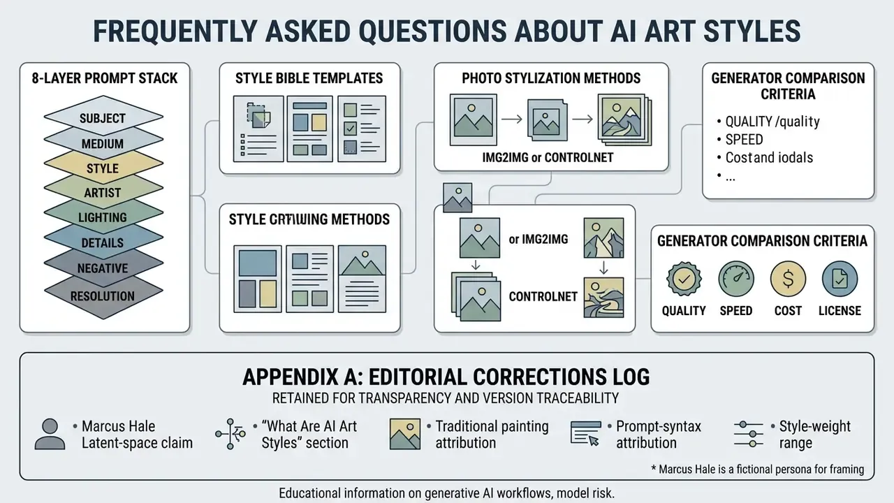
FAQ: Frequently Asked Questions About AI Art Styles
How Do Aspect Ratios Change Perception of an Art Style?
Aspect ratios dictate structural framing and spatial composition, altering how a model distributes visual elements:
- Widescreen ratios (16:9, 21:9): expand horizontal context, pushing the model toward wide environments, atmospheric perspective, and cinematic light. This layout naturally reinforces cinematic style and environmental concept art.
- Square ratios (1:1): focus visual weight on the central subject and reduce background context. Ideal for formal portraits, icons, and detailed character busts.
- Vertical ratios (4:5, 9:16): compress horizontal space while expanding vertical headroom, which suits mobile feeds, full-length character designs, and architectural renderings.
«Users embed aspect ratio in the detail segment of the prompt alongside medium and lighting, for example "16:9 cinematic" or "square canvas", as an intuitive style parameter.» - "Is It AI or Is It Me? Understanding Users' Prompt Journey in the Era of Generative AI", ACM CHI, 2024. https://dl.acm.org/doi/10.1145/3613904.3642492 Changing the ratio changes spatial arrangement, focal length, and composition light, but it does not mechanically alter lens properties such as depth of field. Those must be specified separately via aperture, focal length, or the
shallow depth of fieldandbokehtokens. Because ratio changes also change pixel dimensions, teams often finish delivery with AI image upscalers to hit print or billboard resolution targets.
Can the Same Art Style Be Reproduced Exactly Using Seeds?
Seeds control the initial noise pattern, so re-running an identical prompt, model version, sampler, and seed generally reproduces the same image on the same engine. Seeds are not portable, though: the same seed on a different model version, sampler, or platform produces a different result. For governed workflows this means three things. First, treat seed alone as insufficient for reproducibility and log model version plus sampler beside it. Second, evaluate a style string across 3 to 9 seeds before judging it, because single-seed output confuses noise variance with prompt failure. Third, when a specific output must survive indefinitely, archive the rendered file. Regeneration is a convenience, not a guarantee.
How Should Prompt Logs and Style Specifications Be Stored?
Store prompts as structured records, not free text. A minimum schema holds: asset ID, full prompt, negative prompt, Style Bible version, model and adapter versions, seed, sampler, style weight, reference-image hashes and licenses, reviewer, approval date. Version the Style Bible independently so a palette change traces to an exact date and an exact asset set. That discipline converts "we used AI for the brochure" into a defensible audit trail, and it is also what lets a team regenerate a missing asset eighteen months later without re-deriving the aesthetic from memory.
Who Owns the Commercial Rights to an AI-Generated Image in a Specific Style?
Ownership splits into two independent questions. Usage rights are set by platform terms of service. Most paid tiers grant broad commercial use, but free tiers, watermarking rules, and public-gallery defaults vary widely and must be read per tool. Copyright is separate: in the United States, protection attaches only to human-authored contributions, and prompts alone are generally insufficient; EU analysis reaches a comparable conclusion for purely AI-generated output. Practically, an asset that has been selected, composited, edited, and arranged by a human has a stronger claim than a raw single-generation export. Style itself is not the protected element in either jurisdiction. Specific expression is.
Which Styles Are Hardest to Keep Consistent Across a Series?
Photorealism is hardest, because identity, lens behavior, skin rendering, and lighting must stay stable at once, with no line or shading convention constraining the model. Painterly digital styles sit in the middle: brushwork drifts unless texture and shadow count are pinned. Flat vector, bold-outline cartoon, cut-paper, and cel-shaded styles lock most easily, since their constraints (limited palette, fixed contour weight, discrete shadow bands) remove most of the model's freedom by design. If a project needs dozens of consistent assets on a deadline, choosing a constrained style beats any prompt trick.
Do Style Keywords Work the Same Way Across Different Generators?
No. Identical prompts vary significantly by model, which is why prompt-design research recommends comparing outputs across engines rather than assuming transferability. Cel shading is understood almost everywhere; made of light and risograph behave inconsistently; named parameter syntax such as --sw or is engine-specific and meaningless elsewhere. Maintain one Style Bible per engine, or accept a visible aesthetic shift when you migrate platforms mid-project.
Verification Status and Institutional Governance Notice
Appendix A: Editorial Corrections Log