If a chart reaches a risk committee, someone owns the numbers on it. That single sentence explains why a tool that drafts visuals in four seconds still belongs inside your control environment.
An AI graph generator is a software system that uses natural language processing and automated data parsing to transform raw numbers, spreadsheets, and text descriptions into structured visual charts. By interpreting user prompts and database schemas, these tools automate visual selection, axis mapping, label formatting, and layout design without requiring manual configuration in traditional design software.
"An AI graph generator must never be treated as an autonomous decision-maker. Without deterministic data lineage, explicit validation controls, and human oversight, automated chart generation introduces severe model risk into executive reporting." (Marcus Hale, AI Governance & Model Risk Specialist. Marcus Hale is the author.)
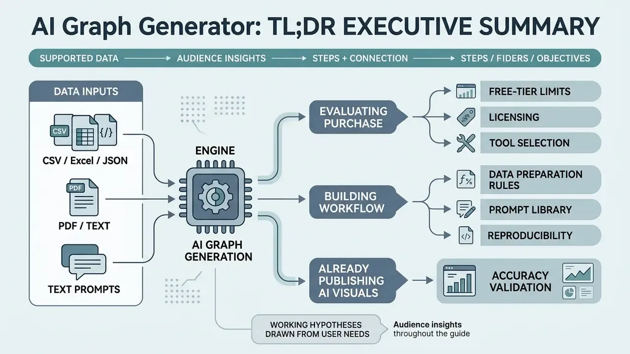
TL;DR executive summary
- What it does An AI graph generator ingests tabular files (CSV, XLSX, TSV), semi-structured data (JSON), or unstructured documents (PDF, DOCX, TXT), interprets the schema and analytic intent, then renders chart code and a first visual draft, typically in seconds.
- How accurate it is Benchmarked natural-language-to-visualization pipelines produce valid chart code roughly 60–95% of the time depending on model, schema clarity, and prompt precision. Accuracy degrades sharply when both the phrasing and the table schema change.
- Where the risk sits Truncated y-axis baselines, inverted signs during CSV transformation, hallucinated data points, and mislabeled series. All published charts require deterministic value-by-value verification against source data.
- What governance requires A reproducible audit trail (prompt text, model version, generated Vega-Lite or Python code, source-file hash), documented human review, and vendor terms that prohibit training on uploaded datasets.
- Free vs paid Free tiers typically ship watermarks, credit caps, small file limits, and non-commercial licenses. Commercial rights and non-training data agreements usually begin at paid or enterprise tiers.
- Best-fit workflows Exploratory data analysis, recurring KPI and QBR decks, marketing and portfolio reviews, research summaries. Always with human-in-the-loop sign-off before external distribution.
Who this guide is written for, and how to read it
What is an AI graph generator and how does it work?
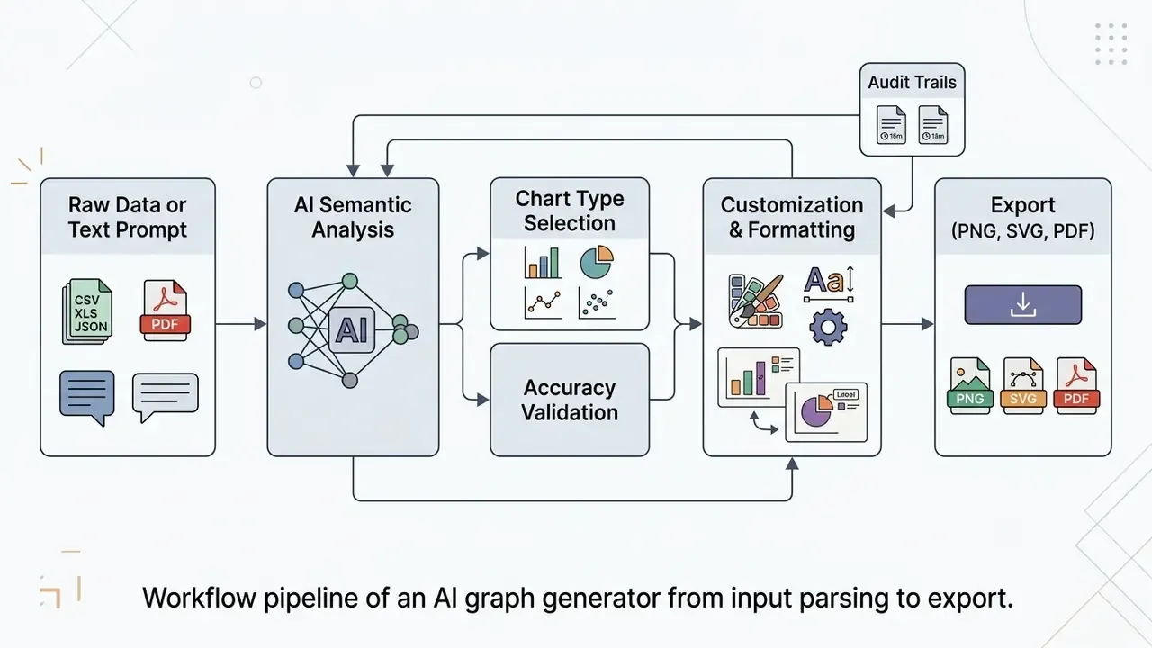
An AI graph generator is an automated data visualization generator that converts structured tabular inputs or plain-language descriptions into executable visual specifications and rendered charts. The core mechanism relies on large language models (LLMs) and heuristic chart-recommendation engines that parse input text, identify data attributes, infer analytic intent, and output visualization code in frameworks such as Vega-Lite, Python matplotlib, or JavaScript libraries.
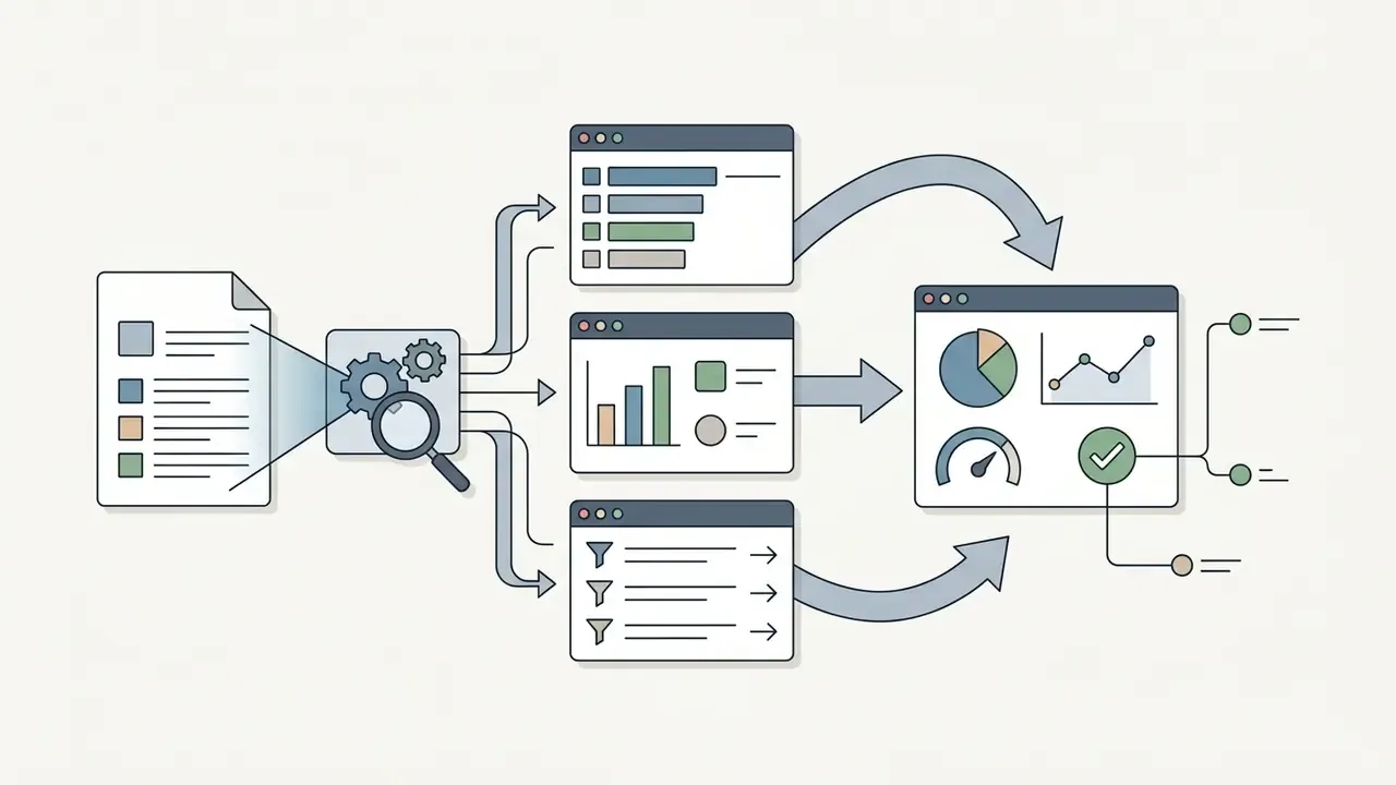
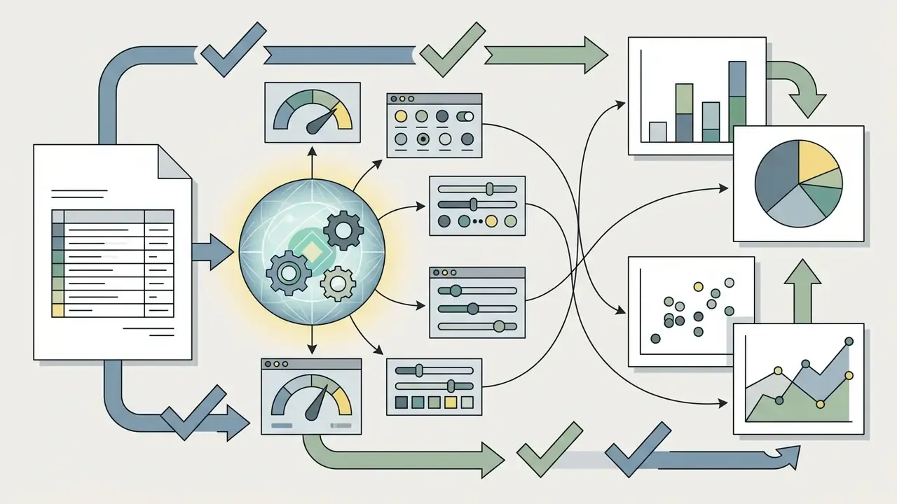
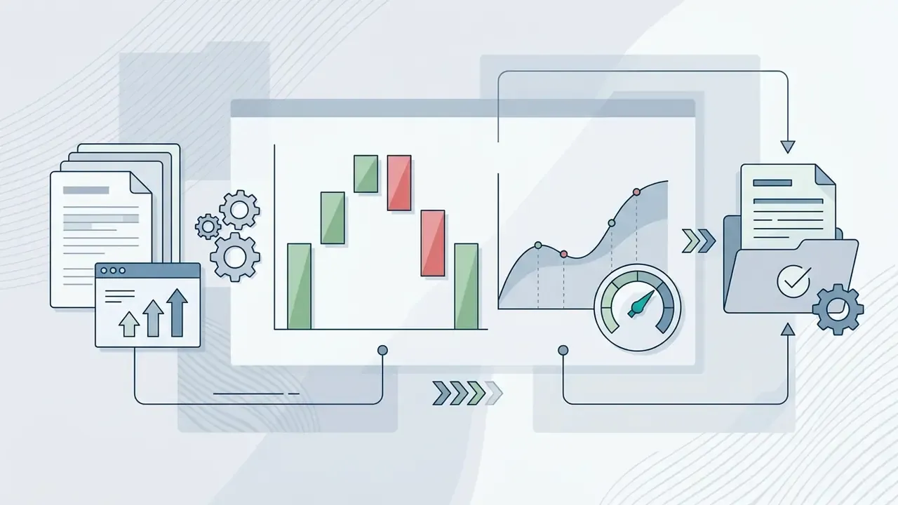
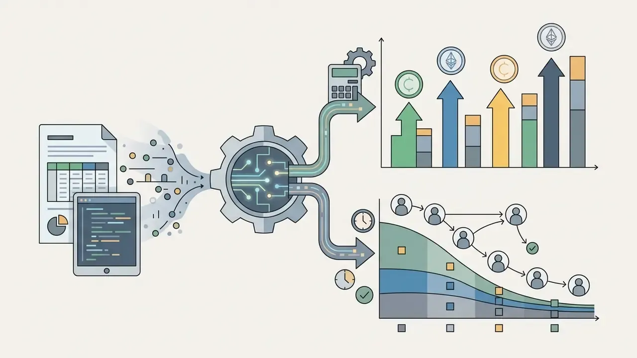
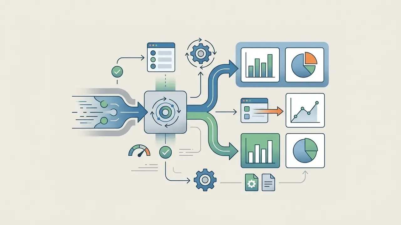
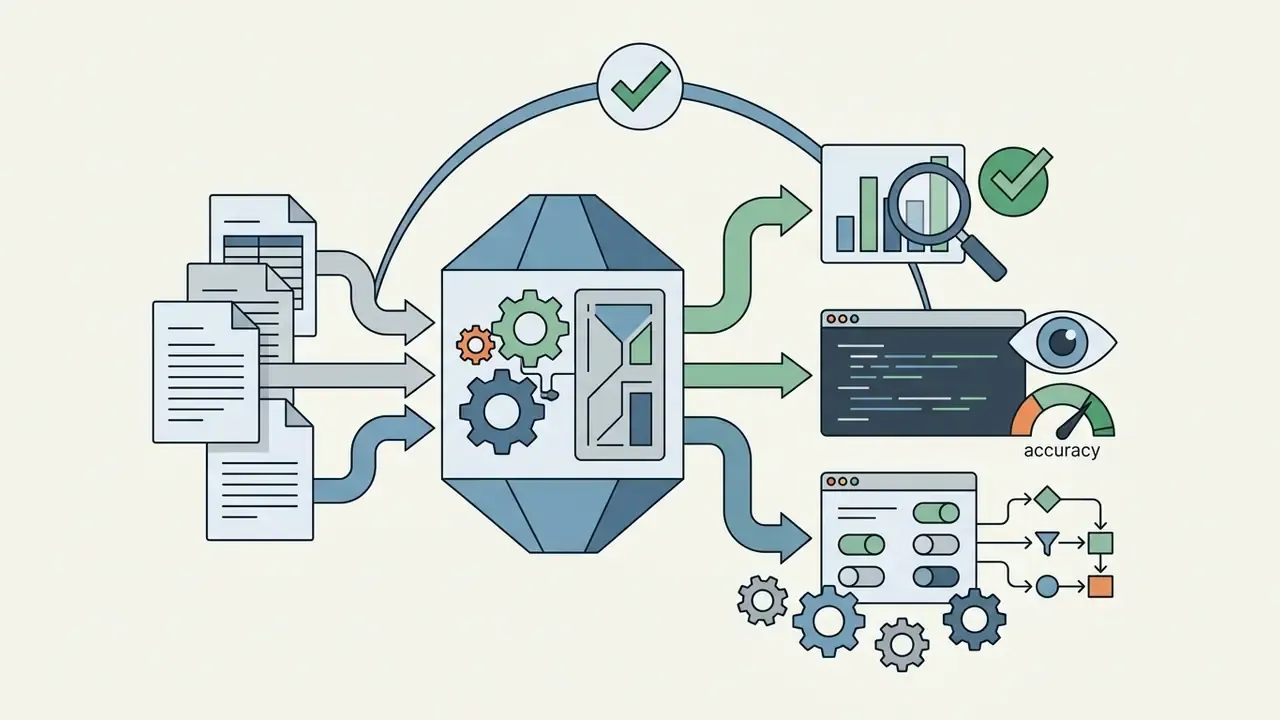
Modern AI chart creation architectures operate through a multi-stage pipeline:
According to research on Natural Language to Visualization (NL2VIS) benchmarks, LLM-driven pipelines can achieve 60% to 95% accuracy in generating valid chart code from plain-English queries (Wu et al., Evaluating LLM-based Text-to-Visualization Systems, 2024). Model-level differences are material: in comparative evaluations of visualization generation, GPT-4o produced approximately 95% of charts correctly, while GPT-3.5 reached roughly 79%, with accuracy varying substantially by chart family (Evaluating LLMs for Visualization Generation and Understanding, 2025). System accuracy therefore remains highly dependent on table schema clarity, model selection, and prompt precision.
An additional behavior deserves governance attention: agentic pipelines. Newer tools do not merely render what the user described. They may silently perform multi-step aggregations, derive ratios, drop outliers, or impute missing periods before plotting. Because these intermediate transformations are rarely surfaced in the visual output, reviewers must inspect the generated code, not only the image, to confirm which calculations the engine actually executed.


AI chart generator vs chart maker: what is the difference?
An AI chart generator automatically determines visual encoding, data aggregations, and layout from unstructured commands or raw tables, whereas a traditional chart maker requires manual field mapping and manual chart selection. In a conventional tool, the user must explicitly choose a bar or line format, drag fields to specific X and Y axes, and manually set scale ranges.
AI chart creation tools streamline this process by applying automated heuristic rules. Research comparing AI-driven tools with conventional systems demonstrates that AI tools significantly lower the operational entry barrier for complex data exploration (Maddigan & Susnjak, Chat2VIS: Generating Data Visualisations via Natural Language, 2023). However, traditional chart tools offer complete deterministic control, while an AI chart generator tool produces probabilistic drafts that require verification against original source data.
| Dimension | Traditional chart maker | AI chart generator |
|---|---|---|
| Time to first draft | Multiple manual steps: open editor, load data, choose type, map axes, format | One prompt or one upload; draft returned in seconds |
| Chart-type selection | Explicit and manual | Automated heuristics, often with an "auto" mode |
| Determinism | Fully deterministic; identical inputs produce identical output | Probabilistic; the same prompt can produce different drafts across runs |
| Error handling | Errors are visible to the operator during mapping | Errors can be silent (inverted signs, truncated axes, hallucinated points) |
| Entry barrier | Requires spreadsheet or BI literacy | Requires only plain-language description of the goal |
| Governance burden | Low, because the human made every choice | High, because it requires validation, audit trail, and human sign-off |
The trade-off is not speed versus quality. It is speed versus provability.
When AI-generated charts are useful
AI-generated charts are most effective when teams need to quickly convert raw data into visual summaries for business reports, executive presentations, academic research summaries, marketing decks, and social media content. They allow analysts and operators to bypass manual plotting steps during initial exploratory data analysis.
Enterprise risk officers and business teams frequently rely on an AI data graph generator to convert complex spreadsheet exports into clear visual narratives. When reviewing credit portfolio performance or cross-border payment trends, an AI data chart generator can synthesize multi-column tables into concise visual drafts in seconds, letting stakeholders focus on risk analysis rather than manual layout work. Teams standardizing visual output across static graphics and other media assets often benchmark these systems against neighboring categories such as online photo editors to keep brand rendering consistent.
High-value use cases observed across departments include:
That last row deserves a caution. Charts summarizing KYC or AML performance often travel to regulators, so they belong in the highest validation tier, not the "quick draft" tier.
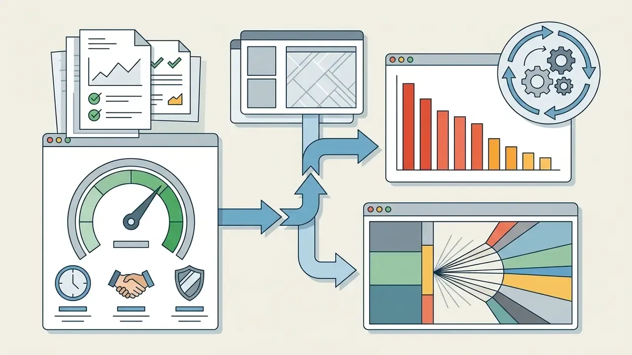
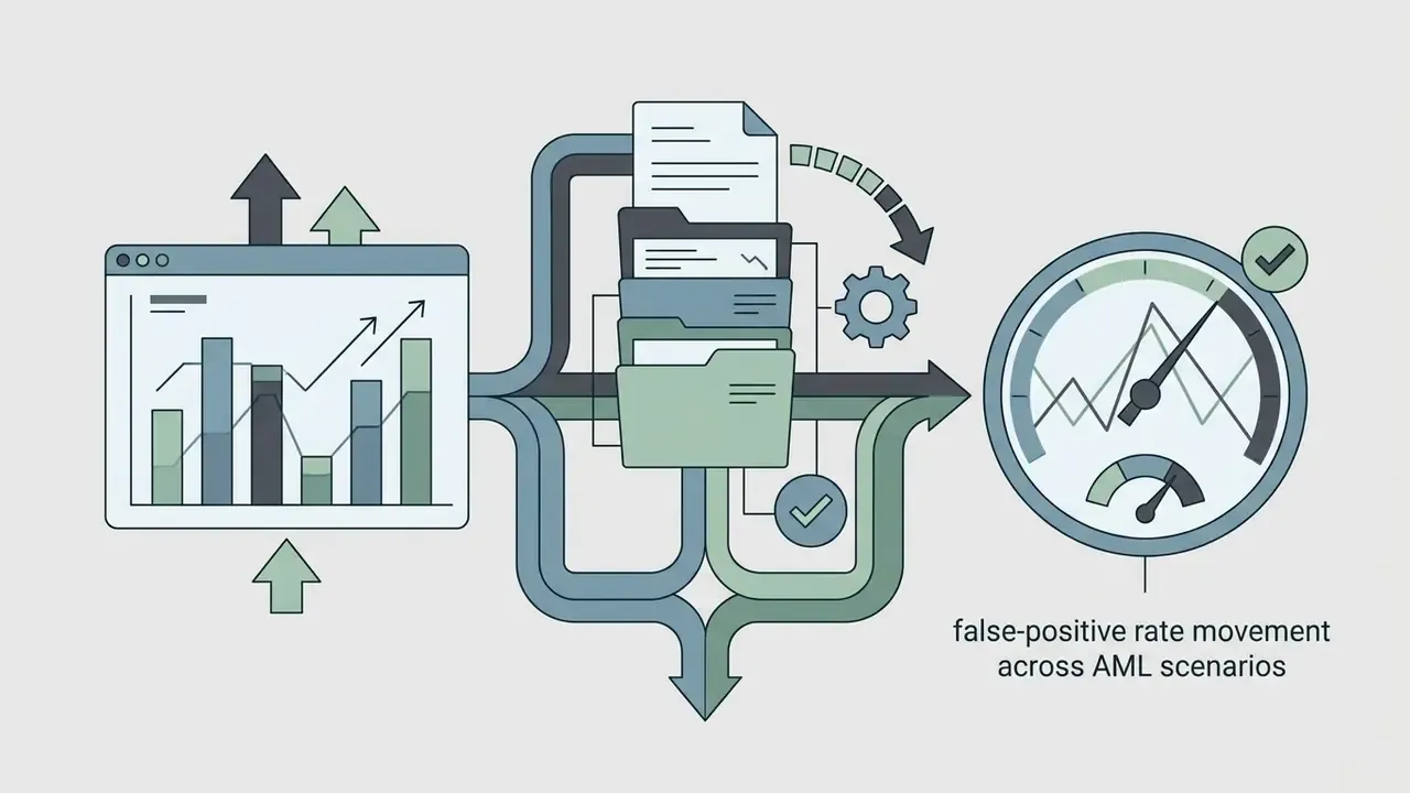
Automated data interpretation and recurring reporting workflows
Advanced AI graph generators extend beyond visual rendering by automatically pairing generated charts with written narrative summaries. Rather than forcing analysts to interpret visual trends manually, the system extracts key takeaways, statistical outliers, and percentage variance highlights directly alongside the graphic output. In practice, the deliverable is not an isolated image but a chart plus a two- to four-sentence explanation ready for a slide, memo, or committee note.
For recurring operational reviews, such as weekly KPI tracking or monthly financial updates, teams can save approved prompt parameters and schema mappings as reusable templates. When new source data is connected via API or spreadsheet upload, the AI updates the visual chart and refreshes the executive text summary simultaneously, ready for immediate inclusion in slide decks and corporate updates.
Technically, this recurrence is usually implemented through spreadsheet or API connectors. The Google Sheets API exposes chart methods (AddChartRequest, spreadsheets.batchUpdate) that create embedded charts programmatically, while presentation APIs support refreshing an already-inserted chart against changed source data. That architecture is what allows a "generate once, refresh weekly" pattern instead of manual re-creation each cycle. Teams evaluating programmatic media and reporting pipelines can review comparable implementation economics in the Google Veo API implementation guide and the broader AI Media API documentation to understand how usage-based connectors are typically priced and rate-limited.
Two cautions apply to automated narratives. First, generated summaries inherit any error present in the underlying chart, so text review cannot replace numerical validation. Second, because outputs vary across runs, the same dataset can produce differently worded conclusions; regulated teams should freeze approved phrasing templates rather than shipping free-form AI prose into board materials.
How to create a graph with AI from data, Excel, or text
To ai create a graph, you upload a structured data file or input a clear natural-language prompt describing the variables, analytic objective, and preferred chart structure. The AI system parses the input, maps categorical and numeric fields, and renders an initial visual draft for user review and refinement.
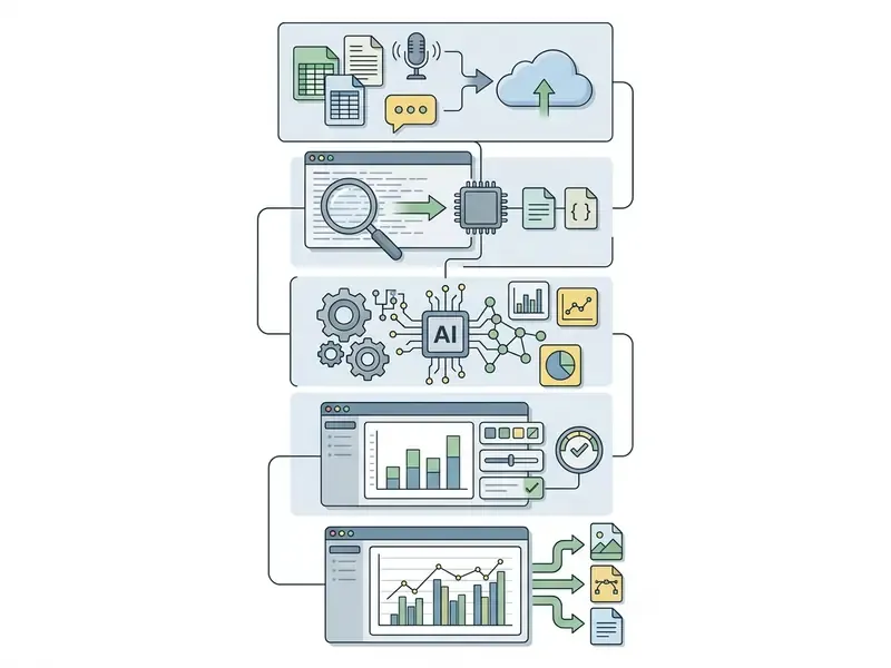

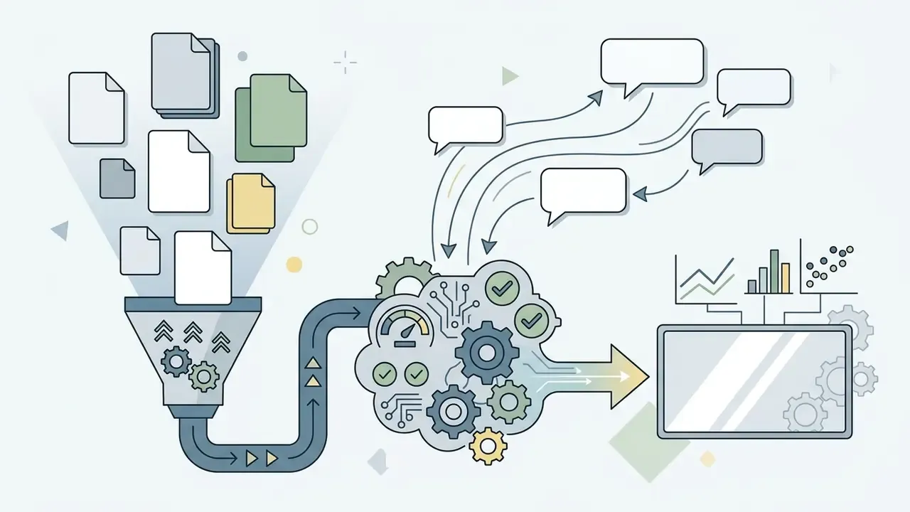
Upload raw data, spreadsheets, and Excel files
Modern AI graph generators ingest both structured databases and unformatted text documents. Supported file formats typically include:
- Tabular datasets (CSV, XLSX, TSV) Optimal for precise quantitative mapping and multi-series analysis. Maximum recommended file size: 100 MB, with many free tiers capping uploads far lower (5–10 MB).
- Semi-structured and API formats (JSON) Directly parses nested key-value pairs and temporal metrics exported from product analytics or REST endpoints.
- Unstructured documents (PDF, DOCX, TXT) The AI engine extracts numeric tables, embedded bullet points, and key metrics from long-form text documents before rendering the visual draft. Document-parsing pipelines commonly handle large files; Gemini-class models, for example, document PDF inputs up to 50 MB or 1,000 pages for chart and table extraction.
Uploading raw data spreadsheets into an ai excel graph generator requires systematic file preparation to prevent parsing errors and visual hallucinations. AI models perform best when tabular data follows standard database normalization rules.
To ensure clean ingestion into an AI graph chart generator, follow these structural rules:
- Maintain a single header row on the first line containing descriptive, unique column names.
- Ensure consistent data types within each column (numeric values only in financial columns, ISO format for dates).
- Avoid merged cells, blank spacer rows, subtotal rows, and special characters in header labels.
- Use explicit null values or standardized codes rather than blank cells.
- Supply data at the observation level rather than pre-summarized, so aggregation logic remains visible and auditable.
Public data-submission standards make the same demands. Federal data-submission guidance requires that the first row contain only column headers, that variable names be applied consistently without spaces or special characters, and that missing values follow an explicit convention rather than blank cells. The W3C CSV on the Web model likewise treats the first line as the header that names columns, and requires an explicit declaration when no header exists. Empirically, prompt engineering that includes schema information materially improves NL2VIS accuracy on unfamiliar databases (Wu et al., 2024), which is why pasting column definitions alongside the file is a practical accuracy lever rather than a formality.
A small habit that saves rework: paste the header row into the prompt as a data dictionary, with units. "Revenue_USD_millions" beats "Rev" every single time.
Create charts from a natural-language prompt
You can ai create a chart directly from a text prompt by specifying the underlying dataset, the desired visual structure, target metrics, and styling constraints. Effective prompts eliminate ambiguity by explicitly declaring variables and analytic objectives. Robustness testing shows why precision matters: when the phrasing of a request and the underlying table schema change simultaneously, text-to-visualization accuracy can fall by roughly 60% (NVBench-Rob robustness dataset for text-to-vis models, 2024).
A structured framework for prompt-driven chart creation includes four core components:
- Data context: Define the metrics and dimensions ("Using monthly revenue and operational expenditure data").
- Analytic goal: State the comparative or trend objective ("Compare quarterly operating margins across three business units").
- Visual structure: Specify the chart type and layout preferences ("Generate a grouped horizontal bar chart").
- Formatting constraints: Define labels, legend positioning, and color schemes ("Use high-contrast blue and gray palettes with explicit dollar values above each bar").
Production-ready AI graph prompts
For marketing and growth analysis:
For financial performance and portfolio reviews:
For HR and workforce analytics:
For operations and vendor reviews:
For research and survey reporting:
For quick trend checks:
Prompts can also be organized by business scenario, such as sales and market analysis, user behavior analysis, academic research, or marketing experiments, so recurring requests are copied from an approved internal library rather than rewritten from scratch each cycle. When evaluating workflows across media generation tools, teams often benchmark prompt-driven engines against the best AI art generators to decide whether prompt-based rendering or spreadsheet uploads suit a given deliverable, and can see the overview of adjacent comparison guides before standardizing.
Edit the AI-generated first draft
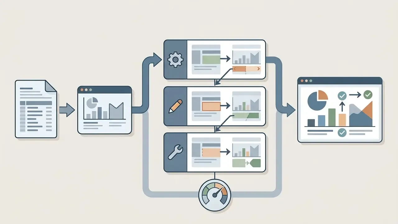
Editing the initial output from an ai chart graph generator is necessary to correct automated formatting errors, verify numerical accuracy, and adjust scaling parameters. AI systems often default to arbitrary axis baselines or imprecise label placement.
During the post-generation editing phase, check the following elements:
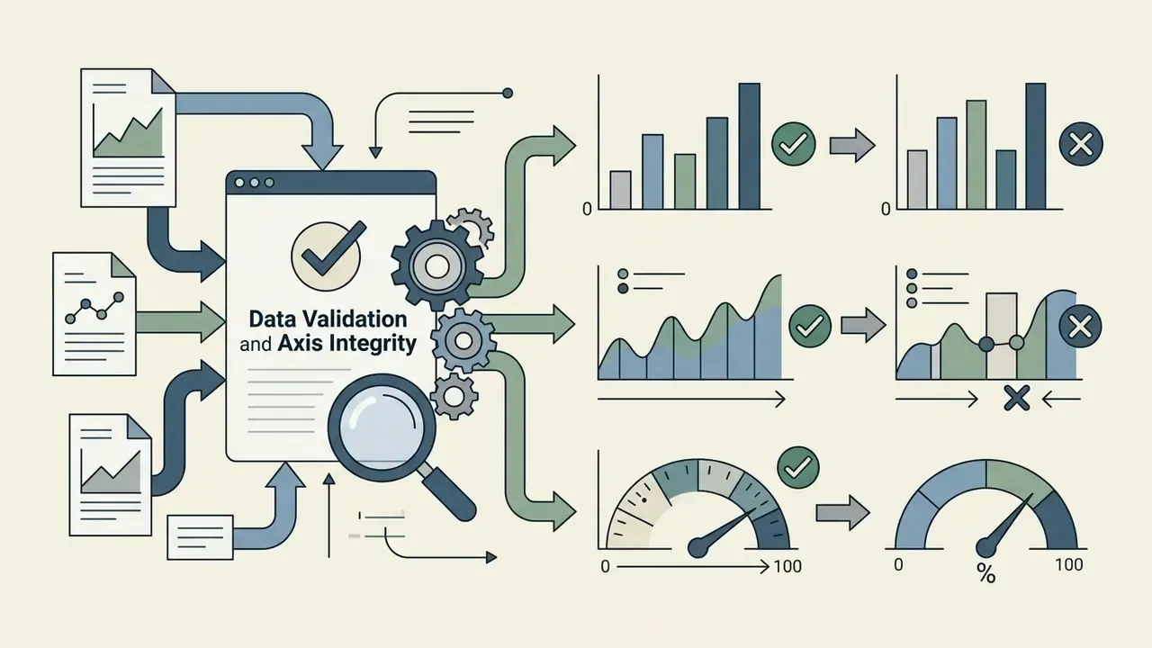
- Axis scaling Ensure vertical axes on bar charts start at zero to avoid visual distortion.
- Label placement Move crowded text labels near data points, or embed direct labels to eliminate redundant legends.
- Color hierarchy Adjust palette contrast to highlight key data anomalies while maintaining accessibility standards.
- Legend alignment Position legends top-left or adjacent to data series to streamline reading flow.
- Redundancy removal Avoid duplicating numeric data labels on top of an already-visible y-axis scale.
Evaluating multi-draft visual candidates: Modern generative tools frequently output one to four visual variations from a single prompt, for example a grouped bar chart against a horizontal breakdown of the same series. Reviewing multiple drafts lets teams select the layout that minimizes cognitive load before fine-tuning labels and color schemes. Because generative output is probabilistic, running the same prompt two or three times is also a cheap diagnostic: if the drafts disagree on values rather than only on styling, the input schema is ambiguous and must be cleaned before the chart is trusted.
In an internal validation exercise (illustrative, based on practitioner accounts rather than a named institution), a fintech compliance team audited automated charts prepared for an executive risk committee. By enforcing manual verification of y-axis baselines, they corrected three truncated axis drafts that overstated non-performing loan growth by 22%, so the final committee deck reflected true portfolio risk.
Which chart types can an AI chart generator create?
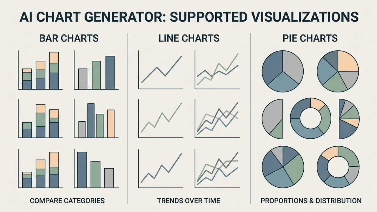
An AI chart generator can produce a broad spectrum of visual formats, including bar charts, line charts, pie charts, scatter plots, area charts, heatmaps, and stacked compositions. Matching the chart type to the mathematical structure of the data is essential for accurate visual communication.
| Chart type | Primary data structure | Recommended business purpose | Common selection errors |
|---|---|---|---|
| Bar charts | Categorical variables with numerical values | Comparing distinct categories, ranking performance | Truncating y-axis baselines above zero, overcrowding category labels |
| Line charts | Continuous time-series data with numerical metrics | Tracking performance trends, dynamic change over time | Plotting unordered categorical data, rendering more than 5 overlapping lines |
| Pie charts | Part-to-whole proportions summing exactly to 100% | Displaying simple percentage distributions (2–5 slices) | Using for time-series dynamics, displaying slices with negligible differences |
| Scatter plots | Paired numerical variables | Identifying correlations, distribution clusters, and outliers | Implying causality without statistical testing, overplotting dense data points |
| Stacked and 100% stacked bars | Category totals with sub-components | Showing contribution to a total or share within each category | Stacking too many segments, making mid-stack comparisons unreadable |
| Area charts | Time-series where cumulative volume matters | Showing magnitude of change plus total volume | Overlapping filled areas that hide lower series |
| Heatmaps | Two categorical dimensions with one measure | Density, concentration, and cross-tab pattern detection | Sequential palettes with insufficient contrast steps |
The differences matter less as aesthetics and more as claims: a bar chart asserts comparison, a line chart asserts continuity, a pie chart asserts completeness. Pick the wrong one and the visual argues something your data never said.
Bar charts for comparing categories
Bar charts compare categorical groups along a shared quantitative scale. An ai generator chart engine defaults to horizontal or vertical bar formats depending on label lengths and group density.
Use vertical bar charts when displaying a small number of categories with concise labels. Switch to horizontal bar charts when category names are long, which prevents awkward label rotation. For grouped bar charts comparing multiple sub-series, maintain consistent high-contrast colors across all groups and preserve an appropriate gap ratio between category clusters (Medicaid.gov Data Visualization Best Practices). Keep the same color assigned to the same series across every chart in a publication, and maintain at least a 3:1 contrast ratio between adjacent fills so grouped bars remain distinguishable.
Line charts for trends over time
Line charts display dynamic metrics over continuous time intervals. An ai create graph command targeting time-series performance relies on line plots to highlight directional velocity, seasonal cycles, and rate-of-change shifts.
To maintain clarity in line charts:
- Limit the plot to 4–5 distinct line series to avoid visual clutter and "spaghetti charts."
- Connect raw data points directly with straight segments rather than artificial spline-smoothing algorithms that distort data values.
- Use direct line annotations rather than separate visual legends whenever space permits.
- Use highlighting or small multiples when more series must be shown.
Guidance from the RADx-UP Data Visualization Style Guide emphasizes that non-linear smoothing curves can incorrectly imply data points that do not exist in the underlying raw dataset (RADx-UP Style Guide, 2022). This is a frequent AI default: many generators apply gentle curve smoothing for aesthetic reasons, and it must be switched off for analytical and regulatory reporting.
Pie charts for proportions and distribution
Pie charts represent relative parts of a single whole. An ai chart maker tool can generate pie or donut charts to display high-level percentage breakdowns across a constrained number of categories.
Pie charts should only be used when:
- The component values sum to exactly 100%.
- The dataset contains no more than 3 to 5 slices.
- The proportional differences between slices are distinct and visually obvious.
If a dataset contains more than five categories, convert the visualization into a horizontal bar chart or treemap. Research published by Statistics Canada confirms that human visual perception struggles to decode angles and area proportions accurately compared with linear length alignments (Statistics Canada, Data Visualization Manual, 2023). The same guidance recommends 2–6 categories arranged in descending clockwise order. Donut charts are best reserved for single percent-complete indicators, and treemaps should always be directly labeled rather than relying on a legend.
How to check accuracy before publishing an AI-generated graph
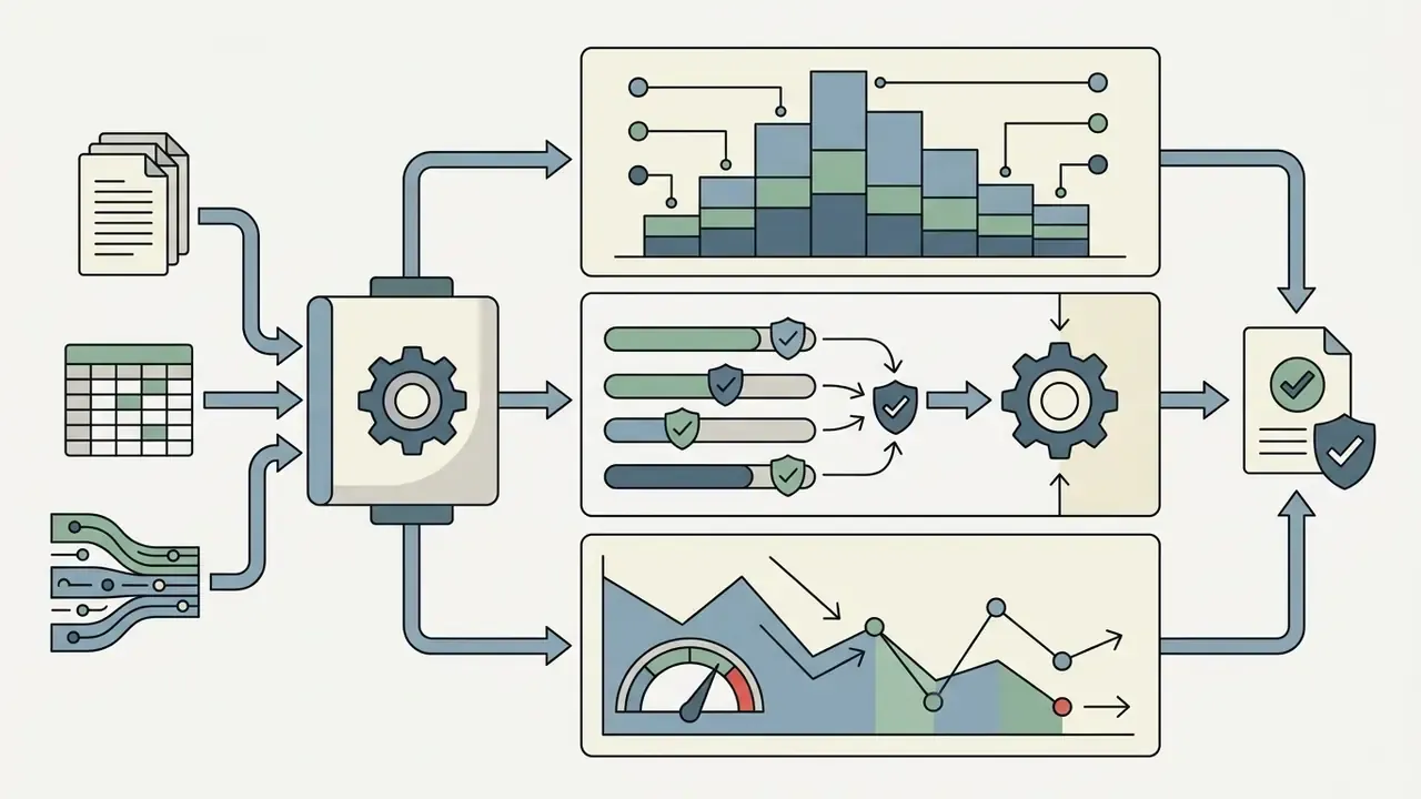
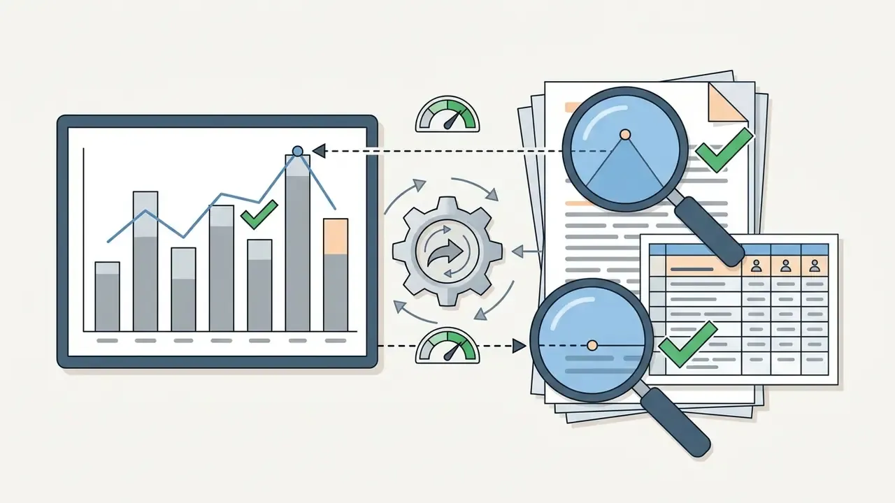
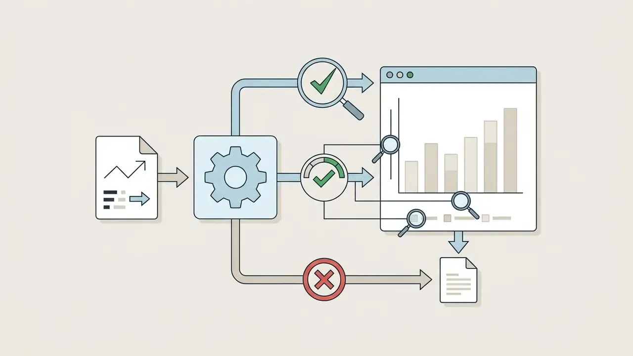
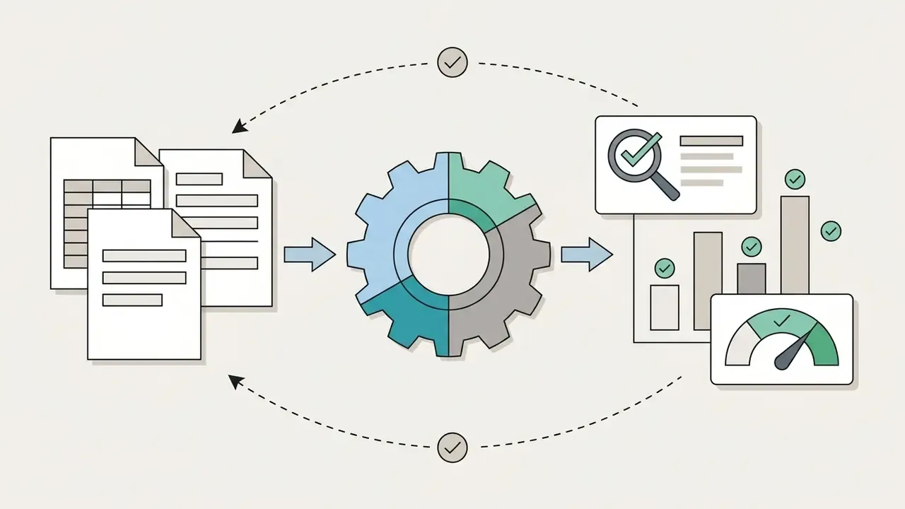
Validating an ai-generated chart before external publication requires cross-checking plotted data points against the primary source spreadsheet. Because LLM pipelines can generate visual hallucinations or misinterpret schema columns, human verification remains mandatory.
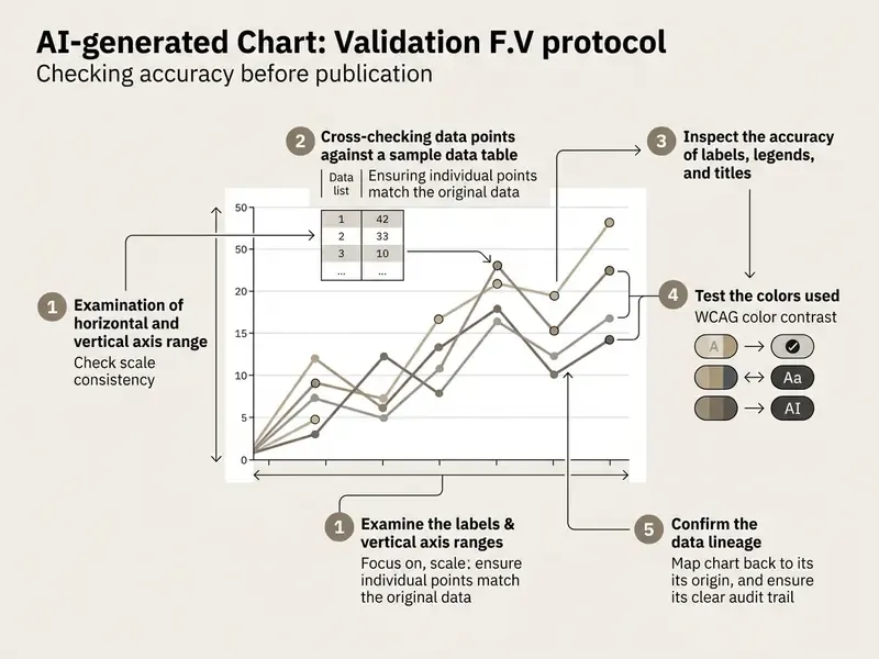
Validate data, labels, and chart type
Data validation requires systematic inspection of every graphical element against the source data. Automated visual outputs should be subjected to deterministic mathematical checks.
Validation steps include:
Public statistical guidance supports the strict bar-chart rule: the quantitative scale should normally include zero or another principal reference point, and departures should be exceptional and clearly labeled. Line charts may justify a non-zero baseline when zero is not meaningful, but any truncation or scale break must be visibly marked. Automated chart-validation research goes further, comparing plotted values cell-by-cell against the source CSV and flagging mismatches programmatically. That pattern is worth replicating internally with a simple value-matching script.
In one operational review of an automated reporting pipeline, an analytics team discovered that an LLM-based graph builder inverted negative budget variances during CSV transformation. A programmatic value-matching script flagged the error before quarterly earnings decks were finalized, preventing a significant misstatement (consistent with error classes documented in Wu et al., 2024). Sign inversion is the failure that scares me most, because the chart looks perfectly plausible.
Preserve a reproducible audit trail
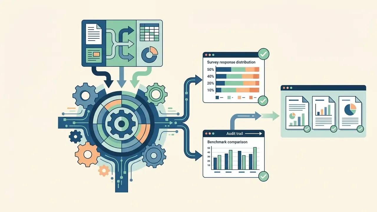
For institutional reporting, "the chart looked right" is not an auditable control. Each published AI-generated visual should carry a reproducibility record that a reviewer or examiner can re-run months later:
- Prompt text, verbatim, including any follow-up refinement instructions.
- Model and tool version, plus temperature or seed settings where the vendor exposes them.
- Generated specification code (Vega-Lite JSON, Python matplotlib script, or equivalent) stored alongside the image, not discarded after export.
Storing the specification code rather than only the exported PNG also makes the chart re-runnable against refreshed data, which converts a one-off graphic into a controlled, versioned reporting asset.


Make the visual clear for the intended audience
Optimizing visual clarity involves removing unnecessary background clutter, establishing readable typography, and ensuring accessible color choices for colorblind viewers. High visual noise degrades comprehension and increases cognitive processing time.
Compliance with Web Content Accessibility Guidelines (WCAG 2.2) requires a minimum contrast ratio of 3:1 for graphical objects and data indicators relative to adjacent background colors, alongside 4.5:1 for standard body text and 3:1 for large text. Chart designs must never rely solely on color hue to convey critical data categories; use pattern fills, direct text labels, or distinct line styles alongside color coding (W3C WCAG 2.2 Standard). Where gradients or textured fills are used, test contrast against the least-contrasting area of the object.
Practical clarity checks before release:
- Are axes labeled with units, and is the time period stated explicitly?
- Does the legend obscure any plotted data?
- Is every acronym in the title, subtitle, or labels defined?
- Would a colorblind reader still decode every series without the color key?
- Is alt text written to describe the insight, not merely "bar chart"?
How to customize, download, share, or embed AI charts
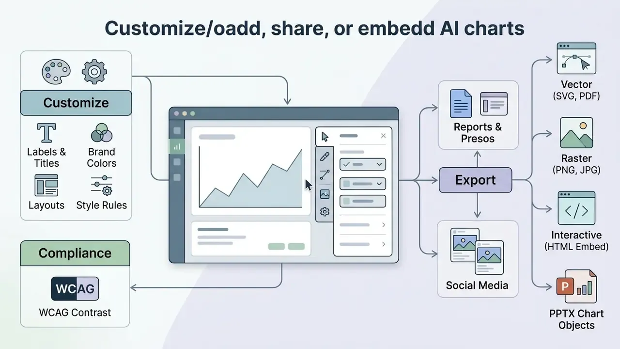
Customizing an AI-generated graph involves adjusting design elements to match organizational brand standards, WCAG contrast ratios, and publication layout requirements. Once finalized, charts can be exported as static image files, resolution-independent vector graphics, or interactive web embeddings.
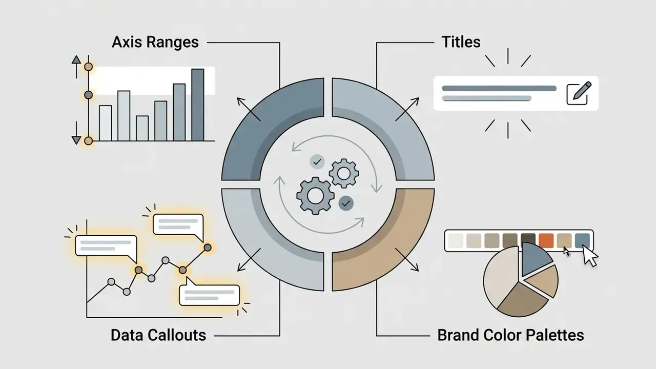
Customize labels, colors, layouts, and brand design
Modern ai chart creation tools let users apply corporate design systems by configuring hex color codes, typography, logo watermarks, and layout grid settings. Consistent design components keep visuals uniform across multi-page financial reports and external marketing collateral.
To establish brand alignment:
- Input exact corporate HEX color codes into the tool's styling panel, mirroring the palette values published in the brand book.
- Select primary and secondary typefaces that match executive presentation guidelines.
- Position legends consistently, for example across the top between the subtitle and the y-axis label, so multi-chart decks read uniformly.
- Save customized design parameters as reusable team templates or themes for recurring reporting workflows.
When building broader visual assets, digital teams often inspect adjacent systems such as animation makers, AI voice generators, and an ai audio to video generator to align brand colors, typography, and narration style across static graphics and dynamic media. Teams that compress or repackage visual exhibits for distribution can review practical trade-offs in the video compressor guide.
Export charts for reports, presentations, and social media
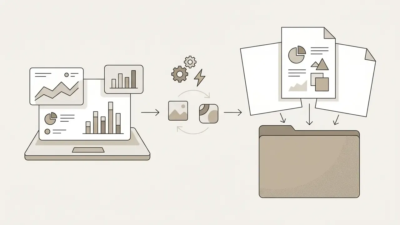
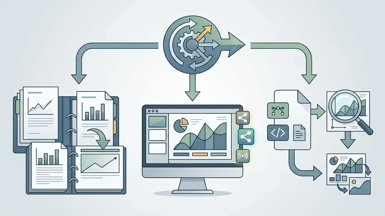
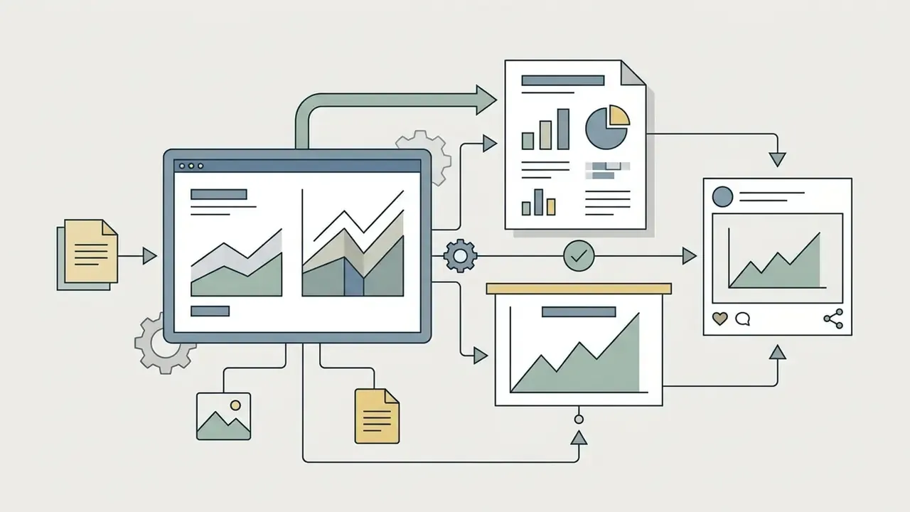
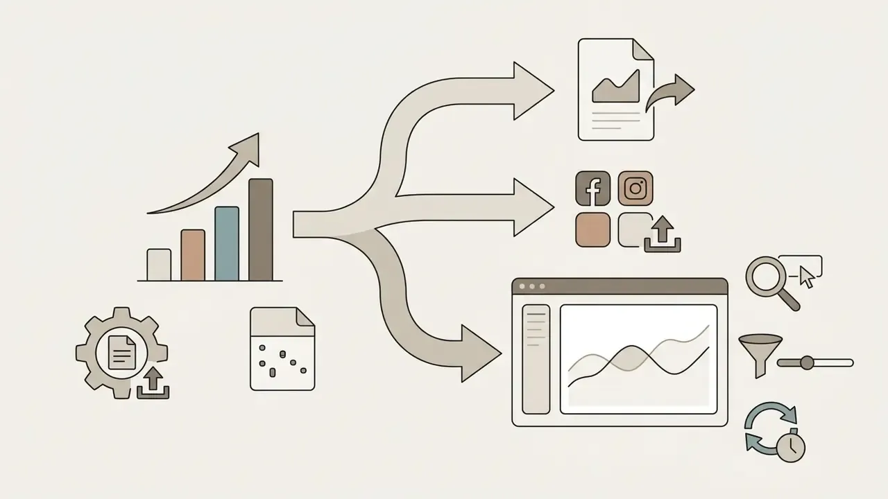
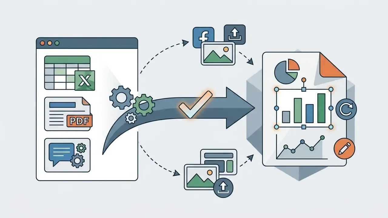
Selecting the correct export format depends on the intended destination channel. An ai graph creater typically offers vector formats (SVG, PDF) for print and high-resolution presentations, alongside raster formats (PNG, JPG) for web and social distribution.
Export format selection criteria:
Destination-specific constraints matter in practice. Knowledge bases such as Notion accept SVG, PNG, JPG, and PDF uploads with size ceilings (commonly 5 MB for images on free plans, 20 MB for PDFs on paid plans) and require a URL for embeds rather than an iframe snippet. Teams seeking platform comparisons can review the best free AI video generators to see how export limits, watermarks, and credit systems are typically structured across free tiers, and consult the YouTube video editor workflow guide when charts are repurposed into published video content. A related pattern worth studying is the ai auto video editor, where the same template-plus-refresh logic appears in motion formats.
Free AI chart generator: limits, pricing, and commercial use
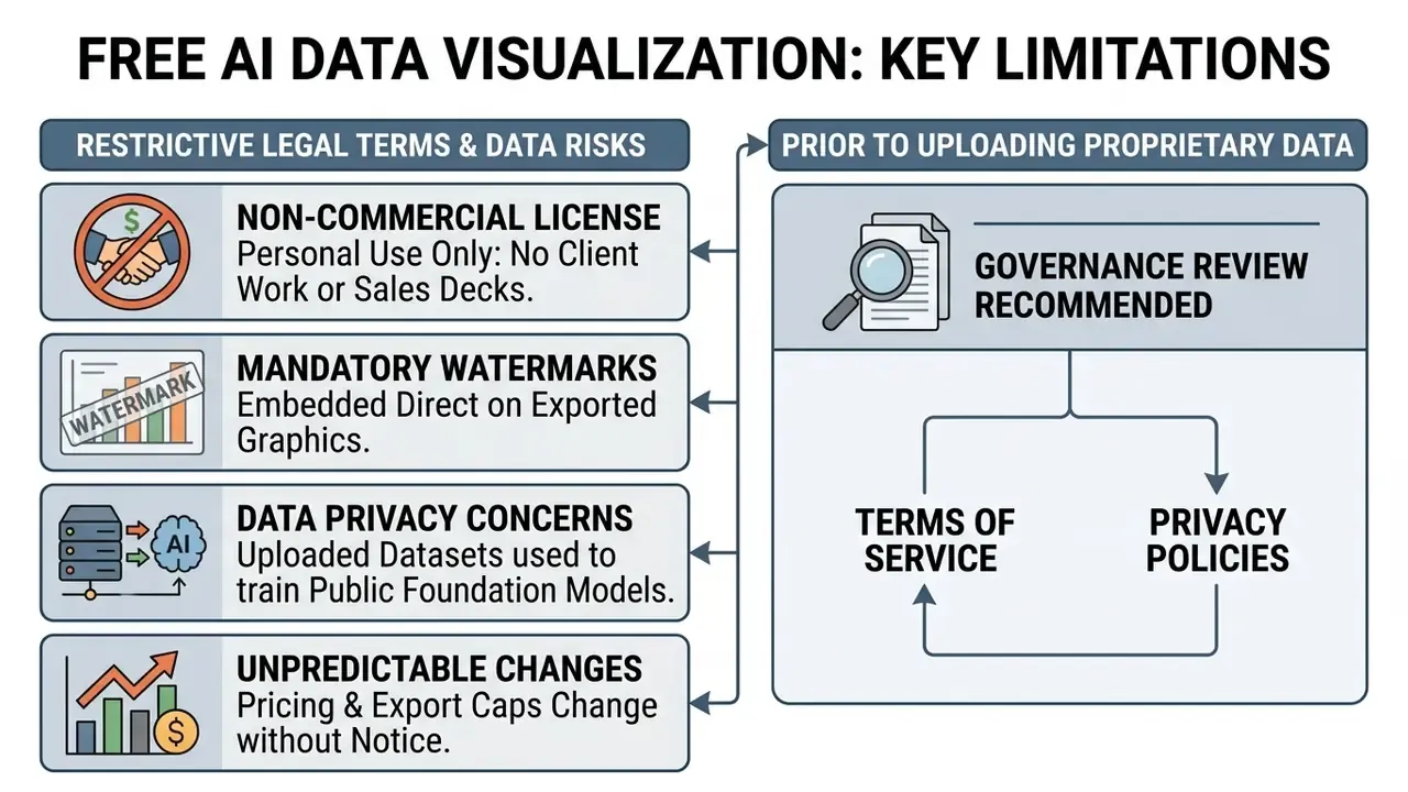
Understanding the commercial rights, usage tiers, and licensing limits of an ai chart generator free plan is critical before incorporating generated assets into business publications or client deliverables. Most free online utilities restrict functionality to encourage upgrades to enterprise subscriptions.
What a free AI chart generator usually includes
A free ai chart maker free offering typically provides basic chart creation capabilities intended for personal exploration or light usage. These entry-level tiers work as feature demonstrations for full commercial platforms.
Standard capabilities and constraints of free tiers:
- Access to standard chart structures (basic bar, line, and pie charts).
- Strict monthly export allowances, often 3 to 5 high-resolution exports per month.
- Mandatory platform watermarks on all downloaded image files.
- Storage limitations on uploaded dataset file sizes, frequently capped below 5–10 MB.
- Restricted collaboration: single-seat access, no shared brand kits, no team templates.
Free tiers commonly use a credit-based system rather than a flat export cap: 1 credit per prompt-based graph and 3 credits per document-parsing upload, resetting monthly. A 60-credit monthly allowance therefore translates to roughly 60 prompt-generated charts or about 20 document-derived charts. Paid tiers typically expand this substantially, into hundreds or thousands of credits per month, and unlock watermark-free export, higher file-size ceilings, and team libraries. Credit-priced vendors in this category have published plans in the range of roughly $5 per month for 1,000 credits up to $50 per month for 16,000 credits, while seat-based AI chart subscriptions commonly begin in the $30–40 monthly range.
Users evaluating cost structures across creative platforms can compare options at plan level and review free photo editor feature limits to see how watermarking, export caps, and upgrade gates are usually structured across free visual tooling. One budgeting note: credits are consumed by failed drafts too, so a noisy dataset burns allowance quickly.
Commercial use, licensing, and brand-safe exports
Using an ai chart creator free tool for commercial purposes requires explicit verification of copyright assignment and commercial usage rights in the vendor's terms of service. Copyright ownership of AI-generated assets varies widely across software providers.
Key legal and compliance considerations:
- Copyright ownership Under current U.S. Copyright Office guidance, purely machine-generated graphics lacking substantial human creative input may not qualify for copyright protection (USCO Guidance on AI Works, 2023). Sufficient human expressive control over the output is the threshold test.
- Commercial rights assignment Many free plans restrict outputs to non-commercial education or personal projects, reserving commercial monetization rights for paid enterprise subscribers. Practices diverge sharply: some vendors permit commercial use of free output outright, while others gate it behind a Pro plan and assign output rights only to paying users.
- Data privacy gates Public generative AI utilities may store and analyze uploaded spreadsheets. Financial institutions must prohibit uploading non-public personal information (NPI) to unencrypted public AI engines (ICO Generative AI Guidance, 2024). Privacy regulators in other jurisdictions issue the same instruction: do not enter personal, and especially sensitive, information into publicly available generative AI tools.
- Vendor security posture Look for documented SOC 2 Type II attestation, explicit non-training data agreements, regional data-residency statements, role-based access control, and zero-access or customer-managed encryption for sensitive datasets.
- Dispute exposure Track how the vendor handles third-party IP claims and indemnification; teams monitoring active cases can see the overview of ongoing AI-related disputes before signing multi-year terms.
Because licensing language differs product by product, procurement teams typically read the exact terms of a named tool rather than relying on category norms. Comparative overviews such as the Canva AI generator licensing breakdown illustrate how commercial-use clauses and export rights are usually documented, and the wider commercial-use library lets you compare options across vendors.
How to choose an AI chart generator tool
Selecting an ai chart generator tool depends on your organization's required data connectors, compliance architecture, prompt accuracy, and workflow scale. Comparing technical capabilities keeps the choice aligned with enterprise security and governance standards.
| Evaluation criterion | Basic online tools | Enterprise AI platforms | Advanced data workspaces |
|---|---|---|---|
| Data ingestion | Manual CSV upload, plain text prompts | Direct Excel, CSV, JSON, Google Sheets integration | Native database connectors, API pipelines, live data tables |
| Document parsing | None or limited text paste | PDF, DOCX, TXT extraction into chartable tables | Programmatic ETL plus document parsing at scale |
| Customization depth | Basic color picks, standard templates | Brand kit integration, custom fonts, layout grid controls | Full CSS or Vega-Lite code modification, programmatic styling |
| Security and privacy | Public cloud storage, potential model training | SOC 2 Type II, non-training data agreements, RBAC | Zero-access encryption, HIPAA and GDPR compliance, private hosting or isolated VPC |
| Export formats | Standard PNG, watermarked PDF | Resolution-independent SVG, PNG, PDF, PPTX | Native JSON, interactive HTML embeds, SVG, programmatic API |
| Auditability | No stored prompt or code history | Prompt history, versioned templates | Full lineage, stored specification code, reproducible re-runs |
| Pricing model | Freemium with usage caps and credits | Monthly user subscriptions | Usage-based credits or enterprise site licenses |
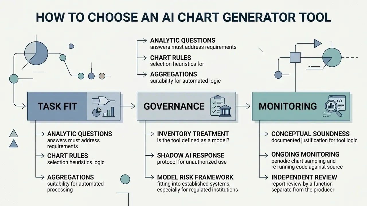
Selection criteria cluster into three practical blocks: task fit (which analytic questions must be answered, and for which audience), data scale (file-level uploads versus millions of records and live connectors), and work format (single analyst, collaborative team, or scheduled pipeline). Accessibility and integration act as hard filters rather than preferences. An ai chart generator online with no export history may be fine for an internal brainstorm and unacceptable for a board pack.
Fitting AI chart tools into a model risk framework
Practical governance additions worth documenting at onboarding: inventory treatment (is the tool a model, a model-adjacent utility, or an end-user computing application?), approved data classifications for upload, prohibited data classes (NPI, PII, MNPI, client-identifiable records), retention of prompts and generated code, and a defined escalation path when unapproved public tools are discovered in use.
A shadow AI response protocol should specify immediate containment (revoke access, identify uploaded datasets), impact assessment under the applicable privacy framework, notification duties, and migration of the workflow to a sanctioned platform. Where the workflow touches KYC refresh reporting or AML alert metrics, treat the chart as part of the control evidence chain, not as decoration on a slide.
Measurable business impact deserves the same discipline as risk. Track hours saved per recurring deck, validation exception rate per 100 charts, rework volume between draft and published exhibit, and the cost of controls (review time, storage, license tier). Risk-adjusted ROI that excludes control cost is not ROI; it is marketing.
When assessing technical specifications across data and visual utilities, technical leaders can consult the Google Veo API implementation guide to analyze programmatic integration options, cost structures, and rate limits typical of AI media APIs.
AI graph generator FAQ
Can AI explain what a graph shows?
Yes. Modern AI graph generators equipped with vision-language models can analyze chart imagery and underlying data tables to generate natural-language summaries, identify directional trends, highlight statistical anomalies, and answer specific data questions. Research on jointly trained text-and-visualization models supports this capability: DataVisT5, trained across paired chart and text data, outperforms baseline models on vis-to-text tasks over a corpus of 44,096 charts (DataVisT5: Joint Understanding of Text and Data Visualization, 2024). Explanation-focused fine-tuning also improves both narrative quality and downstream question-answering accuracy on chart datasets. However, research on multi-chart datasets shows that LLMs still face performance drops on complex cross-chart comparative reasoning and multi-step quantitative calculations (Zhu et al., MultiChartQA Benchmark, 2024). Executive users must cross-check AI-generated chart summaries against raw source data before strategic decisions.
Can AI create reusable graphs for recurring reports?
Yes. AI systems can generate reusable chart templates by producing parameterized code scripts (Python matplotlib scripts, Vega-Lite JSON specifications, or automated macro routines) that can be re-executed against updated data files. By standardizing data headers and connecting the AI tool to live Google Sheets or REST API endpoints, enterprise teams can automate monthly QBR visual updates, portfolio tracking charts, and recurring marketing performance decks. The mechanism is documented at the API level: spreadsheet APIs expose chart-creation and chart-refresh requests, so an inserted chart can be re-synced when the source range changes rather than rebuilt manually. Vendor documentation also warns that generative output can vary between runs, which is why recurring workflows should pin approved prompts, templates, and formatting rules instead of re-prompting freely each cycle. For setup questions or workflow errors when configuring automated visual systems, see AI Media Support and Troubleshooting.
What file formats can an AI graph generator accept?
Tabular files (CSV, XLSX, TSV) provide the most reliable quantitative mapping; JSON supports nested API exports; and PDF, DOCX, and TXT are parsed to extract embedded tables and key metrics. A practical ceiling of about 100 MB per file applies on many platforms, with free tiers often capping uploads at 5–10 MB. Files should carry a single header row, consistent number and date formats, no merged cells, and continuous rows.
Are AI-generated graphs accurate?
An AI graph generator visualizes the numbers you supply; it does not independently verify them. Accuracy failures typically arise from misread schemas, silent aggregations, sign inversions during transformation, or default styling choices such as truncated axes and curve smoothing. Every chart intended for external or executive use should be reconciled value-by-value against the source of record before release.
Is an AI graph generator better than building charts in Excel?
AI generators are faster for one-off visuals and exploratory work, because they remove formatting and mapping steps. Spreadsheet and BI environments remain better for complex linked analysis, deterministic reproducibility, and controlled recalculation. The strongest pattern in regulated environments is hybrid: keep the calculation layer in the governed spreadsheet or warehouse, and use AI for the drafting and narrative layer.
Can AI charts be used in client-facing deliverables?
Only after verifying two things: that the vendor's terms grant commercial rights on your plan, and that the export is watermark-free and brand-compliant. Copyright protection for purely machine-generated output is uncertain, so document the human creative and editorial contribution to each published exhibit.
What are the open questions we cannot answer yet?
Several. There is no widely accepted validation standard specific to AI-generated visuals, benchmark accuracy figures come from research datasets rather than bank production data, and supervisory expectations for agentic chart pipelines remain unsettled. Treat published accuracy ranges as directional, not contractual. Next steps for controlled AI adoption Implementing an AI graph generator inside institutional workflows means balancing operational speed against rigorous controls. A staged roadmap keeps that balance explicit:
- Scope and inventory (weeks 1–2): Identify the recurring reports that consume the most manual charting hours, and classify the data each one touches.
- Controlled pilot (weeks 3–6): Run one low-sensitivity reporting workflow on synthetic or de-identified data. Measure draft-to-final edit volume, validation exception rate, and time saved per deliverable.
- Model risk and privacy review (weeks 6–10): Submit the tool for inventory classification, conceptual soundness documentation, vendor security review (SOC 2 Type II, non-training agreements, data residency), and privacy assessment.
- Control build-out (weeks 10–14): Implement the reproducible audit trail, approved prompt library, value-matching validation script, and human sign-off workflow.
- Enterprise rollout and monitoring (ongoing): Expand to additional report families, sample outputs continuously, retrain users on prohibited data classes, and review vendor terms at each renewal. Organizations expanding automation across multimedia and visual analytics workflows can view the guide to estimate operational resource requirements, or explore specialized enterprise modules, such as automated executive-summary builders, scheduled spreadsheet connectors, and API-driven reporting pipelines, to see how enterprise visual engines handle recurring data flows. Teams extending the same governance model to other AI media categories can review comparable licensing and quality trade-offs in the free AI art generator comparison and the AI reverse-image-search overview. Consumer-grade categories illustrate the licensing edge cases well: an ai baby face generator, its companion ai baby face generator app, the broader ai baby generator, and ai baby video tools all sit on similar output-rights questions that enterprise buyers meet in chart tooling too. For enterprise-grade data management, establish a formal verification protocol: mandate data cleaning prior to upload, validate generated visual baselines against raw tables, store prompts and generated specification code for audit, verify vendor privacy and licensing agreements, and enforce human-in-the-loop oversight across all published decks. Start with one report. Prove the control. Then scale. To explore additional data definitions, governance frameworks, and technical visual guides, browse the hub for the complete documentation set.