Executive Summary
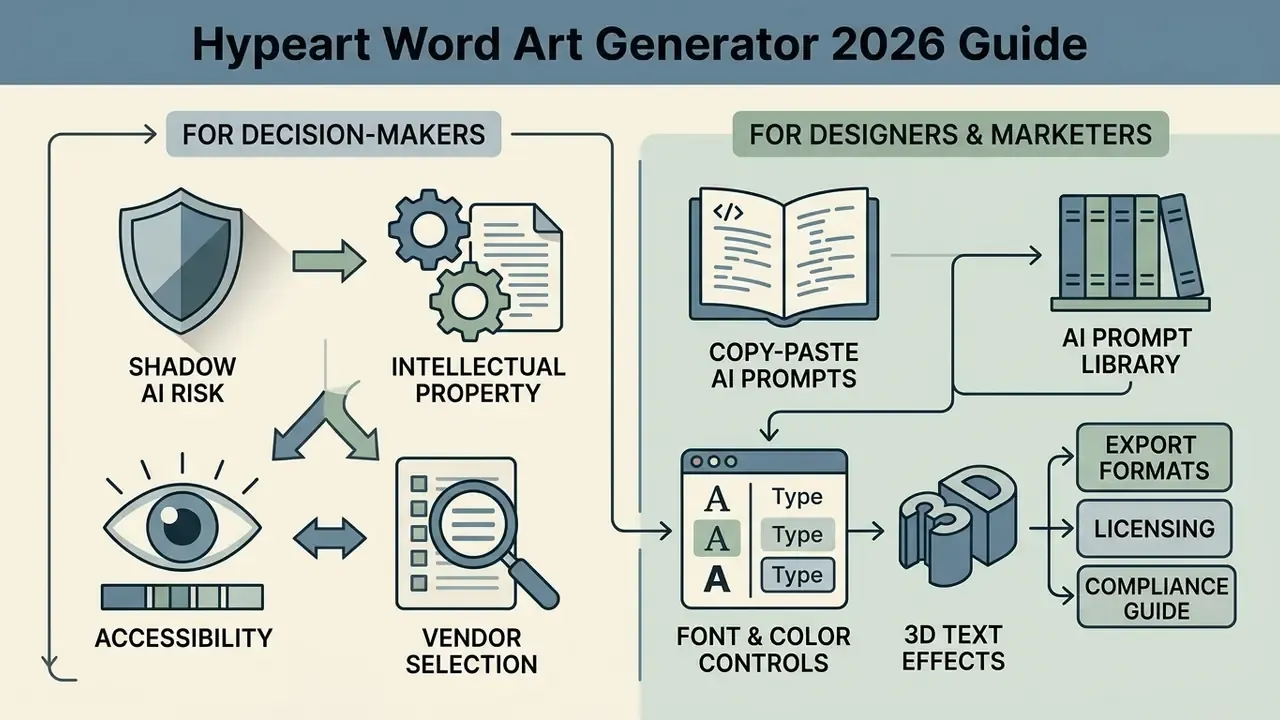
Decorative typography looks like a purely creative task. In a regulated environment it is a procurement and control question first. This guide covers both layers: how a word art generator actually produces stylized lettering, and how to deploy one without creating intellectual-property, accessibility, or data-handling exposure.
For decision-makers:
- Shadow AI risk. Browser-based generators process prompts, uploaded brand text, and sometimes logo files on third-party infrastructure. Treat any unapproved public generator as an uncontrolled data egress path. Restrict it to non-confidential display copy: campaign slogans, event titles, public marketing headlines.
- Intellectual property. Purely machine-generated output has no human authorship and therefore no U.S. copyright protection. Document human creative edits (layout, palette decisions, manual kerning, composition) if ownership matters for a campaign asset.
- Accessibility. Display typography must still meet WCAG 2.2 contrast thresholds (3:1 large text, 4.5:1 standard text) when it carries meaning rather than pure decoration.
- Vendor selection. Check audit logs, data-retention and model-training terms, SSO and RBAC support, export formats (SVG or PDF versus watermarked PNG), and explicit commercial-redistribution language before allowing a tool inside the corporate perimeter.
For designers and marketers: the practical parts of this guide are the copy-paste AI prompt library, the advanced render parameter table, and the file export troubleshooting list further down the page.
What is a Word Art Generator and What Business Problems Does It Solve
A word art generator is an automated design tool that turns standard text strings into stylized typography, using custom geometries, gradients, textures, and spatial layouts. Marketing teams, event organizers, and in-house brand studios use these platforms to produce visual headings, social graphics, and print assets without commissioning manual vector illustration.
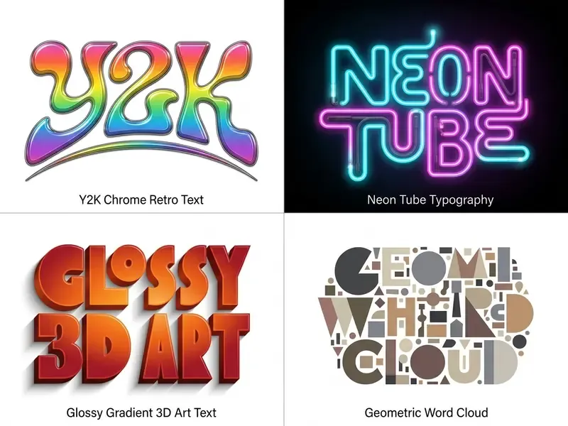
Modern display typography balances aesthetic impact against structural legibility. Research by Bai et al. (2024) splits artistic text generation into two core functions: artistic text stylization, which applies surface overlays, shadows, and textures, and semantic typography, which deforms glyph geometry to reflect meaning.
«Artistic text generation balances three competing goals: visual appeal, legibility, and semantic fidelity to the source text.»
Dedicated generators maintain typographic contrast and letterform integrity. That is precisely what general-purpose text-to-image models still get wrong.
«Popular platforms such as MidJourney, DALL·E and Stable Diffusion produce striking images, yet frequently fail at rendering accurate text inside them.»
That gap is the entire commercial rationale for specialized tools. A general diffusion model optimizes for pixel plausibility. A word art generator constrains glyph geometry to a real font file or a text-aware pipeline. Readers comparing the broader tool category can review our analysis of AI art generators and their output quality to see where prompt-driven systems still trail dedicated typography engines.
Word Art, Art Text, and Word Clouds: Which Format to Choose
Word art formats decorative text as a cohesive graphic object. Art text applies targeted visual surface effects to individual letterforms. A word cloud arranges word frequency data into dense geometric layouts.
| Feature Category | Word Art | Art Text | Word Cloud |
|---|---|---|---|
| Primary Focus | Decorative typography composition | Stylized surface effects (glow, bevel) | Data frequency visualization |
| Input Structure | Single words or short phrases | Individual characters or words | Large text blocks, word lists |
| Glyph Control | High (curving, 3D extrusions) | Medium (textures, strokes) | Low (preset font positioning) |
| Core Target Use | Headings, logos, print graphics | Interface banners, social assets | Document summaries, displays |
Choosing the right format depends on communication intent. For data summaries, word clouds organize key terms by density; they are commonly used to compress survey responses, meeting transcripts, or document corpora into one visual. For brand assets and titles, an art text generator or word art generator keeps letterforms legible while carrying visual personality.
«Semantic typography harmoniously blends typeface and imagery, visually conveying conceptual meaning while preserving legibility.»
Teams building identity systems rather than one-off banners should also assess dedicated identity tooling. Our overview of Canva AI generator design and licensing features explains how template-driven editors handle logo lockups and brand kits. For related terminology and technical definitions, consult our AI Media Glossary.
Which Text Types Work Best with a Generator
Short phrases, single brand names, and display headlines deliver the highest legibility and visual fidelity. Long paragraphs collapse structurally once you add aggressive distortion or heavy surface effects.
Guidance from the U.S. Web Design System (USWDS) and typographic accessibility research recommends limiting display line lengths and holding minimum contrast ratios. USWDS targets 45 to 90 characters per line for body copy, with 66 as the practical goal, while APA accessibility guidance narrows the optimal range to 40 to 50 characters and a 70-character ceiling. Decorative display lines should sit well below those limits. For stylized compositions, short character counts let stroke weight, drop shadows, and custom fonts colors render cleanly on desktop and mobile.
Practical input ceilings that hold across most generators:
| Text Type | Recommended Input Length | Rendering Notes |
|---|---|---|
| Brand name / logotype | 1 to 2 words | Highest glyph control; safe for heavy bevel and 3D extrusion |
| Poster or banner headline | 2 to 5 words | Keep to one or two lines; avoid full justification |
| Quote or lyric graphic | 6 to 15 words | Reduce effect intensity; maintain 1.5× line height |
| Word cloud / frequency map | 50+ words or a full document | Effects limited to color themes and shape masks |
One small caveat worth naming: these ceilings are practical observations from published tool limits, not a validated benchmark. Test with your own strings before locking a template.
Word Art Styles: Classic, 2000s, Clip Art, and AI Text Effects
Typography styles range from structured legacy office presets to prompt-driven diffusion models. Picking the right aesthetic means aligning text effects with audience expectations and brand identity.
Visual DNA: Deconstructing Iconic Typography Aesthetics
Understanding the structural components of a decorative style prevents "almost right" output. That is the most common failure mode when a prompt names a style without describing its mechanics.
- Pop Art Typography (1960s Visual DNA). The movement began as a British provocation in the mid-1950s through the Independent Group at London's Institute of Contemporary Arts, then crystallized in New York around 1962 with Andy Warhol's Campbell's Soup Cans and Roy Lichtenstein's comic-panel paintings. Its reproducible signatures:
- Ben-Day dot patterns: uniformly spaced halftone dots simulating cheap mechanical comic printing, never hidden, always the signature.
- Heavy black contour inking: thick 3px to 8px outer strokes bounding every color area.
- Unmodulated flat color: high-saturation primaries (cyan, magenta, yellow) with no gradient or atmospheric blending.
- Comic-strip grammar: speech bubbles and caption boxes, where text is a picture element rather than a caption below the image.
- Commercial display lettering: bold, condensed, frequently all-caps typefaces borrowed from advertising.
- Y2K / Chrome Aesthetic (late 1990s to early 2000s Visual DNA). A 2024 Politecnico di Milano thesis defines "Y2K typography" as display typefaces from the 1990s and early 2000s built for a futuristic, technological appearance. The Web Design Museum's Y2K exhibit describes the same period as translucent, iridescent, playful, and shiny.
- Liquid chrome reflection: high-contrast metallic gradients moving from deep gray to specular white.
- Volumetric beveling: pronounced edge curvature producing inflated plastic or liquid letterforms.
- Curved baseline warping: text arched along spherical or cylindrical projection planes.
- Wide letter-spacing: generous tracking on display lines, paired with abstract 3D background graphics.
Classic and 2000s Word Art for Retro Typography
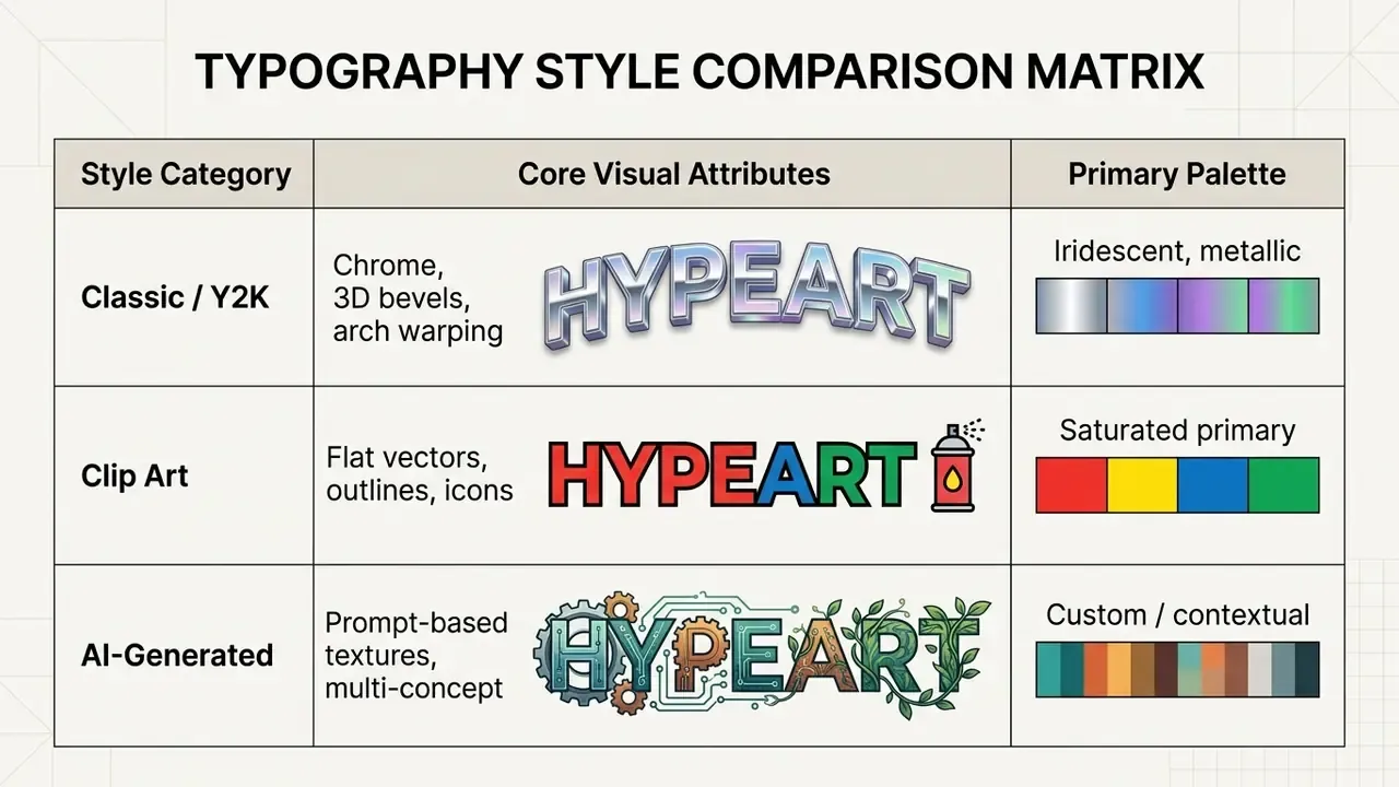
Classic and Y2K-era word art relies on metallic chrome textures, dramatic drop shadows, curved perspective baselines, and multi-color gradient fills. A classic word art generator or 2000s word art generator reproduces those late-1990s desktop office aesthetics for retro media campaigns. Microsoft's own documentation still describes legacy WordArt as a gallery of preset text styles with shadowed or mirrored text, outlines, and 3-D rotation. That is exactly why the look reads as "office software" rather than "studio design."
The structural claim is better supported by peer-reviewed typography research than by a single design-museum exhibit:
«Artistic text stylization, meaning shadows, outlines, colors, glow and textures, preserves glyph structure, making it safer for multi-word retro compositions.»
In practice, Y2K typography leans on glossy surfaces, liquid gradients, and inflated bubble forms. Those attributes live in the stylization layer, not the deformation layer. When building retro banners, a clip art font generator helps keep letterforms structurally separate even under heavy gradient warping.
Clip Art and Artistic Word Art for Illustrative Headings
Clip art typography combines decorative text with flat vector illustrations, icons, and defined outlines. An artistic word art generator or clip art text generator places graphic elements alongside text strings to build illustrative display titles. Microsoft's product distinction is useful here: clip art is inserted as an image type (Insert > Pictures > Online Pictures, filtered by Type = Clipart), while WordArt is stylized text that stays editable as text. The two live on different layers of the same composition.
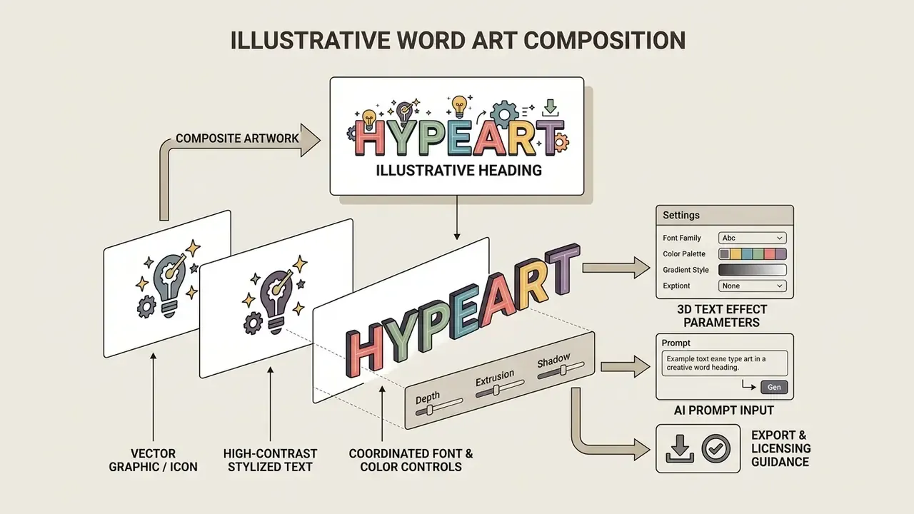
To keep text legible next to graphic icons, apply contrasting stroke outlines around letterforms and match the visual weight of the illustration to the weight of the type. A dedicated clip art word generator lets designers tune spacing between graphic frames and display words, which is usually what saves a busy composition from visual clutter.
Copy-Paste AI Word Art Prompts and Style Formula
How to Create Word Art Online: Text Input, Styling, and Generation
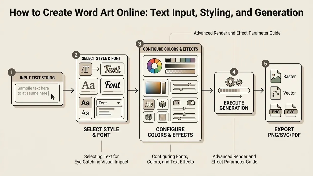
Creating visual typography online involves five moves: enter the source text, choose a style model, adjust color and font parameters, generate the raster or vector output, and export the finished artwork.
A structured process prevents the two errors that cost the most rework: insufficient color contrast and clipped letter outlines.
«An effective workflow moves through ideation, selection, generation, evaluation and iteration, each stage improving alignment between output and user intent.»
Estimate output requirements directly from the final placement. Multiply the physical print dimension in inches by 300 to get the minimum pixel width, or keep screen assets at the native CSS dimension multiplied by two for high-density displays. Assets that need post-generation retouching can be finished in a raster environment; see our guide to online photo editors and their core features for layer, mask, and background-removal workflows. If the same headline needs to move, our overview of free AI photo to video tools shows how static lettering is animated without re-rendering it from scratch.
- [1. Input Text String]
- [2. Select Style & Font]
- [3. Configure Colors & Effects]
- [4. Execute Generation]
[5. Export PNG/SVG/PDF]
*Purpose:* Maps the sequential steps required to generate custom typography graphics online. *Semantics:*- ` semantic structure duplicated within the DOM for accessibility; non-JavaScript plain text step fallbacks
Selecting Text for Eye-Catching Visual Impact
Eye-catching text graphics rely on concise copy, intentional capitalization, and a deliberate focal point. Overload the composition and letterform distinction disappears, taking comprehension with it.
To maximize visual impact with an art word generator or art words generator:
- Limit input strings to 1 to 4 words per visual line.
- Use sentence case, or selective uppercase for short emphasis, rather than full block capitals. All-caps measurably reduces reading speed and belongs in titles or very brief emphasis only.
- Check letter spacing (kerning) so glyph boundaries never overlap.
- Keep a clear hierarchy between primary titles and supporting subtext, using decisive shifts in weight and size rather than marginal ones.
- Avoid centered blocks, full justification, and hyphenation across more than two lines. Each one creates uneven "rivers" of whitespace.
Configuring Fonts, Colors, and Text Effects
Stroke thickness, drop shadow projection, and palette choice decide whether decorative typography survives a busy background. A flexible font generator word art workflow gives you independent control over font geometry and surface filters, not a single locked preset.
Web Content Accessibility Guidelines (WCAG 2.2) require a minimum contrast ratio of 3:1 for large display text and 4.5:1 for standard text, calculated as (L1 + 0.05) / (L2 + 0.05) from relative luminance. Purely decorative text is exempt. Lettering that carries meaning is not.
«Legibility metrics, including contrast, unoccluded text area and minimum font size, should act as hard constraints rather than optional objectives during generation.»
When configuring a text effect with custom fonts colors, confirm the relative luminance between letterforms and background satisfies those thresholds. Verify with a dedicated contrast-ratio checker before export. Where an enterprise design suite includes automated contrast auditing, capture that audit output and attach it to the campaign approval record. It takes a minute and it answers the only accessibility question an internal reviewer will actually ask.
Advanced Render and Effect Parameter Guide
Professional-grade hierarchy comes from micro-controls over geometry, lighting, and layer blending, not from a preset dropdown.
| Effect Control Group | Technical Parameter | Practical Function and Recommended Value |
|---|---|---|
| 3D Projection | Extrusion length and orientation (projection #1 / #2) | Controls depth shadow length (10px to 50px) and spatial rotation angle (0° to 360°); stack two projections for layered depth. |
| Beveling and Lighting | Blur, size, intensity, shininess, elevation, point light X/Y/height | Sets directional highlights on letter edges; align the light source near 45° for natural depth and keep shininess moderate to avoid blown highlights. |
| Contour and Stroke | Multi-layer outlines (#1 and #2), dotted stroke, vertices | Applies stacked stroke lines; use a high-contrast outer stroke to prevent background bleeding on photographic backdrops. |
| Lettering Distortion | Boggle / wave deformation (angle, amplitude) | Alters glyph alignment along curved baselines; amplitude of 5% to 15% delivers retro warping without breaking legibility. |
| Inner / Outer Shadows | Size, strength, opacity, distance, direction, offset | Separates letterforms from the background; keep a single shadow direction consistent across all layers. |
| Layer Blending | Blend modes (overlay, screen, multiply, color-dodge, exclusion, hard-light, luminosity) | Controls visual integration between text fills, textures, patterns, and background imagery. |
| Fill and Pattern | Gradient direction, color opacity, imported fill pattern, one style per letter / line / word | Enables per-letter palettes and imported texture fills for material realism. |
| Canvas and Ratio | Aspect ratio presets (1:1, 16:9, 9:16, 4:3, 3:2, 21:9) and text spacing (0% to 40%) | Locks composition to the destination channel before rendering, avoiding destructive re-crops. |
Free Word Art Generator: Features Available Without Payment
Free online word art platforms typically offer standard-resolution exports, core font libraries, and basic text effect presets at no cost. Paid tiers unlock scalable vector formats (SVG, PDF), higher export resolution, and broader commercial licensing. Enterprise tiers add the controls a risk function actually reviews.
| Capability | Free Tier | Premium Tier | Enterprise Tier |
|---|---|---|---|
| Export resolution | Standard (720p to 1080p, sometimes up to 4K) | High-res (4K to 8000 px) | High-res plus batch rendering |
| Supported formats | Web-ready PNG / JPG | Vector SVG, PDF, PNG, GIF/MP4 | SVG, PDF/X-1a, PDF/X-4 with embedded fonts |
| Font access | Standard system fonts | Full commercial library | Licensed brand fonts plus custom font upload |
| Commercial rights | Personal or non-commercial, attribution sometimes required | Full commercial use | Full commercial use with indemnification language |
| Watermark status | May include watermark | No watermarks | No watermarks |
| Data handling | Prompts may be retained and used for model improvement | Usually opt-out available | Contractual no-training clause, defined retention window |
| Security and governance | None | Basic account controls | SSO, RBAC, audit logs, SOC 2 Type II or ISO 27001 evidence |
| Integration | Manual download | Editor plugins | API access, DAM/CMS connectors, SLA |
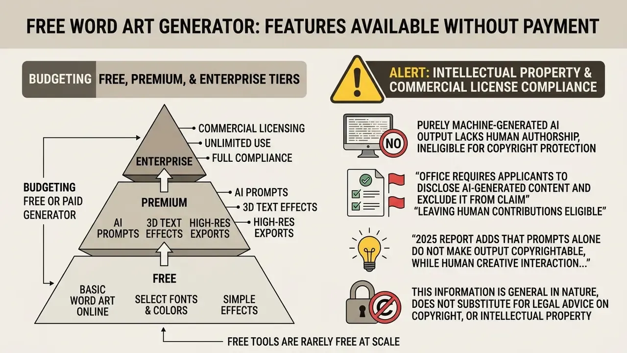
Knowing those limits tells you whether a free word art generator online or free online word art generator covers the project. The split differs by vendor, and not always in the obvious direction: some tools remove watermarks entirely on the free plan but gate vector export behind premium fonts, while others cap resolution and commercial rights instead. Teams evaluating adjacent free tooling can review our guide to free photo editors, export limits, and privacy terms or compare cost structures across free AI art generators by quality, limits, and licensing.
Downloading, Printing, and Commercial Use of Word Art
Exporting typography for print or merchandise requires vector formats (SVG, PDF) or high-resolution raster files rendered at 300 DPI at 1:1 physical print dimensions. Screen graphics use 72 DPI raster PNG files with transparent backgrounds. Small typographic elements and fine strokes are sometimes prepared at 600 DPI.
To prepare files from a custom word art generator or art text generator for physical merchandise:
«Every stage of the generative AI chain, from dataset assembly and training through generation and prompt usage, potentially involves reproduction of protected works.»
Organizations scaling commercial workflows can wire generation pipelines through a structured api implementation guide. For a concrete example of cost, quota, and rate-limit modelling, see our Google Veo API implementation and cost breakdown, or compare alternative design options using our AI Media Comparison Matrices.
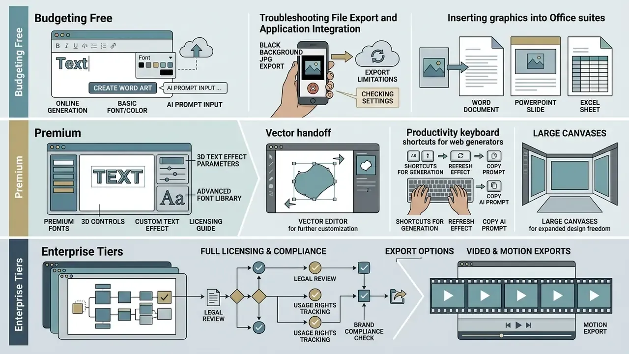
Troubleshooting File Export and Application Integration
- Black backgrounds on JPG exports. The JPEG format has no alpha transparency channel. Export artwork with a transparent background as JPG and those regions render as solid black, or as whatever background color the canvas defines. Choose PNG-24 or SVG to preserve transparency. If JPG is mandatory, set an explicit background color in the background tab before download.
- Inserting graphics into Office suites (Word, PowerPoint, Excel). Avoid copy-pasting PNG files straight from a browser into Microsoft Office documents; this frequently drops the transparency channel and re-compresses pixels. Use the native path
Insert > Pictures > Picture from Fileinstead, and keep the source file at final placement size. - Vector handoff. If the generator offers SVG, download it even when you also need PNG. SVG survives rescaling for large-format print, and vectors keep file weight low for web embeds.
- Productivity keyboard shortcuts for web generators.
Ctrl + S/Cmd + S: download the generated asset (PNG/JPG).Ctrl + P/Cmd + P: print the current canvas.Ctrl + L/Cmd + L: open the internal word list or prompt editor.Ctrl + Z/Ctrl + Y: undo and redo layout or color adjustments.Esc: interrupt the active client-side rendering engine.+/-: zoom the canvas without resampling the output resolution.
- Large canvases. Curved-text and multi-layer bevel effects sharply increase render time. Generate at the final aspect ratio rather than cropping a larger render, and switch off animation previews while tuning static parameters.
- Video and motion exports. Animated word art delivered as MP4 or WEBM usually needs compression before distribution. Our guide to video compressors, quality loss, and format support covers the trade-offs, and animation makers with templates and export options covers motion authoring itself.
Where Word Art Delivers Value: Commercial and Personal Scenarios
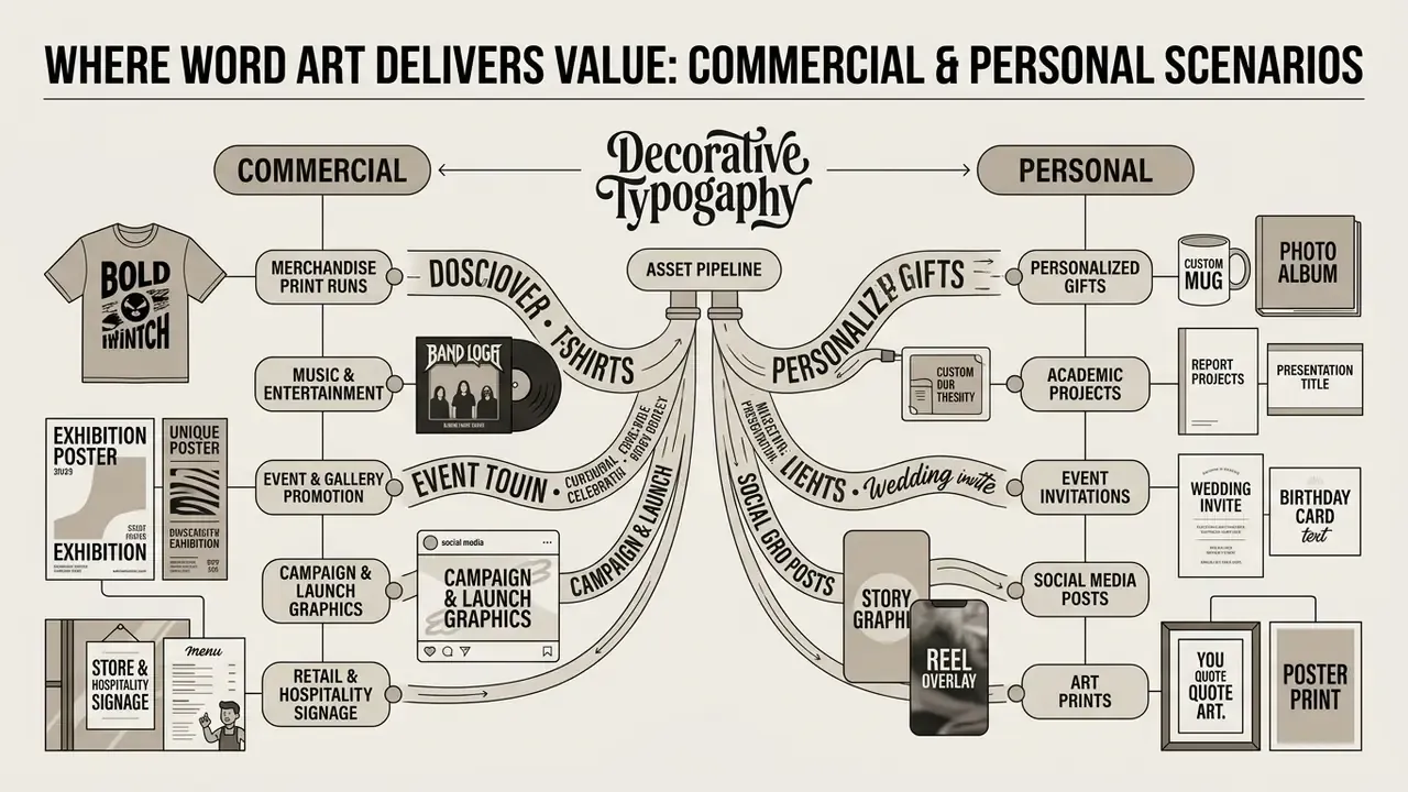
Decorative typography is one of the few design outputs that serves revenue programs and personal projects through the same asset pipeline.
Commercial scenarios
- Merchandise print runs. T-shirts, tote bags, mugs, and stickers built from halftone or chrome lettering, exported as 300 DPI CMYK or vector files.
- Music and entertainment. Album covers, tour posters, and single artwork where high-contrast display type carries the brand.
- Event and gallery promotion. Exhibition posters, show invitations, and venue signage needing large-format vector output.
- Campaign and launch graphics. Social-first headline art, paid-ad hero text, and landing-page banners produced in channel-specific aspect ratios.
- Retail and hospitality signage. Menu boards, window decals, and shelf talkers where readability outranks decorative ambition.
Personal and educational scenarios
- Personalized gifts. Shaped word clouds assembled from names, anniversaries, or memories. This is one of the most commonly reported non-commercial uses of word art tools, retirement and birthday gifts included.
- Classroom materials. Vocabulary walls, reading-corner signage, and project titles.
- Home and celebration décor. Wedding signage, nursery lettering, and holiday cards.
- Portfolio and study projects. Typography exercises that test Visual DNA replication without font licensing risk.
For teams whose asset mix extends into portraits and profile imagery, our guide to AI headshot generators, pricing, and professional use covers the matching privacy and licensing checks, and our notes on free AI selfie tools explain why user-supplied face data raises the review bar considerably.
How to Choose a Custom Word Art Generator
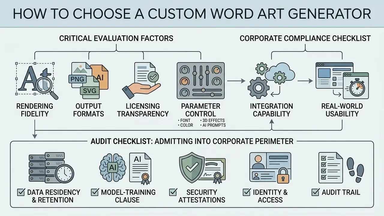
Choosing a custom word art generator comes down to rendering fidelity, output formats, licensing transparency, and how much control you get over individual design parameters.
When reviewing ai word art platforms, weigh these criteria:
- Output precision. Support for vector SVG and high-resolution PNG exports without mandatory watermarks. Cross-reference candidates against our comparison of the best AI art generators before committing to a single vendor.
- Typographic control. Fine-grained adjustment of kerning, line height, bevel depth, shadow angle, and stroke width.
- Licensing clarity. Transparent terms covering commercial redistribution, print merchandise, and font embed rights.
«459 surveyed artists indicated that creators should disclose which works trained an AI, and that outputs should not belong to model developers.»
- Integration capability. Compatibility with external editing software and workflow automation APIs.
- Usability under real conditions. Measure onboarding time for non-designers, not feature counts.
«A few-shot font generation system scored 95.8 on the System Usability Scale among metaverse content designers.»
Audit Checklist: Admitting a Generator into the Corporate Perimeter
Model risk, IT security, and procurement teams can run the same ten-point review across any typography or image generation vendor:
- Data residency and retention.Where are prompts, uploads, and outputs stored, and for how long?
- Model-training clause.Is customer input contractually excluded from training datasets?
- Security attestations.SOC 2 Type II, ISO 27001, or equivalent, with a current report date.
- Identity and access.SSO/SAML support, role-based access control, and revocation on offboarding.
- Audit trail.Per-user generation logs exportable for review, with prompt and asset lineage.
- Model and vendor disclosure.Which underlying models are used, and are subprocessors listed?
- Licensing and indemnity.Explicit commercial redistribution rights, font embed rights, and any IP indemnification.
- Accessibility evidence.Documented contrast checks and export metadata supporting WCAG 2.2 review.
- Export completeness.Vector formats, embedded fonts, CMYK and PDF/X support, no forced watermarks.
- Exit plan.Bulk export of historical assets and project files if the contract ends.
Name an owner for each answer. A checklist without an accountable human is documentation, not control.
Vendor Verification Example
Specialized Design Tool Workflows
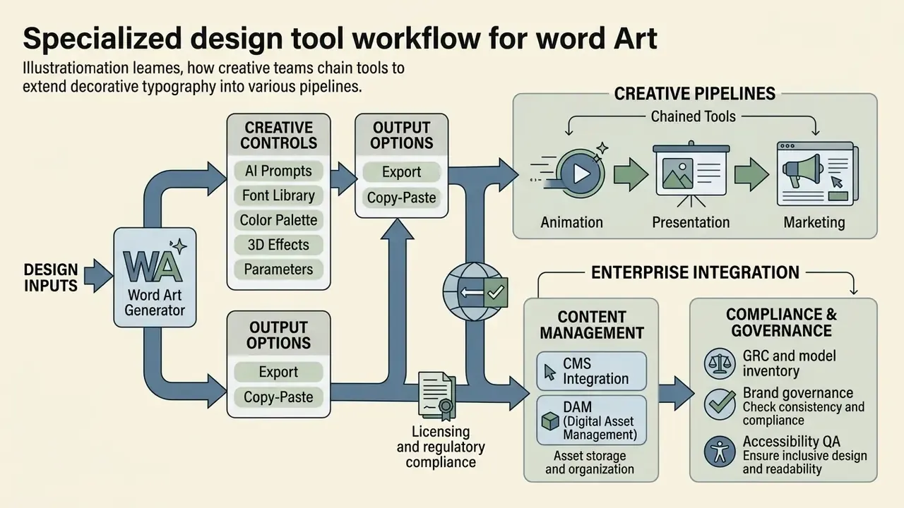
Creative teams routinely chain several tools to extend decorative typography into animation, presentation, and marketing pipelines.
«A multi-agent system with Pipeline, Glyph and Texture agents enables multilingual WordArt synthesis with iterative refinement based on user feedback.»
That architecture mirrors how production teams already operate. One system resolves layout, another resolves letterforms, a third resolves surface texture, and a human reviews each handoff. Worth stressing: the human review points are what make the chain auditable at all.
For interactive presentations and slide decks, pairing visual text banners with automated layout tools shortens document assembly. Review our documentation on free AI presentation maker options to evaluate template and layout features, and our overview of Microsoft's AI image generation access and commercial terms if Office-native workflows dominate your stack.
Video-led channels need the same lettering to survive motion and compression. Teams publishing on social platforms can combine typography exports with the workflows in our YouTube video editor and publishing guide, while voice-over layers are covered in our guide to AI voice generators, language support, and commercial licensing.
Enterprise Integration: CMS, DAM, and GRC Touchpoints
Generative typography becomes governable only when it is wired into existing systems instead of used ad hoc in a browser tab.
- DAM (Digital Asset Management). Store the generated asset together with the prompt, model name, license record, and human-edit log, so authorship can be evidenced later.
- CMS integration. Push approved PNG and SVG variants through the content pipeline with alt text attached at upload, not at publication.
- GRC and model inventory. Register the generator as a third-party AI tool with a named owner, approved use cases, and prohibited inputs: client PII, unreleased product names, confidential deal codenames.
- Brand governance. Lock approved palettes and font licenses into shared templates, so contrast ratios and font rights are enforced by default.
- Accessibility QA. Include a contrast and alt-text check in the publication gate. For SVG exports, confirm
<title>and<desc>elements plus ARIA labelling, so screen readers announce meaningful text.
Where an in-house pipeline is impractical, evaluate managed alternatives the way you would any other creative vendor. Our reviews of outpainting and image-expansion tools for business use and reverse image search for asset provenance cover adjacent controls that matter during brand-misuse investigations.
Word Art Generator FAQ
How do I generate word art with AI?
Enter the target text, then describe style, material, lighting, and background explicitly. For example: "3D metallic letters with a neon glow," or "watercolor brush strokes forming words." Use the five-part prompt formula above, generate a batch of variations, then refine the best candidate.
Can AI produce legible word art?
Yes, though results vary by model. Earlier diffusion models garbled glyphs; current text-aware models render short strings reliably. Legibility drops sharply as string length grows, so keep display text to a few words and verify contrast after export.
Is AI-generated word art copyright-free or copyrighted?
Neither label is fully accurate. Purely machine-generated output has no human authorship and is not protected in the U.S., which also means competitors are not blocked from producing similar output. Human creative selection, arrangement, and editing can be protected. Platform terms are a separate layer: some free tiers require attribution or prohibit commercial use outright.
Can I use a free word art generator for a commercial product?
Only if the platform's terms permit commercial redistribution and the underlying font license permits commercial embedding or rasterization. Check both. Free tiers frequently limit use to personal projects, add watermarks, or cap resolution.
Why is my downloaded file showing a black background?
You exported as JPG, which has no transparency channel. Re-export as PNG-24 or SVG, or set an explicit background color before downloading.
What resolution do I need for printed word art?
300 DPI at the final physical dimension for raster files. Use vector SVG or PDF for anything that will be scaled, such as banners, apparel, or signage. Fine typographic detail may warrant 600 DPI.
How do I protect confidential information when using a public generator?
Treat prompts as external disclosures. Do not paste unreleased product names, client identifiers, or internal codenames into tools without a contractual no-training clause and a defined retention period.
Do word art graphics need alt text?
Yes, whenever the lettering conveys meaning. Screen readers cannot read pixels, so the exact wording of the graphic belongs in the alt attribute. Purely decorative flourishes should be marked as decorative instead.