Last updated: August 2026 · Reviewed against vendor licensing terms, U.S. Copyright Office guidance and current prompt-engineering research.
Executive summary
- An ai art style is not one keyword. It is a stack of six controllable layers: art style, medium, material, lighting, palette, composition. Locking each layer independently is what turns probabilistic generation into a repeatable production pipeline.
- Consistency across an image series requires a Style Bible, seed testing across 5 to 10 generations, and reference-based style binding (IP-Adapter, ControlNet, swapped self-attention).
- Commercially, prompt-only outputs are not copyrightable in the U.S.; protection attaches only to substantial human expressive contribution. Vendor thresholds matter: Midjourney requires Pro or Mega above $1M annual gross revenue, Stability AI's Community License is free for entities under $1M, and Adobe Firefly ships non-beta outputs with enterprise IP indemnification.
How to read this guide
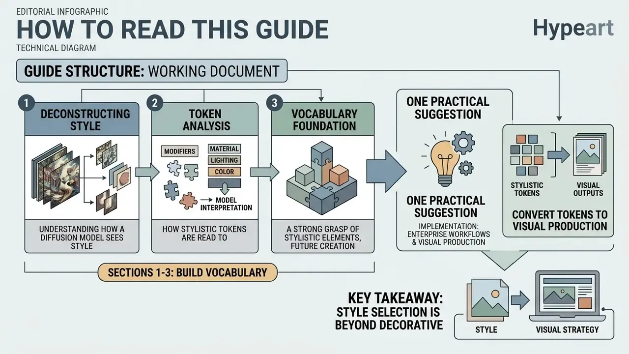
This is a working document, not an inspiration board. The order matters.
Sections one through three build the vocabulary: what a style actually is inside a diffusion model, and how medium, material, lighting and framing behave as separate control channels. Sections four through six are the production layer: the ai art styles list, the prompt formula, the copy-paste matrix and the negative-prompt library. Sections seven through nine cover the parts that decide whether a pilot survives contact with a compliance function: style selection, cross-image consistency, audit evidence, pricing and rights.
One practical suggestion. If you are being asked to sign off on AI imagery for customer-facing channels, read the consistency and commercial-use sections first, then come back for the taxonomy. The vocabulary is easier to absorb once you know which decisions it protects.
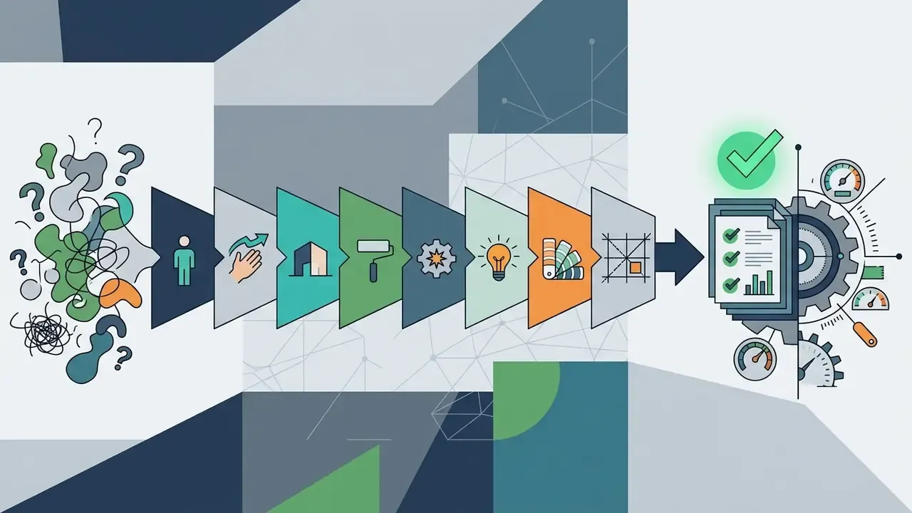
In modern enterprise workflows and visual production, selecting an ai art style is more than a decorative decision. It serves as a visual framework that dictates edge behavior, surface texture, color relationships, and emotional response. When teams rely on vague prompts, synthetic image engines default to generic averages, which produces inconsistent brand representation and unpredictable model output.
Understanding how text-to-image models interpret stylistic tokens allows organizations to convert probabilistic generation into a controlled, repeatable pipeline. This guide breaks down the core taxonomy of ai generated art style parameters, provides a catalog of established visual directions with prompt examples, details a structured prompting methodology, and analyzes the legal and commercial requirements governing AI-generated imagery in 2026.
What are AI art styles in image generation?
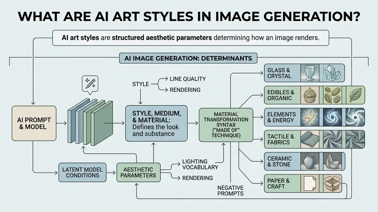
An ai art style in ai image generation is a structured set of aesthetic parameters and latent model conditions that determine how an ai generated art style renders line quality, texture, color, and composition across different subjects. Rather than altering what is depicted in an image, an art style dictates how the visual information is organized and presented.
Text-to-image diffusion models and vision transformers process style directives through cross-attention mechanisms and dedicated style embeddings. When a user inputs visual directives, the system maps those tokens against learned visual representations in its training data. Without explicit boundaries, models blend stylistic elements unpredictably.
Managing AI image generation effectively requires separating high-level aesthetic intent from technical parameters such as surface material, illumination source, and camera framing. That decoupling is what allows a marketing team, a documentation team and a product team to share one visual language while generating entirely different subjects.
Style, medium and material: what changes the generated image
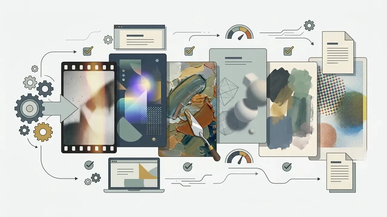
The specific medium and material tokens in a prompt fundamentally dictate how a model calculates surface texture, light refraction, and edge definition. While an overall style defines the high-level aesthetic system, the medium defines the physical or simulated production technique, such as an oil painting, gouache, charcoal drawing, or 3D render.
Material parameters control the tactile characteristics of the rendered subject. Specifying a watercolor medium introduces fluid, semi-transparent layers with soft branching pigment boundaries and visible paper grain, because the model reproduces the statistical signature of pigment diffusion learned from watercolor training data rather than simulating physics directly. Conversely, directing the generator toward porcelain introduces a smooth, highly reflective ceramic glaze with distinct highlight specularities, while metallic descriptors force the model to calculate sharp surface reflections and high specular contrast.
That distinction matters operationally. Because material lives in the style channel rather than the content channel, swapping "porcelain" for "brushed titanium" alters reflectance and micro-texture without disturbing the subject, pose or framing.
When teams need precise visual descriptors for textual or design outputs, an ai description generator helps standardize technical terminology before those directives become image prompts.
How to use material transformation syntax (the "made of" technique)
To force an image generator to render an object out of an unnatural substance, standard adjective placement often fails. Prompting "a glass armchair" frequently produces a normal armchair standing near glass, or a chair with a few glass accents. Instead, use explicit structural transformation syntax:
[Subject] + made of + [Material] + [Surface details] + [Lighting]
- Glass and crystal "A human skull made of blown iridescent glass, refractive light bends, subtle internal bubbles, polished finish, dark studio backdrop."
- Edibles and organic "An executive desk made of carved dark chocolate, cocoa powder dusting, glossy ganache highlights, warm side light."
- Elements and energy "A majestic lion made of liquid neon light, glowing electric blue tendrils, obsidian background, long exposure trails."
- Tactile and fabrics "A sports car made of woven tweed fabric, visible stitch details, matte cloth texture, soft diffused lighting."
- Ceramic and stone "A pineapple made of blue-and-white Ming porcelain, hand-painted cobalt motifs, glossy glaze, museum lighting."
- Paper and craft "A city skyline made of folded papercraft, layered cardstock, visible fold creases, top-down soft light."
- Botanical "A grand piano made of moss and living ferns, damp organic texture, forest ambient light."
- Industrial "A butterfly made of oxidized copper plates, riveted seams, verdigris patina, rim light."
- Frozen and fluid "A running horse made of splashing water, frozen droplets mid-air, high-speed flash freeze."
- Sugar and confection "The letter 'B' made of hard candy, translucent sugar glass, colorful refraction, bright key light."
Two practical rules. Place the material clause immediately after the subject so cross-attention binds them, and add a surface descriptor (glossy, matte, faceted, woven, patinated) so the model resolves reflectance instead of guessing. For style transfer driven by an existing photograph rather than text, image-to-image generators provide a more deterministic route.
How lighting, color and composition support an art style
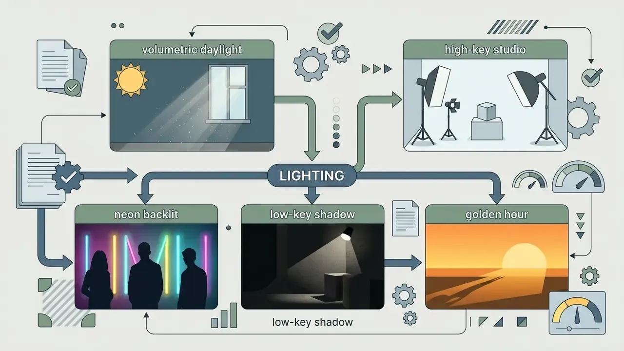
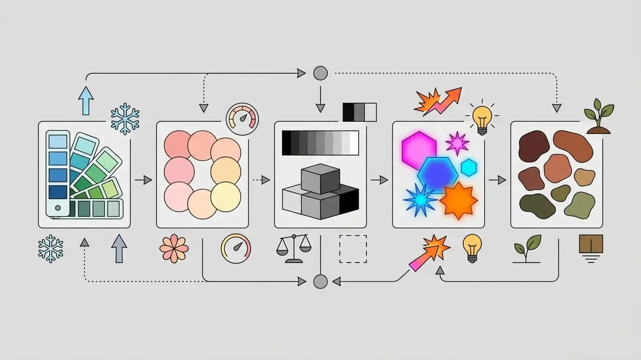
Lighting, color temperature, and compositional framing act as structural support for any visual style, and they directly influence atmosphere and subject legibility. Natural daylight provides neutral color rendering and predictable shadow falloff, whereas volumetric lighting creates visible light shafts through atmospheric scattering, adding dramatic depth to cinematic scenes. Neon lighting introduces saturated, high-contrast chromatic separation that defines futuristic aesthetics.
Color palettes establish emotional tone and visual cohesion.
Warm tungsten tones evoke intimacy, while cool daylight or desaturated pastels soften visual contrast and lower perceived intensity. Compositional parameters dictate spatial dominance: low-angle framing elevates subject authority, high-angle framing conveys vulnerability, and extreme close-ups compress environmental context to focus entirely on micro-textures.
When designing structured visual documentation or mapping workflow architectures, teams frequently combine these visual parameters inside an ai diagram generator to maintain structural clarity across creative pipelines.
Cinematography vocabulary: the lighting and optics cheat sheet
Generic light words produce generic light. The tokens below are the operative vocabulary photographers and cinematographers already use, and diffusion models recognize them because captioned training data uses the same terms.
| Term | What the model renders | Best used for |
|---|---|---|
| Golden hour | Low warm sun, long soft shadows, amber highlights | Lifestyle, travel, hopeful brand imagery |
| Blue hour | Cool ambient twilight, low contrast, deep blue sky | Architecture, moody exteriors, tech launches |
| Chiaroscuro | Extreme light-to-dark modeling, sculptural volume | Portraits, editorial drama, fine-art references |
| God rays (crepuscular rays) | Visible shafts through haze, dust or foliage | Cinematic reveals, spiritual or epic scenes |
| Softbox / studio lighting | Broad diffuse source, gentle falloff, clean catchlights | E-commerce, headshots, product photography |
| Rim light / backlighting | Bright separation edge, silhouetted subject | Hero shots, subject isolation on dark plates |
| High-key | Bright, minimal shadow, low contrast | Consumer marketing, health, SaaS optimism |
| Low-key | Dark field, dense shadows, selective highlights | Thrillers, luxury, security and risk themes |
| Volumetric fog / atmospheric haze | Scattered light, depth layering, mist density | Sci-fi, cyberpunk, concept art depth |
| Anamorphic lens flare | Horizontal streaks, oval bokeh, wide frame feel | Cinematic key art, trailers, film stills |
| Candlelight / practical light | Warm point source, flicker falloff, intimate scale | Period scenes, storybook interiors |
| Neon glow / holographic spill | Saturated magenta-cyan bounce on wet surfaces | Cyberpunk, nightlife, gaming |
| Macro 100mm | Extreme detail, razor-thin focus plane, texture | Materials, watches, food, craftsmanship |
| 35mm film / 85mm portrait lens | Natural perspective, gentle grain, flattering compression | Photorealistic people and documentary looks |
Precision color targeting: hex codes and historical pigments
To enforce brand color compliance across AI generations, replace generic visual terms like "blue" with strict hex codes or standardized historical pigment names:
- Saffron yellow or ochre for natural warm tones.
- Celadon green for pale, jade-like ceramic glazes.
- International Klein Blue or ultramarine for high-saturation artistic punch.
- Titanium white and burnt umber for classical painterly contrast.
- Peacock blue, forest green, terracotta for controlled mid-tone families.
- Hex code integration.Diffusion models recognize standard six-character hex strings. Direct the palette using: "...colored in hex palette #003366 (navy) and #FF6600 (amber), no other accent colors...". Hex targeting is approximate rather than absolute, so verify output swatches against your brand book before release.
- Specific pigment tokens.Historical pigment names carry a tighter hue distribution in training captions than generic color words:
- Palette families.Where exact hues are unnecessary, use palette archetypes: cool tones, warm tones, pastels, vibrant neon, earth tones, jewel tones (emerald, sapphire, ruby), monochromatic grey, warm cinematic gold.
- Combination syntax.Two-color systems read most reliably: "peacock blue and saffron yellow color scheme, everything else neutral grey."
| Parameter | Technical definition | Direct impact on the AI generated image |
|---|---|---|
| Art Style | High-level aesthetic language and visual system (anime, cinematic, retro poster). | Controls overall rendering logic, shape simplification, and structural visual identity. |
| Medium | Simulated physical or digital technique (watercolor, oil painting, 3D render). | Dictates surface mark-making, edge sharpness, and core rendering behavior. |
| Material | Surface substance cues (porcelain, polished chrome, matte paper, woven fabric). | Controls light reflectance, translucency, specular highlights, and micro-texture depth. |
| Lighting | Source, direction, and quality of light (volumetric god rays, rim light, neon). | Establishes contrast ratio, visual depth, shadow hardness, and atmospheric mood. |
| Palette | Dominant hue range and saturation profile (warm pastel, monochromatic, neon, #003366). | Sets emotional tone, color harmony, and visual continuity across image sets. |
| Composition | Camera positioning, lens choice, and framing (extreme close-up, low-angle shot). | Determines subject dominance, spatial depth, background blur, and narrative focus. |
AI art styles list: popular directions with examples
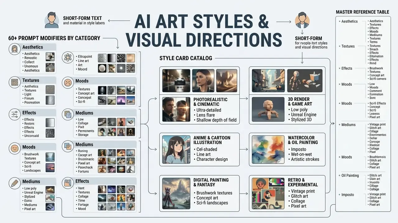
Master reference table: 60+ prompt modifiers by category
| Category | Key tokens (prompt modifiers) | Effect on generation | Ready-to-use prompt example |
|---|---|---|---|
| Traditional mediums | Impasto oil painting, Risograph print, Gouache on paper, Charcoal sketch, Ink wash (sumi-e), Watercolor wet-on-wet, Pastel drawing, Woodcut, Linocut, Etching, Screen print, Stencil, Marker illustration, Quilling, Mosaic | Produces visible strokes, canvas or paper grain, halftone noise, ink bleed and hand-made irregularity. | "A lighthouse on a stormy cliff, impasto oil painting, thick palette knife strokes, visible canvas texture, heavy paint layers." |
| Photography and optics | 35mm film, 85mm portrait lens, Macro 100mm, Bokeh, Shallow depth of field, Deep focus, Chiaroscuro lighting, Anamorphic lens flare, High-key studio, Low-key, Street photography, Editorial fashion, Documentary realism, Black and white, Daguerreotype, Cyanotype | Controls focus falloff, aberration, grain, sharpness and light ratios; signals optical capture instead of illustration. | "Portrait of a watchmaker, macro 100mm lens, sharp focus on mechanical gears, chiaroscuro lighting, deep shadows, subtle dust motes." |
| Cinematic | Film still, Neo-noir, Anamorphic widescreen 21:9, Color graded teal and orange, Epic wide shot, Indie film aesthetic, Art-house cinema, Historical period film | Adds widescreen framing, motivated key light, grain and narrative composition. | "A detective waiting under a subway sign, neo-noir film still, hard rim light, wet pavement reflections, desaturated palette, 21:9 framing." |
| 3D and game art | Isometric 2:1 grid, Low-poly geometry, Claymation style, Matte clay render, Unreal Engine 5 render, Voxel art, Diorama scene, Cel-shaded, Architectural visualization, Ambient occlusion | Sets geometric grid, polygon simplification, shader family and studio-render lighting. | "A cozy medieval tavern interior, isometric 2:1 grid, claymation style, soft ambient occlusion, warm lantern light." |
| Digital and retro | Cyberpunk neon, 1980s synthwave, Vaporwave pastel, Pop art halftone dots, Vector flat design, Pixel art 16-bit, VHS scan lines, Polaroid instant photo, Sepia vintage, Mid-century modern, Glitch art, Op art | Adds neon, spot colors, print raster dots, analog artifacts or clean vector edges. | "A sports car driving through a futuristic city, 1980s synthwave aesthetic, glowing magenta grid lines, dark purple sky." |
| Illustration and narrative | Anime key visual, Manga linework, Comic book inking, Children's storybook illustration, Coloring-book contour, Sticker illustration, Editorial conceptual illustration, Line art single weight | Governs outline weight, flat or cel shading, character emphasis and readability. | "A curious fox scientist in a paper laboratory, children's storybook illustration, soft contour lines, warm pastel palette, centered framing." |
| Fine art and historical | Renaissance, Baroque, Impressionist, Expressionist, Surrealist, Art Nouveau, Art Deco, Bauhaus, Cubism, Dadaism, Medieval manuscript, Fresco, Psychedelic, Art noir | Imports composition conventions, palette history and ornamental logic of an art movement. | "A botanical greenhouse pavilion, Art Nouveau style, long sinuous organic lines, floral ornamentation, muted gold and celadon palette." |
| Craft and material 3D | Felt, Tapestry, Embroidery, Knitted wool, Papercraft, Origami, Modeling clay, Porcelain, Metalwork, Crystal, Fiberglass, Bubble wrap, Candy, Marble, Concrete | Turns the subject into a handcrafted object with tactile texture and physical scale cues. | "A miniature city block made of felt and embroidery thread, visible stitching, soft top light, pastel craft palette." |
Style card catalog (text version of the visual gallery)
| Style card | Core tokens | Visual signature |
|---|---|---|
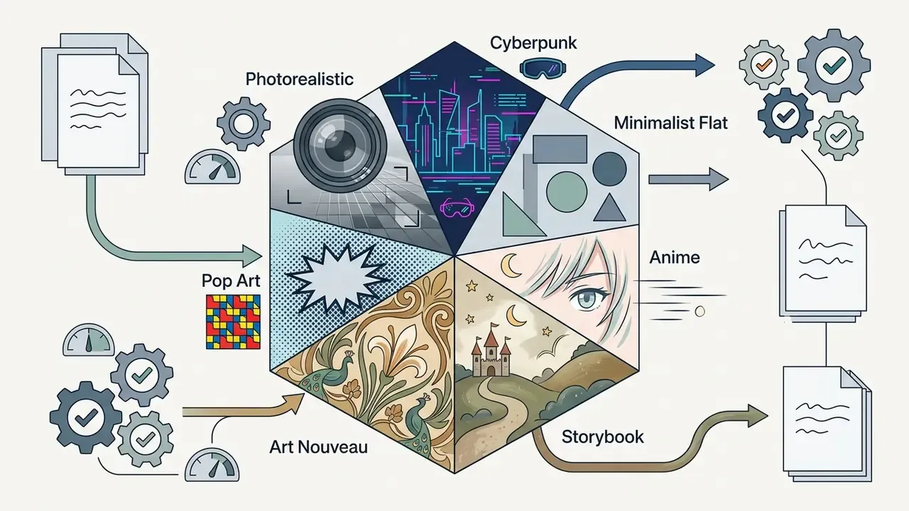
| Photorealistic photography | 35mm lens, shallow depth of field, natural lighting, sharp focus, natural skin texture | Portrait with soft bokeh and neutral grading |
| Cinematic cyberpunk | Neon lighting, rain-slicked pavement, volumetric fog, dark shadows, magenta-cyan palette | Futuristic night street with holographic signage |
| Anime key visual | Clean linework, cel shading, vibrant palette, detailed character focus | Expressive anime character over a softer background |
| Watercolor illustration | Wet-on-wet wash, paper texture, soft gradients, delicate edges | Soft landscape with branching pigment edges |
| 3D isometric render | 2:1 diagonal grid, smooth clay shader, ambient occlusion | Miniature isometric room, collectible scale |
| Retro risograph print | Halftone pattern, two-color spot palette, slight misregistration | Graphic vintage poster with visible ink texture |
| Fantasy concept art | Ornate armor detail, dramatic sky, painterly brushwork, epic scale | Mythic environment with readable silhouettes |
| Flat vector design | Geometric shapes, opaque fills, no gradients, 8px grid discipline | Clean UI-ready illustration |
| Pixel art 16-bit | Low resolution grid, limited palette, hard pixel edges | Retro game scene, no anti-aliasing |
| Pop art | Bold outlines, halftone dots, primary color blocks, satire framing | Mass-culture object rendered as poster art |
Photorealistic, photography and cinematic styles
Photorealistic and photographic styles aim to reproduce optical capture, simulating camera lenses, physical sensor behavior, and natural light falloff. Key prompt tokens include 35mm photograph, shallow depth of field, natural skin texture, and bokeh.
Cinematic styles push photorealism further by introducing dramatic lighting ratios, widescreen aspect ratios (16:9 or 21:9), and anamorphic lens artifacts. High-key photographic prompts generate bright, low-shadow environments suitable for commercial product shots, while low-key prompts enforce dark backgrounds and harsh shadow structures for high-drama scenes.
For teams producing corporate portraiture at scale, the same optical vocabulary underpins dedicated AI headshot generators, where lens choice and lighting profile matter far more than style keywords.
Anime, cartoon, comic and children's book illustration styles
Illustrative styles rely on line quality, flat or cel-shaded color blocks, and stylized proportions. Anime aesthetics leverage clean black or colored linework, exaggerated facial features, and vibrant color fill, placing sharp focus on character silhouettes. Outline color and thickness measurably change how natural and how forceful a character reads, which is why "black outline, uniform weight" remains the safest default for brand mascots.
Comic book styles incorporate graphic line shading, halftone dot patterns, and high-density ink lines. Children's book illustration focuses on soft, accessible imagery using gentle contour lines, warm color palettes, and storybook textures. These character-driven styles benefit from simplified visual elements, which keeps them readable across diverse digital platforms.
Teams validating illustrative directions on a limited budget can begin with free AI image generators, then migrate the winning prompt set to a paid tier. Studio-specific looks, for example the softly lit pastoral aesthetic reproduced by Ghibli-style AI image generators, require closer attention to the style attribution rules discussed later in this guide.
Digital painting, fantasy, sci-fi and cyberpunk styles
Digital painting offers brushstroke texture, smooth color blending, and atmospheric depth, which makes it a primary medium for concept art and world-building. Fantasy art combines ornate compositions with dramatic lighting to depict mythical environments and detailed armor textures. Concept art specifically optimizes for clear silhouettes, functional form and scene readability, so it is the right choice for design review rather than final marketing art.
Sci-fi aesthetics focus on sleek mechanical structures, advanced materials, and vast environmental scale. Cyberpunk is a specialized branch of sci-fi defined by high-contrast "high tech, low life" markers: rain-slick urban streets, holographic advertisements, dark shadows, and electric magenta, cyan and neon lighting palettes.
3D render, pixel art, game art and flat design
Three-dimensional renders rely on precise physical shading, isometric geometry, and material depth. Isometric game art builds scenes on a structured 2:1 diagonal grid (a 26.57 degree diagonal, two pixels across for every one down), which preserves uniform spatial scale across game assets.
Pixel art uses low-resolution grid placement with restricted color palettes to emulate retro digital interfaces. Flat design removes gradients and heavy shadow effects, using basic geometric shapes, clean lines, and opaque color fills. This minimalist approach is compatible with interface accessibility requirements, because WCAG 2.2 asks that graphical objects and UI components remain perceivable, that color never be the only carrier of meaning, and that contrast thresholds be met. Flat, high-contrast shape systems satisfy those constraints more easily than gradient-heavy illustration. Design systems such as the U.S. Web Design System apply the same logic by standardizing shapes, spacing and angles for accessible interfaces.
Animated derivatives of these styles, meaning sprite sheets, tile grids and looped motion tests, are usually assembled downstream in an animation maker once the still style is locked.
Watercolor, oil painting, collage, retro and experimental styles
Traditional and experimental mediums introduce physical paper grain, pigment diffusion, and tactile impasto. Watercolor prompts simulate fluid edge bleeding and semi-transparent color washes over paper grain. Oil painting directives induce heavy brushstroke textures, rich surface gloss, and visible palette knife marks.
Retro styles leverage historical printmaking cues, including risograph halftone layering, subtle color misregistration, vintage 1920s line art, or sepia-toned analog photographs. Experimental mixed media and photo collage combine disparate textures, cut-out paper elements, and contrasting imagery to create high-concept editorial visuals. Double exposure, glitch distortion and digital collage extend the same family for editorial and album-cover work.
How to write art styles for AI prompts
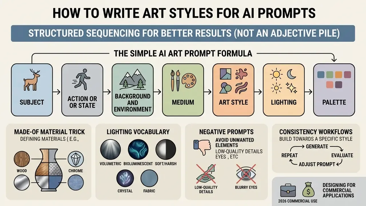
Writing effective art styles for ai prompts requires structured sequencing, not a pile of adjectives. Inserting broad descriptors like "hyperrealistic" or "masterpiece" creates conflicting instructions inside diffusion models, and the output degrades accordingly.
To build structured visual concepts before generating art assets, teams can leverage an ai design generator to outline core layout parameters.
A simple AI art prompt formula
For predictable outputs, prompts should follow a layered sequence that moves from primary subject matter down to technical rendering constraints. An optimal construction looks like this:
Prompt = Subject + Action + Environment + Medium + Art Style + Lighting + Palette + Composition
- Subject
- Primary object, character, or scene focal point.
- Action or state
- What the subject is doing, or its dynamic posture.
- Background and environment
- Setting, spatial context, and environmental elements.
- Medium
- Physical or digital capture format (oil painting, 35mm photograph).
- Art style
- High-level aesthetic direction (cyberpunk, storybook illustration).
- Lighting
- Light source, direction, and atmospheric behavior (backlit, volumetric fog).
- Palette
- Hue range and color temperature (muted earth tones, warm pastels, #003366).
- Composition
- Camera position, framing, and lens focal length (wide low-angle shot).
Prompt examples for combining style, lighting and palette
Combining style, illumination, and color temperature into one cohesive string helps the generator balance scene elements. Three verified combinations demonstrate proper modifier stacking:
- Watercolor direction: "A red fox sitting in a snowy pine forest, watercolor painting, charming children's storybook style, soft natural morning light, warm pastel palette with pale blue and copper tones, centered framing, delicate paper texture."
- Cinematic cyberpunk direction: "An autonomous delivery drone navigating narrow urban alleyways, digital concept art, cyberpunk aesthetic, vibrant neon lighting with strong surface reflections, cool cyan and magenta palette, low-angle tracking shot, shallow depth of field."
- Photorealistic portrait direction: "An executive sitting in a modern glass conference room, 35mm film photograph, photorealistic style, soft window backlighting, neutral professional color grading, waist-up composition, natural skin texture."
When creating narrative assets or script-driven character sequences, creators often pair visual prompts with an ai dialogue generator so that dialogue tone matches the visual aesthetic.
Why style words fail and how to make prompts more specific
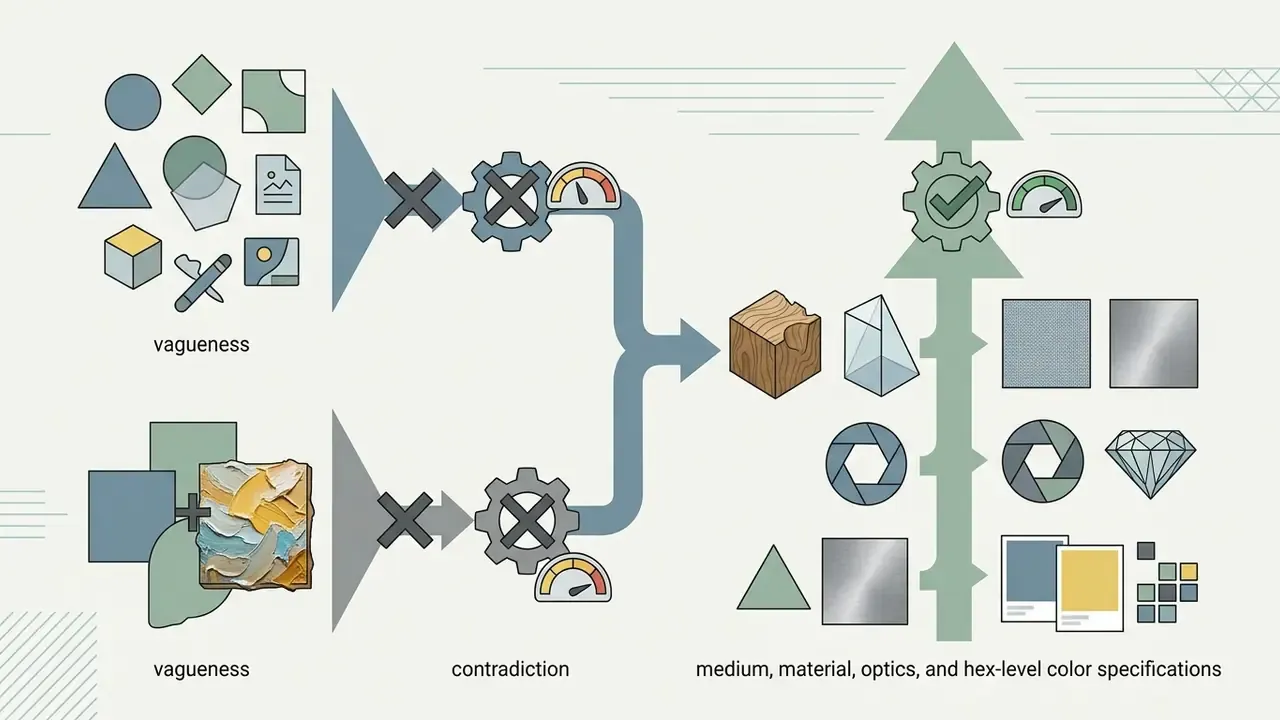
Style tokens fail when prompts contain vague, subjective terminology or contradictory instructions. Descriptors such as "stunning," "ultra-detailed," or "trending on ArtStation" add noise to text encoders without providing actionable visual guidelines. Current prompt-engineering guidance from major model vendors consistently advises cutting fluffy, imprecise description and stating style explicitly instead.
Contradictions occur when users merge incompatible parameters, for instance "flat vector graphics" with "impasto oil painting texture." The model tries to resolve both latent spaces at once, and the result is muddy texture and lost detail.
To increase prompt fidelity:
- Replace generic adjectives with specific medium cues (swap "high quality" for "crisp 85mm lens capture").
- Isolate style parameters from narrative subject descriptions.
- Cut redundant synonyms to keep token count within the model's optimal processing window.
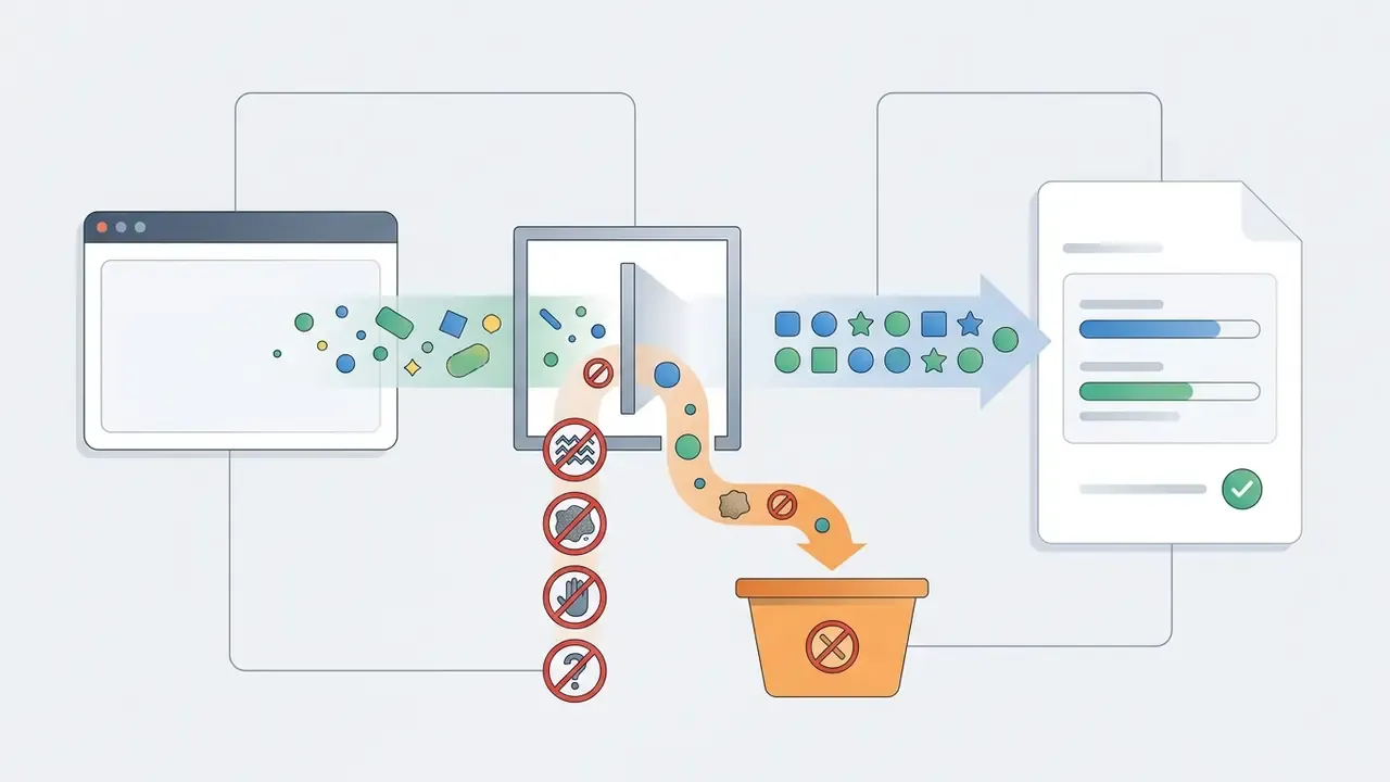
- Move exclusions into a negative prompt instead of negating inside the positive prompt.
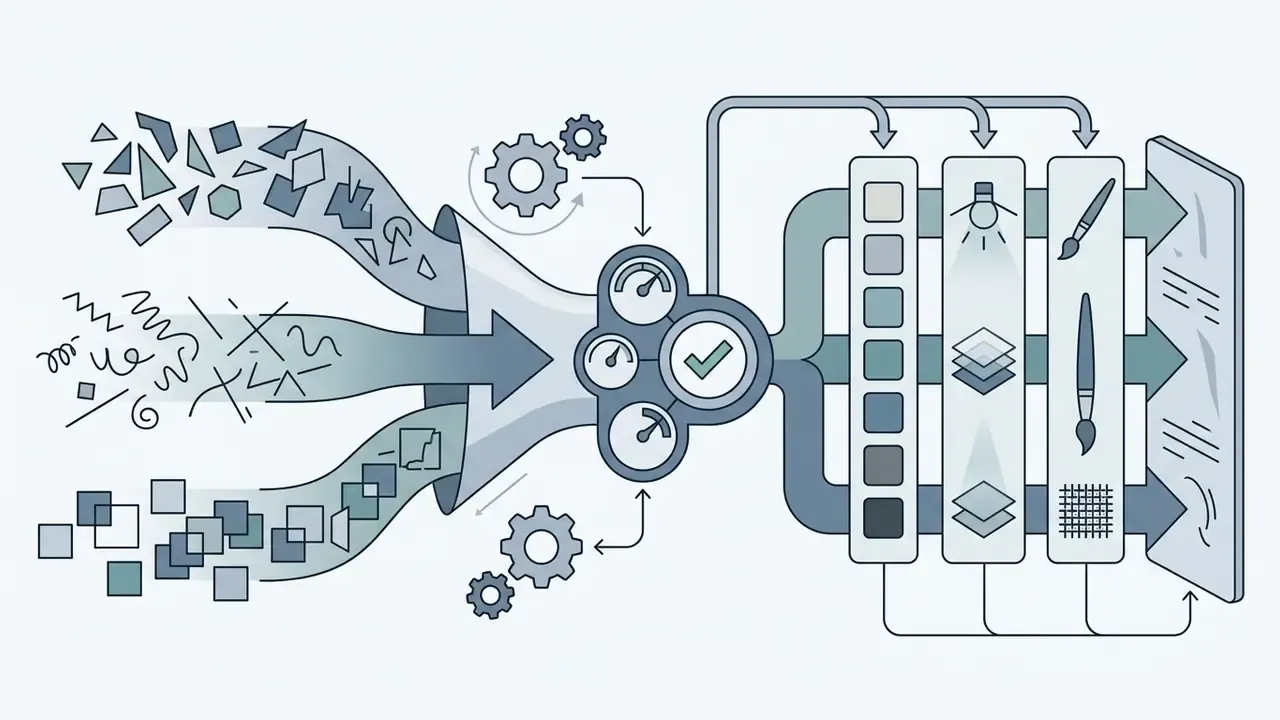
Copy-paste prompt matrix for enterprise workflows
Use this modular structure to compose production-ready prompts. Each bracket is a slot; swap the contents without touching the order.
[Subject & Action] + [Environment] + [Medium & Material] + [Art Style] + [Lighting & Optics] + [Palette & Color] + [Composition]
Pre-filled examples:
- E-commerce product "A minimalist ceramic watch resting on a wet slate rock + dark luxury studio + 35mm macro lens capture, brushed titanium and matte ceramic + photorealistic product design + soft directional softbox light + monochromatic grey with #D4AF37 gold accents + extreme close-up shot."
- Editorial illustration "A giant robot planting a small flower + overgrown ruins of a city + gouache paint on rough paper + storybook illustration style + golden hour backlighting + muted earth tones + ultra-wide low-angle framing."
- Corporate documentation "Two engineers reviewing a server rack diagram + clean-room data center + 35mm photograph + photorealistic documentary style + neutral high-key overhead light + desaturated blue-grey with #003366 accents + eye-level medium shot, generous negative space for text overlay."
- Game concept "A floating market island with airships docking + tropical volcanic archipelago + stylized 3D render, matte clay shader + fantasy concept art + volumetric god rays through haze + jewel tones with saffron highlights + isometric 2:1 grid, wide establishing shot."

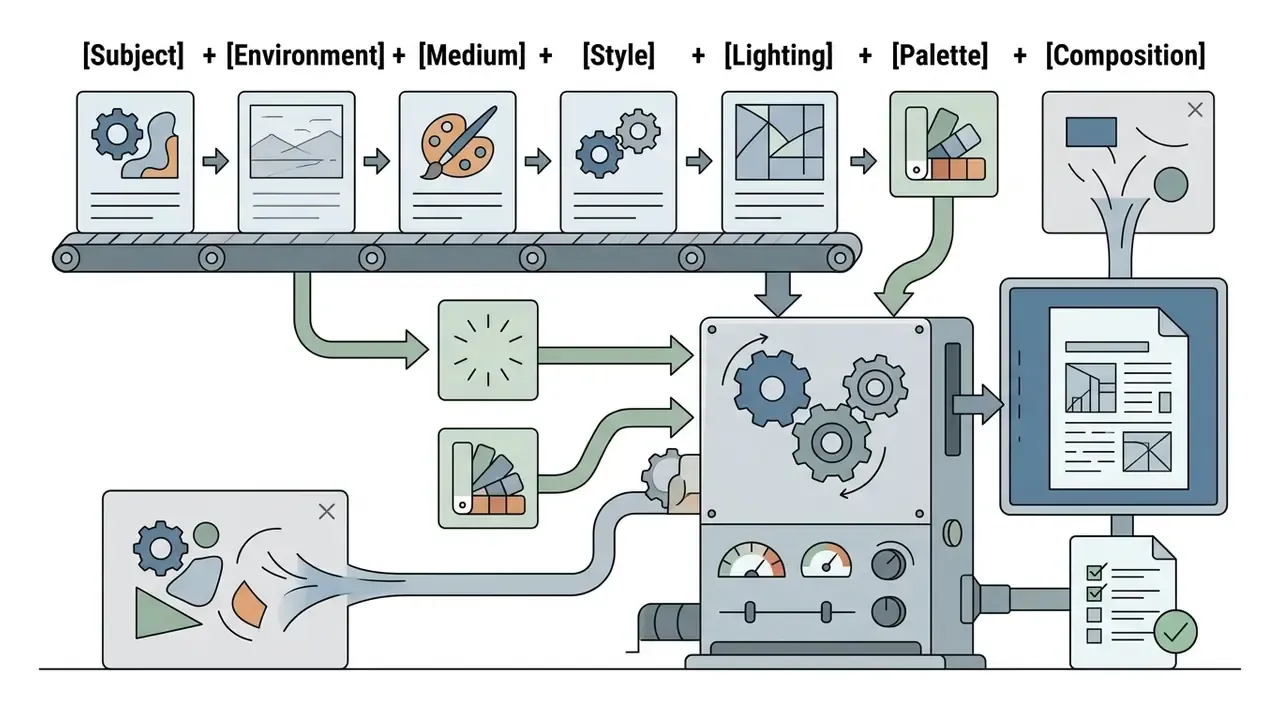
[Subject] + [Environment] + [Medium] + [Style] + [Lighting] + [Palette] + [Composition] / negative: [exclusions]Negative prompting for style purity
To keep visual styles clean and suppress model default artifacts, append these negative constraints based on your target direction:
- For photorealism
negative prompt: illustration, 3D render, plastic skin, smooth waxy surface, painting, drawing, cartoon, oversaturated, watermark, text. - For flat design and vector
negative prompt: realistic shadows, 3D depth, gradients, noise, blur, photorealistic texture, specular highlights, film grain. - For traditional watercolor
negative prompt: sharp hard edges, digital gloss, 3D lighting, heavy black outlines, vector aesthetic, neon colors. - For anime and comic linework
negative prompt: photorealistic skin, depth-of-field blur, painterly brushstrokes, muddy shading, extra fingers, deformed hands. - For product photography
negative prompt: cluttered background, visible reflections of studio equipment, distorted logo, fake text, uneven horizon.
How to choose the best AI art style for a project
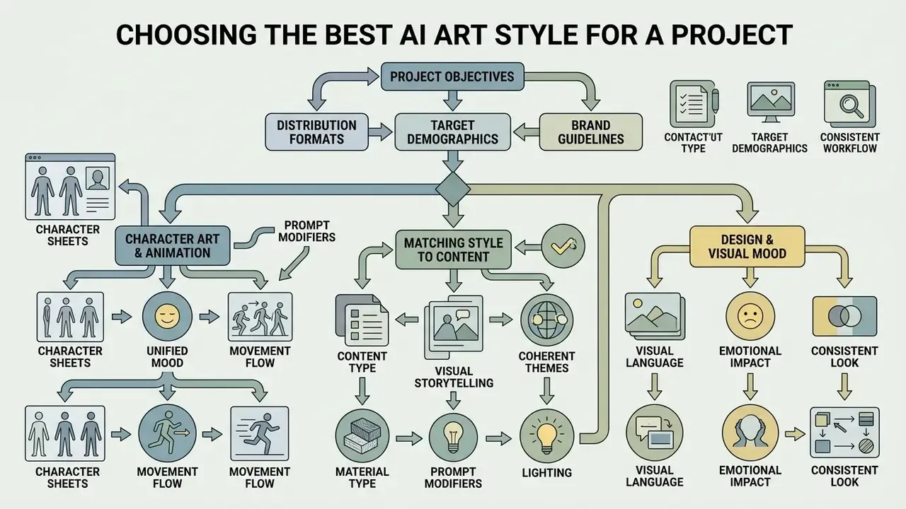
Selecting the best art styles for ai visual campaigns means weighing project objectives, distribution formats, target demographics, and brand guidelines. Choosing the wrong style can compromise message clarity or quietly alienate the audience you were courting. Before styling anything, answer the two questions used in professional visual style guides: who is the audience and what is the purpose of this image.
To evaluate pricing structures and subscription tiers across creative AI tooling, organizations can compare options before deploying models at scale.
AI art styles for characters, character sheets and animation
Developing consistent ai art styles for characters across multiple turnaround angles requires locked aesthetic rules. Styles with clear geometry, such as anime, comic book inking, 3D clay renders, or digital vector illustration, yield higher consistency than fluid mediums like expressive watercolor.
When creating turnaround character sheets (front, side, and back views), production teams hold consistency by locking character descriptors, wardrobe details, and lighting setups across all generation passes. Minor structural variances across views are resolved afterwards in manual post-processing. Practitioner workflows commonly budget 30 to 45 minutes of cleanup per character to remove drift in facial features, proportions and costume detail.
A production-ready character package usually contains four artifacts: a canonical front-view reference, a three-view turnaround, an expression sheet (neutral, joy, anger, surprise, fatigue), and an action sheet with two to three signature poses. Each artifact reuses the same verbatim character description, the same lens and lighting tokens, and the same background plate, so that only the pose changes.
Matching style to content, design and visual mood
Visual style must align with functional content intent and the distribution channel. The list below outlines workable pairings between art styles and commercial applications:
- Corporate reporting and technical documentation: Clean photorealistic photography, neutral lighting, and flat minimalist vector art promote readability and executive authority. This pairing follows established information-design practice, meaning plain presentation, legible contrast and consistent navigation cues rather than decorative styling. Adaptive prompt elicitation research also confirms that matching stylistic parameters to the stated task raises alignment with user intent (APE, 2024. https://arxiv.org/abs/2412.03428).
- Consumer product marketing and branding: High-key studio photography, 3D product renders, and vibrant pop-art visuals drive engagement and brand recall. Teams shortlisting a platform for these outputs can review the best AI art generators by style control and licensing.
- Editorial concepts and narrative content: Digital painting, surreal collage, watercolor, and retro risograph prints evoke emotional depth and intellectual engagement.
- Social and performance creative: Lifestyle photography, sticker illustration and bold flat design survive aggressive compression and small viewports. Extending crops for multiple placements is faster with AI outpainting tools than by re-prompting.
- Presentation and template systems: Line art, geometric illustration and icon-style visuals keep decks readable, and they are frequently produced inside integrated suites such as the Canva AI generator.
For organizations building comprehensive visual libraries and enterprise asset collections, creators can explore specialized frameworks in the ai digital art documentation hub.
How to keep one AI art style consistent across images
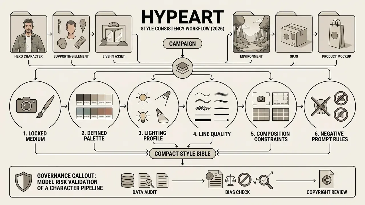
Maintaining style consistency across a multi-image campaign is one of the primary technical challenges in AI asset generation. Without explicit controls, text-to-image models vary camera distance, color saturation, and line rendering between consecutive generations. Small drifts. Big brand headaches.
Build a compact style bible for repeatable results
A Style Bible is a standardized document that locks core visual parameters for the whole production team. By standardizing style tokens, creative directors prevent prompt drift between individual contributors. A workable Style Bible includes six core constraints:
- Locked medium directiveFixed technical capture term, for example digital concept painting.
- Defined palette standardsStandardized color tokens, for example cool teal, slate grey, muted amber, or explicit hex values such as #0F3A4A / #7F8C8D / #E0A34A.
- Lighting profileFixed illumination rules, for example soft diffuse daylight from camera left.
- Line quality rulesSpecified edge definitions, for example clean vector outlines, no gradients.
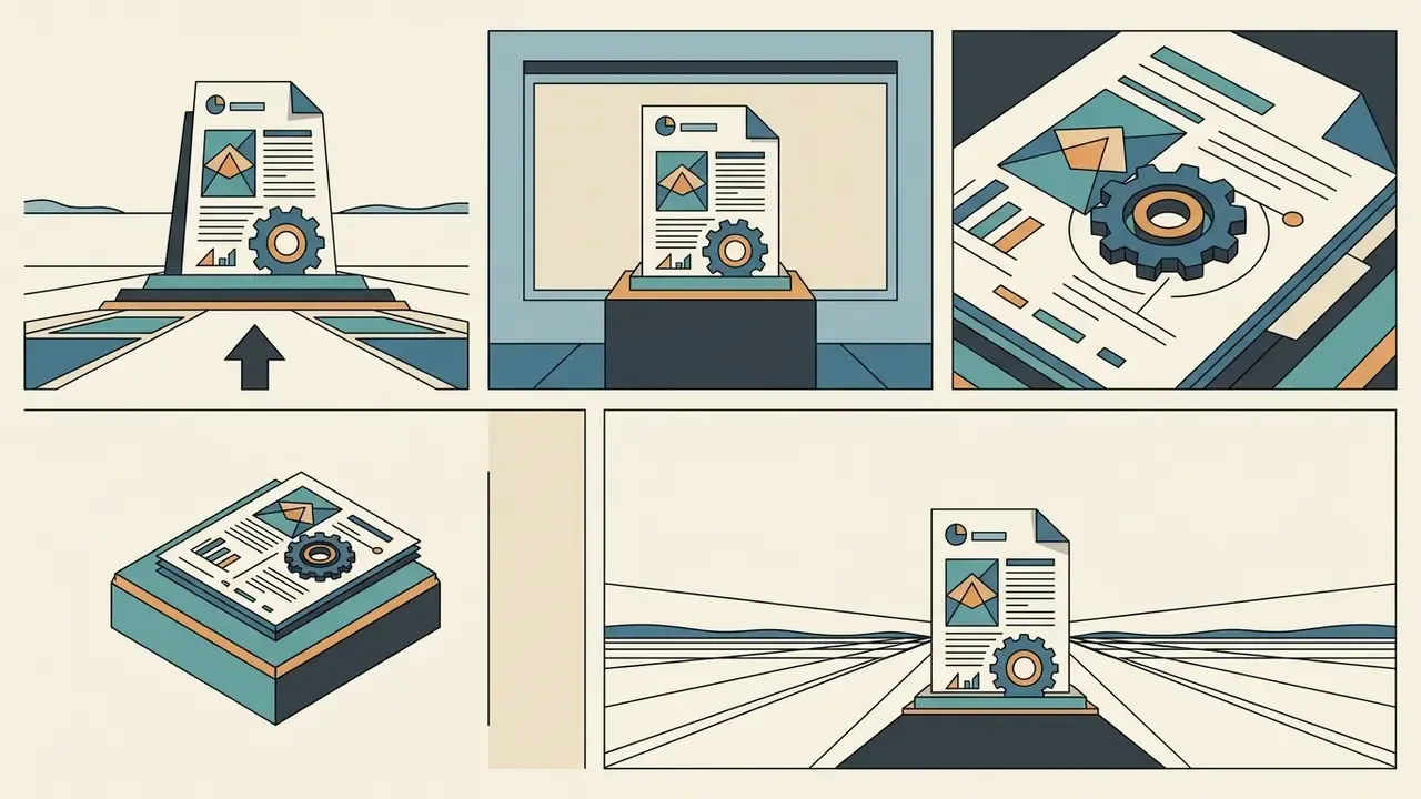
- Composition constraintsFixed camera framing, for example eye-level medium shots, centered subject.
- Negative prompt rulesProhibited visual attributes, for example no neon, no 3D render gloss, no text.
For brand-critical imagery, add a seventh row of non-negotiables: identity, wardrobe, shot type, background plate, minimum export resolution and hard negatives. Keeping cropping rules and aspect-ratio families in the same document prevents downstream inconsistency when assets are resized.
Test a style before using it in a full image series
Before generating large image sets, prompt engineers test style stability across multiple random seeds. Established prompt-engineering guidance recommends generating three to nine seeds per candidate prompt to see the representative range a single prompt can return. Generating 5 to 10 test outputs from identical prompt strings lets teams check whether the style holds when the subject matter changes.
If the style drifts noticeably, simplify the prompt by removing redundant adjectives and reinforcing core medium tokens. Advanced workflows use style-reference mechanisms such as IP-Adapter or ControlNet to bind latent style vectors directly to reference images, bypassing text-encoder limitations.
Complementary approaches worth benchmarking include pixel-level cycle-consistency conditioning (ControlNet++), shared internal activations for consistent subjects (ConsiStory), and numeric style codes that can be stored and reissued like a brand asset (CoTyle).
Audit evidence: what to log for every generated asset
| Field | Example value | Why it matters |
|---|---|---|
| Model and version | Firefly Image 4 / SD 3.5 Large | Model updates silently change style behavior |
| Prompt string (verbatim) | full positive prompt | Reproducibility and IP defense |
| Negative prompt | no text, no logos | Explains exclusions in the output |
| Seed or reference image ID | seed 88214 / ref_char_014.png | Enables exact regeneration |
| Parameters | aspect ratio, steps, guidance, style weight | Distinguishes drift from configuration change |
| Human edits | layers, retouching, compositing notes | Establishes the human-authorship record |
| Operator and timestamp | a.ivanova / 2026-08-14 11:42 UTC | Accountability and shadow-AI detection |
| Approval and usage scope | approved: paid social, EU only | Prevents license or territory misuse |
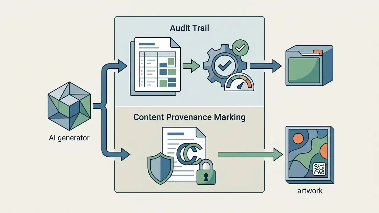
| Provenance marking | C2PA Content Credentials attached | Supports disclosure and anti-misinformation controls |
To review developer access options and API integration paths for automated asset pipelines, engineering teams can open the hub for full documentation.
AI image generators: pricing, rights and commercial-use checks
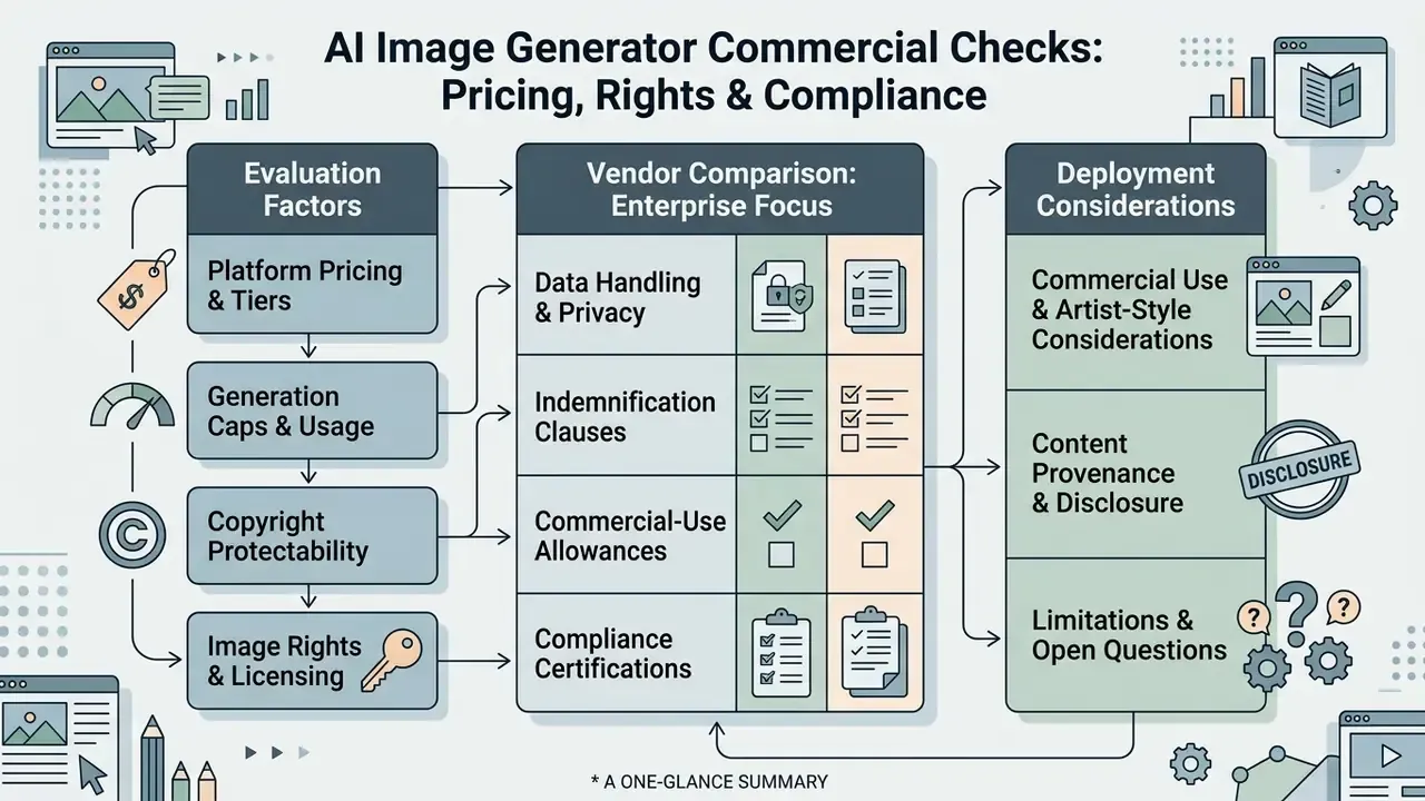
Deploying AI-generated imagery commercially requires a sober legal read on platform pricing, generation caps, and copyright protectability. Commercial permissions vary a lot by vendor and by subscription tier. Teams formalizing internal policy should start from the practical rules on commercial use of AI image generators before selecting a vendor.
For enterprise teams comparing commercial licensing framework documents across platforms, leaders can browse the hub to examine verified usage rules.
What to compare before paying for an AI image generator
Organizations evaluating AI image platforms should analyze several operational variables before committing to enterprise subscriptions:
- Pricing models and credit limits: Subscriptions typically offer credit-based monthly caps (Adobe Firefly Standard at roughly $9.99 per month for 25 credits) or tiered generation limits (Midjourney Basic at roughly $10 per month). API-metered products price by image tokens instead, with published rate tiers capping images per minute. To model total cost including control overhead, view the guide on cost and ROI calculators.
- Style reference and control capabilities: Support for seed control, pose estimation, and image-to-image style transfer.
- Export resolution and formats: High-resolution rendering limits, vector export capability, and uncompressed download options.
- Commercial usage tier rules: Explicit revenue boundaries determining whether commercial rights require a basic or enterprise plan.
- Data handling: Whether prompts and uploaded references are used for model training, and whether opt-out or zero-retention modes exist.
- Indemnification: Whether the vendor contractually defends customers against third-party IP claims arising from generated output.
Enterprise vendor comparison: rights, indemnification and data handling
| Platform | Commercial-use rule | IP indemnification | Training on customer data | Practical note |
|---|---|---|---|---|
| Adobe Firefly | Non-beta outputs cleared for commercial projects | Enterprise IP indemnification offered | Enterprise terms restrict training on customer content | Strongest fit for regulated brand work |
| Midjourney | Paid plans grant commercial rights; Pro or Mega required above $1M annual gross revenue | Not offered as a standard enterprise indemnity | Public visibility depends on plan mode | Compare licensing against alternatives in the Midjourney vs competing tools breakdown |
| Stability AI (SD 3.5) | Community License permits free commercial use under $1M annual revenue; Enterprise License required above | Enterprise agreement dependent | Self-hosting removes prompt egress entirely | Best control for on-premise pipelines |
| OpenAI image models | Commercial use via paid consumer tiers or metered API | Contract-dependent | Enterprise and API tiers offer no-training defaults | Metered pricing suits volume automation |
| Google image models | Usage governed by platform terms and tier | Contract-dependent | Enterprise tiers offer data controls | See the Google AI image generator overview for access and restriction detail |
| Microsoft and Bing image tools | Consumer terms restrict some commercial reuse | Limited | Consumer terms differ from enterprise | Details in the Microsoft AI image generator guide and Bing AI image guide |
To analyze technical support options and platform integration guides, operational teams can compare options across service documentation.
Commercial-use and artist-style considerations
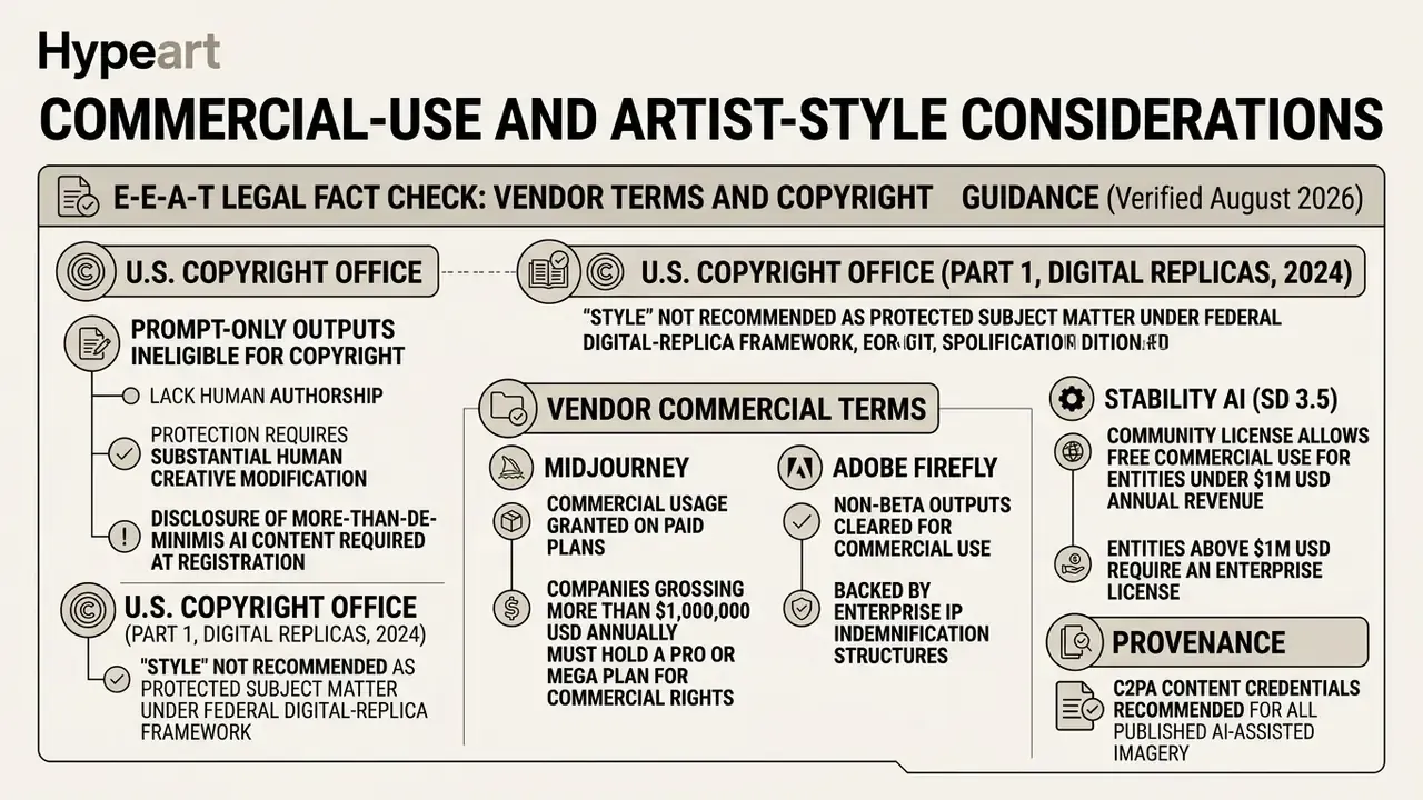
Under current U.S. copyright law, purely AI-generated images created solely from text prompts lack human authorship and cannot be registered for copyright protection (U.S. Copyright Office, Copyright and Artificial Intelligence, Part 2: Copyrightability, 2025). Protection applies only when a human author exercises significant creative control, for example through custom digital manipulation, complex multi-step editing, or layering generated assets into a larger human-authored work. Registration practice also requires applicants to disclose more-than-de-minimis AI-generated material and to identify their own contributions (U.S. Copyright Office, Copyright Registration Guidance: Works Containing Material Generated by Artificial Intelligence, 2023).
From a liability perspective, generating commercial art that mimics specific living artists by name introduces potential right-of-publicity, trademark, or unfair competition claims. Notably, the Copyright Office declined to recommend adding "style" as protected subject matter in its digital-replica analysis (Part 1, 2024). Read that carefully: style imitation is legally risky without being automatically infringing, and the risk arrives through publicity rights, trademark and unfair competition rather than copyright alone. Best practice is to use broad medium and historical epoch descriptors instead of individual artist names.
Content provenance and disclosure. Two controls reduce downstream reputational and regulatory exposure. Attach C2PA Content Credentials (or equivalent IPTC provenance metadata) to every published AI-assisted image, and record whether the asset was disclosed as AI-assisted in the channel where it appeared. Provenance marking protects against accusations of fabricated evidence, survives platform redistribution better than a visible watermark alone, and provides the paper trail auditors ask for when synthetic imagery shows up in customer-facing communications.
For risk management teams tracking legal precedents and platform litigation exposure around AI models, counsel can compare options in specialized regulatory summaries.
Limitations and open questions
A short note on honesty, because this field moves faster than its guidance.
Three areas remain unsettled. First, hex-code targeting is statistical, not deterministic; treat every brand color as needing a manual verification step. Second, the boundary between "prompt-only" and "substantial human contribution" has not been tested widely enough in registration practice to give teams a bright line, so document edits rather than argue about thresholds. Third, provenance metadata still gets stripped by some distribution platforms, which weakens the disclosure chain in ways nobody has fully measured. If your control design depends on any of those three, add a compensating check.
AI art styles FAQ
Where can I find new AI art style names to try?
New ai art style names surface in historical art movement archives, digital medium directories, and technical documentation hubs. Examining traditional printmaking methods (woodcut, linocut, risograph), photographic processes (daguerreotype, cyanotype), and modern rendering modes (ambient occlusion, low-poly wireframe) provides precise style tokens that diffusion models interpret effectively. Academic style-classification work, including texture-feature classifiers trained across a dozen historical art styles and semantic-workflow platforms for quantitative style analysis, offers vocabulary that is both specific and well represented in training captions. Validating candidate tokens through small test generations confirms that your target engine recognizes the directive before you deploy it across production workflows. Low-cost validation is possible with free AI art generators before allocating paid credits. To explore community discussions and prompt engineering frameworks, creators can review an ai discussion post detailing prompt strategies.
Which AI art style is most consistent across a long image series?
Styles with hard geometric rules reproduce best: flat vector design, isometric 3D, cel-shaded illustration and clean-lined comic inking. Fluid mediums, meaning expressive watercolor, loose impasto oil, glitch and collage, vary the most, because their defining feature is controlled randomness. If a fluid style is mandatory, bind it to a reference image with IP-Adapter or swapped self-attention rather than relying on text tokens alone.
How do I hit exact brand colors in AI images?
Use hex codes inside the palette clause, restrict the number of accent colors, and add a negative prompt excluding competing hues. Because hex targeting is approximate, sample the output in a photo editor and correct the final swatch by hand. That step also strengthens the human-authorship record for copyright purposes.
Can I prompt "in the style of" a named living artist?
Technically yes, commercially inadvisable. Style itself is not protected as copyright subject matter, but naming a living artist can trigger right-of-publicity, trademark and unfair-competition exposure, and many enterprise policies prohibit it outright. Replace the name with the underlying attributes: medium, era, palette, line quality and lighting.
What is the difference between medium and material in a prompt?
Medium is the production technique (oil painting, gouache, 35mm photograph, 3D render) and governs mark-making and edge behavior. Material is the substance the depicted object is made of (porcelain, brushed steel, tweed, candy) and governs reflectance, translucency and micro-texture. They combine happily: "a porcelain rabbit, gouache on rough paper."
How many test generations do I need before scaling a style?
Generate three to nine seeds per candidate prompt to see its natural variance, then five to ten outputs with the finalized prompt across different subjects to confirm the style survives content changes. Only after both passes should the prompt enter a Style Bible.
Do negative prompts work in every generator?
Support varies. Diffusion-based tools generally expose a dedicated negative-prompt field, while conversational image tools may require exclusions written as instructions ("no visible text, no logos, no gradient shading"). Verify behavior with a two-image A/B test before assuming exclusions are actually being applied.
Meta information
- SEO title: AI Art Styles: 60+ Examples, Prompt Guide and Commercial Use
- Meta description: AI art styles explained: 60+ prompt modifiers with examples, the "made of" material trick, hex color targeting, lighting terms, negative prompts, consistency workflows and 2026 commercial-use rules.
- Primary keyphrases included:
ai art style,ai art style examples,ai art style guide,ai art style list,ai art style names,ai art styles examples,ai art styles for characters,ai art styles list,ai art styles names,ai art styles to try,ai art styles with examples,ai generated art style,ai image generation styles examples,ai image generation styles list,ai image generator styles list,ai image styles list,art style names for ai,art styles for ai prompts,art styles list for ai,art styles to use in ai prompts,artist styles for ai,best ai art styles,best art styles for ai,cool ai art styles,cool art styles for ai.
Footer navigation
To examine full platform definitions, regulatory compliance frameworks, and comprehensive technical glossaries, readers can explore the hub.